06Layered depth cards
Three stacked cards peel back at different speeds as you scroll, revealing their depth.
Best forFeature-highlight cards, pricing comparisons
scale 단계별animation-timeline: scroll(root)translateY
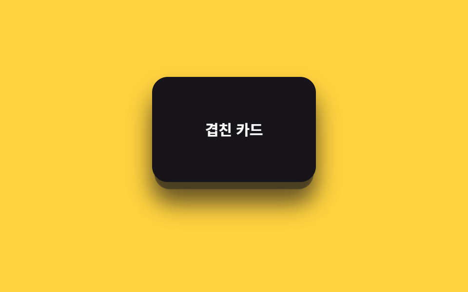
<main class="stage is-demo">
  <div class="depthcards">
    <div class="depthcards__card depthcards__card--3" aria-hidden="true"></div>
    <div class="depthcards__card depthcards__card--2" aria-hidden="true"></div>
    <div class="depthcards__card depthcards__card--1">
      <span>Stacked cards</span>
    </div>
  </div>
</main>
@use "../../../../site/static/demo-tokens" as *;
// ── 변수 3개. 변형은 이것만 바꾼다 ──────────────────────────
$peel: 34px; // 맨 앞 카드가 밀려나는 거리
$scale-step: .06; // 뒤 카드일수록 커지는 폭
$color: $subject-ink; // 카드 색 (yellow 무대라 ink)
@include stage($stage-yellow);
.depthcards {
position: relative;
width: 100%;
height: 100%;
display: grid;
place-items: center;
}
.depthcards__card {
position: absolute;
width: 168px;
height: 108px;
border-radius: $r-card;
box-shadow: $shadow-raised;
display: grid;
place-items: center;
font: 700 clamp(13px, 4vw, 15px)/1 -apple-system, "Segoe UI", "Noto Sans KR", sans-serif;
&--3 {
background: rgba($color, .28);
transform: translateY(18px) scale(.88);
@supports (animation-timeline: scroll()) { animation: peel-3 linear both; animation-timeline: scroll(root); }
}
&--2 {
background: rgba($color, .58);
transform: translateY(9px) scale(.94);
@supports (animation-timeline: scroll()) { animation: peel-2 linear both; animation-timeline: scroll(root); }
}
&--1 {
background: $color;
color: #fff;
@supports (animation-timeline: scroll()) { animation: peel-1 linear both; animation-timeline: scroll(root); }
}
}
// ── 실제 사용 코드: 앞 카드일수록 더 멀리, 더 빨리 밀려난다 ──
@keyframes peel-1 { from { transform: translateY(0) scale(1); } to { transform: translateY(-#{$peel}) scale(1); } }
@keyframes peel-2 { from { transform: translateY(9px) scale(.94); } to { transform: translateY(9px - $peel) scale(.94 + $scale-step); } }
@keyframes peel-3 { from { transform: translateY(18px) scale(.88); } to { transform: translateY(18px - $peel * 1.4) scale(.88 + $scale-step * 2); } }
// ── 데모(.is-demo): 왕복 루프로 흉내 ────────
.stage.is-demo .depthcards__card--1 { animation: loop-1 $dur-loop ease-in-out infinite; }
.stage.is-demo .depthcards__card--2 { animation: loop-2 $dur-loop ease-in-out infinite; }
.stage.is-demo .depthcards__card--3 { animation: loop-3 $dur-loop ease-in-out infinite; }
@keyframes loop-1 { 0%, 100% { transform: translateY(0) scale(1); } 50% { transform: translateY(-$peel) scale(1); } }
@keyframes loop-2 { 0%, 100% { transform: translateY(9px) scale(.94); } 50% { transform: translateY(9px - $peel) scale(.94 + $scale-step); } }
@keyframes loop-3 { 0%, 100% { transform: translateY(18px) scale(.88); } 50% { transform: translateY(18px - $peel * 1.4) scale(.88 + $scale-step * 2); } }
@media (prefers-reduced-motion: reduce) {
.depthcards__card--1, .depthcards__card--2, .depthcards__card--3,
.stage.is-demo .depthcards__card--1, .stage.is-demo .depthcards__card--2, .stage.is-demo .depthcards__card--3 {
animation: none !important;
}
.depthcards__card--1 { transform: translateY(0) scale(1); }
.depthcards__card--2 { transform: translateY(9px) scale(.94); }
.depthcards__card--3 { transform: translateY(18px) scale(.88); }
}html, body {
margin: 0;
overflow: hidden;
}
.stage {
box-sizing: border-box;
min-height: 100vh;
display: grid;
place-items: center;
margin: 0;
background: #ffd23f;
font-family: -apple-system, "Segoe UI", "Noto Sans KR", sans-serif;
padding: clamp(8px, 4vw, 24px);
}
.depthcards {
position: relative;
width: 100%;
height: 100%;
display: grid;
place-items: center;
}
.depthcards__card {
position: absolute;
width: 168px;
height: 108px;
border-radius: 16px;
box-shadow: 0 14px 24px rgba(23, 20, 26, 0.32);
display: grid;
place-items: center;
font: 700 clamp(13px, 4vw, 15px)/1 -apple-system, "Segoe UI", "Noto Sans KR", sans-serif;
}
.depthcards__card--3 {
background: rgba(23, 20, 26, 0.28);
transform: translateY(18px) scale(0.88);
}
@supports (animation-timeline: scroll()) {
.depthcards__card--3 {
animation: peel-3 linear both;
animation-timeline: scroll(root);
}
}
.depthcards__card--2 {
background: rgba(23, 20, 26, 0.58);
transform: translateY(9px) scale(0.94);
}
@supports (animation-timeline: scroll()) {
.depthcards__card--2 {
animation: peel-2 linear both;
animation-timeline: scroll(root);
}
}
.depthcards__card--1 {
background: #17141a;
color: #fff;
}
@supports (animation-timeline: scroll()) {
.depthcards__card--1 {
animation: peel-1 linear both;
animation-timeline: scroll(root);
}
}
@keyframes peel-1 {
from {
transform: translateY(0) scale(1);
}
to {
transform: translateY(-34px) scale(1);
}
}
@keyframes peel-2 {
from {
transform: translateY(9px) scale(0.94);
}
to {
transform: translateY(-25px) scale(1);
}
}
@keyframes peel-3 {
from {
transform: translateY(18px) scale(0.88);
}
to {
transform: translateY(-29.6px) scale(1);
}
}
.stage.is-demo .depthcards__card--1 {
animation: loop-1 2s ease-in-out infinite;
}
.stage.is-demo .depthcards__card--2 {
animation: loop-2 2s ease-in-out infinite;
}
.stage.is-demo .depthcards__card--3 {
animation: loop-3 2s ease-in-out infinite;
}
@keyframes loop-1 {
0%, 100% {
transform: translateY(0) scale(1);
}
50% {
transform: translateY(-34px) scale(1);
}
}
@keyframes loop-2 {
0%, 100% {
transform: translateY(9px) scale(0.94);
}
50% {
transform: translateY(-25px) scale(1);
}
}
@keyframes loop-3 {
0%, 100% {
transform: translateY(18px) scale(0.88);
}
50% {
transform: translateY(-29.6px) scale(1);
}
}
@media (prefers-reduced-motion: reduce) {
.depthcards__card--1, .depthcards__card--2, .depthcards__card--3,
.stage.is-demo .depthcards__card--1, .stage.is-demo .depthcards__card--2, .stage.is-demo .depthcards__card--3 {
animation: none !important;
}
.depthcards__card--1 {
transform: translateY(0) scale(1);
}
.depthcards__card--2 {
transform: translateY(9px) scale(0.94);
}
.depthcards__card--3 {
transform: translateY(18px) scale(0.88);
}
}import type { CSSProperties, ReactNode } from "react";
import styles from "./DepthCards.module.scss";
export type DepthCardsProps = {
/** 맨 앞 카드 라벨 */
children: ReactNode;
/** 맨 앞 카드가 밀려나는 거리 (기본 34px) */
peel?: number;
/** 뒤 카드일수록 커지는 폭 (기본 .06) */
scaleStep?: number;
className?: string;
};
type Vars = CSSProperties & { "--peel"?: string; "--scale-step"?: string };
export default function DepthCards({
children,
peel = 34,
scaleStep = 0.06,
className = "",
}: DepthCardsProps) {
const vars: Vars = { "--peel": `${peel}px`, "--scale-step": `${scaleStep}` };
return (
<div className={`${styles.wrap} ${className}`} style={vars}>
<div className={`${styles.card} ${styles.card3}`} aria-hidden="true" />
<div className={`${styles.card} ${styles.card2}`} aria-hidden="true" />
<div className={`${styles.card} ${styles.card1}`}>{children}</div>
</div>
);
}06 Layered depth cards — Measured area 16.794% · moving frames 23/23Original by GODRICH · SCSS and React ship in the zip · 9 CSS Parallax Scrolling — No JS, Scroll-Driven
The post this demo lives in
 9 CSS Parallax Scrolling — No JS, Scroll-DrivenCSS parallax scrolling is scroll-linked motion — a background, a layer, a whole hero — driven entirely by animation-time See all demos in this post