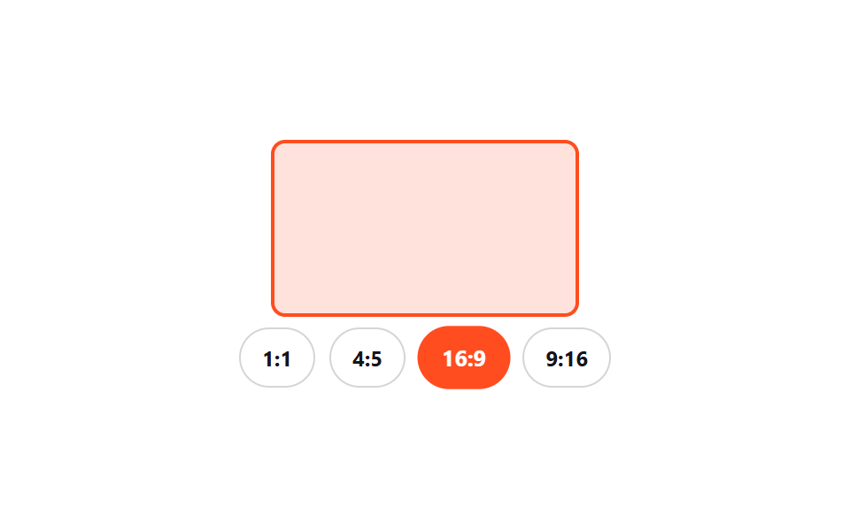
08Aspect-ratio crop preset picker
Picking a 1:1, 4:5, 16:9, or 9:16 chip smoothly morphs the preview box's aspect-ratio to match.
Best forChoosing a crop ratio for a profile photo, picking an upload ratio for Reels or Shorts
aspect-ratio 전환role=radiogroup0.3초
<main class="stage">
  <div class="ar is-demo">
    <div class="ar__preview"><div class="ar__box" id="box"></div></div>
    <div class="ar__chips" role="radiogroup" aria-label="Select aspect ratio">
      <label class="ar__chip"><input type="radio" name="ar" class="ar__radio" value="1/1" checked><span>1:1</span></label>
      <label class="ar__chip"><input type="radio" name="ar" class="ar__radio" value="4/5"><span>4:5</span></label>
      <label class="ar__chip"><input type="radio" name="ar" class="ar__radio" value="16/9"><span>16:9</span></label>
      <label class="ar__chip"><input type="radio" name="ar" class="ar__radio" value="9/16"><span>9:16</span></label>
    </div>
  </div>
</main>
@use "../../../../site/static/demo-tokens" as *;
// ── 변수 3개 ──────────────────────────────
$duration: $dur-base;
$easing: $ease-spring;
$color: $stage-orange;
@include stage($stage-paper);
.ar { display: flex; flex-direction: column; align-items: center; gap: $sp-2; }
.ar__preview { height: 96px; display: grid; place-items: center; width: 100%; }
.ar__box {
aspect-ratio: 1 / 1; height: 100%; max-width: 90%;
border-radius: $r-sm; background: rgba($color, .16); border: 2px solid $color;
transition: aspect-ratio $duration $easing;
}
.ar__chips { display: flex; gap: $sp-2; }
.ar__chip { position: relative; }
.ar__radio { position: absolute; opacity: 0; width: 1px; height: 1px; }
.ar__chip span {
display: grid; place-items: center; padding: $sp-2 $sp-3; border-radius: $r-pill;
border: 1px solid rgba($subject-ink, .18); font-size: 12px; font-weight: 700; color: $subject-ink;
cursor: pointer; transition: background-color $duration $easing, color $duration $easing, transform $duration $easing;
}
.ar__radio:checked ~ span { background: $color; border-color: $color; color: #fff; transform: scale(1.05); }
.ar__radio:focus-visible ~ span { outline: 2px solid $subject-ink; outline-offset: 2px; }
@media (prefers-reduced-motion: reduce) {
.ar__box, .ar__chip span { transition: none; }
}html, body {
margin: 0;
overflow: hidden;
}
.stage {
box-sizing: border-box;
min-height: 100vh;
display: grid;
place-items: center;
margin: 0;
background: #ffffff;
font-family: -apple-system, "Segoe UI", "Noto Sans KR", sans-serif;
padding: clamp(8px, 4vw, 24px);
}
.ar {
display: flex;
flex-direction: column;
align-items: center;
gap: 8px;
}
.ar__preview {
height: 96px;
display: grid;
place-items: center;
width: 100%;
}
.ar__box {
aspect-ratio: 1/1;
height: 100%;
max-width: 90%;
border-radius: 8px;
background: rgba(255, 77, 31, 0.16);
border: 2px solid #ff4d1f;
transition: aspect-ratio 300ms cubic-bezier(0.2, 0.8, 0.2, 1);
}
.ar__chips {
display: flex;
gap: 8px;
}
.ar__chip {
position: relative;
}
.ar__radio {
position: absolute;
opacity: 0;
width: 1px;
height: 1px;
}
.ar__chip span {
display: grid;
place-items: center;
padding: 8px 12px;
border-radius: 999px;
border: 1px solid rgba(23, 20, 26, 0.18);
font-size: 12px;
font-weight: 700;
color: #17141a;
cursor: pointer;
transition: background-color 300ms cubic-bezier(0.2, 0.8, 0.2, 1), color 300ms cubic-bezier(0.2, 0.8, 0.2, 1), transform 300ms cubic-bezier(0.2, 0.8, 0.2, 1);
}
.ar__radio:checked ~ span {
background: #ff4d1f;
border-color: #ff4d1f;
color: #fff;
transform: scale(1.05);
}
.ar__radio:focus-visible ~ span {
outline: 2px solid #17141a;
outline-offset: 2px;
}
@media (prefers-reduced-motion: reduce) {
.ar__box, .ar__chip span {
transition: none;
}
}(function () {
var ar = document.querySelector('.ar'), box = document.getElementById('box');
var radios = Array.prototype.slice.call(ar.querySelectorAll('.ar__radio'));
function apply(v) { box.style.aspectRatio = v; }
radios.forEach(function (r) { r.addEventListener('change', function () { stop(); apply(r.value); }); });
var seq = ['1/1', '4/5', '16/9', '9/16'], si = 0;
var t = setInterval(function () {
si = (si + 1) % seq.length;
radios[si].checked = true; apply(seq[si]);
}, 700);
function stop() { ar.classList.remove('is-demo'); clearInterval(t); }
apply('1/1');
}());import { useState } from "react";
import type { CSSProperties } from "react";
import styles from "./AspectRatioCropPresetPicker.module.scss";
export type AspectRatioCropPresetPickerProps = {
ratios?: string[];
duration?: number;
easing?: string;
color?: string;
};
type Vars = CSSProperties & { "--duration"?: string; "--easing"?: string; "--c"?: string };
export default function AspectRatioCropPresetPicker({
ratios = ["1/1", "4/5", "16/9", "9/16"],
duration = 300,
easing = "cubic-bezier(.2,.8,.2,1)",
color = "#ff4d1f",
}: AspectRatioCropPresetPickerProps) {
const [ratio, setRatio] = useState(ratios[0]);
const vars: Vars = { "--duration": `${duration}ms`, "--easing": easing, "--c": color };
return (
<div className={styles.ar} style={vars}>
<div className={styles.preview}>
<div className={styles.box} style={{ aspectRatio: ratio }} />
</div>
<div className={styles.chips} role="radiogroup" aria-label="Select aspect ratio">
{ratios.map((r) => (
<label key={r} className={styles.chip}>
<input type="radio" name="ratio" className={styles.radio} checked={ratio === r}
onChange={() => setRatio(r)} />
<span data-on={ratio === r}>{r.replace("/", ":")}</span>
</label>
))}
</div>
</div>
);
}08 Aspect-ratio crop preset picker — Measured area 12.704% · moving frames 11/23Original by GODRICH · SCSS and React ship in the zip · 9 Date Range Picker UI Patterns — Copy-Paste
The post this demo lives in
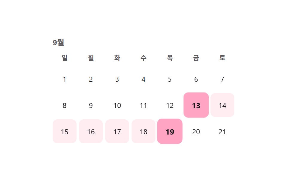 9 Date Range Picker UI Patterns — Copy-PasteA date range picker UI is a control that lets someone choose a span, not just one value. This post collects 9 fresh sele See all demos in this post
If you like this effect - similar demos
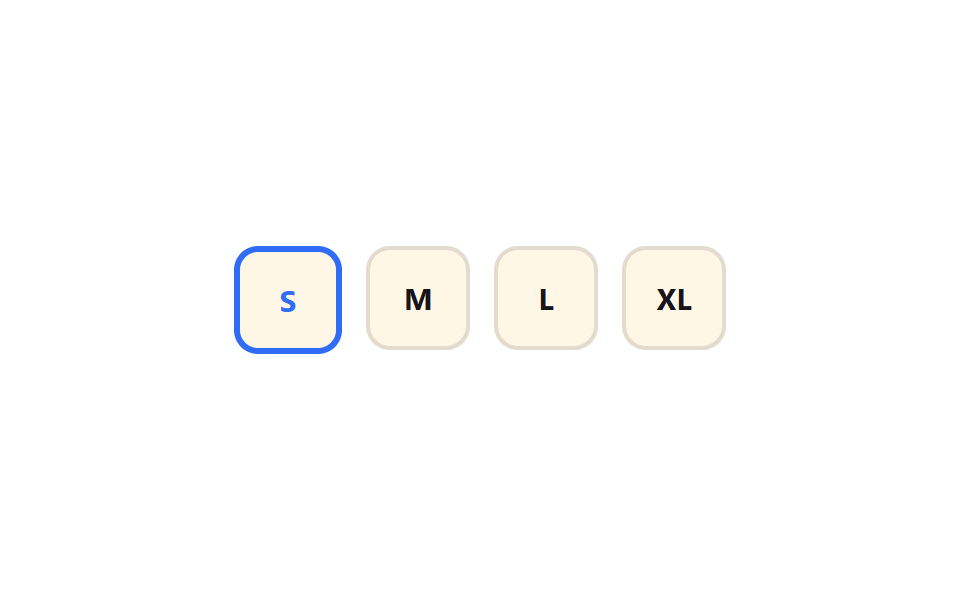 Pickers04 Size radio chips9 Segmented Control UI Patterns — Copy-Paste
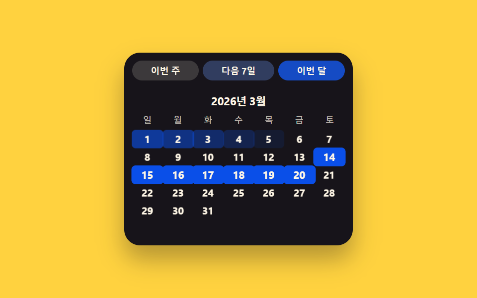 Pickers06 Preset-chip value toggle — engaging a chip value sets the date value directly, skipping the gridDate Picker UI: 9 Popover & Calendar Patterns
 Pickers04 Picker Whose Donut Segment Grows With Its Value Ratio9 Graph Animation CSS Pickers With Live Recompute