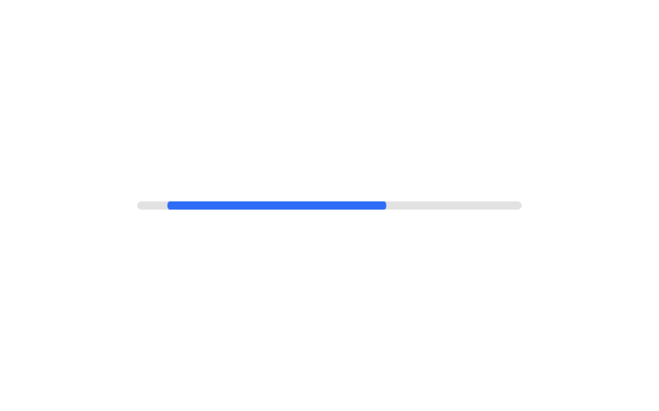
06Indeterminate bar
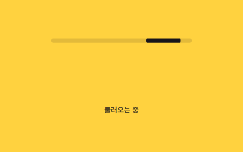
Rather than one short bar sweeping back and forth, two bar segments of different lengths roll across at staggered timings, overlapping the way Google's Material Design loading bar does.
Best forInitial loads with an unknown duration, search-result waits
두 세그먼트animation-delay 차등cubic-bezier
<main class="stage">
  <div class="track" role="progressbar" aria-label="Loading">
    <span class="seg seg--a is-demo"></span>
    <span class="seg seg--b is-demo"></span>
  </div>
  <p class="cap">Loading</p>
</main>
@use "../../../../site/static/demo-tokens" as *;
// ── 변수 3개 ──────────────────────────────────────────
$duration: 1.6s; // 긴 조각 하나가 지나가는 시간
$easing: cubic-bezier(.4, 0, .2, 1);
$color: $subject-ink; // 조각 색
@include stage($stage-yellow);
// 진행률을 모르므로 aria-valuenow 를 주지 않는다 (ARIA 명세: 불확정 progressbar 는 값 속성을 뺀다)
.track {
position: relative;
width: clamp(200px, 58vw, 280px);
height: 8px;
border-radius: $r-pill;
background: rgba(23, 20, 26, .12);
overflow: hidden;
}
.seg {
position: absolute;
inset: 0; // 폭을 꽉 채운 뒤 transform 으로만 밀고 줄인다 (width 는 건드리지 않는다)
border-radius: inherit;
background: $color;
transform-origin: left center; // 규칙8: 좌변 기준 이동·신축
}
// 짧은 바 하나가 오가는 대신, 길이가 다른 두 조각이 시간차를 두고 서로 겹쳐 지나간다 (머티리얼 디자인 방식)
.seg--a.is-demo { animation: seg-a $duration $easing infinite; }
.seg--b.is-demo { animation: seg-b $duration $easing infinite; animation-delay: $duration * .35; }
@keyframes seg-a {
0% { transform: translateX(-100%) scaleX(.15); }
55% { transform: translateX(30%) scaleX(.7); }
100% { transform: translateX(120%) scaleX(.15); }
}
@keyframes seg-b {
0% { transform: translateX(-140%) scaleX(.1); }
60% { transform: translateX(10%) scaleX(.4); }
100% { transform: translateX(120%) scaleX(.1); }
}
.cap {
margin: 14px 0 0;
color: rgba(23, 20, 26, .75);
font: 600 clamp(12px, 3.2vw, 14px)/1 -apple-system, "Segoe UI", "Noto Sans KR", sans-serif;
}
@media (prefers-reduced-motion: reduce) {
.seg.is-demo { animation: none; transform: translateX(0) scaleX(.4); opacity: .7; }
}html, body {
margin: 0;
overflow: hidden;
}
.stage {
box-sizing: border-box;
min-height: 100vh;
display: grid;
place-items: center;
margin: 0;
background: #ffd23f;
font-family: -apple-system, "Segoe UI", "Noto Sans KR", sans-serif;
padding: clamp(8px, 4vw, 24px);
}
.track {
position: relative;
width: clamp(200px, 58vw, 280px);
height: 8px;
border-radius: 999px;
background: rgba(23, 20, 26, 0.12);
overflow: hidden;
}
.seg {
position: absolute;
inset: 0;
border-radius: inherit;
background: #17141a;
transform-origin: left center;
}
.seg--a.is-demo {
animation: seg-a 1.6s cubic-bezier(0.4, 0, 0.2, 1) infinite;
}
.seg--b.is-demo {
animation: seg-b 1.6s cubic-bezier(0.4, 0, 0.2, 1) infinite;
animation-delay: 0.56s;
}
@keyframes seg-a {
0% {
transform: translateX(-100%) scaleX(0.15);
}
55% {
transform: translateX(30%) scaleX(0.7);
}
100% {
transform: translateX(120%) scaleX(0.15);
}
}
@keyframes seg-b {
0% {
transform: translateX(-140%) scaleX(0.1);
}
60% {
transform: translateX(10%) scaleX(0.4);
}
100% {
transform: translateX(120%) scaleX(0.1);
}
}
.cap {
margin: 14px 0 0;
color: rgba(23, 20, 26, 0.75);
font: 600 clamp(12px, 3.2vw, 14px)/1 -apple-system, "Segoe UI", "Noto Sans KR", sans-serif;
}
@media (prefers-reduced-motion: reduce) {
.seg.is-demo {
animation: none;
transform: translateX(0) scaleX(0.4);
opacity: 0.7;
}
}import type { CSSProperties } from "react";
import styles from "./IndeterminateBar.module.scss";
export type IndeterminateBarProps = {
duration?: number;
easing?: string;
color?: string;
/** 진행률을 모르므로 값이 아니라 상태만 알린다 */
label?: string;
};
type Vars = CSSProperties & {
"--duration"?: string;
"--easing"?: string;
"--color"?: string;
};
export default function IndeterminateBar({
duration = 1600,
easing = "cubic-bezier(.4,0,.2,1)",
color = "#17141a",
label = "Loading",
}: IndeterminateBarProps) {
const vars: Vars = { "--duration": `${duration}ms`, "--easing": easing, "--color": color };
return (
<div className={styles.track} style={vars} role="progressbar" aria-label={label}>
<span className={`${styles.seg} ${styles.a}`} />
<span className={`${styles.seg} ${styles.b}`} />
</div>
);
}06 Indeterminate bar — Measured area 1.542% · moving frames 19/23Original by GODRICH · SCSS and React ship in the zip · 9 CSS Progress Bar Circle Gauges, Copy-Paste Ready
The post this demo lives in
 9 CSS Progress Bar Circle Gauges, Copy-Paste ReadyA css progress bar circle is a ring or arc that fills toward a value with conic-gradient and a custom property instead o See all demos in this post