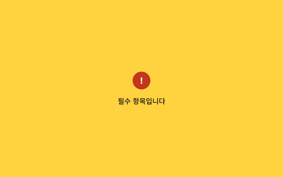
06Attention icon bounce
A warning-triangle icon bounces up and settles via a keyframe mixing scale and translateY, pulling the eye toward the error message.
Best forWarning icons beside form fields, alert-banner icons
scaletranslateY700ms
<main class="stage">
  <div class="ib is-demo">
    <span class="ib__icon" aria-hidden="true">!</span>
    <p class="ib__msg">This field is required</p>
  </div>
</main>
@use "../../../../site/static/demo-tokens" as *;
$duration: 700ms; // 아이콘이 튀어 올랐다 착지하는 시간
$easing: $ease-pop;
$color: $error;
@include stage($stage-yellow);
.ib { display: flex; flex-direction: column; align-items: center; gap: $sp-3; }
.ib__icon {
width: $sp-8; height: $sp-8;
border-radius: 50%;
background: $color;
color: #fff;
display: grid; place-items: center;
font-weight: 700;
font-size: 16px;
line-height: 1;
font-family: inherit;
transform-origin: center;
}
.ib__msg { margin: 0; color: $subject-ink; font-weight: 500; font-size: 12px; line-height: 1.3; font-family: inherit; }
@keyframes ib-bounce {
0%, 100% { transform: translateY(0) scale(1); }
20% { transform: translateY(-10px) scale(1.15); }
40% { transform: translateY(0) scale(.95); }
55% { transform: translateY(-4px) scale(1.05); }
70% { transform: translateY(0) scale(1); }
}
// 실제 동작: 오류가 뜨면 .ib--bounce 가 한 번 붙는다
.ib__icon.ib--bounce { animation: ib-bounce $duration $easing; }
// 데모 루프
.ib.is-demo .ib__icon { animation: ib-bounce $duration $easing infinite; }
@media (prefers-reduced-motion: reduce) {
.ib__icon.ib--bounce,
.ib.is-demo .ib__icon { animation: none !important; }
}html, body {
margin: 0;
overflow: hidden;
}
.stage {
box-sizing: border-box;
min-height: 100vh;
display: grid;
place-items: center;
margin: 0;
background: #ffd23f;
font-family: -apple-system, "Segoe UI", "Noto Sans KR", sans-serif;
padding: clamp(8px, 4vw, 24px);
}
.ib {
display: flex;
flex-direction: column;
align-items: center;
gap: 12px;
}
.ib__icon {
width: 32px;
height: 32px;
border-radius: 50%;
background: #c2361a;
color: #fff;
display: grid;
place-items: center;
font-weight: 700;
font-size: 16px;
line-height: 1;
font-family: inherit;
transform-origin: center;
}
.ib__msg {
margin: 0;
color: #17141a;
font-weight: 500;
font-size: 12px;
line-height: 1.3;
font-family: inherit;
}
@keyframes ib-bounce {
0%, 100% {
transform: translateY(0) scale(1);
}
20% {
transform: translateY(-10px) scale(1.15);
}
40% {
transform: translateY(0) scale(0.95);
}
55% {
transform: translateY(-4px) scale(1.05);
}
70% {
transform: translateY(0) scale(1);
}
}
.ib__icon.ib--bounce {
animation: ib-bounce 700ms cubic-bezier(0.2, 1.4, 0.4, 1);
}
.ib.is-demo .ib__icon {
animation: ib-bounce 700ms cubic-bezier(0.2, 1.4, 0.4, 1) infinite;
}
@media (prefers-reduced-motion: reduce) {
.ib__icon.ib--bounce,
.ib.is-demo .ib__icon {
animation: none !important;
}
}import { useState } from "react";
import type { CSSProperties } from "react";
import styles from "./AttentionIconBounce.module.scss";
export type AttentionIconBounceProps = {
duration?: number;
easing?: string;
color?: string;
};
type Vars = CSSProperties & { "--duration"?: string; "--easing"?: string; "--color"?: string };
export default function AttentionIconBounce({ duration = 700, easing = "cubic-bezier(.2,1.4,.4,1)", color = "#c2361a" }: AttentionIconBounceProps) {
const [run, setRun] = useState(0);
const vars: Vars = { "--duration": `${duration}ms`, "--easing": easing, "--color": color };
return (
<div className={styles.ib} style={vars} onClick={() => setRun((n) => n + 1)}>
<span key={run} className={`${styles.icon} ${styles.bounce}`} aria-hidden="true">!</span>
<p className={styles.msg}>필수 항목입니다</p>
</div>
);
}06 Attention icon bounce — Measured area 0.726% · moving frames 18/23Original by GODRICH · SCSS and React ship in the zip · 9 CSS Shake Animation Examples for Form Errors
The post this demo lives in
 9 CSS Shake Animation Examples for Form ErrorsType a wrong password and the box shakes before you read why — that's a css shake animation, code that makes a form say See all demos in this post