04Logo-only shrink
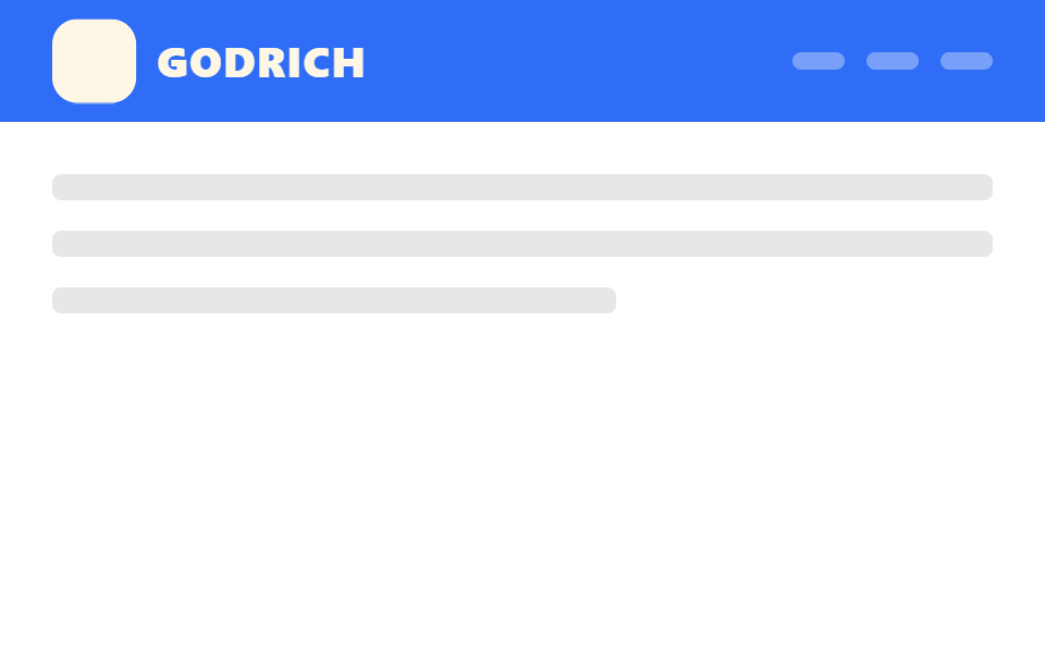
The header's height and background stay fixed while only the logo mark scales down, so the layout never shifts as you scroll.
Best forSaaS landing pages with a large brand mark, headers that must avoid layout shift
transform:scale높이 고정transform-origin:left
<main class="stage">
  <header class="head is-demo">
    <span class="head__logo"><span class="head__mark" aria-hidden="true"></span>GODRICH</span>
    <nav class="head__nav" aria-hidden="true"><span></span><span></span><span></span></nav>
  </header>
  <div class="page">
    <p class="page__line"></p>
    <p class="page__line"></p>
    <p class="page__line short"></p>
  </div>
</main>
@use "../../../../site/static/demo-tokens" as *;
// ── 변수 3개 ──────────────────────────────────────────
$duration: $dur-enter; // 로고가 줄어드는 시간
$easing: $ease-out;
$scale-to: .72; // 줄어든 비율
// ── 데모 무대 ──────────────────────────────────────────
html, body { margin: 0; overflow: hidden; }
.stage {
min-height: 100vh;
margin: 0;
background: $stage-paper;
font-family: -apple-system, "Segoe UI", "Noto Sans KR", sans-serif;
}
// 헤더 높이·배경은 고정. 로고만 scale 로 줄어든다 (레이아웃은 절대 바뀌지 않는다)
.head {
position: sticky;
top: 0;
height: 56px;
display: flex;
align-items: center;
justify-content: space-between;
padding: 0 clamp(16px, 5vw, 24px);
background: $subject-blue;
&__logo {
display: flex; align-items: center; gap: 10px;
color: $subject-cream; font-weight: 800; font-size: 20px; line-height: 1; font-family: inherit; letter-spacing: .04em;
transform-origin: left center; // 규칙8: 헤더 좌변 붙은 로고 축소
}
&__mark { width: 40px; height: 40px; border-radius: $r-control; background: $subject-cream; }
&__nav { display: flex; gap: 10px; span { width: 24px; height: 8px; border-radius: 4px; background: rgba(255, 255, 255, .35); } }
// 실제 사용: 문서 스크롤이 진행되는 동안 로고만 줄어든다
@supports (animation-timeline: scroll()) {
.head__logo { animation: logo-shrink linear both; animation-timeline: scroll(root); animation-range: 0 150px; }
}
}
@keyframes logo-shrink {
from { transform: scale(1); }
to { transform: scale($scale-to); }
}
// ── 데모(.is-demo): 로고가 줄었다 늘었다 2초 루프 ──────────
.head.is-demo .head__logo {
animation: logo-shrink-loop $dur-loop $easing infinite;
}
@keyframes logo-shrink-loop {
0%, 15% { transform: scale(1); }
45%, 70% { transform: scale($scale-to); }
95%, 100% { transform: scale(1); }
}
// ── 배경: 문서처럼 보이는 자리 ─────────────────────────
.page { padding: 24px 24px 0; }
.page__line {
height: 12px;
margin: 0 0 14px;
border-radius: 4px;
background: rgba($stage-ink, .1);
&.short { width: 60%; }
}
@media (prefers-reduced-motion: reduce) {
.head.is-demo .head__logo { animation: none !important; transform: scale($scale-to); }
}html, body {
margin: 0;
overflow: hidden;
}
.stage {
min-height: 100vh;
margin: 0;
background: #ffffff;
font-family: -apple-system, "Segoe UI", "Noto Sans KR", sans-serif;
}
.head {
position: sticky;
top: 0;
height: 56px;
display: flex;
align-items: center;
justify-content: space-between;
padding: 0 clamp(16px, 5vw, 24px);
background: #2f6df6;
}
.head__logo {
display: flex;
align-items: center;
gap: 10px;
color: #fff7e6;
font-weight: 800;
font-size: 20px;
line-height: 1;
font-family: inherit;
letter-spacing: 0.04em;
transform-origin: left center;
}
.head__mark {
width: 40px;
height: 40px;
border-radius: 12px;
background: #fff7e6;
}
.head__nav {
display: flex;
gap: 10px;
}
.head__nav span {
width: 24px;
height: 8px;
border-radius: 4px;
background: rgba(255, 255, 255, 0.35);
}
@supports (animation-timeline: scroll()) {
.head .head__logo {
animation: logo-shrink linear both;
animation-timeline: scroll(root);
animation-range: 0 150px;
}
}
@keyframes logo-shrink {
from {
transform: scale(1);
}
to {
transform: scale(0.72);
}
}
.head.is-demo .head__logo {
animation: logo-shrink-loop 2s ease-out infinite;
}
@keyframes logo-shrink-loop {
0%, 15% {
transform: scale(1);
}
45%, 70% {
transform: scale(0.72);
}
95%, 100% {
transform: scale(1);
}
}
.page {
padding: 24px 24px 0;
}
.page__line {
height: 12px;
margin: 0 0 14px;
border-radius: 4px;
background: rgba(23, 20, 26, 0.1);
}
.page__line.short {
width: 60%;
}
@media (prefers-reduced-motion: reduce) {
.head.is-demo .head__logo {
animation: none !important;
transform: scale(0.72);
}
}import type { CSSProperties, ReactNode } from "react";
import styles from "./LogoShrinkHeader.module.scss";
export type LogoShrinkHeaderProps = {
logo: string;
children?: ReactNode;
/** 로고가 줄어드는 시간 (기본 600ms) — 실제 사용은 scroll() 타임라인이 대신한다 */
duration?: number;
easing?: string;
/** 줄어든 비율 (기본 .72) */
scaleTo?: number;
};
type Vars = CSSProperties & { "--duration"?: string; "--easing"?: string; "--scale-to"?: number };
export default function LogoShrinkHeader({
logo,
children,
duration = 600,
easing = "ease-out",
scaleTo = 0.72,
}: LogoShrinkHeaderProps) {
const vars: Vars = { "--duration": `${duration}ms`, "--easing": easing, "--scale-to": scaleTo };
return (
<header className={styles.head} style={vars}>
<span className={styles.logo}>
<span className={styles.mark} aria-hidden="true" />
{logo}
</span>
<nav className={styles.nav}>{children}</nav>
</header>
);
}04 Logo-only shrink — Measured area 1.585% · moving frames 15/23Original by GODRICH · SCSS and React ship in the zip · 9 CSS Sticky Header Effects — No JS, Scroll-Driven
The post this demo lives in
 9 CSS Sticky Header Effects — No JS, Scroll-DrivenA css sticky header is a header pinned with position: sticky so it locks to the top of the viewport once the page scroll See all demos in this post