02Marker overlap
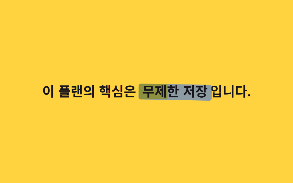
The same highlighter block is duplicated as ::before and ::after, each with a different rotate angle and delay while scaleX grows, so the two strokes overlap unevenly like a marker passed twice by hand.
Best forThe single most important word on a page, the answer keyword in an FAQ
::before·::afterrotate + scaleX지연 0/.3s
<main class="stage">
  <p class="line">The heart of this plan is <span class="hl">unlimited storage</span>.</p>
</main>
@use "../../../../site/static/demo-tokens" as *;
// ── 변수 3개 ─────────────────────────────
$duration: $dur-loop;
$easing: $ease-spring;
$color: $subject-blue; // 두 번째 스트로크 색 (첫 번째는 무대 노랑)
// ── 데모 무대 ───────────────────────────────
@include stage($stage-yellow);
.line {
max-width: 92%;
margin: 0;
color: $stage-ink;
font-weight: 700;
font-size: clamp(16px, 4.6vw, 22px);
line-height: 1.6;
font-family: inherit;
text-align: center;
}
// 같은 자리에 두 겹의 마커 스트로크를 서로 다른 각도로 겹쳐 칠한다 (018 체크 게이트와 무관 — 여긴 체크 아이콘이 아니다)
.hl {
position: relative;
isolation: isolate; // z-index:-1 을 이 안에 가둬 무대 배경 뒤로 숨지 않게 한다
padding: 0 $sp-1;
&::before, &::after {
content: "";
position: absolute;
inset: 10% -2% 4%;
border-radius: $r-xs;
transform: scaleX(0);
transform-origin: left center; // 규칙8: 마커 겹칠 왼쪽 칠함
mix-blend-mode: multiply;
z-index: -1;
}
&::before {
background: $stage-yellow;
rotate: -1.2deg;
animation: mark $duration $easing infinite, mark-thick-1 $duration ease-in-out infinite;
}
&::after {
background: $color;
opacity: .55;
rotate: 1deg;
animation: mark $duration $easing infinite .3s, mark-thick-2 $duration ease-in-out infinite .15s;
}
}
@keyframes mark {
0% { transform: scaleX(0); }
20% { transform: scaleX(1); }
75% { transform: scaleX(1); }
100% { transform: scaleX(0); }
}
// 한 겹: 각 스트로크의 위·아래 두께 요동 — inset(top/bottom) 변조라 transform 아님.
// 두 스트로크가 서로 다른 위상으로 출렁여 겹침 가장자리가 살아 움직인다
@keyframes mark-thick-1 {
0% { inset: 10% -2% 4%; }
25% { inset: 8% -2% 5.5%; }
50% { inset: 11.5% -2% 3%; }
75% { inset: 9% -2% 6%; }
100% { inset: 10% -2% 4%; }
}
@keyframes mark-thick-2 {
0% { inset: 10% -2% 4%; }
30% { inset: 12% -2% 2.5%; }
55% { inset: 7.5% -2% 6.5%; }
80% { inset: 11% -2% 3.5%; }
100% { inset: 10% -2% 4%; }
}
@media (prefers-reduced-motion: reduce) {
.hl::before, .hl::after { animation: none; transform: scaleX(1); }
}html, body {
margin: 0;
overflow: hidden;
}
.stage {
box-sizing: border-box;
min-height: 100vh;
display: grid;
place-items: center;
margin: 0;
background: #ffd23f;
font-family: -apple-system, "Segoe UI", "Noto Sans KR", sans-serif;
padding: clamp(8px, 4vw, 24px);
}
.line {
max-width: 92%;
margin: 0;
color: #17141a;
font-weight: 700;
font-size: clamp(16px, 4.6vw, 22px);
line-height: 1.6;
font-family: inherit;
text-align: center;
}
.hl {
position: relative;
isolation: isolate;
padding: 0 4px;
}
.hl::before, .hl::after {
content: "";
position: absolute;
inset: 10% -2% 4%;
border-radius: 4px;
transform: scaleX(0);
transform-origin: left center;
mix-blend-mode: multiply;
z-index: -1;
}
.hl::before {
background: #ffd23f;
rotate: -1.2deg;
animation: mark 2s cubic-bezier(0.2, 0.8, 0.2, 1) infinite, mark-thick-1 2s ease-in-out infinite;
}
.hl::after {
background: #2f6df6;
opacity: 0.55;
rotate: 1deg;
animation: mark 2s cubic-bezier(0.2, 0.8, 0.2, 1) infinite 0.3s, mark-thick-2 2s ease-in-out infinite 0.15s;
}
@keyframes mark {
0% {
transform: scaleX(0);
}
20% {
transform: scaleX(1);
}
75% {
transform: scaleX(1);
}
100% {
transform: scaleX(0);
}
}
@keyframes mark-thick-1 {
0% {
inset: 10% -2% 4%;
}
25% {
inset: 8% -2% 5.5%;
}
50% {
inset: 11.5% -2% 3%;
}
75% {
inset: 9% -2% 6%;
}
100% {
inset: 10% -2% 4%;
}
}
@keyframes mark-thick-2 {
0% {
inset: 10% -2% 4%;
}
30% {
inset: 12% -2% 2.5%;
}
55% {
inset: 7.5% -2% 6.5%;
}
80% {
inset: 11% -2% 3.5%;
}
100% {
inset: 10% -2% 4%;
}
}
@media (prefers-reduced-motion: reduce) {
.hl::before, .hl::after {
animation: none;
transform: scaleX(1);
}
}import type { CSSProperties, ReactNode } from "react";
import styles from "./MarkerOverlap.module.scss";
export type MarkerOverlapProps = {
before: ReactNode;
keyword: ReactNode;
after?: ReactNode;
duration?: number;
easing?: string;
/** 두 번째(위) 스트로크 색 */
color?: string;
};
type Vars = CSSProperties & {
"--duration"?: string;
"--easing"?: string;
"--color"?: string;
};
export default function MarkerOverlap({
before,
keyword,
after,
duration = 2000,
easing = "cubic-bezier(.2,.8,.2,1)",
color = "#2f6df6",
}: MarkerOverlapProps) {
const vars: Vars = {
"--duration": `${duration}ms`,
"--easing": easing,
"--color": color,
};
return (
<p className={styles.line}>
{before} <span className={styles.hl} style={vars}>{keyword}</span>{after}
</p>
);
}02 Marker overlap — Measured area 1.945% · moving frames 14/23Original by GODRICH · SCSS and React ship in the zip · 9 CSS Text Highlight Animations, Copy-Paste
The post this demo lives in
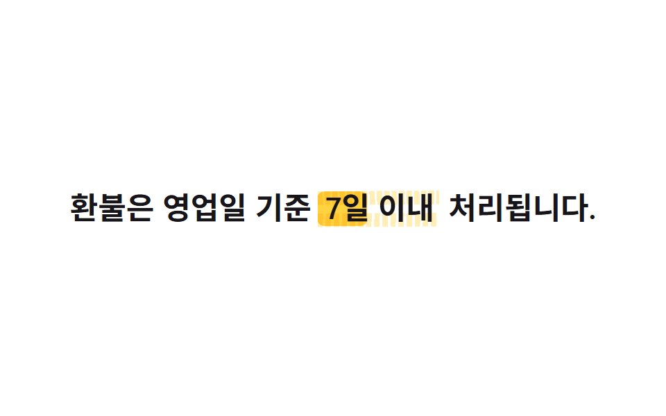 9 CSS Text Highlight Animations, Copy-PasteA css text highlight animation calls attention to one word or line with a highlighter stroke, an underline, or a striket See all demos in this post