08Color sweep
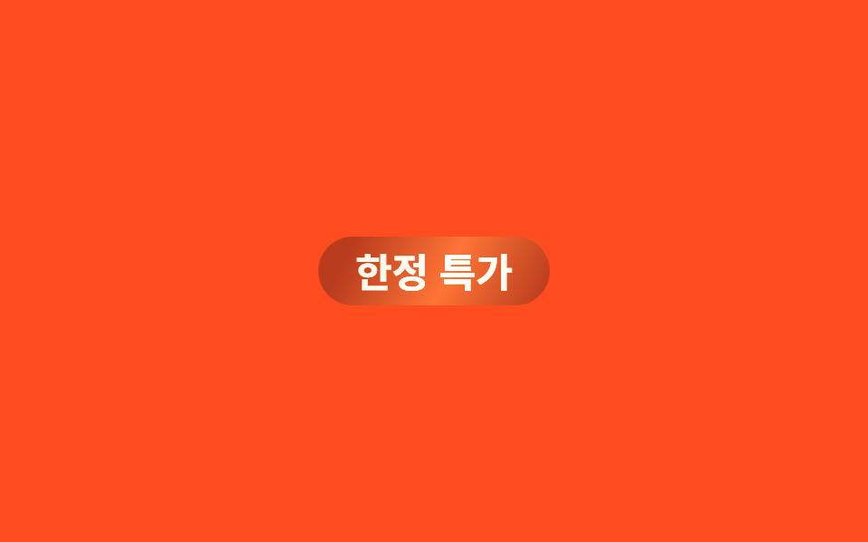
A badge behind the keyword carries a 250%-wide diagonal gradient, and background-position slides linearly and endlessly from -150% to 150% so a strip of light keeps sweeping across with no seam.
Best forPromo badges, new-or-limited labels
대각선 그러데이션background-position2s·linear
<main class="stage">
  <span class="badge">Limited-time deal</span>
</main>
@use "../../../../site/static/demo-tokens" as *;
// ── 변수 3개 ─────────────────────────────
$duration: $dur-loop;
$easing: linear; // 이음새 없이 계속 도는 스윕이라 등속이 맞다
$color: $subject-cream; // 빛 줄기 색
// ── 데모 무대 ───────────────────────────────
@include stage($stage-orange);
.badge {
position: relative;
overflow: hidden;
display: inline-block;
padding: $sp-2 $sp-5;
border-radius: $r-pill;
background: color-mix(in srgb, $stage-ink 30%, $stage-orange);
color: $subject-cream;
font-weight: 700;
font-size: clamp(16px, 4.6vw, 22px);
line-height: 1;
font-family: inherit;
// 대각선 그러데이션을 폭 250% 로 깔고 background-position 을 끝없이 옮긴다 (linear·infinite → 이음새 없음)
&::after {
content: "";
position: absolute;
inset: 0;
background: linear-gradient(115deg, transparent 30%, $color 48%, transparent 66%);
background-size: 250% 100%;
mix-blend-mode: overlay;
animation: sweep $duration $easing infinite, sweep-thick $duration $easing infinite;
}
}
@keyframes sweep {
0% { background-position: 150% 0; }
100% { background-position: -150% 0; }
}
// 페인트 물성: 스윕 줄기의 수직 두께가 불규칙 요동 — inset 진동 (transform 아님, 병렬 안전)
@keyframes sweep-thick {
0% { inset: 0 -1px; }
14% { inset: 1px 0; }
28% { inset: -1px 1px; }
42% { inset: 0.5px -0.5px; }
57% { inset: -0.5px 1px; }
71% { inset: 1px 0.5px; }
85% { inset: -1px -0.5px; }
100% { inset: 0 -1px; }
}
@media (prefers-reduced-motion: reduce) {
.badge::after { animation: none; opacity: 0; }
}html, body {
margin: 0;
overflow: hidden;
}
.stage {
box-sizing: border-box;
min-height: 100vh;
display: grid;
place-items: center;
margin: 0;
background: #ff4d1f;
font-family: -apple-system, "Segoe UI", "Noto Sans KR", sans-serif;
padding: clamp(8px, 4vw, 24px);
}
.badge {
position: relative;
overflow: hidden;
display: inline-block;
padding: 8px 20px;
border-radius: 999px;
background: color-mix(in srgb, #17141a 30%, #ff4d1f);
color: #fff7e6;
font-weight: 700;
font-size: clamp(16px, 4.6vw, 22px);
line-height: 1;
font-family: inherit;
}
.badge::after {
content: "";
position: absolute;
inset: 0;
background: linear-gradient(115deg, transparent 30%, #fff7e6 48%, transparent 66%);
background-size: 250% 100%;
mix-blend-mode: overlay;
animation: sweep 2s linear infinite, sweep-thick 2s linear infinite;
}
@keyframes sweep {
0% {
background-position: 150% 0;
}
100% {
background-position: -150% 0;
}
}
@keyframes sweep-thick {
0% {
inset: 0 -1px;
}
14% {
inset: 1px 0;
}
28% {
inset: -1px 1px;
}
42% {
inset: 0.5px -0.5px;
}
57% {
inset: -0.5px 1px;
}
71% {
inset: 1px 0.5px;
}
85% {
inset: -1px -0.5px;
}
100% {
inset: 0 -1px;
}
}
@media (prefers-reduced-motion: reduce) {
.badge::after {
animation: none;
opacity: 0;
}
}import type { CSSProperties, ReactNode } from "react";
import styles from "./ColorSweepBadge.module.scss";
export type ColorSweepBadgeProps = {
children: ReactNode;
/** 빛 한 줄이 한 바퀴 도는 시간 (기본 2000ms) */
duration?: number;
/** 배지 바탕색 */
bg?: string;
/** 빛 줄기 색 */
color?: string;
};
type Vars = CSSProperties & {
"--duration"?: string;
"--bg"?: string;
"--color"?: string;
};
export default function ColorSweepBadge({
children,
duration = 2000,
bg = "#ff4d1f",
color = "#fff7e6",
}: ColorSweepBadgeProps) {
const vars: Vars = {
"--duration": `${duration}ms`,
"--bg": bg,
"--color": color,
};
return (
<span className={styles.badge} style={vars}>
{children}
</span>
);
}08 Color sweep — Measured area 3.189% · moving frames 18/23Original by GODRICH · SCSS and React ship in the zip · 9 CSS Text Highlight Animations, Copy-Paste
The post this demo lives in
 9 CSS Text Highlight Animations, Copy-PasteA css text highlight animation calls attention to one word or line with a highlighter stroke, an underline, or a striket See all demos in this post