02Binary bit swap
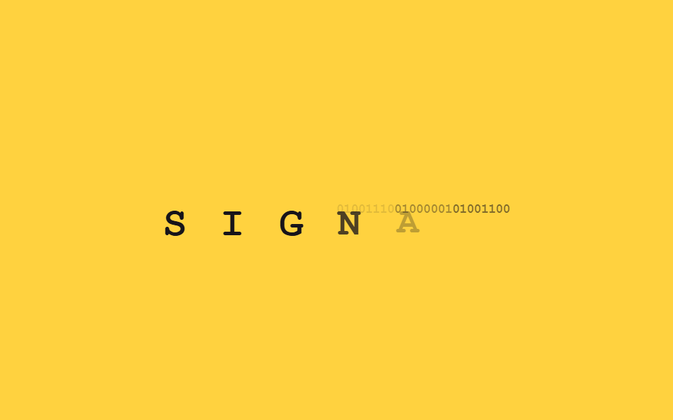
Each letter first appears as an 8-digit binary code like 01001000, then briefly cross-fades into the real character — happening left to right across the word.
Best forTech blog intros, developer conference banners
opacity crossfadeJS 9줄animation-delay stagger
<main class="stage">
  <p class="bn-word is-demo" aria-label="SIGNAL">
    <span class="bn-c" style="animation-delay:0ms"><span class="bn-bin">01010011</span><span class="bn-ch">S</span></span><span class="bn-c" style="animation-delay:120ms"><span class="bn-bin">01001001</span><span class="bn-ch">I</span></span><span class="bn-c" style="animation-delay:240ms"><span class="bn-bin">01000111</span><span class="bn-ch">G</span></span><span class="bn-c" style="animation-delay:360ms"><span class="bn-bin">01001110</span><span class="bn-ch">N</span></span><span class="bn-c" style="animation-delay:480ms"><span class="bn-bin">01000001</span><span class="bn-ch">A</span></span><span class="bn-c" style="animation-delay:600ms"><span class="bn-bin">01001100</span><span class="bn-ch">L</span></span>
  </p>
</main>
@use "../../../../site/static/demo-tokens" as *;
// ── 변수 3개 ──────────────────────────────────────────
$duration: $dur-loop;
$easing: $ease-out;
$color: $subject-ink;
@include stage($stage-yellow);
.bn-word {
margin: 0;
display: flex;
gap: 0;
font: 800 clamp(20px, 6vw, 30px)/1.2 "Space Mono", "Courier New", monospace;
}
.bn-c {
position: relative;
display: inline-block;
min-width: 1.1ch;
}
.bn-bin,
.bn-ch {
display: block;
}
.bn-bin {
font-size: .32em;
letter-spacing: -0.04em;
color: $color;
opacity: .55;
}
.bn-ch {
position: absolute;
inset: 0;
color: $color;
opacity: 0;
transform: scale(.85);
}
// 데모 루프: 이진수 여덟 자리가 잠깐 보이다가 크로스페이드로 실제 글자가 겹쳐 떠오른다
@keyframes bn-bin-out {
0%, 40% { opacity: .55; }
55%, 100% { opacity: 0; }
}
@keyframes bn-ch-in {
0%, 40% { opacity: 0; transform: scale(.85); }
55%, 90% { opacity: 1; transform: scale(1); }
100% { opacity: 0; transform: scale(.85); }
}
.bn-word.is-demo .bn-bin { animation: bn-bin-out $duration $easing infinite; animation-delay: inherit; }
.bn-word.is-demo .bn-ch { animation: bn-ch-in $duration $easing infinite; animation-delay: inherit; }
@media (prefers-reduced-motion: reduce) {
.bn-bin, .bn-word.is-demo .bn-bin { animation: none !important; opacity: 0 !important; }
.bn-ch, .bn-word.is-demo .bn-ch { animation: none !important; opacity: 1 !important; transform: none !important; }
}html, body {
margin: 0;
overflow: hidden;
}
.stage {
box-sizing: border-box;
min-height: 100vh;
display: grid;
place-items: center;
margin: 0;
background: #ffd23f;
font-family: -apple-system, "Segoe UI", "Noto Sans KR", sans-serif;
padding: clamp(8px, 4vw, 24px);
}
.bn-word {
margin: 0;
display: flex;
gap: 0;
font: 800 clamp(20px, 6vw, 30px)/1.2 "Space Mono", "Courier New", monospace;
}
.bn-c {
position: relative;
display: inline-block;
min-width: 1.1ch;
}
.bn-bin,
.bn-ch {
display: block;
}
.bn-bin {
font-size: 0.32em;
letter-spacing: -0.04em;
color: #17141a;
opacity: 0.55;
}
.bn-ch {
position: absolute;
inset: 0;
color: #17141a;
opacity: 0;
transform: scale(0.85);
}
@keyframes bn-bin-out {
0%, 40% {
opacity: 0.55;
}
55%, 100% {
opacity: 0;
}
}
@keyframes bn-ch-in {
0%, 40% {
opacity: 0;
transform: scale(0.85);
}
55%, 90% {
opacity: 1;
transform: scale(1);
}
100% {
opacity: 0;
transform: scale(0.85);
}
}
.bn-word.is-demo .bn-bin {
animation: bn-bin-out 2s ease-out infinite;
animation-delay: inherit;
}
.bn-word.is-demo .bn-ch {
animation: bn-ch-in 2s ease-out infinite;
animation-delay: inherit;
}
@media (prefers-reduced-motion: reduce) {
.bn-bin, .bn-word.is-demo .bn-bin {
animation: none !important;
opacity: 0 !important;
}
.bn-ch, .bn-word.is-demo .bn-ch {
animation: none !important;
opacity: 1 !important;
transform: none !important;
}
}import { CSSProperties, useEffect, useRef, useState } from "react";
import styles from "./BinaryBitSwap.module.scss";
export interface BinaryBitSwapProps {
text?: string;
duration?: string;
easing?: string;
}
function toBinary(ch: string) {
return ch.charCodeAt(0).toString(2).padStart(8, "0");
}
// 실사용: 뷰포트에 들어오면 이진수 여덟 자리가 잠깐 보이다가 크로스페이드로 실제 글자가 겹쳐 떠오른다.
export default function BinaryBitSwap({
text = "SIGNAL",
duration = "480ms",
easing = "ease-out",
}: BinaryBitSwapProps) {
const ref = useRef<HTMLParagraphElement>(null);
const [revealed, setRevealed] = useState(false);
useEffect(() => {
const el = ref.current;
if (!el) return;
const io = new IntersectionObserver((entries) => {
entries.forEach((e) => { if (e.isIntersecting) { setRevealed(true); io.unobserve(e.target); } });
}, { threshold: 0.3 });
io.observe(el);
return () => io.disconnect();
}, []);
const style = { "--duration": duration, "--easing": easing } as CSSProperties;
return (
<p className={styles.word} style={style} ref={ref}>
{text.split("").map((ch, i) => (
<span key={i} className={styles.c} style={{ transitionDelay: `${i * 90}ms` }}>
<span className={`${styles.bin} ${revealed ? styles.hide : ""}`}>{toBinary(ch)}</span>
<span className={`${styles.ch} ${revealed ? styles.show : ""}`}>{ch}</span>
</span>
))}
</p>
);
}02 Binary bit swap — Measured area 1.574% · moving frames 13/23Original by GODRICH · SCSS and React ship in the zip · 9 CSS Text Reveal Effects — Hex, Cipher, Radar
The post this demo lives in
 9 CSS Text Reveal Effects — Hex, Cipher, RadarA css text reveal effect is a short animation for text appearing on screen, ready to paste in with no coding needed. All See all demos in this post