02steps() typewriter
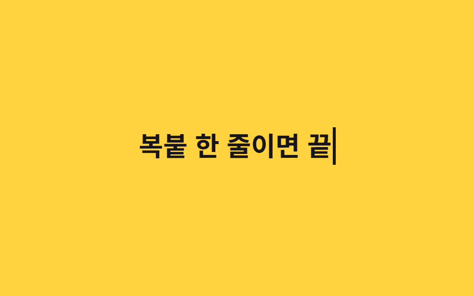
Width transitions from 0 to the text length in ch using steps(), advancing one character at a time like a real typewriter.
Best forHero headlines, landing page taglines
steps(n)ch 단위white-space: nowrap
<main class="stage">
  <p class="type"><span class="type__text">One line, copy-paste done</span></p>
</main>
@use "../../../../site/static/demo-tokens" as *;
$duration: $dur-loop; // 한 루프 전체 길이
$easing: steps(10, end); // 글자 수만큼 뚝뚝 끊어 늘어나는 곡선
$color: $subject-ink; // 글자·커서 색
@include stage($stage-yellow);
.type {
margin: 0;
&__text {
display: inline-block;
overflow: hidden;
white-space: nowrap;
width: 0;
border-right: .12em solid $color;
font-weight: 700; font-size: clamp(20px, 5.6vw, 34px); line-height: 1.4; font-family: inherit;
color: $color;
animation: type-loop $duration linear infinite;
}
}
@keyframes type-loop {
0%, 6% { width: 0; animation-timing-function: $easing; }
58% { width: var(--full, 10ch); }
88% { width: var(--full, 10ch); }
94%, 100% { width: 0; }
}
@media (prefers-reduced-motion: reduce) {
.type__text { animation: none; width: var(--full, 10ch); border-right-color: transparent; }
}html, body {
margin: 0;
overflow: hidden;
}
.stage {
box-sizing: border-box;
min-height: 100vh;
display: grid;
place-items: center;
margin: 0;
background: #ffd23f;
font-family: -apple-system, "Segoe UI", "Noto Sans KR", sans-serif;
padding: clamp(8px, 4vw, 24px);
}
.type {
margin: 0;
}
.type__text {
display: inline-block;
overflow: hidden;
white-space: nowrap;
width: 0;
border-right: 0.12em solid #17141a;
font-weight: 700;
font-size: clamp(20px, 5.6vw, 34px);
line-height: 1.4;
font-family: inherit;
color: #17141a;
animation: type-loop 2s linear infinite;
}
@keyframes type-loop {
0%, 6% {
width: 0;
animation-timing-function: steps(10, end);
}
58% {
width: var(--full, 10ch);
}
88% {
width: var(--full, 10ch);
}
94%, 100% {
width: 0;
}
}
@media (prefers-reduced-motion: reduce) {
.type__text {
animation: none;
width: var(--full, 10ch);
border-right-color: transparent;
}
}(function () {
var el = document.querySelector('.type__text'), cv = document.createElement('canvas').getContext('2d');
cv.font = getComputedStyle(el).font;
el.style.setProperty('--full', Math.ceil(cv.measureText(el.textContent).width) + 'px');
})();import { useEffect, useRef } from "react";
import type { CSSProperties } from "react";
import styles from "./StepsTypewriter.module.scss";
export type StepsTypewriterProps = {
text: string;
/** 한 루프 전체 길이 (기본 2000ms) */
duration?: number;
color?: string;
};
export default function StepsTypewriter({ text, duration = 2000, color = "#17141a" }: StepsTypewriterProps) {
const ref = useRef<HTMLSpanElement | null>(null);
useEffect(() => {
const el = ref.current;
const cv = el && document.createElement("canvas").getContext("2d");
if (!el || !cv) return;
cv.font = getComputedStyle(el).font;
el.style.setProperty("--full", Math.ceil(cv.measureText(text).width) + "px");
}, [text]);
const vars = { "--duration": `${duration}ms`, "--color": color, "--easing": `steps(${text.length}, end)` } as CSSProperties;
return (
<p className={styles.type} style={vars}>
<span ref={ref} className={styles.text}>{text}</span>
</p>
);
}02 steps() typewriter — Measured area 3.509% · moving frames 12/23Original by GODRICH · SCSS and React ship in the zip · 9 CSS Typing Animation, One Line, Copy-Paste
The post this demo lives in
 9 CSS Typing Animation, One Line, Copy-PasteA css typing animation is a text effect that types itself onto the screen letter by letter, built from a width transitio See all demos in this post