03Belly-laugh bean
A bean buddy folds its eyes into crescents, tipping side to side while its belly wobbles with the laugh. Each press pushes the laugh up three steps until the whole body folds over.
Best forComment-posted success badge
rotatescaleXanimation-duration
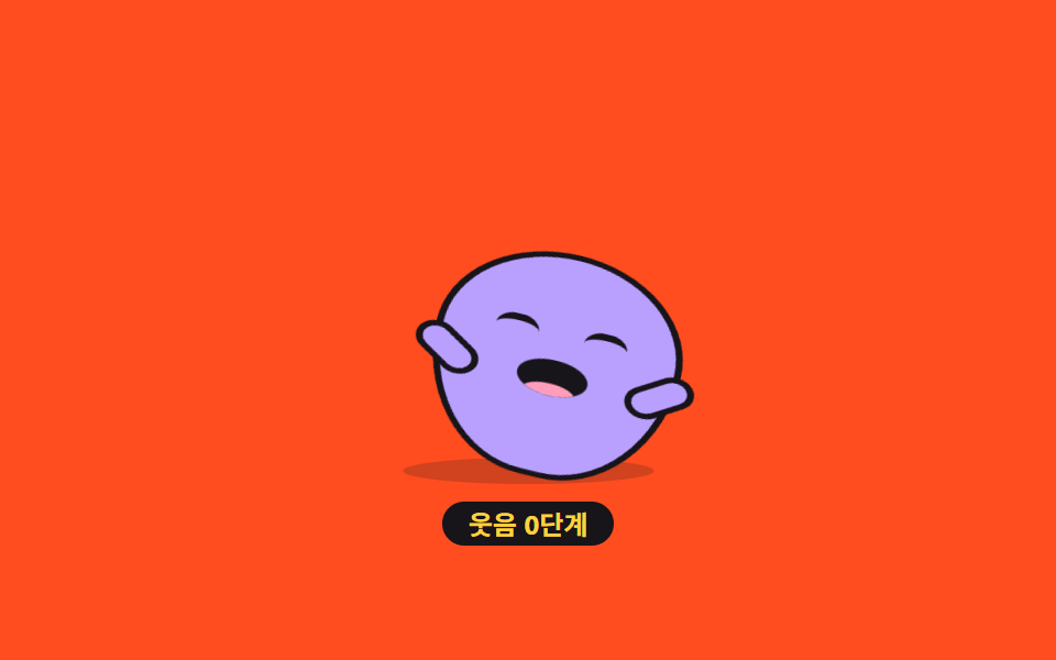
<main class="stage">
<div class="bn is-demo" id="bn" data-level="0">
  <button class="bn__hit" type="button" aria-label="Make the bean friend laugh">
    <span class="bn__scene" aria-hidden="true">
      <span class="bn__shadow"></span>
      <span class="bn__bean" id="bnBean">
        <span class="bn__eye bn__eye--l"></span>
        <span class="bn__eye bn__eye--r"></span>
        <span class="bn__mouth"><span class="bn__tongue"></span></span>
        <span class="bn__arm bn__arm--l"></span>
        <span class="bn__arm bn__arm--r"></span>
      </span>
    </span>
  </button>
  <p class="bn__level" id="bnLevel" aria-hidden="true">Laugh level 0</p>
</div>
</main>
@use "../../../../site/static/demo-tokens" as *;
// 배 흔들기 웃음 — 눈을 반달로 접고 웃느라 몸이 기울고 배가 출렁이는 콩알 친구.
// 기울기의 원점은 발바닥(땅에 닿은 붙는 지점)이다 — 중심에 두면 발이 미끄러져 떠 보인다.
// 웃음 단계(data-level)는 기울기 진폭 --tilt 로만 커진다. 3단계에서는 몸이 앞으로 폭 접힌다.
// 정적 경로(미리보기 아님)에서도 기본 웃음 루프는 항상 돈다 — 누르면 진폭이 커질 뿐이다.
$duration: $dur-loop;
$easing: $ease-pop;
$color: $subject-lilac;
@include stage($stage-orange);
.bn { display: grid; justify-items: center; gap: $sp-2; }
.bn__hit { border: 0; padding: 0; background: none; cursor: pointer; -webkit-tap-highlight-color: transparent; }
.bn__hit:focus-visible { outline: 2px solid $subject-ink; outline-offset: 4px; border-radius: $r-card; }
.bn__scene {
position: relative; display: block; box-sizing: border-box;
width: clamp(140px, 44vw, 196px); height: clamp(120px, 38vw, 168px);
}
.bn__shadow {
position: absolute; bottom: 0; left: 50%; width: 58%; height: 12px;
background: rgba(23, 20, 26, .2); border-radius: 50%;
transform: translateX(-50%);
}
// 콩알 몸 — 세로로 길쭉한 알갱이. 기울기 진폭은 --tilt 변수 하나
.bn__bean {
--tilt: 4deg;
position: absolute; bottom: 4px; left: 50%; width: 52%; aspect-ratio: 1 / 1.18;
background: $color; border: 3px solid $subject-ink;
border-radius: 50% 50% 46% 46% / 42% 42% 58% 58%;
transform: translateX(-50%);
transform-origin: 50% 100%; // 붙는 지점: 발바닥 — 몸이 기울어도 발은 제자리
}
// 팔 — 웃으며 몸을 감싼다
.bn__arm {
position: absolute; top: 46%; width: 26%; height: 10%;
background: $color; border: 3px solid $subject-ink; border-radius: $r-pill;
}
.bn__arm--l { left: -12%; transform: rotate(38deg); }
.bn__arm--r { right: -12%; transform: rotate(-38deg); }
// 반달 눈 — 웃어서 감긴 호. border-top 만 있는 원호다
.bn__eye {
position: absolute; top: 30%; width: 18%; height: 10%;
border-top: 4px solid $subject-ink; border-radius: 50%;
}
.bn__eye--l { left: 22%; }
.bn__eye--r { right: 22%; }
// 벌린 입 — 안쪽 혀까지. 웃음에 맞춰 세로로 벌어졌다 닫힌다
.bn__mouth {
position: absolute; top: 46%; left: 50%; width: 30%; aspect-ratio: 1 / .8;
background: $subject-ink; border-radius: 50%;
transform: translateX(-50%); overflow: hidden;
}
.bn__tongue {
position: absolute; bottom: -22%; left: 50%; width: 74%; aspect-ratio: 1 / .6;
background: $subject-pink; border-radius: 50%;
transform: translateX(-50%);
}
// 단계 표시 — 주황 무대 위 잉크 알약
.bn__level {
margin: 0; padding: 0 $sp-3; background: $subject-ink; color: $stage-yellow;
border-radius: $r-pill; font-weight: 700; font-size: 12px; line-height: 20px;
}
// ── 기본 웃음 루프(정적 경로에서도 항상 돈다). 진폭은 --tilt 하나뿐이라 단계가 곧 진폭
.bn__bean {
animation-name: bnTilt;
animation-duration: $duration;
animation-timing-function: ease-in-out;
animation-iteration-count: infinite;
}
.bn__mouth {
animation-name: bnMouth;
animation-duration: $duration;
animation-timing-function: $easing;
animation-iteration-count: infinite;
}
@keyframes bnTilt {
0%, 100% { transform: translateX(-50%) rotate(calc(var(--tilt) * -1)); }
50% { transform: translateX(-50%) rotate(var(--tilt)); }
}
@keyframes bnMouth {
0%, 100% { transform: translateX(-50%) scale(1, .8); }
50% { transform: translateX(-50%) scale(1, 1.2); }
}
// ── 단계: 진폭이 커지다가 3단계에서 몸이 앞으로 폭 접힌다(일회성)
.bn[data-level="1"] .bn__bean { --tilt: 8deg; }
.bn[data-level="2"] .bn__bean { --tilt: 13deg; }
.bn[data-level="3"] .bn__bean {
--tilt: 4deg;
animation: bnFold 700ms cubic-bezier(.2, 1.4, .4, 1) 1 forwards;
}
@keyframes bnFold {
0% { transform: translateX(-50%) rotate(0deg) scale(1, 1); }
40% { transform: translateX(-50%) rotate(16deg) scale(1.06, .82); }
70% { transform: translateX(-50%) rotate(20deg) scale(1.1, .68); }
100% { transform: translateX(-50%) rotate(19deg) scale(1.08, .7); }
}
// ── 격자 미리보기 루프(2초): 같은 루프 안에서 단계가 커지다 접히고 돌아온다(90% 안에 복귀)
.bn.is-demo .bn__bean {
animation-name: bnLaughShow;
animation-duration: $duration;
animation-timing-function: ease-in-out;
animation-iteration-count: infinite;
}
@keyframes bnLaughShow {
0%, 8% { transform: translateX(-50%) rotate(-3deg) scaleX(1); }
16% { transform: translateX(-50%) rotate(3deg) scaleX(1.04); }
24% { transform: translateX(-50%) rotate(-3deg) scaleX(1); }
32% { transform: translateX(-50%) rotate(5deg) scaleX(1.06); }
40% { transform: translateX(-50%) rotate(-5deg) scaleX(1); }
48% { transform: translateX(-50%) rotate(5deg) scaleX(1.06); }
56% { transform: translateX(-50%) rotate(-5deg) scaleX(1); }
64% { transform: translateX(-50%) rotate(15deg) scale(1.06, .8); }
72%, 84% { transform: translateX(-50%) rotate(19deg) scale(1.08, .7); }
90%, 100% { transform: translateX(-50%) rotate(0deg) scale(1, 1); }
}
// ── 좁은 화면
@media (max-width: 340px) {
.bn { gap: $sp-1; }
.bn__level { font-size: 11px; line-height: 16px; }
.bn__bean { border-width: 2px; }
}
@media (prefers-reduced-motion: reduce) {
// 웃임 루프를 끊면 눈을 반달로 접고 선 채 웃고 있는 모습이 남는다
.bn__bean,
.bn__mouth,
.bn.is-demo .bn__bean {
animation: none !important;
}
}html, body {
margin: 0;
overflow: hidden;
}
.stage {
box-sizing: border-box;
min-height: 100vh;
display: grid;
place-items: center;
margin: 0;
background: #ff4d1f;
font-family: -apple-system, "Segoe UI", "Noto Sans KR", sans-serif;
padding: clamp(8px, 4vw, 24px);
}
.bn {
display: grid;
justify-items: center;
gap: 8px;
}
.bn__hit {
border: 0;
padding: 0;
background: none;
cursor: pointer;
-webkit-tap-highlight-color: transparent;
}
.bn__hit:focus-visible {
outline: 2px solid #17141a;
outline-offset: 4px;
border-radius: 16px;
}
.bn__scene {
position: relative;
display: block;
box-sizing: border-box;
width: clamp(140px, 44vw, 196px);
height: clamp(120px, 38vw, 168px);
}
.bn__shadow {
position: absolute;
bottom: 0;
left: 50%;
width: 58%;
height: 12px;
background: rgba(23, 20, 26, 0.2);
border-radius: 50%;
transform: translateX(-50%);
}
.bn__bean {
--tilt: 4deg;
position: absolute;
bottom: 4px;
left: 50%;
width: 52%;
aspect-ratio: 1/1.18;
background: #b9a0ff;
border: 3px solid #17141a;
border-radius: 50% 50% 46% 46%/42% 42% 58% 58%;
transform: translateX(-50%);
transform-origin: 50% 100%;
}
.bn__arm {
position: absolute;
top: 46%;
width: 26%;
height: 10%;
background: #b9a0ff;
border: 3px solid #17141a;
border-radius: 999px;
}
.bn__arm--l {
left: -12%;
transform: rotate(38deg);
}
.bn__arm--r {
right: -12%;
transform: rotate(-38deg);
}
.bn__eye {
position: absolute;
top: 30%;
width: 18%;
height: 10%;
border-top: 4px solid #17141a;
border-radius: 50%;
}
.bn__eye--l {
left: 22%;
}
.bn__eye--r {
right: 22%;
}
.bn__mouth {
position: absolute;
top: 46%;
left: 50%;
width: 30%;
aspect-ratio: 1/0.8;
background: #17141a;
border-radius: 50%;
transform: translateX(-50%);
overflow: hidden;
}
.bn__tongue {
position: absolute;
bottom: -22%;
left: 50%;
width: 74%;
aspect-ratio: 1/0.6;
background: #ff9ebb;
border-radius: 50%;
transform: translateX(-50%);
}
.bn__level {
margin: 0;
padding: 0 12px;
background: #17141a;
color: #ffd23f;
border-radius: 999px;
font-weight: 700;
font-size: 12px;
line-height: 20px;
}
.bn__bean {
animation-name: bnTilt;
animation-duration: 2s;
animation-timing-function: ease-in-out;
animation-iteration-count: infinite;
}
.bn__mouth {
animation-name: bnMouth;
animation-duration: 2s;
animation-timing-function: cubic-bezier(0.2, 1.4, 0.4, 1);
animation-iteration-count: infinite;
}
@keyframes bnTilt {
0%, 100% {
transform: translateX(-50%) rotate(calc(var(--tilt) * -1));
}
50% {
transform: translateX(-50%) rotate(var(--tilt));
}
}
@keyframes bnMouth {
0%, 100% {
transform: translateX(-50%) scale(1, 0.8);
}
50% {
transform: translateX(-50%) scale(1, 1.2);
}
}
.bn[data-level="1"] .bn__bean {
--tilt: 8deg;
}
.bn[data-level="2"] .bn__bean {
--tilt: 13deg;
}
.bn[data-level="3"] .bn__bean {
--tilt: 4deg;
animation: bnFold 700ms cubic-bezier(0.2, 1.4, 0.4, 1) 1 forwards;
}
@keyframes bnFold {
0% {
transform: translateX(-50%) rotate(0deg) scale(1, 1);
}
40% {
transform: translateX(-50%) rotate(16deg) scale(1.06, 0.82);
}
70% {
transform: translateX(-50%) rotate(20deg) scale(1.1, 0.68);
}
100% {
transform: translateX(-50%) rotate(19deg) scale(1.08, 0.7);
}
}
.bn.is-demo .bn__bean {
animation-name: bnLaughShow;
animation-duration: 2s;
animation-timing-function: ease-in-out;
animation-iteration-count: infinite;
}
@keyframes bnLaughShow {
0%, 8% {
transform: translateX(-50%) rotate(-3deg) scaleX(1);
}
16% {
transform: translateX(-50%) rotate(3deg) scaleX(1.04);
}
24% {
transform: translateX(-50%) rotate(-3deg) scaleX(1);
}
32% {
transform: translateX(-50%) rotate(5deg) scaleX(1.06);
}
40% {
transform: translateX(-50%) rotate(-5deg) scaleX(1);
}
48% {
transform: translateX(-50%) rotate(5deg) scaleX(1.06);
}
56% {
transform: translateX(-50%) rotate(-5deg) scaleX(1);
}
64% {
transform: translateX(-50%) rotate(15deg) scale(1.06, 0.8);
}
72%, 84% {
transform: translateX(-50%) rotate(19deg) scale(1.08, 0.7);
}
90%, 100% {
transform: translateX(-50%) rotate(0deg) scale(1, 1);
}
}
@media (max-width: 340px) {
.bn {
gap: 4px;
}
.bn__level {
font-size: 11px;
line-height: 16px;
}
.bn__bean {
border-width: 2px;
}
}
@media (prefers-reduced-motion: reduce) {
.bn__bean,
.bn__mouth,
.bn.is-demo .bn__bean {
animation: none !important;
}
}var bn = document.getElementById('bn');
var level = 0;
var labels = ['Laugh level 0', 'Laugh level 1', 'Laugh level 2', 'Laugh level 3 — doubled up'];
// 누를 때마다 웃음 단계가 0→1→2→3 까지 커지고, Again 누르면 처음으로 돌아간다
document.querySelector('.bn__hit').addEventListener('click', function () {
bn.classList.remove('is-demo');
level = (level + 1) % 4;
bn.dataset.level = String(level);
document.getElementById('bnLevel').textContent = labels[level];
});
bn.addEventListener('pointerdown', function () { bn.classList.remove('is-demo'); });// CuteBellyLaughBean — vanilla 판(run/075/demo/03-cute-belly-laugh-bean) 의 React 포트.
// 누를 때마다 웃음 단계가 0→1→2→3 까지 커지고 다시 누르면 처음으로 돌아간다(data-level).
import { useState } from "react";
import type { CSSProperties } from "react";
import styles from "./CuteBellyLaughBean.module.scss";
export type CuteBellyLaughBeanProps = {
duration?: number;
easing?: string;
color?: string;
};
type Vars = CSSProperties & { "--duration"?: string; "--easing"?: string; "--color"?: string };
const LABELS = ["웃음 0단계", "웃음 1단계", "웃음 2단계", "웃음 3단계 — 폭 접힘"];
export default function CuteBellyLaughBean(props: CuteBellyLaughBeanProps) {
const duration = props.duration ?? 2000;
const easing = props.easing ?? "cubic-bezier(.2, 1.4, .4, 1)";
const color = props.color ?? "#b9a0ff";
const [level, setLevel] = useState<number>(0);
const [preview, setPreview] = useState<boolean>(true);
const vars: Vars = { "--duration": duration + "ms", "--easing": easing, "--color": color };
return (
<main className={styles.stage}>
<div
className={styles.bn + (preview ? " " + styles.isDemo : "")}
style={vars}
data-level={level}
>
<button
className={styles.hit}
type="button"
aria-label="콩알 친구 웃기기"
onClick={() => setLevel((level + 1) % 4)}
onPointerDown={() => setPreview(false)}
>
<span className={styles.scene} aria-hidden="true">
<span className={styles.shadow}></span>
<span className={styles.bean} key={"fold" + level}>
<span className={styles.eye + " " + styles.eyeL}></span>
<span className={styles.eye + " " + styles.eyeR}></span>
<span className={styles.mouth}><span className={styles.tongue}></span></span>
<span className={styles.arm + " " + styles.armL}></span>
<span className={styles.arm + " " + styles.armR}></span>
</span>
</span>
</button>
<p className={styles.level} aria-hidden="true">{LABELS[level]}</p>
</div>
</main>
);
}03 Belly-laugh bean — Measured area 8.074% · moving frames 22/23Original by GODRICH · SCSS and React ship in the zip · Cute CSS Animations: 9 Kawaii Character Demos
The post this demo lives in
 Cute CSS Animations: 9 Kawaii Character DemosCute CSS animations are characters that blink, bounce, and blush from nothing but shapes and keyframes — no image files See all demos in this post