06Speech-bubble chatter
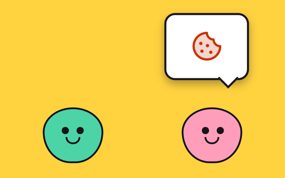
Two characters facing each other trade speech bubbles. A bubble pokes out its tail first, then stretches to full; the picture inside swaps in one cut. Press to pop your side's bubble right away.
Best forSupport-chat greeting pair
scaleYscaleanimation-delay
<main class="stage">
<div class="ch is-demo" id="ch">
  <button class="ch__hit" type="button" aria-pressed="false" aria-label="Pop your speech bubble">
    <span class="ch__scene" aria-hidden="true">
      <span class="ch__bubble ch__bubble--l"><span class="ch__tail"></span><span class="ch__icon ch__icon--heart"><svg xmlns="http://www.w3.org/2000/svg" width="1em" height="1em" viewBox="0 0 256 256"><g fill="currentColor"><path d="M232 102c0 66-104 122-104 122S24 168 24 102a54 54 0 0 1 54-54c22.59 0 41.94 12.31 50 32c8.06-19.69 27.41-32 50-32a54 54 0 0 1 54 54" opacity=".2"/><path d="M178 40c-20.65 0-38.73 8.88-50 23.89C116.73 48.88 98.65 40 78 40a62.07 62.07 0 0 0-62 62c0 70 103.79 126.66 108.21 129a8 8 0 0 0 7.58 0C136.21 228.66 240 172 240 102a62.07 62.07 0 0 0-62-62m-50 174.8c-18.26-10.64-96-59.11-96-112.8a46.06 46.06 0 0 1 46-46c19.45 0 35.78 10.36 42.6 27a8 8 0 0 0 14.8 0c6.82-16.67 23.15-27 42.6-27a46.06 46.06 0 0 1 46 46c0 53.61-77.76 102.15-96 112.8"/></g></svg></span></span>
      <span class="ch__bubble ch__bubble--r"><span class="ch__tail"></span><span class="ch__icon ch__icon--cookie"><svg xmlns="http://www.w3.org/2000/svg" width="1em" height="1em" viewBox="0 0 256 256"><g fill="currentColor"><path d="M224 128a96 96 0 1 1-96-96a48 48 0 0 0 48 48a48 48 0 0 0 48 48" opacity=".2"/><path d="M164.49 163.51a12 12 0 1 1-17 0a12 12 0 0 1 17 0m-81-8a12 12 0 1 0 17 0a12 12 0 0 0-16.98 0Zm9-39a12 12 0 1 0-17 0a12 12 0 0 0 17-.02Zm48-1a12 12 0 1 0 0 17a12 12 0 0 0 0-17M232 128A104 104 0 1 1 128 24a8 8 0 0 1 8 8a40 40 0 0 0 40 40a8 8 0 0 1 8 8a40 40 0 0 0 40 40a8 8 0 0 1 8 8m-16.31 7.39A56.13 56.13 0 0 1 168.5 87.5a56.13 56.13 0 0 1-47.89-47.19a88 88 0 1 0 95.08 95.08"/></g></svg></span></span>
      <span class="ch__char ch__char--l"><span class="ch__eye ch__eye--l1"></span><span class="ch__eye ch__eye--l2"></span><span class="ch__smile"></span></span>
      <span class="ch__char ch__char--r"><span class="ch__eye ch__eye--r1"></span><span class="ch__eye ch__eye--r2"></span><span class="ch__smile"></span></span>
    </span>
  </button>
</div>
</main>
@use "../../../../site/static/demo-tokens" as *;
// 말풍선 대화 번갈아 — 마주 본 두 캐릭터가 말풍선을 주고받는다.
// 말풍선 등장은 꼬리가 먼저 나왔다가(animation-delay 를 몸보다 60ms 이른 시각으로 잡아 꼬리 키프레임을 따로 돌린다)
// 몸이 펴지는 순서.
// 아이콘은 감정 그림 두 장(하트·쿠키) — 말풍선 안 글자를 로케일 밖으로 두면 번역이 필요 없다.
// 사라짐은 visibility 컷 — opacity 페이드는 두 말풍선이 반투명하게 겹쳐 poster 에 유령을 남긴다.
$duration: $dur-loop;
$easing: $ease-pop;
$color: $subject-mint;
@include stage($stage-yellow);
.ch { width: min(88vw, 400px); display: grid; place-items: center; }
// 뿌리가 vw 폭을 정하고 단추는 그 100% 를 쓴다 — 수축 폭 안에서 % 폭은 0 으로 접힌다
.ch__hit { display: block; width: 100%; border: 0; padding: 0; background: none; cursor: pointer; -webkit-tap-highlight-color: transparent; }
.ch__hit:focus-visible { outline: 2px solid $subject-ink; outline-offset: 4px; border-radius: $r-card; }
.ch__scene {
position: relative; display: block; box-sizing: border-box;
width: 100%; aspect-ratio: 16 / 10;
}
// 캐릭터 둘 — 서로를 향해 마주 본다(눈 위치가 안쪽으로 쏠림)
.ch__char {
position: absolute; bottom: 0; width: 24%; aspect-ratio: 1 / .92;
border: 3px solid $subject-ink; border-radius: 50% 50% 46% 46% / 44% 44% 56% 56%;
}
.ch__char--l { left: 8%; background: $color; }
.ch__char--r { right: 8%; background: $subject-pink; }
.ch__eye {
position: absolute; top: 34%; width: 12%; aspect-ratio: 1;
background: $subject-ink; border-radius: 50%;
}
.ch__eye--l1 { left: 30%; } .ch__eye--l2 { left: 56%; }
.ch__eye--r1 { right: 56%; } .ch__eye--r2 { right: 30%; }
.ch__smile {
position: absolute; top: 54%; left: 50%; width: 20%; height: 10%;
border: 3px solid $subject-ink; border-top: 0; border-radius: 0 0 $r-pill $r-pill;
transform: translateX(-50%);
}
// 말풍선 — 흰 바탕에 먹 테두리. 꼬리는 마름모(회전한 정사각형)로 접착
.ch__bubble {
position: absolute; top: 4%; width: 30%; aspect-ratio: 1 / .78;
display: grid; place-items: center;
background: $stage-paper; border: 3px solid $subject-ink; border-radius: $r-card;
box-shadow: $shadow-press;
transform: scale(0);
}
.ch__bubble--l { left: 6%; transform-origin: 20% 100%; } // 붙는 지점: 꼬리가 캐릭터에 닿는 아래왼쪽
.ch__bubble--r { right: 6%; transform-origin: 80% 100%; }
.ch__tail {
position: absolute; bottom: -12%; width: 16%; aspect-ratio: 1;
background: $stage-paper; border-right: 3px solid $subject-ink; border-bottom: 3px solid $subject-ink;
transform: rotate(45deg);
}
.ch__bubble--l .ch__tail { left: 14%; }
.ch__bubble--r .ch__tail { right: 14%; }
.ch__icon { width: 44%; aspect-ratio: 1; }
.ch__icon svg { display: block; width: 100%; height: 100%; }
.ch__icon--heart { color: $error; }
.ch__icon--cookie { color: $subject-orange-deep; }
// ── 격자 미리보기 루프(2초): 왼쪽 말풍선(0~44%) → 컷 → 오른쪽 말풍선(50~94%) → 컷
.ch.is-demo .ch__bubble--l { animation-name: chPopL; animation-duration: $duration; animation-timing-function: $easing; animation-iteration-count: infinite; }
.ch.is-demo .ch__bubble--r { animation-name: chPopR; animation-duration: $duration; animation-timing-function: $easing; animation-iteration-count: infinite; }
// 꼬리는 몸보다 60ms 먼저 나온다 — 음수 animation-delay 로 같은 루프를 살짝 앞당긴다
.ch.is-demo .ch__tail { animation-name: chTail; animation-duration: $duration; animation-delay: -60ms; animation-timing-function: $easing; animation-iteration-count: infinite; }
// 캐릭터 눈은 말하는 쪽으로 한 번씩 깜빡 — 등장 컷과 어긋나지 않게 같은 주기
.ch.is-demo .ch__eye { animation-name: chBlink; animation-duration: $duration; animation-timing-function: steps(1, end); animation-iteration-count: infinite; }
@keyframes chPopL {
0% { transform: scale(0); }
10% { transform: scale(1.08); }
16%, 44% { transform: scale(1); }
45%, 100% { transform: scale(0); }
}
@keyframes chPopR {
0%, 49% { transform: scale(0); }
50% { transform: scale(0); }
60% { transform: scale(1.08); }
66%, 94% { transform: scale(1); }
95%, 100% { transform: scale(0); }
}
@keyframes chBlink {
0%, 19% { transform: scaleY(1); }
20%, 24% { transform: scaleY(.1); }
25%, 69% { transform: scaleY(1); }
70%, 74% { transform: scaleY(.1); }
75%, 100% { transform: scaleY(1); }
}
// 꼬리 — 몸보다 한 발 먼저 살아나 scale(1) 을 유지하다 몸이 사라질 때 같이 접힌다
@keyframes chTail {
0% { transform: rotate(45deg) scale(0); }
4%, 44% { transform: rotate(45deg) scale(1); }
45%, 49% { transform: rotate(45deg) scale(0); }
50% { transform: rotate(45deg) scale(0); }
54%, 94% { transform: rotate(45deg) scale(1); }
95%, 100% { transform: rotate(45deg) scale(0); }
}
// ── 내 차례: 누르면 왼쪽(내 쪽) 말풍선이 떠 있는 채로 고정된다(정적 규칙)
.ch.mine .ch__bubble--l { animation: none; transform: scale(1); }
.ch.mine .ch__bubble--r { animation: none; transform: scale(0); }
// ── 좁은 화면: 장면은 16/10 고정비라 폭이 곧 높이다 — 무대 세로(320×200, 패딩 제외 174px) 안으로 폭을 줄인다
@media (max-width: 340px) {
.ch { width: min(84vw, 400px); } // 320px 기준 268.8 × 10/16 = 168px
.ch__char, .ch__bubble, .ch__smile { border-width: 2px; }
.ch__tail { border-width: 2px; }
}
@media (prefers-reduced-motion: reduce) {
// 번갈아 뜨기를 끊면 두 캐릭터가 말풍선 없이 마주 본 채 선다 — 누르면 내 말풍선이 뜬다
.ch.is-demo .ch__bubble--l,
.ch.is-demo .ch__bubble--r,
.ch.is-demo .ch__tail,
.ch.is-demo .ch__eye {
animation: none !important;
}
}html, body {
margin: 0;
overflow: hidden;
}
.stage {
box-sizing: border-box;
min-height: 100vh;
display: grid;
place-items: center;
margin: 0;
background: #ffd23f;
font-family: -apple-system, "Segoe UI", "Noto Sans KR", sans-serif;
padding: clamp(8px, 4vw, 24px);
}
.ch {
width: min(88vw, 400px);
display: grid;
place-items: center;
}
.ch__hit {
display: block;
width: 100%;
border: 0;
padding: 0;
background: none;
cursor: pointer;
-webkit-tap-highlight-color: transparent;
}
.ch__hit:focus-visible {
outline: 2px solid #17141a;
outline-offset: 4px;
border-radius: 16px;
}
.ch__scene {
position: relative;
display: block;
box-sizing: border-box;
width: 100%;
aspect-ratio: 16/10;
}
.ch__char {
position: absolute;
bottom: 0;
width: 24%;
aspect-ratio: 1/0.92;
border: 3px solid #17141a;
border-radius: 50% 50% 46% 46%/44% 44% 56% 56%;
}
.ch__char--l {
left: 8%;
background: #4cd4a6;
}
.ch__char--r {
right: 8%;
background: #ff9ebb;
}
.ch__eye {
position: absolute;
top: 34%;
width: 12%;
aspect-ratio: 1;
background: #17141a;
border-radius: 50%;
}
.ch__eye--l1 {
left: 30%;
}
.ch__eye--l2 {
left: 56%;
}
.ch__eye--r1 {
right: 56%;
}
.ch__eye--r2 {
right: 30%;
}
.ch__smile {
position: absolute;
top: 54%;
left: 50%;
width: 20%;
height: 10%;
border: 3px solid #17141a;
border-top: 0;
border-radius: 0 0 999px 999px;
transform: translateX(-50%);
}
.ch__bubble {
position: absolute;
top: 4%;
width: 30%;
aspect-ratio: 1/0.78;
display: grid;
place-items: center;
background: #ffffff;
border: 3px solid #17141a;
border-radius: 16px;
box-shadow: 0 6px 12px rgba(23, 20, 26, 0.32);
transform: scale(0);
}
.ch__bubble--l {
left: 6%;
transform-origin: 20% 100%;
}
.ch__bubble--r {
right: 6%;
transform-origin: 80% 100%;
}
.ch__tail {
position: absolute;
bottom: -12%;
width: 16%;
aspect-ratio: 1;
background: #ffffff;
border-right: 3px solid #17141a;
border-bottom: 3px solid #17141a;
transform: rotate(45deg);
}
.ch__bubble--l .ch__tail {
left: 14%;
}
.ch__bubble--r .ch__tail {
right: 14%;
}
.ch__icon {
width: 44%;
aspect-ratio: 1;
}
.ch__icon svg {
display: block;
width: 100%;
height: 100%;
}
.ch__icon--heart {
color: #c2361a;
}
.ch__icon--cookie {
color: #c93000;
}
.ch.is-demo .ch__bubble--l {
animation-name: chPopL;
animation-duration: 2s;
animation-timing-function: cubic-bezier(0.2, 1.4, 0.4, 1);
animation-iteration-count: infinite;
}
.ch.is-demo .ch__bubble--r {
animation-name: chPopR;
animation-duration: 2s;
animation-timing-function: cubic-bezier(0.2, 1.4, 0.4, 1);
animation-iteration-count: infinite;
}
.ch.is-demo .ch__tail {
animation-name: chTail;
animation-duration: 2s;
animation-delay: -60ms;
animation-timing-function: cubic-bezier(0.2, 1.4, 0.4, 1);
animation-iteration-count: infinite;
}
.ch.is-demo .ch__eye {
animation-name: chBlink;
animation-duration: 2s;
animation-timing-function: steps(1, end);
animation-iteration-count: infinite;
}
@keyframes chPopL {
0% {
transform: scale(0);
}
10% {
transform: scale(1.08);
}
16%, 44% {
transform: scale(1);
}
45%, 100% {
transform: scale(0);
}
}
@keyframes chPopR {
0%, 49% {
transform: scale(0);
}
50% {
transform: scale(0);
}
60% {
transform: scale(1.08);
}
66%, 94% {
transform: scale(1);
}
95%, 100% {
transform: scale(0);
}
}
@keyframes chBlink {
0%, 19% {
transform: scaleY(1);
}
20%, 24% {
transform: scaleY(0.1);
}
25%, 69% {
transform: scaleY(1);
}
70%, 74% {
transform: scaleY(0.1);
}
75%, 100% {
transform: scaleY(1);
}
}
@keyframes chTail {
0% {
transform: rotate(45deg) scale(0);
}
4%, 44% {
transform: rotate(45deg) scale(1);
}
45%, 49% {
transform: rotate(45deg) scale(0);
}
50% {
transform: rotate(45deg) scale(0);
}
54%, 94% {
transform: rotate(45deg) scale(1);
}
95%, 100% {
transform: rotate(45deg) scale(0);
}
}
.ch.mine .ch__bubble--l {
animation: none;
transform: scale(1);
}
.ch.mine .ch__bubble--r {
animation: none;
transform: scale(0);
}
@media (max-width: 340px) {
.ch {
width: min(84vw, 400px);
}
.ch__char, .ch__bubble, .ch__smile {
border-width: 2px;
}
.ch__tail {
border-width: 2px;
}
}
@media (prefers-reduced-motion: reduce) {
.ch.is-demo .ch__bubble--l,
.ch.is-demo .ch__bubble--r,
.ch.is-demo .ch__tail,
.ch.is-demo .ch__eye {
animation: none !important;
}
}var ch = document.getElementById('ch');
// 누르면 왼쪽(내 쪽) 말풍선이 즉시 뜬다 — 상태는 aria-pressed 한 곳, 보임은 CSS 가 고른다
document.querySelector('.ch__hit').addEventListener('click', function () {
ch.classList.remove('is-demo');
var on = ch.classList.toggle('mine');
this.setAttribute('aria-pressed', String(on));
});
ch.addEventListener('pointerdown', function () { ch.classList.remove('is-demo'); });// CuteSpeechBubbleChatter — vanilla 판(run/075/demo/06-cute-speech-bubble-chatter) 의 React 포트.
// 누르면 왼쪽(내 쪽) 말풍선이 즉시 뜬다 — 상태는 aria-pressed 한 곳, 보임은 CSS 가 고른다.
import { useState } from "react";
import type { CSSProperties } from "react";
import styles from "./CuteSpeechBubbleChatter.module.scss";
export type CuteSpeechBubbleChatterProps = {
duration?: number;
easing?: string;
color?: string;
};
type Vars = CSSProperties & { "--duration"?: string; "--easing"?: string; "--color"?: string };
const HEART_SVG = (
<svg xmlns="http://www.w3.org/2000/svg" width="1em" height="1em" viewBox="0 0 256 256"><g fill="currentColor"><path d="M232 102c0 66-104 122-104 122S24 168 24 102a54 54 0 0 1 54-54c22.59 0 41.94 12.31 50 32c8.06-19.69 27.41-32 50-32a54 54 0 0 1 54 54" opacity=".2"/><path d="M178 40c-20.65 0-38.73 8.88-50 23.89C116.73 48.88 98.65 40 78 40a62.07 62.07 0 0 0-62 62c0 70 103.79 126.66 108.21 129a8 8 0 0 0 7.58 0C136.21 228.66 240 172 240 102a62.07 62.07 0 0 0-62-62m-50 174.8c-18.26-10.64-96-59.11-96-112.8a46.06 46.06 0 0 1 46-46c19.45 0 35.78 10.36 42.6 27a8 8 0 0 0 14.8 0c6.82-16.67 23.15-27 42.6-27a46.06 46.06 0 0 1 46 46c0 53.61-77.76 102.15-96 112.8"/></g></svg>
);
const COOKIE_SVG = (
<svg xmlns="http://www.w3.org/2000/svg" width="1em" height="1em" viewBox="0 0 256 256"><g fill="currentColor"><path d="M224 128a96 96 0 1 1-96-96a48 48 0 0 0 48 48a48 48 0 0 0 48 48" opacity=".2"/><path d="M164.49 163.51a12 12 0 1 1-17 0a12 12 0 0 1 17 0m-81-8a12 12 0 1 0 17 0a12 12 0 0 0-16.98 0Zm9-39a12 12 0 1 0-17 0a12 12 0 0 0 17-.02Zm48-1a12 12 0 1 0 0 17a12 12 0 0 0 0-17M232 128A104 104 0 1 1 128 24a8 8 0 0 1 8 8a40 40 0 0 0 40 40a8 8 0 0 1 8 8a40 40 0 0 0 40 40a8 8 0 0 1 8 8m-16.31 7.39A56.13 56.13 0 0 1 168.5 87.5a56.13 56.13 0 0 1-47.89-47.19a88 88 0 1 0 95.08 95.08"/></g></svg>
);
export default function CuteSpeechBubbleChatter(props: CuteSpeechBubbleChatterProps) {
const duration = props.duration ?? 2000;
const easing = props.easing ?? "cubic-bezier(.2, 1.4, .4, 1)";
const color = props.color ?? "#4cd4a6";
const [mine, setMine] = useState<boolean>(false);
const [preview, setPreview] = useState<boolean>(true);
const vars: Vars = { "--duration": duration + "ms", "--easing": easing, "--color": color };
return (
<main className={styles.stage}>
<div
className={styles.ch + (preview ? " " + styles.isDemo : "") + (mine ? " " + styles.mine : "")}
style={vars}
>
<button
className={styles.hit}
type="button"
aria-pressed={mine}
aria-label="내 차례에 말풍선 띄우기"
onClick={() => setMine(!mine)}
onPointerDown={() => setPreview(false)}
>
<span className={styles.scene} aria-hidden="true">
<span className={styles.bubble + " " + styles.bubbleL}>
<span className={styles.tail}></span>
<span className={styles.icon + " " + styles.iconHeart}>{HEART_SVG}</span>
</span>
<span className={styles.bubble + " " + styles.bubbleR}>
<span className={styles.tail}></span>
<span className={styles.icon + " " + styles.iconCookie}>{COOKIE_SVG}</span>
</span>
<span className={styles.char + " " + styles.charL}>
<span className={styles.eye + " " + styles.eyeL1}></span>
<span className={styles.eye + " " + styles.eyeL2}></span>
<span className={styles.smile}></span>
</span>
<span className={styles.char + " " + styles.charR}>
<span className={styles.eye + " " + styles.eyeR1}></span>
<span className={styles.eye + " " + styles.eyeR2}></span>
<span className={styles.smile}></span>
</span>
</span>
</button>
</div>
</main>
);
}06 Speech-bubble chatter — Measured area 27.268% · moving frames 16/23Original by GODRICH · SCSS and React ship in the zip · Cute CSS Animations: 9 Kawaii Character Demos
The post this demo lives in
 Cute CSS Animations: 9 Kawaii Character DemosCute CSS animations are characters that blink, bounce, and blush from nothing but shapes and keyframes — no image files See all demos in this post