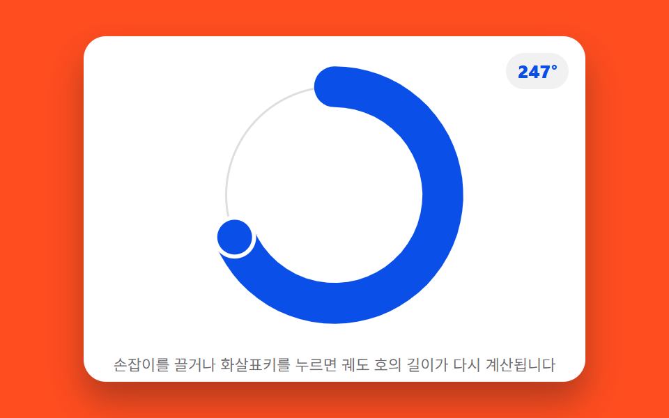
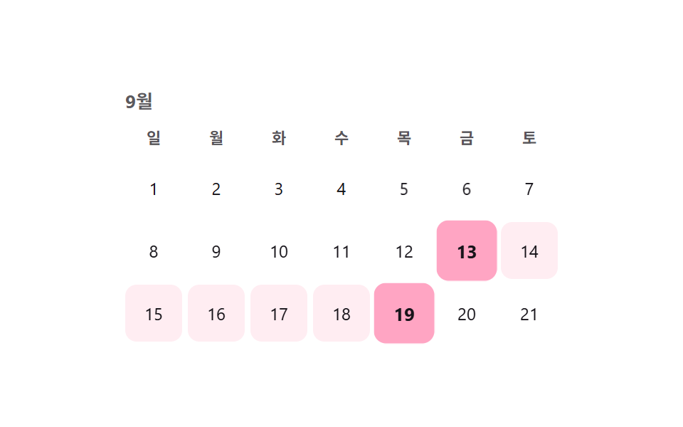
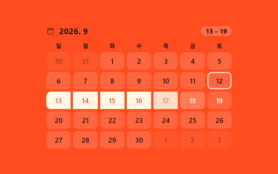
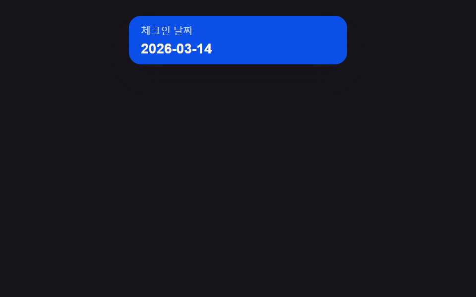
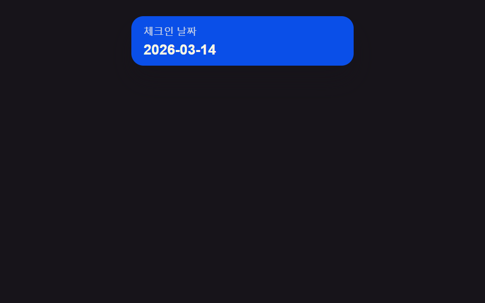
01Input-popover value toggle — when an input's focus value turns on, a calendar unfolds as a popover, and folds away when it turns off
As the focus value turns on, a popover unfolds below the input, its height overshooting the target slightly before settling, and folds back when the focus value turns off.
Best forA booking form's date field, a filter panel's period input
measureAnchor()ANCHOR_GAP$ease-elastic
<main class="stage">
<div class="dp is-demo" id="dp">
  <button type="button" class="dp__field" id="dpField" aria-haspopup="dialog" aria-expanded="false">
    <span class="dp__fieldLabel">Check-in date</span>
    <span class="dp__fieldValue" id="dpValue">2026-03-14</span>
  </button>
  <div class="dp__pop" id="dpPop" role="dialog" aria-label="Calendar" aria-hidden="true">
    <div class="dp__head"><span class="dp__label">March 2026</span></div>
    <div class="dp__weekday" aria-hidden="true">
      <span>Sun</span><span>Mon</span><span>Tue</span><span>Wed</span><span>Thu</span><span>Fri</span><span>Sat</span>
    </div>
    <div class="dp__grid" id="dpGrid"></div>
  </div>
</div>
</main>
@use "../../../../site/static/demo-tokens" as *;
// 계산 겹: 팝오버 위치는 index.html measureAnchor() 의 getBoundingClientRect 실측값으로 정해진다.
// 애니메이션은 그 자리에서 transform(scale)·opacity 만 — top/left 는 실측 뒤 한 번만 세팅되고 트윈하지 않는다.
@include stage($stage-ink);
// 계산 겹: 팝오버가 필드 아래로 실제 높이만큼 펼쳐지므로 무대는 위쪽에 붙여
// 열림 상태의 전체 높이가 480x300·320x200 두 화면 모두에 들어가게 한다.
.stage {
align-items: start;
padding-top: $sp-4;
}
.dp {
position: relative;
width: 100%;
max-width: 220px;
}
.dp__field {
display: grid;
gap: $sp-1;
width: 100%;
padding: $sp-2 $sp-3;
border: none;
border-radius: $r-control;
background: $subject-blue-deep;
color: $subject-cream;
text-align: left;
cursor: pointer;
box-shadow: $shadow-raised;
}
.dp__fieldLabel {
font-size: 10px;
opacity: .8;
}
.dp__fieldValue {
font-size: 14px;
font-weight: 700;
}
.dp__pop {
position: absolute;
z-index: 2;
box-sizing: border-box;
padding: $sp-2;
border-radius: $r-card;
background: $stage-paper;
box-shadow: $shadow-raised;
transform-origin: top center;
transform: scale(.85);
opacity: 0;
pointer-events: none;
transition: transform $dur-enter $ease-elastic, opacity $dur-quick $ease-out;
}
.dp--open .dp__pop {
transform: scale(1);
opacity: 1;
pointer-events: auto;
}
.dp__head {
text-align: center;
margin-bottom: $sp-1;
}
.dp__label {
font-size: 11px;
font-weight: 700;
color: $subject-ink;
}
.dp__weekday,
.dp__grid {
display: grid;
grid-template-columns: repeat(7, 1fr);
}
.dp__weekday span {
font-size: 9px;
text-align: center;
color: rgba($subject-ink, .72);
padding-bottom: $sp-1;
}
.dp__cell {
display: grid;
place-items: center;
height: 21px;
font-size: 11px;
color: $subject-ink;
border-radius: $r-xs;
}
.dp__cell--out {
visibility: hidden;
}
.dp__cell--today {
background: $subject-blue;
color: $subject-cream;
font-weight: 700;
}
@media (max-width: 340px) {
.stage { padding-top: $sp-2; }
.dp { max-width: 180px; }
.dp__field { padding: $sp-1 $sp-2; }
.dp__pop { padding: $sp-1; }
.dp__cell { height: 17px; font-size: 10px; }
.dp__weekday span { font-size: 8px; padding-bottom: 0; }
}
@media (prefers-reduced-motion: reduce) {
.dp__pop { transition: none; }
}html, body {
margin: 0;
overflow: hidden;
}
.stage {
box-sizing: border-box;
min-height: 100vh;
display: grid;
place-items: center;
margin: 0;
background: #17141a;
font-family: -apple-system, "Segoe UI", "Noto Sans KR", sans-serif;
padding: clamp(8px, 4vw, 24px);
}
.stage {
align-items: start;
padding-top: 16px;
}
.dp {
position: relative;
width: 100%;
max-width: 220px;
}
.dp__field {
display: grid;
gap: 4px;
width: 100%;
padding: 8px 12px;
border: none;
border-radius: 12px;
background: #0a4fe8;
color: #fff7e6;
text-align: left;
cursor: pointer;
box-shadow: 0 14px 24px rgba(23, 20, 26, 0.32);
}
.dp__fieldLabel {
font-size: 10px;
opacity: 0.8;
}
.dp__fieldValue {
font-size: 14px;
font-weight: 700;
}
.dp__pop {
position: absolute;
z-index: 2;
box-sizing: border-box;
padding: 8px;
border-radius: 16px;
background: #ffffff;
box-shadow: 0 14px 24px rgba(23, 20, 26, 0.32);
transform-origin: top center;
transform: scale(0.85);
opacity: 0;
pointer-events: none;
transition: transform 600ms cubic-bezier(0.34, 1.56, 0.64, 1), opacity 220ms ease-out;
}
.dp--open .dp__pop {
transform: scale(1);
opacity: 1;
pointer-events: auto;
}
.dp__head {
text-align: center;
margin-bottom: 4px;
}
.dp__label {
font-size: 11px;
font-weight: 700;
color: #17141a;
}
.dp__weekday,
.dp__grid {
display: grid;
grid-template-columns: repeat(7, 1fr);
}
.dp__weekday span {
font-size: 9px;
text-align: center;
color: rgba(23, 20, 26, 0.72);
padding-bottom: 4px;
}
.dp__cell {
display: grid;
place-items: center;
height: 21px;
font-size: 11px;
color: #17141a;
border-radius: 4px;
}
.dp__cell--out {
visibility: hidden;
}
.dp__cell--today {
background: #2f6df6;
color: #fff7e6;
font-weight: 700;
}
@media (max-width: 340px) {
.stage {
padding-top: 8px;
}
.dp {
max-width: 180px;
}
.dp__field {
padding: 4px 8px;
}
.dp__pop {
padding: 4px;
}
.dp__cell {
height: 17px;
font-size: 10px;
}
.dp__weekday span {
font-size: 8px;
padding-bottom: 0;
}
}
@media (prefers-reduced-motion: reduce) {
.dp__pop {
transition: none;
}
}(function () {
var BASE = { y: 2026, m: 3, d: 14 }; // 계산 겹 상수: 고정 오늘(Mon 1~12), new Date() 미사용
function isLeap(y) { return (y % 4 === 0 && y % 100 !== 0) || y % 400 === 0; }
function daysInMonth(y, m) {
var t = [31, isLeap(y) ? 29 : 28, 31, 30, 31, 30, 31, 31, 30, 31, 30, 31];
return t[m - 1];
}
function dow(y, m, d) { // Zeller 합동식 — 0=Sun ~ 6=Sat
var yy = y, mm = m;
if (mm < 3) { yy -= 1; mm += 12; }
var K = yy % 100, J = Math.floor(yy / 100);
var h = (d + Math.floor(13 * (mm + 1) / 5) + K + Math.floor(K / 4) + Math.floor(J / 4) - 2 * J) % 7;
h = ((h % 7) + 7) % 7;
return (h + 6) % 7;
}
var ANCHOR_GAP = 8; // 계산 겹: 필드 아래 팝오버 간격(px)
var dp = document.getElementById('dp');
var field = document.getElementById('dpField');
var pop = document.getElementById('dpPop');
var grid = document.getElementById('dpGrid');
var n = daysInMonth(BASE.y, BASE.m);
var lead = dow(BASE.y, BASE.m, 1);
for (var i = 0; i < lead; i++) {
var blank = document.createElement('span');
blank.className = 'dp__cell dp__cell--out';
grid.appendChild(blank);
}
for (var d = 1; d <= n; d++) {
var cell = document.createElement('span');
cell.className = 'dp__cell';
cell.textContent = String(d);
if (d === BASE.d) cell.classList.add('dp__cell--today');
grid.appendChild(cell);
}
function measureAnchor() {
// 계산 겹: 실측 위치 — 필드의 실제 렌더 폭·좌표를 읽어 팝오버를 그 자리에 앵커한다
var fr = field.getBoundingClientRect();
var pr = dp.getBoundingClientRect();
pop.style.left = (fr.left - pr.left) + 'px';
pop.style.top = (fr.bottom - pr.top + ANCHOR_GAP) + 'px';
pop.style.width = fr.width + 'px';
}
function setOpen(v) {
dp.classList.toggle('dp--open', v);
field.setAttribute('aria-expanded', v ? 'true' : 'false');
pop.setAttribute('aria-hidden', v ? 'false' : 'true');
if (v) measureAnchor();
}
function human() {
dp.classList.remove('is-demo');
stopAutoplay();
setOpen(!dp.classList.contains('dp--open'));
}
field.addEventListener('click', human);
document.addEventListener('keydown', function (e) {
if (e.key === 'Escape' && dp.classList.contains('dp--open')) { human(); }
});
document.addEventListener('click', function (e) {
if (dp.classList.contains('dp--open') && !dp.contains(e.target)) { human(); }
});
var open = false;
var autoTimer = null;
function stopAutoplay() { if (autoTimer) { clearInterval(autoTimer); autoTimer = null; } }
var reduce = window.matchMedia('(prefers-reduced-motion: reduce)').matches;
setOpen(false);
if (!reduce) {
autoTimer = setInterval(function () {
open = !open;
setOpen(open);
}, 1400);
}
})();import { useEffect, useRef, useState } from 'react';
import styles from './DatePickerPopoverOpen.module.scss';
type Box<T> = { current: T };
const BASE = { y: 2026, m: 3, d: 14 }; // 계산 겹 상수: 고정 오늘(월 1~12), new Date() 미사용
const ANCHOR_GAP = 8; // 계산 겹: 필드 아래 팝오버 간격(px)
const WEEKDAY = ['일', '월', '화', '수', '목', '금', '토'];
function isLeap(y: number) {
return (y % 4 === 0 && y % 100 !== 0) || y % 400 === 0;
}
function daysInMonth(y: number, m: number) {
const t = [31, isLeap(y) ? 29 : 28, 31, 30, 31, 30, 31, 31, 30, 31, 30, 31];
return t[m - 1];
}
function dow(y: number, m: number, d: number) { // Zeller 합동식 — 0=일 ~ 6=토
let yy = y;
let mm = m;
if (mm < 3) { yy -= 1; mm += 12; }
const K = yy % 100;
const J = Math.floor(yy / 100);
let h = (d + Math.floor((13 * (mm + 1)) / 5) + K + Math.floor(K / 4) + Math.floor(J / 4) - 2 * J) % 7;
h = ((h % 7) + 7) % 7;
return (h + 6) % 7;
}
function buildCells() {
const n = daysInMonth(BASE.y, BASE.m);
const lead = dow(BASE.y, BASE.m, 1);
const cells: { key: string; d: number | null; today: boolean }[] = [];
for (let i = 0; i < lead; i++) cells.push({ key: 'out' + i, d: null, today: false });
for (let d = 1; d <= n; d++) cells.push({ key: 'd' + d, d, today: d === BASE.d });
return cells;
}
export default function DatePickerPopoverOpen() {
const rootRef = useRef(null) as unknown as Box<HTMLDivElement>;
const fieldRef = useRef(null) as unknown as Box<HTMLButtonElement>;
const popRef = useRef(null) as unknown as Box<HTMLDivElement>;
const [isDemo, setIsDemo] = useState(true);
const [open, setOpen] = useState(false);
const cells = buildCells();
function measureAnchor() {
// 계산 겹: 실측 위치 — 필드의 실제 렌더 폭·좌표를 읽어 팝오버를 그 자리에 앵커한다
const field = fieldRef.current;
const root = rootRef.current;
const pop = popRef.current;
if (!field || !root || !pop) return;
const fr = field.getBoundingClientRect();
const pr = root.getBoundingClientRect();
pop.style.left = fr.left - pr.left + 'px';
pop.style.top = fr.bottom - pr.top + ANCHOR_GAP + 'px';
pop.style.width = fr.width + 'px';
}
function human() {
setIsDemo(false);
setOpen((v) => !v);
}
useEffect(() => {
if (open) measureAnchor();
}, [open]);
useEffect(() => {
function onKey(e: KeyboardEvent) {
if (e.key === 'Escape' && open) human();
}
function onDoc(e: MouseEvent) {
const root = rootRef.current;
if (open && root && !root.contains(e.target as Node)) human();
}
document.addEventListener('keydown', onKey);
document.addEventListener('click', onDoc);
return () => {
document.removeEventListener('keydown', onKey);
document.removeEventListener('click', onDoc);
};
}, [open]);
useEffect(() => {
const reduce = window.matchMedia('(prefers-reduced-motion: reduce)').matches;
if (!isDemo || reduce) return;
const timer = window.setInterval(() => {
setOpen((v) => !v);
}, 1400);
return () => window.clearInterval(timer);
}, [isDemo]);
return (
<div className={`${styles.dp} ${isDemo ? styles.isDemo : ''} ${open ? styles.dpOpen : ''}`} ref={rootRef}>
<button
type="button"
className={styles.dpField}
ref={fieldRef}
aria-haspopup="dialog"
aria-expanded={open}
onClick={human}
>
<span className={styles.dpFieldLabel}>체크인 날짜</span>
<span className={styles.dpFieldValue}>2026-03-14</span>
</button>
<div className={styles.dpPop} ref={popRef} role="dialog" aria-label="달력" aria-hidden={!open}>
<div className={styles.dpHead}><span className={styles.dpLabel}>2026년 3월</span></div>
<div className={styles.dpWeekday} aria-hidden="true">
{WEEKDAY.map((w) => <span key={w}>{w}</span>)}
</div>
<div className={styles.dpGrid}>
{cells.map((c) => (
<span
key={c.key}
className={`${styles.dpCell} ${c.d === null ? styles.dpCellOut : ''} ${c.today ? styles.dpCellToday : ''}`}
>
{c.d ?? ''}
</span>
))}
</div>
</div>
</div>
);
}01 Input-popover value toggle — when an input's focus value turns on, a calendar unfolds as a popover, and folds away when it turns off — Measured area 25.682% · moving frames 8/23Original by GODRICH · SCSS and React ship in the zip · Date Picker UI: 9 Popover & Calendar Patterns
The post this demo lives in
 Date Picker UI: 9 Popover & Calendar PatternsDate picker UI: One of nine opens a calendar popover when a focus value turns on, one fades out-of-range dates to unsele See all demos in this post