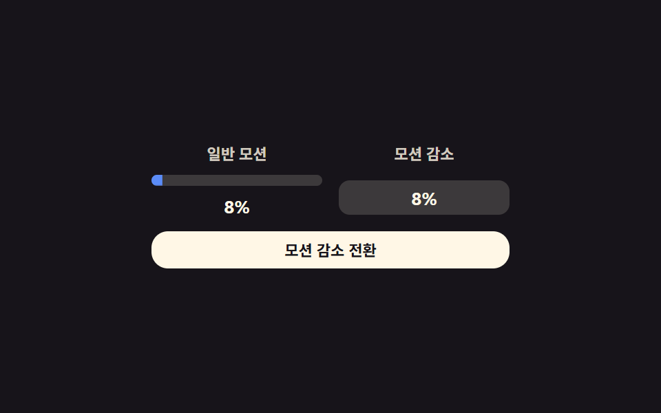
09Reduced-motion static download notice — with reduced motion, only the progress value's label changes instead of animating
When reduced motion is on, bar and position values do not move, and only the label showing the progress value changes in place.
Best forA download-progress notice that respects accessibility settings, a screen for users who requested minimal motion
.drm__staticBoxSTEP.drm--force-reduce
<main class="stage">
<div class="drm is-demo" id="drm">
  <div class="drm__col">
    <span class="drm__colLabel">Normal motion</span>
    <div class="drm__track"><div class="drm__fill" id="drmFillA"></div></div>
    <span class="drm__pct" id="drmPctA">0%</span>
  </div>
  <div class="drm__col drm__col--reduced">
    <span class="drm__colLabel">Reduced motion</span>
    <div class="drm__staticBox"><span class="drm__pct" id="drmPctB">0%</span></div>
  </div>
  <button class="drm__btn" id="drmBtn" type="button">Switch to reduced motion</button>
</div>
</main>
@use "../../../../site/static/demo-tokens" as *;
// 계산 겹: 진행 값 하나를 두 판이 다르게 그린다 — 왼쪽 transform 갱신 · 오른쪽 문구만 교체 — index.html paint() 참조
@include stage($stage-ink);
.drm {
width: 100%;
max-width: 260px;
display: grid;
grid-template-columns: 1fr 1fr;
gap: $sp-3;
}
.drm__col {
display: grid;
justify-items: center;
gap: $sp-2;
}
.drm__colLabel {
font: 600 11px/1.2 -apple-system, "Segoe UI", "Noto Sans KR", sans-serif;
color: rgba($subject-cream, .8);
text-align: center;
}
.drm__track {
width: 100%;
height: $sp-2;
border-radius: $r-pill;
background: rgba($subject-cream, .16);
overflow: hidden;
}
.drm__fill {
height: 100%;
width: 100%;
transform-origin: left center;
transform: scaleX(0);
border-radius: $r-pill;
background: $subject-blue-light;
transition: transform $dur-instant linear;
}
.drm--force-reduce .drm__fill { transition: none; }
.drm__pct {
font: 700 13px/1 -apple-system, "Segoe UI", "Noto Sans KR", sans-serif;
color: $subject-cream;
font-variant-numeric: tabular-nums;
}
.drm__staticBox {
width: 100%;
min-height: $sp-2;
padding: $sp-1 0;
border-radius: $r-sm;
background: rgba($subject-cream, .16);
display: grid;
place-items: center;
// 의도적으로 막대·위치를 움직이지 않는다 — 모션 감소 판은 문구 교체만(둥근 칩, 진행 막대 아님)
}
.drm__btn {
grid-column: 1 / -1;
width: 100%;
border: 0;
border-radius: $r-control;
padding: $sp-2 $sp-4;
background: $subject-cream;
color: $stage-ink;
font: 700 11px/1 -apple-system, "Segoe UI", "Noto Sans KR", sans-serif;
cursor: pointer;
transition: transform $dur-instant $ease-out;
&:active { transform: scale(.96); }
}
@media (max-width: 340px) {
.drm { max-width: 210px; gap: $sp-2; }
.drm__colLabel { font-size: 10px; }
}
@media (prefers-reduced-motion: reduce) {
.drm__fill { transition: none; }
.drm__btn { transition: none; }
}html, body {
margin: 0;
overflow: hidden;
}
.stage {
box-sizing: border-box;
min-height: 100vh;
display: grid;
place-items: center;
margin: 0;
background: #17141a;
font-family: -apple-system, "Segoe UI", "Noto Sans KR", sans-serif;
padding: clamp(8px, 4vw, 24px);
}
.drm {
width: 100%;
max-width: 260px;
display: grid;
grid-template-columns: 1fr 1fr;
gap: 12px;
}
.drm__col {
display: grid;
justify-items: center;
gap: 8px;
}
.drm__colLabel {
font: 600 11px/1.2 -apple-system, "Segoe UI", "Noto Sans KR", sans-serif;
color: rgba(255, 247, 230, 0.8);
text-align: center;
}
.drm__track {
width: 100%;
height: 8px;
border-radius: 999px;
background: rgba(255, 247, 230, 0.16);
overflow: hidden;
}
.drm__fill {
height: 100%;
width: 100%;
transform-origin: left center;
transform: scaleX(0);
border-radius: 999px;
background: #5b8cf8;
transition: transform 140ms linear;
}
.drm--force-reduce .drm__fill {
transition: none;
}
.drm__pct {
font: 700 13px/1 -apple-system, "Segoe UI", "Noto Sans KR", sans-serif;
color: #fff7e6;
font-variant-numeric: tabular-nums;
}
.drm__staticBox {
width: 100%;
min-height: 8px;
padding: 4px 0;
border-radius: 8px;
background: rgba(255, 247, 230, 0.16);
display: grid;
place-items: center;
}
.drm__btn {
grid-column: 1/-1;
width: 100%;
border: 0;
border-radius: 12px;
padding: 8px 16px;
background: #fff7e6;
color: #17141a;
font: 700 11px/1 -apple-system, "Segoe UI", "Noto Sans KR", sans-serif;
cursor: pointer;
transition: transform 140ms ease-out;
}
.drm__btn:active {
transform: scale(0.96);
}
@media (max-width: 340px) {
.drm {
max-width: 210px;
gap: 8px;
}
.drm__colLabel {
font-size: 10px;
}
}
@media (prefers-reduced-motion: reduce) {
.drm__fill {
transition: none;
}
.drm__btn {
transition: none;
}
}(function () {
var root = document.getElementById('drm');
var fillA = document.getElementById('drmFillA');
var pctA = document.getElementById('drmPctA');
var pctB = document.getElementById('drmPctB');
var btn = document.getElementById('drmBtn');
// 상수: In progress 속도(%/틱) · 틱 간격(ms)
var STEP = 4;
var TICK_MS = 130;
var forcedReduce = false;
var pct = 0;
// 계산 겹: 같은 In progress 값 하나를 두 판이 다르게 그린다 — 왼쪽은 매 틱 transform 갱신, 오른쪽은 문구만 교체(레이아웃·트랜지션 0)
function paint() {
fillA.style.transform = 'scaleX(' + (pct / 100).toFixed(3) + ')';
pctA.textContent = pct + '%';
pctB.textContent = pct + '%';
}
function tick() {
pct = (pct + STEP) % 101;
paint();
setTimeout(tick, TICK_MS);
}
tick();
btn.addEventListener('click', function () {
root.classList.remove('is-demo');
forcedReduce = !forcedReduce;
root.classList.toggle('drm--force-reduce', forcedReduce);
btn.textContent = forcedReduce ? 'Switch to normal motion' : 'Switch to reduced motion';
});
})();import { useEffect, useRef } from "react";
import styles from "./DownloadManagerReducedMotion.module.scss";
type Box<T> = { current: T };
export default function DownloadManagerReducedMotion() {
const rootRef = useRef(null) as unknown as Box<HTMLDivElement | null>;
useEffect(() => {
const root = rootRef.current;
if (!root) return;
const fillA = root.querySelector(`.${styles.fill}`) as HTMLElement | null;
const pctA = root.querySelector(`.${styles.pctA}`) as HTMLElement | null;
const pctB = root.querySelector(`.${styles.pctB}`) as HTMLElement | null;
const btn = root.querySelector(`.${styles.btn}`) as HTMLElement | null;
if (!fillA || !pctA || !pctB || !btn) return;
// 상수: 진행 속도(%/틱) · 틱 간격(ms)
const STEP = 4;
const TICK_MS = 130;
let forcedReduce = false;
let pct = 0;
let timer = 0;
let stopped = false;
// 계산 겹: 같은 진행 값 하나를 두 판이 다르게 그린다 — 왼쪽은 매 틱 transform 갱신, 오른쪽은 문구만 교체(레이아웃·트랜지션 0)
function paint() {
fillA!.style.transform = "scaleX(" + (pct / 100).toFixed(3) + ")";
pctA!.textContent = pct + "%";
pctB!.textContent = pct + "%";
}
function tick() {
if (stopped) return;
pct = (pct + STEP) % 101;
paint();
timer = window.setTimeout(tick, TICK_MS);
}
tick();
function onClick() {
root!.classList.remove(styles["is-demo"]);
forcedReduce = !forcedReduce;
root!.classList.toggle(styles["drm--force-reduce"], forcedReduce);
btn!.textContent = forcedReduce ? "일반 모션 전환" : "모션 감소 전환";
}
btn.addEventListener("click", onClick);
return () => {
stopped = true;
window.clearTimeout(timer);
btn.removeEventListener("click", onClick);
};
}, []);
return (
<div ref={rootRef} className={`${styles.stage} ${styles.drm} ${styles["is-demo"]}`}>
<div className={styles.col}>
<span className={styles.colLabel}>일반 모션</span>
<div className={styles.track}><div className={styles.fill} /></div>
<span className={`${styles.pct} ${styles.pctA}`}>0%</span>
</div>
<div className={`${styles.col} ${styles["col--reduced"]}`}>
<span className={styles.colLabel}>모션 감소</span>
<div className={styles.staticBox}><span className={`${styles.pct} ${styles.pctB}`}>0%</span></div>
</div>
<button className={styles.btn} type="button">모션 감소 전환</button>
</div>
);
}09 Reduced-motion static download notice — with reduced motion, only the progress value's label changes instead of animating — Measured area 0.643% · moving frames 18/23Original by GODRICH · SCSS and React ship in the zip · Download Progress Bar: 9 Loading UI Patterns
The post this demo lives in
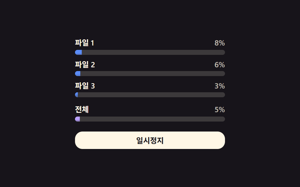 Download Progress Bar: 9 Loading UI PatternsThis download progress bar roundup: One of nine keeps each file's progress value climbing in a list, another resets it t See all demos in this post
If you like this effect - similar demos
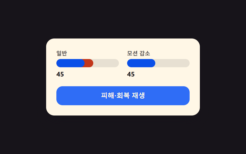 Loaders09 Reduced-motion instant toggle — with reduced motion on, every animation from the prior eight bars snaps straight to its end valueCSS Progress Bar: 9 Game-Style Fill Patterns
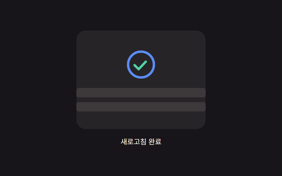 Loaders05 Icon progress ring — an indicator whose circular progress value fills with the pulled distance and morphs into a checkmark once completePull to Refresh CSS: 9 Loading Patterns
 Loaders02 Loader Whose Wireframe Vertices Settle Into Place With the Progress ValueCSS 3D Cube Animation Loaders, 9 Patterns