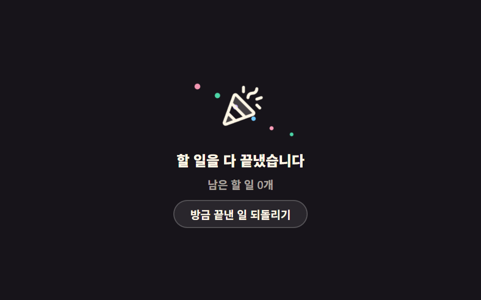
09All-done card with rising confetti
Six confetti pieces rise and fade behind the party-popper icon, each starting 240ms after the one before and spinning its own way.
Best forFor a task or approval queue where an empty list is the good news you want to celebrate
translateanimation-delaycustom property
<main class="stage">
  <section class="ad is-demo" aria-labelledby="ad-t">
    <div class="ad__art">
      <span class="ad__bit" aria-hidden="true"></span>
      <span class="ad__bit" aria-hidden="true"></span>
      <span class="ad__bit" aria-hidden="true"></span>
      <span class="ad__bit" aria-hidden="true"></span>
      <span class="ad__bit" aria-hidden="true"></span>
      <span class="ad__bit" aria-hidden="true"></span>
      <span class="ad__icon" aria-hidden="true"><svg viewBox="0 0 256 256" width="1em" height="1em"><g fill="currentColor"><path d="m58.89 154.89l42.22 42.22l-50.63 18.4a7.79 7.79 0 0 1-10-10Zm138.82-4.72l-91.88-91.88A7.79 7.79 0 0 0 93 61.14l-14.9 41l75.82 75.82l41-14.9a7.79 7.79 0 0 0 2.79-12.89" opacity=".2"/><path d="M111.49 52.63a15.8 15.8 0 0 0-26 5.77L33 202.78A15.83 15.83 0 0 0 47.76 224a16 16 0 0 0 5.46-1l144.37-52.5a15.8 15.8 0 0 0 5.78-26Zm-8.33 135.21l-35-35l13.16-36.21l58.05 58.05Zm-55 20l14-38.41l24.45 24.45ZM156 168.64L87.36 100l13-35.87l91.43 91.43ZM160 72a37.8 37.8 0 0 1 3.84-15.58C169.14 45.83 179.14 40 192 40c6.7 0 11-2.29 13.65-7.21a22 22 0 0 0 2.35-8.85a8 8 0 0 1 16 .06c0 12.86-8.52 32-32 32c-6.7 0-11 2.29-13.65 7.21a22 22 0 0 0-2.35 8.85a8 8 0 0 1-16-.06m-24-32V16a8 8 0 0 1 16 0v24a8 8 0 0 1-16 0m101.66 82.34a8 8 0 1 1-11.32 11.31l-16-16a8 8 0 0 1 11.32-11.32Zm4.87-42.75l-24 8a8 8 0 0 1-5.06-15.18l24-8a8 8 0 0 1 5.06 15.18"/></g></svg></span>
    </div>
    <h2 class="ad__title" id="ad-t">Everything is done</h2>
    <p class="ad__sub" id="ad-s" data-fmt="{n} tasks left" aria-live="polite">0 tasks left</p>
    <button class="ad__btn" type="button" id="ad-b" data-none="Nothing left to undo">Undo the last one</button>
  </section>
</main>
@use "../../../../site/static/demo-tokens" as *;
$duration: $dur-loop;
$easing: ease-in-out;
$color: $subject-cream;
@include stage($stage-ink);
.ad {
box-sizing: border-box;
width: min(248px, 86vw);
display: flex;
flex-direction: column;
align-items: center;
gap: $sp-2;
font-family: -apple-system, "Segoe UI", "Noto Sans KR", sans-serif;
text-align: center;
color: $color;
}
.ad__art {
position: relative;
box-sizing: border-box;
width: 100%;
height: 72px;
display: grid;
place-items: center;
overflow: hidden;
}
.ad__icon {
grid-area: 1 / 1;
font-size: clamp(36px, 11vw, 46px);
line-height: 0;
color: $color;
}
.ad__bit {
position: absolute;
left: 50%;
bottom: 4px;
width: 6px;
height: 6px;
border-radius: $r-xs;
background: $subject-pink;
opacity: 0;
}
.ad__bit:nth-child(2) { background: $subject-mint; }
.ad__bit:nth-child(3) { background: $subject-lilac; }
.ad__bit:nth-child(4) { background: $subject-sky; }
.ad__bit:nth-child(5) { background: $subject-pink; }
.ad__bit:nth-child(6) { background: $subject-mint; }
.ad__title {
margin: 0;
font-size: clamp(12px, 4vw, 14px);
line-height: 1.3;
font-weight: 800;
}
.ad__sub {
margin: 0;
min-height: 14px;
font-size: 11px;
line-height: 14px;
font-weight: 600;
color: rgba(255, 247, 230, .62);
}
.ad.is-back .ad__sub { color: $subject-pink; }
.ad__btn {
height: 28px;
margin: 0;
padding: 0 $sp-4;
border: 1px solid rgba(255, 255, 255, .2);
border-radius: $r-pill;
background: rgba(255, 255, 255, .08);
color: $color;
font-family: inherit;
font-size: 11px;
font-weight: 700;
cursor: pointer;
}
.ad__btn:disabled { opacity: .5; cursor: default; }
.ad__btn:focus-visible { outline: 2px solid $subject-sky; outline-offset: 2px; }
// ── 자동 루프: 조각마다 시작 시각이 달라 한 조각이 사라질 때 다음 조각이 이미 올라와 있다 ──
.ad.is-demo .ad__bit { animation: ad-pop $duration $easing infinite; }
.ad.is-demo .ad__bit:nth-child(1) { animation-delay: 0ms; --x: -46px; --r: 180deg; }
.ad.is-demo .ad__bit:nth-child(2) { animation-delay: 240ms; --x: -26px; --r: -150deg; }
.ad.is-demo .ad__bit:nth-child(3) { animation-delay: 480ms; --x: -8px; --r: 210deg; }
.ad.is-demo .ad__bit:nth-child(4) { animation-delay: 720ms; --x: 10px; --r: -190deg; }
.ad.is-demo .ad__bit:nth-child(5) { animation-delay: 960ms; --x: 28px; --r: 160deg; }
.ad.is-demo .ad__bit:nth-child(6) { animation-delay: 1200ms; --x: 48px; --r: -220deg; }
@keyframes ad-pop {
0% { transform: translate(var(--x, 0), 0) rotate(0deg) scale(.6); opacity: 0; }
16% { opacity: 1; }
70% { opacity: 1; }
100% { transform: translate(var(--x, 0), -58px) rotate(var(--r, 180deg)) scale(1); opacity: 0; }
}
.ad.is-demo .ad__icon { animation: ad-beat $duration $easing infinite; }
@keyframes ad-beat {
0%, 100% { transform: rotate(-6deg) scale(1); }
50% { transform: rotate(6deg) scale(1.06); }
}
@media (prefers-reduced-motion: reduce) {
.ad.is-demo .ad__bit,
.ad.is-demo .ad__icon { animation: none !important; }
}html, body {
margin: 0;
overflow: hidden;
}
.stage {
box-sizing: border-box;
min-height: 100vh;
display: grid;
place-items: center;
margin: 0;
background: #17141a;
font-family: -apple-system, "Segoe UI", "Noto Sans KR", sans-serif;
padding: clamp(8px, 4vw, 24px);
}
.ad {
box-sizing: border-box;
width: min(248px, 86vw);
display: flex;
flex-direction: column;
align-items: center;
gap: 8px;
font-family: -apple-system, "Segoe UI", "Noto Sans KR", sans-serif;
text-align: center;
color: #fff7e6;
}
.ad__art {
position: relative;
box-sizing: border-box;
width: 100%;
height: 72px;
display: grid;
place-items: center;
overflow: hidden;
}
.ad__icon {
grid-area: 1/1;
font-size: clamp(36px, 11vw, 46px);
line-height: 0;
color: #fff7e6;
}
.ad__bit {
position: absolute;
left: 50%;
bottom: 4px;
width: 6px;
height: 6px;
border-radius: 4px;
background: #ff9ebb;
opacity: 0;
}
.ad__bit:nth-child(2) {
background: #4cd4a6;
}
.ad__bit:nth-child(3) {
background: #b9a0ff;
}
.ad__bit:nth-child(4) {
background: #6ec8ff;
}
.ad__bit:nth-child(5) {
background: #ff9ebb;
}
.ad__bit:nth-child(6) {
background: #4cd4a6;
}
.ad__title {
margin: 0;
font-size: clamp(12px, 4vw, 14px);
line-height: 1.3;
font-weight: 800;
}
.ad__sub {
margin: 0;
min-height: 14px;
font-size: 11px;
line-height: 14px;
font-weight: 600;
color: rgba(255, 247, 230, 0.62);
}
.ad.is-back .ad__sub {
color: #ff9ebb;
}
.ad__btn {
height: 28px;
margin: 0;
padding: 0 16px;
border: 1px solid rgba(255, 255, 255, 0.2);
border-radius: 999px;
background: rgba(255, 255, 255, 0.08);
color: #fff7e6;
font-family: inherit;
font-size: 11px;
font-weight: 700;
cursor: pointer;
}
.ad__btn:disabled {
opacity: 0.5;
cursor: default;
}
.ad__btn:focus-visible {
outline: 2px solid #6ec8ff;
outline-offset: 2px;
}
.ad.is-demo .ad__bit {
animation: ad-pop 2s ease-in-out infinite;
}
.ad.is-demo .ad__bit:nth-child(1) {
animation-delay: 0ms;
--x: -46px;
--r: 180deg;
}
.ad.is-demo .ad__bit:nth-child(2) {
animation-delay: 240ms;
--x: -26px;
--r: -150deg;
}
.ad.is-demo .ad__bit:nth-child(3) {
animation-delay: 480ms;
--x: -8px;
--r: 210deg;
}
.ad.is-demo .ad__bit:nth-child(4) {
animation-delay: 720ms;
--x: 10px;
--r: -190deg;
}
.ad.is-demo .ad__bit:nth-child(5) {
animation-delay: 960ms;
--x: 28px;
--r: 160deg;
}
.ad.is-demo .ad__bit:nth-child(6) {
animation-delay: 1200ms;
--x: 48px;
--r: -220deg;
}
@keyframes ad-pop {
0% {
transform: translate(var(--x, 0), 0) rotate(0deg) scale(0.6);
opacity: 0;
}
16% {
opacity: 1;
}
70% {
opacity: 1;
}
100% {
transform: translate(var(--x, 0), -58px) rotate(var(--r, 180deg)) scale(1);
opacity: 0;
}
}
.ad.is-demo .ad__icon {
animation: ad-beat 2s ease-in-out infinite;
}
@keyframes ad-beat {
0%, 100% {
transform: rotate(-6deg) scale(1);
}
50% {
transform: rotate(6deg) scale(1.06);
}
}
@media (prefers-reduced-motion: reduce) {
.ad.is-demo .ad__bit,
.ad.is-demo .ad__icon {
animation: none !important;
}
}// 실제 동작: 되돌리기를 누르면 할 일이 실제로 하나씩 되살아나고, 0개가 아니면 축하 문구가 내려간다.
var card = document.querySelector('.ad');
var btn = document.getElementById('ad-b');
var sub = document.getElementById('ad-s');
var left = 0;
btn.addEventListener('click', function () {
card.classList.remove('is-demo');
left += 1;
card.classList.add('is-back');
sub.textContent = sub.dataset.fmt.replace('{n}', left);
if (left >= 3) {
btn.disabled = true;
btn.textContent = btn.dataset.none;
}
});import { useState } from "react";
import type { CSSProperties } from "react";
import styles from "./AllDoneCard.module.scss";
export type AllDoneCardProps = {
title?: string;
fmt?: string;
action?: string;
none?: string;
maxUndo?: number;
duration?: number;
easing?: string;
color?: string;
};
type Vars = CSSProperties & { "--duration"?: string; "--easing"?: string; "--color"?: string };
type BitVars = CSSProperties & { "--x"?: string; "--r"?: string; animationDelay?: string };
const BITS: BitVars[] = [
{ "--x": "-46px", "--r": "180deg", animationDelay: "0ms" },
{ "--x": "-26px", "--r": "-150deg", animationDelay: "240ms" },
{ "--x": "-8px", "--r": "210deg", animationDelay: "480ms" },
{ "--x": "10px", "--r": "-190deg", animationDelay: "720ms" },
{ "--x": "28px", "--r": "160deg", animationDelay: "960ms" },
{ "--x": "48px", "--r": "-220deg", animationDelay: "1200ms" },
];
export default function AllDoneCard({
title = "Everything is done",
fmt = "{n} tasks left",
action = "Undo the last one",
none = "Nothing left to undo",
maxUndo = 3,
duration = 2000,
easing = "ease-in-out",
color = "#fff7e6",
}: AllDoneCardProps) {
const [left, setLeft] = useState(0);
const [loop, setLoop] = useState(true);
const vars: Vars = { "--duration": `${duration}ms`, "--easing": easing, "--color": color };
const full = left >= maxUndo;
const cls = [styles.ad, loop ? styles.isDemo : "", left > 0 ? styles.isBack : ""].join(" ");
return (
<section className={cls} style={vars}>
<div className={styles.art}>
{BITS.map((b, i) => <span className={styles.bit} style={b} key={i} aria-hidden="true" />)}
<span className={styles.icon} aria-hidden="true">
<svg viewBox="0 0 256 256" width="1em" height="1em">
<g fill="currentColor">
<path d="m58.89 154.89l42.22 42.22l-50.63 18.4a7.79 7.79 0 0 1-10-10Zm138.82-4.72l-91.88-91.88A7.79 7.79 0 0 0 93 61.14l-14.9 41l75.82 75.82l41-14.9a7.79 7.79 0 0 0 2.79-12.89" opacity=".2" />
<path d="M111.49 52.63a15.8 15.8 0 0 0-26 5.77L33 202.78A15.83 15.83 0 0 0 47.76 224a16 16 0 0 0 5.46-1l144.37-52.5a15.8 15.8 0 0 0 5.78-26Zm-8.33 135.21l-35-35l13.16-36.21l58.05 58.05Zm-55 20l14-38.41l24.45 24.45ZM156 168.64L87.36 100l13-35.87l91.43 91.43ZM160 72a37.8 37.8 0 0 1 3.84-15.58C169.14 45.83 179.14 40 192 40c6.7 0 11-2.29 13.65-7.21a22 22 0 0 0 2.35-8.85a8 8 0 0 1 16 .06c0 12.86-8.52 32-32 32c-6.7 0-11 2.29-13.65 7.21a22 22 0 0 0-2.35 8.85a8 8 0 0 1-16-.06m-24-32V16a8 8 0 0 1 16 0v24a8 8 0 0 1-16 0m101.66 82.34a8 8 0 1 1-11.32 11.31l-16-16a8 8 0 0 1 11.32-11.32Zm4.87-42.75l-24 8a8 8 0 0 1-5.06-15.18l24-8a8 8 0 0 1 5.06 15.18" />
</g>
</svg>
</span>
</div>
<h2 className={styles.title}>{title}</h2>
<p className={styles.sub} aria-live="polite">{fmt.replace("{n}", String(left))}</p>
<button
className={styles.btn}
type="button"
disabled={full}
onClick={() => { setLoop(false); setLeft(left + 1); }}
>
{full ? none : action}
</button>
</section>
);
}09 All-done card with rising confetti — Measured area 1.54% · moving frames 23/23Original by GODRICH · SCSS and React ship in the zip · 9 Empty State UI Design Cards Drawn in Pure CSS
The post this demo lives in
 9 Empty State UI Design Cards Drawn in Pure CSSEmpty state UI design fills the space a list would occupy when there is no data to put in it. One of these nine is blank See all demos in this post
If you like this effect - similar demos
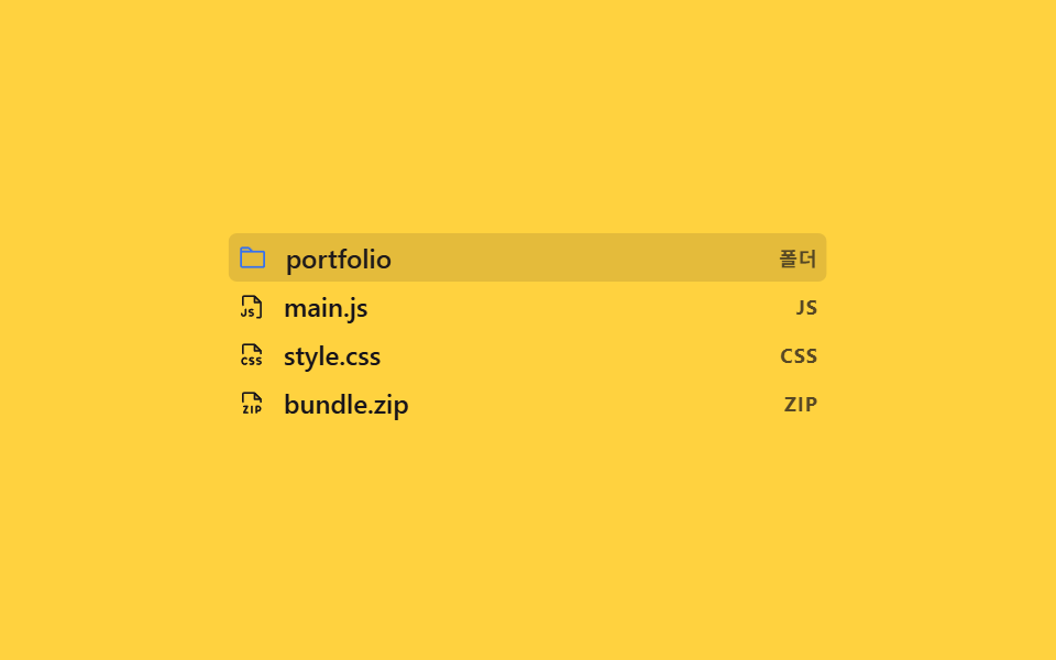 Lists & tables02 Type icons with indent guides9 File Tree CSS Views — Folders That Really Open
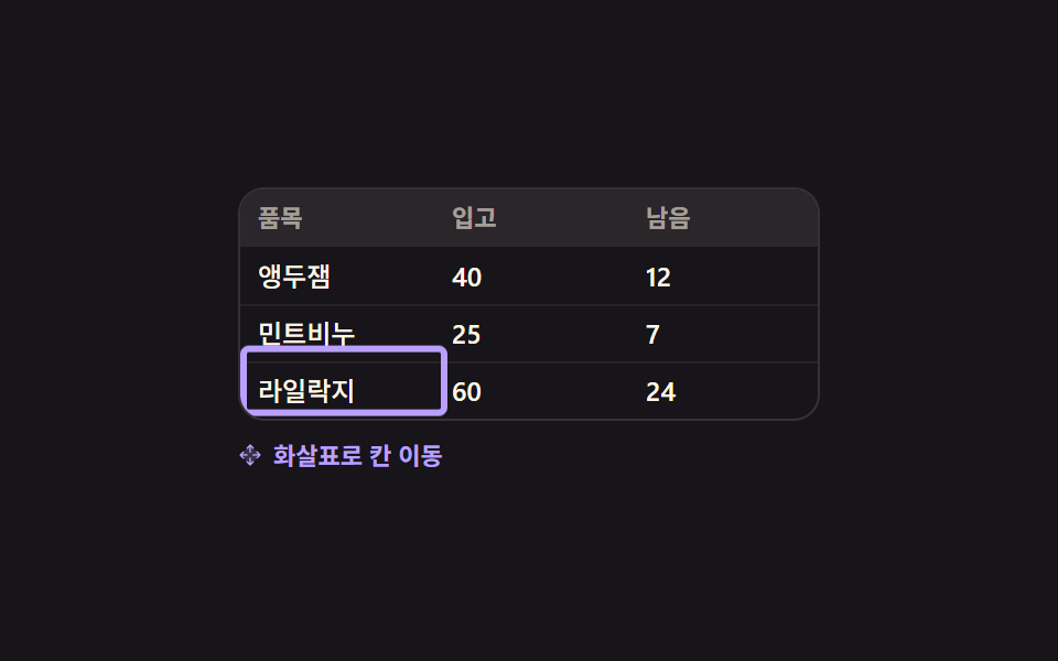 Lists & tables09 Focus outline that walks cells with arrow keys9 Data Table UI Patterns — Drag, Resize, Select
 Lists & tables09 Chain-burst check marker — stacking a delay value so checks pop in cascadeCSS List Style: 9 Marker Design Patterns