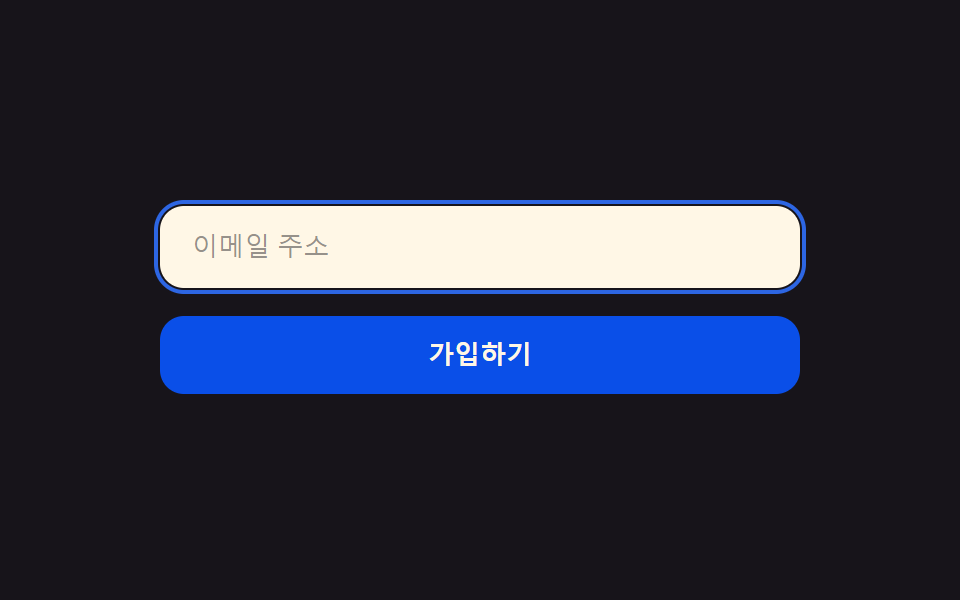
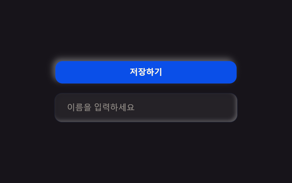
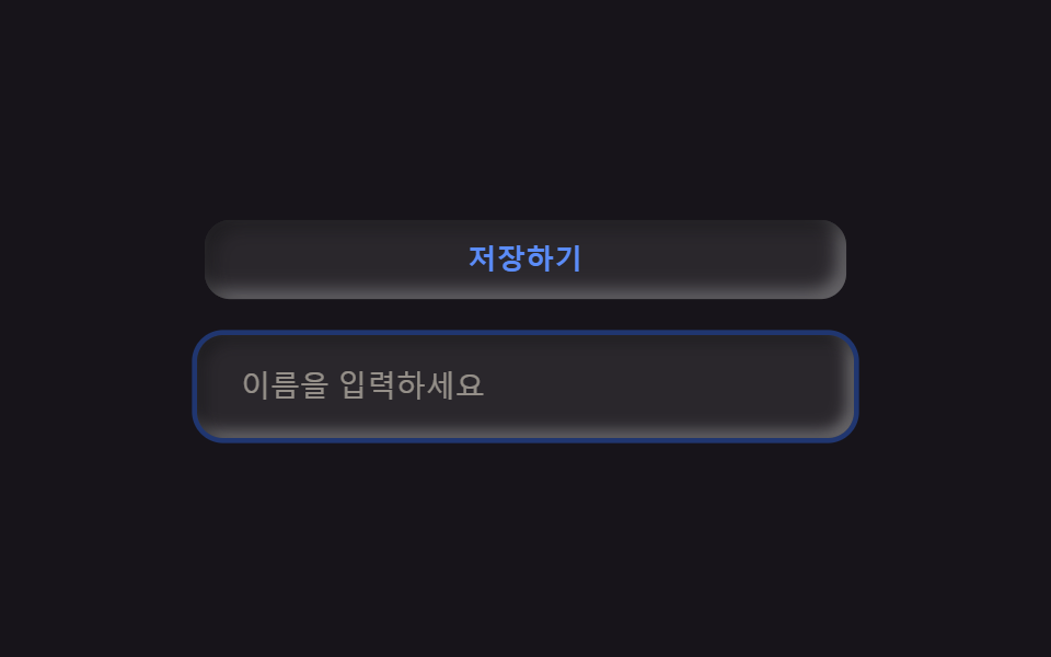
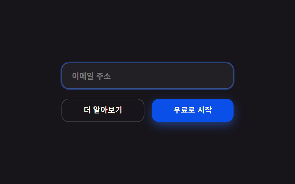
09Ghost/primary buttons, dark inputs
The primary button blooms a blue glow on hover, while the ghost button and dark input only brighten their focus ring.
Best forForm submit buttons, sign-in and search inputs
box-shadow glowfocus ring 2pxradius 12
<main class="stage">
  <form class="form is-demo">
    <label class="form__field">
      <input class="form__input" type="email" placeholder="Email address" readonly>
    </label>
    <div class="form__row">
      <button class="form__ghost" type="button">Learn more</button>
      <button class="form__primary" type="button">Start for free</button>
    </div>
  </form>
</main>
@use "../../../../site/static/demo-tokens" as *;
$duration: $dur-loop; // 글로우·포커스 링이 커졌다 작아지는 한 주기
$easing: $ease-out;
$color: $subject-blue;
@include stage($stage-ink);
.form {
display: flex;
flex-direction: column;
gap: $sp-4;
width: clamp(210px, 74vw, 280px);
}
.form__field {
display: block;
border-radius: $r-control;
background: rgba($subject-cream, .05);
border: 1px solid rgba($subject-cream, .12);
}
.form__input {
width: 100%;
box-sizing: border-box;
background: transparent;
border: 0;
outline: none;
padding: $sp-3 $sp-4;
color: $subject-cream;
font: 600 clamp(11px, 2.8vw, 13px)/1 -apple-system, "Segoe UI", "Noto Sans KR", sans-serif;
border-radius: $r-control;
animation: inputRing $duration $easing infinite;
}
.form__row {
display: flex;
gap: $sp-3;
}
.form__ghost {
flex: 1 1 0;
border-radius: $r-control;
background: transparent;
border: 1px solid rgba($subject-cream, .2);
color: $subject-cream;
padding: $sp-3 $sp-4;
font-weight: 600; font-size: clamp(10.5px, 2.6vw, 12px); line-height: 1;
}
.form__primary {
flex: 1 1 0;
border-radius: $r-control;
border: 0;
background: $subject-blue-deep;
color: $subject-cream;
padding: $sp-3 $sp-4;
font-weight: 600; font-size: clamp(10.5px, 2.6vw, 12px); line-height: 1;
animation: btnGlow $duration $easing infinite;
}
@keyframes inputRing {
0%, 100% { box-shadow: 0 0 0 0 rgba($color, 0); }
50% { box-shadow: 0 0 0 3px rgba($color, .45); }
}
@keyframes btnGlow {
0%, 100% { box-shadow: 0 0 0 0 rgba($color, 0); }
50% { box-shadow: 0 6px 18px rgba($color, .55); }
}
@media (prefers-reduced-motion: reduce) {
.form__input, .form__primary { animation: none !important; box-shadow: none; }
}html, body {
margin: 0;
overflow: hidden;
}
.stage {
box-sizing: border-box;
min-height: 100vh;
display: grid;
place-items: center;
margin: 0;
background: #17141a;
font-family: -apple-system, "Segoe UI", "Noto Sans KR", sans-serif;
padding: clamp(8px, 4vw, 24px);
}
.form {
display: flex;
flex-direction: column;
gap: 16px;
width: clamp(210px, 74vw, 280px);
}
.form__field {
display: block;
border-radius: 12px;
background: rgba(255, 247, 230, 0.05);
border: 1px solid rgba(255, 247, 230, 0.12);
}
.form__input {
width: 100%;
box-sizing: border-box;
background: transparent;
border: 0;
outline: none;
padding: 12px 16px;
color: #fff7e6;
font: 600 clamp(11px, 2.8vw, 13px)/1 -apple-system, "Segoe UI", "Noto Sans KR", sans-serif;
border-radius: 12px;
animation: inputRing 2s ease-out infinite;
}
.form__row {
display: flex;
gap: 12px;
}
.form__ghost {
flex: 1 1 0;
border-radius: 12px;
background: transparent;
border: 1px solid rgba(255, 247, 230, 0.2);
color: #fff7e6;
padding: 12px 16px;
font-weight: 600;
font-size: clamp(10.5px, 2.6vw, 12px);
line-height: 1;
}
.form__primary {
flex: 1 1 0;
border-radius: 12px;
border: 0;
background: #0a4fe8;
color: #fff7e6;
padding: 12px 16px;
font-weight: 600;
font-size: clamp(10.5px, 2.6vw, 12px);
line-height: 1;
animation: btnGlow 2s ease-out infinite;
}
@keyframes inputRing {
0%, 100% {
box-shadow: 0 0 0 0 rgba(47, 109, 246, 0);
}
50% {
box-shadow: 0 0 0 3px rgba(47, 109, 246, 0.45);
}
}
@keyframes btnGlow {
0%, 100% {
box-shadow: 0 0 0 0 rgba(47, 109, 246, 0);
}
50% {
box-shadow: 0 6px 18px rgba(47, 109, 246, 0.55);
}
}
@media (prefers-reduced-motion: reduce) {
.form__input, .form__primary {
animation: none !important;
box-shadow: none;
}
}import type { CSSProperties } from "react";
import styles from "./ButtonsInputsLinear.module.scss";
export type ButtonsInputsLinearProps = {
placeholder?: string;
ghostLabel?: string;
primaryLabel?: string;
/** 글로우·포커스 링이 커졌다 작아지는 한 주기(기본 2000ms) */
duration?: number;
easing?: string;
color?: string;
};
type Vars = CSSProperties & { "--duration"?: string; "--easing"?: string; "--color"?: string };
export default function ButtonsInputsLinear({
placeholder = "Email address",
ghostLabel = "Learn more",
primaryLabel = "Start for free",
duration = 2000,
easing = "ease-out",
color = "#2f6df6",
}: ButtonsInputsLinearProps) {
const vars: Vars = { "--duration": `${duration}ms`, "--easing": easing, "--color": color };
return (
<form className={styles.form} style={vars}>
<label className={styles.field}>
<input className={styles.input} type="email" placeholder={placeholder} readOnly />
</label>
<div className={styles.row}>
<button type="button" className={styles.ghost}>{ghostLabel}</button>
<button type="button" className={styles.primary}>{primaryLabel}</button>
</div>
</form>
);
}09 Ghost/primary buttons, dark inputs — Measured area 4.033% · moving frames 17/23Original by GODRICH · SCSS and React ship in the zip · Linear Style Landing Page: 9 Dark SaaS Sections
The post this demo lives in
 Linear Style Landing Page: 9 Dark SaaS SectionsA linear style landing page — all over Dribbble and Pinterest right now — leans on Linear.app's ink-black background and See all demos in this post