06Signup step progress
Three connected step dots fill their connecting line with an animation each time you move to the next step.
Best forMulti-step signup that splits information across screens, onboarding with several steps before checkout
커스텀 프로퍼티 --progresswidth 전환step-end 타이밍
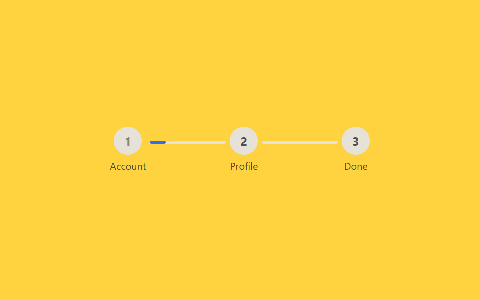
<main class="stage">
  <ol class="stepper is-demo" aria-label="Signup progress">
    <li class="stepper__step stepper__step--1"><span class="stepper__dot">1</span><span class="stepper__label">Account</span></li>
    <li class="stepper__connector"><span class="stepper__fill stepper__fill--1"></span></li>
    <li class="stepper__step stepper__step--2"><span class="stepper__dot">2</span><span class="stepper__label">Profile</span></li>
    <li class="stepper__connector"><span class="stepper__fill stepper__fill--2"></span></li>
    <li class="stepper__step stepper__step--3"><span class="stepper__dot">3</span><span class="stepper__label">Done</span></li>
  </ol>
</main>
@use "../../../../site/static/demo-tokens" as *;
$duration: $dur-base; // 연결선이 채워지는 시간
$easing: $ease-out;
$color: $subject-blue; // 진행 색
@include stage($stage-yellow);
.stepper {
width: min(260px, 90vw);
margin: 0; padding: 0;
list-style: none;
display: flex;
align-items: center;
}
.stepper__step {
display: flex;
flex-direction: column;
align-items: center;
gap: $sp-1;
flex: 0 0 auto;
}
.stepper__dot {
width: 28px; height: 28px;
border-radius: 50%;
display: grid; place-items: center;
background: #e6e2d8;
color: rgba($subject-ink, .72);
font-weight: 700;
font-size: 12px;
font-family: inherit;
transition: background $duration $easing, color $duration $easing;
}
.stepper__label { font-size: 10px; color: rgba($subject-ink, .72); font-family: inherit; }
.stepper__connector {
flex: 1 1 auto;
height: 3px;
margin: 0 $sp-1 16px;
border-radius: $r-xs;
background: #e6e2d8;
overflow: hidden;
}
.stepper__fill {
display: block;
height: 100%;
width: 0%;
background: $color;
border-radius: $r-xs;
}
.stepper.is-demo .stepper__fill--1 { animation: fill-1 $dur-loop $easing infinite; }
.stepper.is-demo .stepper__fill--2 { animation: fill-2 $dur-loop $easing infinite; }
.stepper.is-demo .stepper__step--1 .stepper__dot,
.stepper.is-demo .stepper__step--2 .stepper__dot { animation: dot-fill $dur-loop step-end infinite; }
.stepper.is-demo .stepper__step--2 .stepper__dot { animation-delay: calc(#{$dur-loop} / 2); }
@keyframes fill-1 {
0%, 8% { width: 0%; }
42%, 100% { width: 100%; }
}
@keyframes fill-2 {
0%, 50% { width: 0%; }
92%, 100% { width: 100%; }
}
@keyframes dot-fill {
0% { background: #e6e2d8; color: #8a8272; }
100% { background: $color; color: $stage-paper; }
}
@media (prefers-reduced-motion: reduce) {
.stepper.is-demo .stepper__fill--1,
.stepper.is-demo .stepper__fill--2,
.stepper.is-demo .stepper__step--1 .stepper__dot,
.stepper.is-demo .stepper__step--2 .stepper__dot { animation: none; }
}html, body {
margin: 0;
overflow: hidden;
}
.stage {
box-sizing: border-box;
min-height: 100vh;
display: grid;
place-items: center;
margin: 0;
background: #ffd23f;
font-family: -apple-system, "Segoe UI", "Noto Sans KR", sans-serif;
padding: clamp(8px, 4vw, 24px);
}
.stepper {
width: min(260px, 90vw);
margin: 0;
padding: 0;
list-style: none;
display: flex;
align-items: center;
}
.stepper__step {
display: flex;
flex-direction: column;
align-items: center;
gap: 4px;
flex: 0 0 auto;
}
.stepper__dot {
width: 28px;
height: 28px;
border-radius: 50%;
display: grid;
place-items: center;
background: #e6e2d8;
color: rgba(23, 20, 26, 0.72);
font-weight: 700;
font-size: 12px;
font-family: inherit;
transition: background 300ms ease-out, color 300ms ease-out;
}
.stepper__label {
font-size: 10px;
color: rgba(23, 20, 26, 0.72);
font-family: inherit;
}
.stepper__connector {
flex: 1 1 auto;
height: 3px;
margin: 0 4px 16px;
border-radius: 4px;
background: #e6e2d8;
overflow: hidden;
}
.stepper__fill {
display: block;
height: 100%;
width: 0%;
background: #2f6df6;
border-radius: 4px;
}
.stepper.is-demo .stepper__fill--1 {
animation: fill-1 2s ease-out infinite;
}
.stepper.is-demo .stepper__fill--2 {
animation: fill-2 2s ease-out infinite;
}
.stepper.is-demo .stepper__step--1 .stepper__dot,
.stepper.is-demo .stepper__step--2 .stepper__dot {
animation: dot-fill 2s step-end infinite;
}
.stepper.is-demo .stepper__step--2 .stepper__dot {
animation-delay: calc(2s / 2);
}
@keyframes fill-1 {
0%, 8% {
width: 0%;
}
42%, 100% {
width: 100%;
}
}
@keyframes fill-2 {
0%, 50% {
width: 0%;
}
92%, 100% {
width: 100%;
}
}
@keyframes dot-fill {
0% {
background: #e6e2d8;
color: #8a8272;
}
100% {
background: #2f6df6;
color: #ffffff;
}
}
@media (prefers-reduced-motion: reduce) {
.stepper.is-demo .stepper__fill--1,
.stepper.is-demo .stepper__fill--2,
.stepper.is-demo .stepper__step--1 .stepper__dot,
.stepper.is-demo .stepper__step--2 .stepper__dot {
animation: none;
}
}import type { CSSProperties } from "react";
import styles from "./SignupStepProgress.module.scss";
export type SignupStepProgressProps = {
/** 1~3. 지금 사용자가 있는 단계 */
step: 1 | 2 | 3;
/** 연결선이 채워지는 시간 (기본 300ms) */
duration?: number;
easing?: string;
color?: string;
};
const LABELS = ["Account", "Profile", "Done"];
/** step prop 이 올라갈 때마다 그 앞 연결선의 width 가 전환된다 */
export default function SignupStepProgress({
step,
duration = 300,
easing = "ease-out",
color = "#2f6df6",
}: SignupStepProgressProps) {
const style = { "--duration": `${duration}ms`, "--easing": easing, "--color": color } as CSSProperties;
const items = LABELS.flatMap((label, i) => {
const nodes = [
<li key={`s${i}`} className={styles.step}>
<span className={styles.dot} data-done={i + 1 <= step}>{i + 1}</span>
<span className={styles.label}>{label}</span>
</li>,
];
if (i < LABELS.length - 1) {
nodes.push(
<li key={`c${i}`} className={styles.connector}>
<span className={styles.fill} style={{ width: i + 1 < step ? "100%" : "0%" }} />
</li>
);
}
return nodes;
});
return (
<ol className={styles.stepper} style={style} aria-label="Signup progress">
{items}
</ol>
);
}06 Signup step progress — Measured area 0.337% · moving frames 20/23Original by GODRICH · SCSS and React ship in the zip · 9 Login Form Design Patterns You Can Copy-Paste
The post this demo lives in
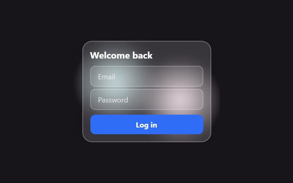 9 Login Form Design Patterns You Can Copy-PasteLogin form design is more than an email field and a button — it's card material, layout, step progress. One of these nin See all demos in this post
If you like this effect - similar demos
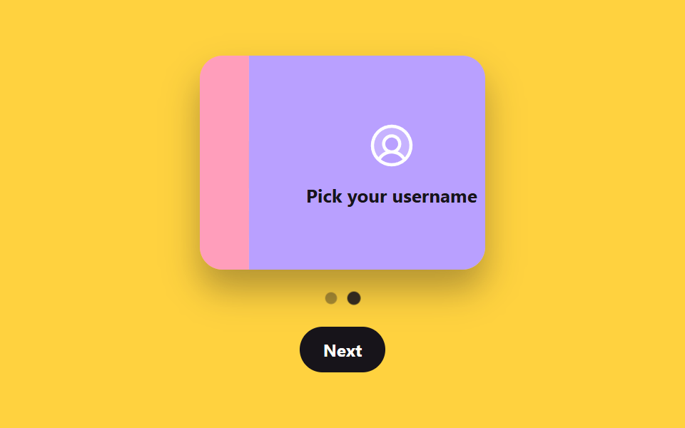 Auth UI06 Onboarding wizard step card9 ID Verification Screen UI Patterns, Paste-Ready
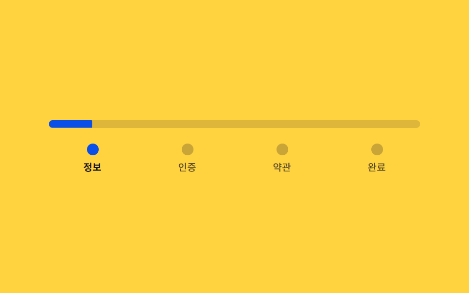 Auth UI02 Signup steps — a stepped form that divides its own progress ratio to set bar length and color9 Login UI Design Patterns (Copy-Paste)
 Auth UI03 Lockout progress ring — the remaining-tries value is shown as a circular progress valueToo Many Failed Login Attempts: 9 Patterns