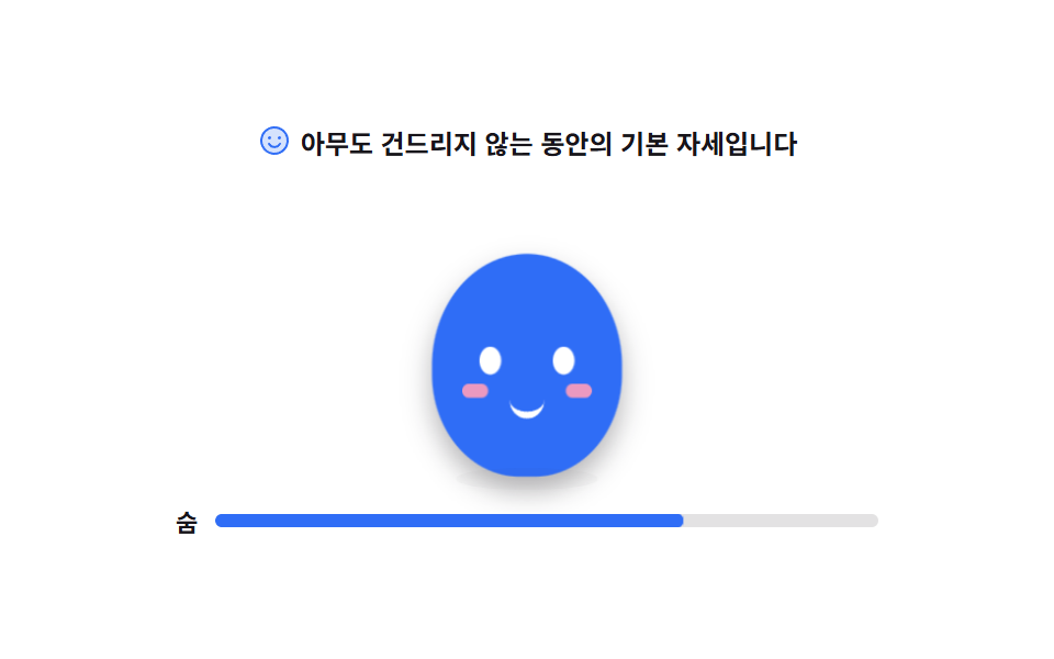
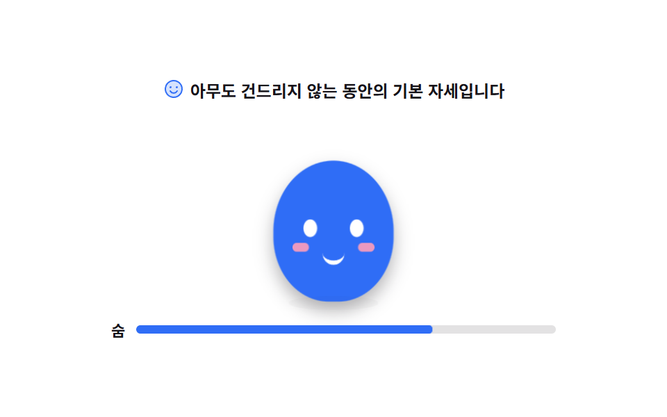
01Idle breathing pose
The body swells and settles slowly while the shadow widens with it. The eyes shut and open again in a single frame at a steady interval.
Best forA product's first screen or an empty dashboard that should not look dead while nothing happens
scaleYsteps(1, end)transform-originanimation-iteration-count
<svg width="0" height="0" style="position:absolute" aria-hidden="true">
  <defs>
    <symbol id="ico-smiley" viewBox="0 0 256 256" fill="currentColor"><path d="M224 128a96 96 0 1 1-96-96a96 96 0 0 1 96 96" opacity=".2"/><path d="M128 24a104 104 0 1 0 104 104A104.11 104.11 0 0 0 128 24m0 192a88 88 0 1 1 88-88a88.1 88.1 0 0 1-88 88M80 108a12 12 0 1 1 12 12a12 12 0 0 1-12-12m96 0a12 12 0 1 1-12-12a12 12 0 0 1 12 12m-1.08 48c-10.29 17.79-27.39 28-46.92 28s-36.63-10.2-46.92-28a8 8 0 1 1 13.84-8c7.47 12.91 19.21 20 33.08 20s25.61-7.1 33.08-20a8 8 0 1 1 13.84 8"/></symbol>
  </defs>
</svg>
<main class="stage">
<div class="mb is-demo" id="mb">
  <p class="mb__hint">
    <svg class="mb__ico" aria-hidden="true"><use href="#ico-smiley"/></svg>
    <span>This is the resting pose while nobody touches it</span>
  </p>

  <div class="mb__floor">
    <!-- 캐릭터는 아이콘이 아니라 이 데모의 피사체라 손으로 그린다 (blog-demo 규칙 4 는 UI 아이콘 이야기).
         몸은 하나의 타원, 눈·볼·입만 얹는다. 부품이 적을수록 Breath 한 번이 선명하다. -->
    <div class="mb__char" aria-label="A mascot standing still and breathing" role="img">
      <span class="mb__body">
        <i class="mb__eye mb__eye--l"></i>
        <i class="mb__eye mb__eye--r"></i>
        <i class="mb__cheek mb__cheek--l"></i>
        <i class="mb__cheek mb__cheek--r"></i>
        <i class="mb__mouth"></i>
      </span>
      <span class="mb__shadow"></span>
    </div>
  </div>

  <p class="mb__beat" id="beat">
    <span class="mb__beatLabel">Breath</span>
    <span class="mb__beatTrack"><i class="mb__beatFill"></i></span>
  </p>
</div>
</main>@use "../../../../site/static/demo-tokens" as *;
// 숨 쉬는 대기 포즈 — 몸 하나가 세로로 늘었다 줄고, 그림자는 반대로 넓어졌다 좁아진다.
// 커지는 방향이 위가 아니라 "발을 딛고 위로" 라서 transform-origin 은 중심이 아닌 바닥(50% 100%)이다
// (blog-demo 규칙 8 의 예외 — 붙는 지점이 있는 요소. 캐릭터의 발은 바닥에 붙어 있다).
// 눈은 보간하면 반쯤 감긴 유령 프레임이 생기므로 steps(1, end) 로 한 프레임에 감았다 뜬다.
$duration: $dur-loop;
$easing: $ease-spring;
$color: $subject-blue;
@include stage($stage-paper);
.mb { display: flex; flex-direction: column; align-items: center; gap: $sp-3; width: 100%; max-width: 320px; }
.mb__hint {
display: flex; align-items: center; gap: $sp-1; margin: 0;
font-weight: 700; font-size: clamp(10px, 2.8vw, 12px); color: $subject-ink;
}
.mb__ico { width: 16px; height: 16px; flex: 0 0 auto; color: $color; }
.mb__floor { position: relative; width: 100%; height: 132px; display: grid; place-items: end center; }
.mb__char { position: relative; width: 104px; height: 124px; display: grid; place-items: end center; }
// 몸 — 타원 하나. 숨은 이 요소의 scaleY 로만 준다
.mb__body {
position: relative; display: block; width: 88px; height: 96px;
border-radius: 50% 50% 46% 46%;
background: $color;
transform-origin: 50% 100%;
box-shadow: $shadow-press;
}
.mb__eye {
position: absolute; top: 40px; width: 10px; height: 12px;
border-radius: 50%; background: $stage-paper;
}
.mb__eye--l { left: 22px; }
.mb__eye--r { right: 22px; }
.mb__cheek {
position: absolute; top: 56px; width: 12px; height: 6px;
border-radius: $r-pill; background: $subject-pink; opacity: .9;
}
.mb__cheek--l { left: 14px; }
.mb__cheek--r { right: 14px; }
.mb__mouth {
position: absolute; top: 60px; left: 50%; width: 16px; height: 8px;
margin-left: -8px;
border-bottom: 3px solid $stage-paper;
border-radius: 0 0 $r-pill $r-pill;
}
// 그림자는 바닥에 눌린 면이라 세로로 안 자란다 — scaleX 만 반대 위상으로
.mb__shadow {
position: absolute; left: 50%; bottom: -6px; width: 72px; height: 10px;
margin-left: -36px;
border-radius: 50%;
background: rgba(23, 20, 26, .18);
}
.mb__beat { display: flex; align-items: center; gap: $sp-2; margin: 0; width: 100%; }
.mb__beatLabel { font-weight: 700; font-size: 11px; color: $subject-ink; flex: 0 0 auto; }
.mb__beatTrack {
position: relative; flex: 1 1 auto; height: 6px;
border-radius: $r-pill; background: rgba(23, 20, 26, .12); overflow: hidden;
}
.mb__beatFill {
position: absolute; inset: 0; display: block;
border-radius: $r-pill; background: $color;
transform-origin: 0 50%; transform: scaleX(.12);
}
// ── 미리보기 루프 ────────────────────────────────────────────
// 들숨 0~50% · 날숨 50~100%. 한 바퀴가 설정 `초`(2s) 와 같아야 24프레임이 한 주기를 다 담는다
@keyframes mbBreath {
0%, 100% { transform: scaleY(1) scaleX(1); }
50% { transform: scaleY(1.085) scaleX(.975); }
}
@keyframes mbShadow {
0%, 100% { transform: scaleX(1); opacity: .18; }
50% { transform: scaleX(.84); opacity: .12; }
}
@keyframes mbBeat {
0%, 100% { transform: scaleX(.12); }
50% { transform: scaleX(1); }
}
// 눈꺼풀 — 76%·80% 두 지점에서만 감긴다. 루프 복귀(90%)보다 앞이라 24프레임에 잡힌다
@keyframes mbBlink {
0%, 74% { transform: scaleY(1); }
76%, 80% { transform: scaleY(.08); }
82%, 100% { transform: scaleY(1); }
}
.mb.is-demo .mb__body {
animation-name: mbBreath;
animation-duration: $duration;
animation-timing-function: $easing;
animation-iteration-count: infinite;
}
.mb.is-demo .mb__shadow {
animation-name: mbShadow;
animation-duration: $duration;
animation-timing-function: $easing;
animation-iteration-count: infinite;
}
.mb.is-demo .mb__beatFill {
animation-name: mbBeat;
animation-duration: $duration;
animation-timing-function: $easing;
animation-iteration-count: infinite;
}
.mb.is-demo .mb__eye {
transform-origin: 50% 50%;
animation-name: mbBlink;
animation-duration: $duration;
animation-timing-function: steps(1, end);
animation-iteration-count: infinite;
}
// 미리보기를 뗀 뒤 사람이 보는 상태 — JS 가 붙이는 클래스로 깜빡임만 남는다
.mb.is-blink .mb__eye { transform: scaleY(.08); }
@media (max-width: 340px) {
.mb { gap: $sp-2; }
.mb__floor { height: 112px; }
.mb__char { width: 92px; height: 104px; }
.mb__body { width: 76px; height: 82px; }
.mb__eye { top: 34px; width: 9px; height: 11px; }
.mb__eye--l { left: 18px; }
.mb__eye--r { right: 18px; }
.mb__cheek { top: 48px; }
.mb__mouth { top: 52px; }
.mb__shadow { width: 62px; }
}
// reduce 에서는 숨을 멈추고 눈을 뜬 한 장으로 세운다. 특이도를 맞추려 !important 를 쓴다
@media (prefers-reduced-motion: reduce) {
.mb.is-demo .mb__body,
.mb.is-demo .mb__shadow,
.mb.is-demo .mb__beatFill,
.mb.is-demo .mb__eye { animation: none !important; }
.mb.is-demo .mb__body { transform: scaleY(1.04) !important; }
.mb.is-demo .mb__beatFill { transform: scaleX(.56) !important; }
.mb.is-demo .mb__eye { transform: none !important; }
}html, body {
margin: 0;
overflow: hidden;
}
.stage {
box-sizing: border-box;
min-height: 100vh;
display: grid;
place-items: center;
margin: 0;
background: #ffffff;
font-family: -apple-system, "Segoe UI", "Noto Sans KR", sans-serif;
padding: clamp(8px, 4vw, 24px);
}
.mb {
display: flex;
flex-direction: column;
align-items: center;
gap: 12px;
width: 100%;
max-width: 320px;
}
.mb__hint {
display: flex;
align-items: center;
gap: 4px;
margin: 0;
font-weight: 700;
font-size: clamp(10px, 2.8vw, 12px);
color: #17141a;
}
.mb__ico {
width: 16px;
height: 16px;
flex: 0 0 auto;
color: #2f6df6;
}
.mb__floor {
position: relative;
width: 100%;
height: 132px;
display: grid;
place-items: end center;
}
.mb__char {
position: relative;
width: 104px;
height: 124px;
display: grid;
place-items: end center;
}
.mb__body {
position: relative;
display: block;
width: 88px;
height: 96px;
border-radius: 50% 50% 46% 46%;
background: #2f6df6;
transform-origin: 50% 100%;
box-shadow: 0 6px 12px rgba(23, 20, 26, 0.32);
}
.mb__eye {
position: absolute;
top: 40px;
width: 10px;
height: 12px;
border-radius: 50%;
background: #ffffff;
}
.mb__eye--l {
left: 22px;
}
.mb__eye--r {
right: 22px;
}
.mb__cheek {
position: absolute;
top: 56px;
width: 12px;
height: 6px;
border-radius: 999px;
background: #ff9ebb;
opacity: 0.9;
}
.mb__cheek--l {
left: 14px;
}
.mb__cheek--r {
right: 14px;
}
.mb__mouth {
position: absolute;
top: 60px;
left: 50%;
width: 16px;
height: 8px;
margin-left: -8px;
border-bottom: 3px solid #ffffff;
border-radius: 0 0 999px 999px;
}
.mb__shadow {
position: absolute;
left: 50%;
bottom: -6px;
width: 72px;
height: 10px;
margin-left: -36px;
border-radius: 50%;
background: rgba(23, 20, 26, 0.18);
}
.mb__beat {
display: flex;
align-items: center;
gap: 8px;
margin: 0;
width: 100%;
}
.mb__beatLabel {
font-weight: 700;
font-size: 11px;
color: #17141a;
flex: 0 0 auto;
}
.mb__beatTrack {
position: relative;
flex: 1 1 auto;
height: 6px;
border-radius: 999px;
background: rgba(23, 20, 26, 0.12);
overflow: hidden;
}
.mb__beatFill {
position: absolute;
inset: 0;
display: block;
border-radius: 999px;
background: #2f6df6;
transform-origin: 0 50%;
transform: scaleX(0.12);
}
@keyframes mbBreath {
0%, 100% {
transform: scaleY(1) scaleX(1);
}
50% {
transform: scaleY(1.085) scaleX(0.975);
}
}
@keyframes mbShadow {
0%, 100% {
transform: scaleX(1);
opacity: 0.18;
}
50% {
transform: scaleX(0.84);
opacity: 0.12;
}
}
@keyframes mbBeat {
0%, 100% {
transform: scaleX(0.12);
}
50% {
transform: scaleX(1);
}
}
@keyframes mbBlink {
0%, 74% {
transform: scaleY(1);
}
76%, 80% {
transform: scaleY(0.08);
}
82%, 100% {
transform: scaleY(1);
}
}
.mb.is-demo .mb__body {
animation-name: mbBreath;
animation-duration: 2s;
animation-timing-function: cubic-bezier(0.2, 0.8, 0.2, 1);
animation-iteration-count: infinite;
}
.mb.is-demo .mb__shadow {
animation-name: mbShadow;
animation-duration: 2s;
animation-timing-function: cubic-bezier(0.2, 0.8, 0.2, 1);
animation-iteration-count: infinite;
}
.mb.is-demo .mb__beatFill {
animation-name: mbBeat;
animation-duration: 2s;
animation-timing-function: cubic-bezier(0.2, 0.8, 0.2, 1);
animation-iteration-count: infinite;
}
.mb.is-demo .mb__eye {
transform-origin: 50% 50%;
animation-name: mbBlink;
animation-duration: 2s;
animation-timing-function: steps(1, end);
animation-iteration-count: infinite;
}
.mb.is-blink .mb__eye {
transform: scaleY(0.08);
}
@media (max-width: 340px) {
.mb {
gap: 8px;
}
.mb__floor {
height: 112px;
}
.mb__char {
width: 92px;
height: 104px;
}
.mb__body {
width: 76px;
height: 82px;
}
.mb__eye {
top: 34px;
width: 9px;
height: 11px;
}
.mb__eye--l {
left: 18px;
}
.mb__eye--r {
right: 18px;
}
.mb__cheek {
top: 48px;
}
.mb__mouth {
top: 52px;
}
.mb__shadow {
width: 62px;
}
}
@media (prefers-reduced-motion: reduce) {
.mb.is-demo .mb__body,
.mb.is-demo .mb__shadow,
.mb.is-demo .mb__beatFill,
.mb.is-demo .mb__eye {
animation: none !important;
}
.mb.is-demo .mb__body {
transform: scaleY(1.04) !important;
}
.mb.is-demo .mb__beatFill {
transform: scaleX(0.56) !important;
}
.mb.is-demo .mb__eye {
transform: none !important;
}
}// 사람이 화면에 손을 대면 미리보기 루프를 떼고 실제 상태로 넘어간다.
// 대기 포즈는 조작이 없는 것이 정상이라, 여기서는 눈 깜빡임만 JS 타이머로 이어 받는다.
(function () {
var root = document.getElementById('mb');
var awake = false;
function blinkOnce() {
root.classList.add('is-blink');
setTimeout(function () { root.classList.remove('is-blink'); }, 120);
}
function wake() {
if (awake) return;
awake = true;
root.classList.remove('is-demo');
// 미리보기가 꺼져도 캐릭터가 멈춰 보이지 않게 깜빡임만 이어 간다
setInterval(blinkOnce, 3200);
}
root.addEventListener('pointerdown', wake);
root.addEventListener('pointerenter', wake);
}());// IdleBreathe — vanilla 판(run/300/demo/01-mascot-idle-breathe/index.html) 의 React 포트.
// 몸 하나가 세로로 늘었다 줄고 그림자가 반대로 넓어진다. 눈은 한 프레임에 감겼다 뜬다.
// 사람이 화면에 손을 대면 미리보기 루프를 떼고, 멈춰 보이지 않게 깜빡임만 타이머로 이어 간다.
import { useEffect, useRef, useState } from "react";
import type { CSSProperties } from "react";
import styles from "./IdleBreathe.module.scss";
export type IdleBreatheProps = {
duration?: string;
easing?: string;
color?: string;
};
type Vars = CSSProperties & { "--duration"?: string; "--easing"?: string; "--color"?: string };
type Box<T> = { current: T };
const HINT = "아무도 건드리지 않는 동안의 기본 자세입니다";
const CHAR_LABEL = "가만히 서서 숨 쉬는 마스코트";
const BEAT_LABEL = "숨";
// 미리보기를 뗀 뒤의 깜빡임 간격·길이. vanilla 의 setInterval(3200) · setTimeout(120) 과 같은 값이다
const BLINK_EVERY = 3200;
const BLINK_HOLD = 120;
export default function IdleBreathe({ duration, easing, color }: IdleBreatheProps) {
const [awake, setAwake] = useState(false);
const [blink, setBlink] = useState(false);
const holdRef = useRef(0) as Box<number>;
useEffect(() => {
if (!awake) return;
const every = window.setInterval(() => {
setBlink(true);
holdRef.current = window.setTimeout(() => setBlink(false), BLINK_HOLD);
}, BLINK_EVERY);
return () => {
window.clearInterval(every);
window.clearTimeout(holdRef.current);
};
}, [awake]);
const wake = () => setAwake(true);
const vars: Vars = {};
if (duration) vars["--duration"] = duration;
if (easing) vars["--easing"] = easing;
if (color) vars["--color"] = color;
const cls = [styles.root, awake ? "" : styles.demo, blink ? styles.blink : ""]
.filter(Boolean)
.join(" ");
return (
<div className={cls} style={vars} onPointerDown={wake} onPointerEnter={wake}>
<p className={styles.hint}>
<svg className={styles.ico} viewBox="0 0 256 256" fill="currentColor" aria-hidden="true">
<path d="M224 128a96 96 0 1 1-96-96a96 96 0 0 1 96 96" opacity=".2" />
<path d="M128 24a104 104 0 1 0 104 104A104.11 104.11 0 0 0 128 24m0 192a88 88 0 1 1 88-88a88.1 88.1 0 0 1-88 88M80 108a12 12 0 1 1 12 12a12 12 0 0 1-12-12m96 0a12 12 0 1 1-12-12a12 12 0 0 1 12 12m-1.08 48c-10.29 17.79-27.39 28-46.92 28s-36.63-10.2-46.92-28a8 8 0 1 1 13.84-8c7.47 12.91 19.21 20 33.08 20s25.61-7.1 33.08-20a8 8 0 1 1 13.84 8" />
</svg>
<span>{HINT}</span>
</p>
<div className={styles.floor}>
{/* 캐릭터는 아이콘이 아니라 이 데모의 피사체라 손으로 그린다. 부품이 적을수록 숨 한 번이 선명하다. */}
<div className={styles.char} role="img" aria-label={CHAR_LABEL}>
<span className={styles.body}>
<i className={`${styles.eye} ${styles.eyeL}`} />
<i className={`${styles.eye} ${styles.eyeR}`} />
<i className={`${styles.cheek} ${styles.cheekL}`} />
<i className={`${styles.cheek} ${styles.cheekR}`} />
<i className={styles.mouth} />
</span>
<span className={styles.shadow} />
</div>
</div>
<p className={styles.beat}>
<span className={styles.beatLabel}>{BEAT_LABEL}</span>
<span className={styles.beatTrack}>
<i className={styles.beatFill} />
</span>
</p>
</div>
);
}01 Idle breathing pose — Measured area 2.49% · moving frames 23/23Original by GODRICH · SCSS and React ship in the zip · Mascot Animation: 9 CSS Parts from Wave to Sleep
The post this demo lives in
 Mascot Animation: 9 CSS Parts from Wave to SleepA mascot animation is a small drawn character that reacts to what the screen is doing: waving at a new visitor, pointing See all demos in this post