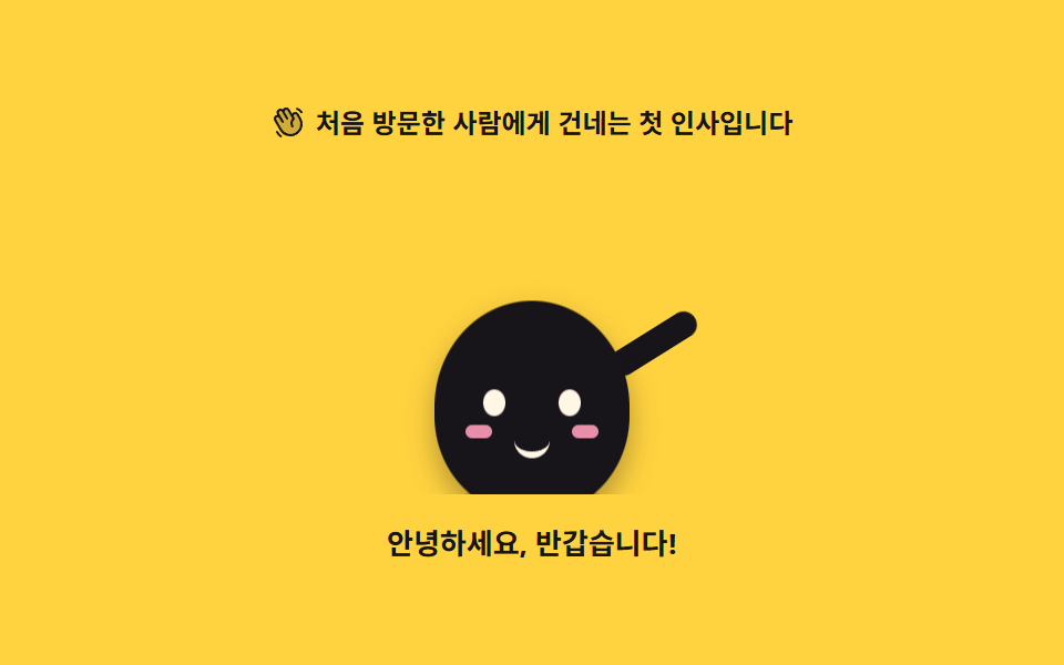
02Waving greeting
The character rises from below, swings an arm side to side, and leans its body the other way. The arm pivots at the shoulder.
Best forA welcome screen right after sign-up, or the first step that introduces the product to a new visitor
rotatetransform-originanimation-fill-modetranslateY
<svg width="0" height="0" style="position:absolute" aria-hidden="true">
  <defs>
    <symbol id="ico-hand" viewBox="0 0 256 256" fill="currentColor"><path d="M184 213.27A80 80 0 0 1 74.7 184l-40-69.32a20 20 0 0 1 34.64-20L55.08 70a20 20 0 0 1 34.65-20l6.92 12a20 20 0 0 1 34.64-20l30 52A20 20 0 0 1 196 74l17.31 30A80 80 0 0 1 184 213.27" opacity=".2"/><path d="m220.17 100l-17.31-30a28 28 0 0 0-38.24-10.25a27.7 27.7 0 0 0-9 8.34L138.2 38a28 28 0 0 0-48.48 0a28 28 0 0 0-41.57 36l1.59 2.76A27.7 27.7 0 0 0 38 80.41a28 28 0 0 0-10.24 38.25l40 69.32a87.47 87.47 0 0 0 53.43 41a88.6 88.6 0 0 0 22.92 3a88 88 0 0 0 76.06-132Zm-6.66 62.64A72 72 0 0 1 81.62 180l-40-69.32a12 12 0 0 1 20.78-12L81.63 132a8 8 0 1 0 13.85-8L62 66a12 12 0 1 1 20.78-12L114 108a8 8 0 1 0 13.85-8l-24.28-42a12 12 0 1 1 20.78-12l33.42 57.9a48 48 0 0 0-5.54 60.6a8 8 0 0 0 13.24-9a32 32 0 0 1 7.31-43.5a8 8 0 0 0 2.13-10.4L168.23 90A12 12 0 1 1 189 78l17.31 30a71.56 71.56 0 0 1 7.2 54.62ZM184.25 31.71A8 8 0 0 1 194 26a59.62 59.62 0 0 1 36.53 28l.33.57a8 8 0 1 1-13.85 8l-.33-.57a43.67 43.67 0 0 0-26.8-20.5a8 8 0 0 1-5.63-9.79M80.89 237a8 8 0 0 1-11.23 1.33A119.6 119.6 0 0 1 40.06 204a8 8 0 0 1 13.86-8a103.7 103.7 0 0 0 25.64 29.72A8 8 0 0 1 80.89 237"/></symbol>
  </defs>
</svg>
<main class="stage">
<div class="wg is-demo" id="wg">
  <p class="wg__hint">
    <svg class="wg__ico" aria-hidden="true"><use href="#ico-hand"/></svg>
    <span>The first hello a new visitor receives</span>
  </p>

  <div class="wg__floor">
    <!-- 캐릭터는 01 대기 포즈와 같은 몸·눈·볼에 팔 하나만 얹는다(피사체라 손으로 그린다).
         등장 translateY 는 바닥 아래에서 시작하므로 0프레임은 빈 무대이고,
         흔들기는 등장이 끝난 뒤 지연 + backwards 로 시작한다. -->
    <div class="wg__char" aria-label="A mascot waving hello" role="img">
      <div class="wg__riser">
        <i class="wg__arm"></i>
        <span class="wg__body">
          <i class="wg__eye wg__eye--l"></i>
          <i class="wg__eye wg__eye--r"></i>
          <i class="wg__cheek wg__cheek--l"></i>
          <i class="wg__cheek wg__cheek--r"></i>
          <i class="wg__mouth"></i>
        </span>
      </div>
      <span class="wg__shadow"></span>
    </div>
  </div>

  <p class="wg__say">Hello, welcome!</p>
</div>
</main>@use "../../../../site/static/demo-tokens" as *;
// 손 흔드는 인사 — 바닥 아래에서 올라온 캐릭터가 팔을 좌우로 흔들며 몸을 반대쪽으로 기울인다.
// 팔은 어깨(아래 끝)를 축으로 돈다. 흔들기는 등장(26%)이 끝난 뒤 시작하므로 animation-delay 와
// animation-fill-mode: backwards 를 함께 쓴다 — fill-mode 가 없으면 지연 구간에 팔이 기본 자세로
// 0프레임에 번쩍였다가 사라진다(252-08 실패표). 루프는 2s(설정 초)의 약수이고
// 복귀(팔·기울기 정지)는 88% 안에 끝난다. 100% 에서 0% 로 되돌아가는 내려가기는
// 두 프레임 사이의 루프 경계라 24장 어디에도 잡히지 않는다.
$duration: $dur-loop;
$easing: $ease-pop;
$color: $subject-ink;
@include stage($stage-yellow);
// 노랑 무대 위 글자는 잉크만 쓴다(설계 대비 표 — 크림은 노랑 위에서 AA 미달)
.wg { display: flex; flex-direction: column; align-items: center; gap: $sp-3; width: 100%; max-width: 320px; }
.wg__hint {
display: flex; align-items: center; gap: $sp-1; margin: 0;
font-weight: 700; font-size: clamp(10px, 2.8vw, 12px); color: $subject-ink;
}
.wg__ico { width: 16px; height: 16px; flex: 0 0 auto; color: $subject-ink; }
// 바닥 아래 등장을 자르는 상자 — translateY 로 내려간 몸이 무대 scrollHeight 를 부풀리지 않게 한다
.wg__floor { position: relative; width: 100%; height: 148px; overflow: hidden; display: grid; place-items: end center; }
.wg__char { position: relative; width: 150px; height: 140px; }
.wg__riser { position: absolute; inset: 0; }
// 몸 — 01 과 같은 타원. 숨은 없고, 착지 눌림과 기울기가 이 요소의 transform 하나에서 나온다.
// 기울기의 축은 발바닥(50% 100%) — 캐릭터의 발은 바닥에 붙어 있어 중심 회전보다 자연스럽다(규칙 8 예외)
.wg__body {
position: absolute; left: 50%; bottom: 0; width: 88px; height: 96px;
margin-left: -44px;
border-radius: 50% 50% 46% 46%;
background: $color;
transform-origin: 50% 100%;
box-shadow: $shadow-press;
}
.wg__eye {
position: absolute; top: 40px; width: 10px; height: 12px;
border-radius: 50%; background: $subject-cream;
}
.wg__eye--l { left: 22px; }
.wg__eye--r { right: 22px; }
.wg__cheek {
position: absolute; top: 56px; width: 12px; height: 6px;
border-radius: $r-pill; background: $subject-pink; opacity: .9;
}
.wg__cheek--l { left: 14px; }
.wg__cheek--r { right: 14px; }
.wg__mouth {
position: absolute; top: 60px; left: 50%; width: 16px; height: 8px;
margin-left: -8px;
border-bottom: 3px solid $subject-cream;
border-radius: 0 0 $r-pill $r-pill;
}
// 팔 — 몸 뒤에 붙는 캡슐 하나. 축은 어깨(아래 끝, 50% 95%)다: 팔은 어깨에 붙어 있어
// 중심이 아니라 붙는 지점에서 돌아간다(규칙 8 예외). 기본 자세는 팔을 든 인사 모양.
.wg__arm {
position: absolute; left: 107px; top: 32px; width: 12px; height: 44px;
border-radius: $r-pill; background: $color;
transform-origin: 50% 95%;
transform: rotate(24deg);
}
// 그림자는 바닥에 눌린 면 — 몸과 함께 올라오지 않고, 착지할 때 넓어진다
.wg__shadow {
position: absolute; left: 50%; bottom: -6px; width: 72px; height: 10px;
margin-left: -36px;
border-radius: 50%;
background: rgba(23, 20, 26, .18);
}
.wg__say { margin: 0; font-weight: 700; font-size: clamp(11px, 3vw, 13px); color: $subject-ink; }
// ── 미리보기 루프 ────────────────────────────────────────────
// 등장 0~26% · 인사 28~88% · 정지 88~100%. 한 바퀴가 2s 다.
@keyframes wgRise {
0% { transform: translateY(36px); }
26%, 100% { transform: translateY(0); }
}
@keyframes wgWave {
0%, 28% { transform: rotate(58deg); }
32% { transform: rotate(24deg); }
40% { transform: rotate(52deg); }
48% { transform: rotate(24deg); }
56% { transform: rotate(52deg); }
64% { transform: rotate(24deg); }
72% { transform: rotate(52deg); }
80% { transform: rotate(24deg); }
88%, 100% { transform: rotate(24deg); }
}
// 몸 기울기는 팔과 반대 위상(팔이 바깥으로 가면 몸은 안쪽으로) + 착지 눌림 한 번
@keyframes wgTilt {
0%, 28% { transform: rotate(0deg) scaleY(1); }
31% { transform: rotate(3deg) scaleY(.94); }
36% { transform: rotate(-3deg) scaleY(1); }
44% { transform: rotate(3deg) scaleY(1); }
52% { transform: rotate(-3deg) scaleY(1); }
60% { transform: rotate(3deg) scaleY(1); }
68% { transform: rotate(-3deg) scaleY(1); }
76% { transform: rotate(3deg) scaleY(1); }
88%, 100% { transform: rotate(0deg) scaleY(1); }
}
@keyframes wgShadow {
0% { transform: scaleX(.4); }
26%, 100% { transform: scaleX(1); }
}
// 등장 애니메이션에 fill-mode backwards — 0프레임이 완성 상태로 번쩍이지 않게(작업지시)
.wg.is-demo .wg__riser {
animation-name: wgRise;
animation-duration: $duration;
animation-timing-function: $easing;
animation-iteration-count: infinite;
animation-fill-mode: backwards;
}
// 팔·몸은 560ms(26%) 뒤 시작 — 지연 구간은 0% 키프레임(팔 내린 자세)으로 채운다
.wg.is-demo .wg__arm {
animation-name: wgWave;
animation-duration: $duration;
animation-timing-function: $easing;
animation-iteration-count: infinite;
animation-delay: 560ms;
animation-fill-mode: backwards;
}
.wg.is-demo .wg__body {
animation-name: wgTilt;
animation-duration: $duration;
animation-timing-function: $easing;
animation-iteration-count: infinite;
animation-delay: 560ms;
animation-fill-mode: backwards;
}
.wg.is-demo .wg__shadow {
animation-name: wgShadow;
animation-duration: $duration;
animation-timing-function: $easing;
animation-iteration-count: infinite;
animation-fill-mode: backwards;
}
@media (max-width: 340px) {
.wg { gap: $sp-2; }
.wg__floor { height: 118px; }
.wg__char { width: 118px; height: 112px; }
.wg__body { width: 72px; height: 80px; margin-left: -36px; }
.wg__eye { top: 33px; width: 9px; height: 11px; }
.wg__eye--l { left: 18px; }
.wg__eye--r { right: 18px; }
.wg__cheek { top: 47px; width: 10px; height: 5px; }
.wg__cheek--l { left: 12px; }
.wg__cheek--r { right: 12px; }
.wg__mouth { top: 50px; width: 14px; height: 7px; margin-left: -7px; }
.wg__arm { left: 84px; top: 24px; width: 10px; height: 36px; }
.wg__shadow { width: 60px; margin-left: -30px; }
}
// reduce 에서는 든 인사 자세 한 장으로 세운다(애니메이션을 꺼도 화면이 성립한다).
// 특이도에 밀리지 않게 !important 로 끈다.
@media (prefers-reduced-motion: reduce) {
.wg.is-demo .wg__riser,
.wg.is-demo .wg__arm,
.wg.is-demo .wg__body,
.wg.is-demo .wg__shadow { animation: none !important; }
}html, body {
margin: 0;
overflow: hidden;
}
.stage {
box-sizing: border-box;
min-height: 100vh;
display: grid;
place-items: center;
margin: 0;
background: #ffd23f;
font-family: -apple-system, "Segoe UI", "Noto Sans KR", sans-serif;
padding: clamp(8px, 4vw, 24px);
}
.wg {
display: flex;
flex-direction: column;
align-items: center;
gap: 12px;
width: 100%;
max-width: 320px;
}
.wg__hint {
display: flex;
align-items: center;
gap: 4px;
margin: 0;
font-weight: 700;
font-size: clamp(10px, 2.8vw, 12px);
color: #17141a;
}
.wg__ico {
width: 16px;
height: 16px;
flex: 0 0 auto;
color: #17141a;
}
.wg__floor {
position: relative;
width: 100%;
height: 148px;
overflow: hidden;
display: grid;
place-items: end center;
}
.wg__char {
position: relative;
width: 150px;
height: 140px;
}
.wg__riser {
position: absolute;
inset: 0;
}
.wg__body {
position: absolute;
left: 50%;
bottom: 0;
width: 88px;
height: 96px;
margin-left: -44px;
border-radius: 50% 50% 46% 46%;
background: #17141a;
transform-origin: 50% 100%;
box-shadow: 0 6px 12px rgba(23, 20, 26, 0.32);
}
.wg__eye {
position: absolute;
top: 40px;
width: 10px;
height: 12px;
border-radius: 50%;
background: #fff7e6;
}
.wg__eye--l {
left: 22px;
}
.wg__eye--r {
right: 22px;
}
.wg__cheek {
position: absolute;
top: 56px;
width: 12px;
height: 6px;
border-radius: 999px;
background: #ff9ebb;
opacity: 0.9;
}
.wg__cheek--l {
left: 14px;
}
.wg__cheek--r {
right: 14px;
}
.wg__mouth {
position: absolute;
top: 60px;
left: 50%;
width: 16px;
height: 8px;
margin-left: -8px;
border-bottom: 3px solid #fff7e6;
border-radius: 0 0 999px 999px;
}
.wg__arm {
position: absolute;
left: 107px;
top: 32px;
width: 12px;
height: 44px;
border-radius: 999px;
background: #17141a;
transform-origin: 50% 95%;
transform: rotate(24deg);
}
.wg__shadow {
position: absolute;
left: 50%;
bottom: -6px;
width: 72px;
height: 10px;
margin-left: -36px;
border-radius: 50%;
background: rgba(23, 20, 26, 0.18);
}
.wg__say {
margin: 0;
font-weight: 700;
font-size: clamp(11px, 3vw, 13px);
color: #17141a;
}
@keyframes wgRise {
0% {
transform: translateY(36px);
}
26%, 100% {
transform: translateY(0);
}
}
@keyframes wgWave {
0%, 28% {
transform: rotate(58deg);
}
32% {
transform: rotate(24deg);
}
40% {
transform: rotate(52deg);
}
48% {
transform: rotate(24deg);
}
56% {
transform: rotate(52deg);
}
64% {
transform: rotate(24deg);
}
72% {
transform: rotate(52deg);
}
80% {
transform: rotate(24deg);
}
88%, 100% {
transform: rotate(24deg);
}
}
@keyframes wgTilt {
0%, 28% {
transform: rotate(0deg) scaleY(1);
}
31% {
transform: rotate(3deg) scaleY(0.94);
}
36% {
transform: rotate(-3deg) scaleY(1);
}
44% {
transform: rotate(3deg) scaleY(1);
}
52% {
transform: rotate(-3deg) scaleY(1);
}
60% {
transform: rotate(3deg) scaleY(1);
}
68% {
transform: rotate(-3deg) scaleY(1);
}
76% {
transform: rotate(3deg) scaleY(1);
}
88%, 100% {
transform: rotate(0deg) scaleY(1);
}
}
@keyframes wgShadow {
0% {
transform: scaleX(0.4);
}
26%, 100% {
transform: scaleX(1);
}
}
.wg.is-demo .wg__riser {
animation-name: wgRise;
animation-duration: 2s;
animation-timing-function: cubic-bezier(0.2, 1.4, 0.4, 1);
animation-iteration-count: infinite;
animation-fill-mode: backwards;
}
.wg.is-demo .wg__arm {
animation-name: wgWave;
animation-duration: 2s;
animation-timing-function: cubic-bezier(0.2, 1.4, 0.4, 1);
animation-iteration-count: infinite;
animation-delay: 560ms;
animation-fill-mode: backwards;
}
.wg.is-demo .wg__body {
animation-name: wgTilt;
animation-duration: 2s;
animation-timing-function: cubic-bezier(0.2, 1.4, 0.4, 1);
animation-iteration-count: infinite;
animation-delay: 560ms;
animation-fill-mode: backwards;
}
.wg.is-demo .wg__shadow {
animation-name: wgShadow;
animation-duration: 2s;
animation-timing-function: cubic-bezier(0.2, 1.4, 0.4, 1);
animation-iteration-count: infinite;
animation-fill-mode: backwards;
}
@media (max-width: 340px) {
.wg {
gap: 8px;
}
.wg__floor {
height: 118px;
}
.wg__char {
width: 118px;
height: 112px;
}
.wg__body {
width: 72px;
height: 80px;
margin-left: -36px;
}
.wg__eye {
top: 33px;
width: 9px;
height: 11px;
}
.wg__eye--l {
left: 18px;
}
.wg__eye--r {
right: 18px;
}
.wg__cheek {
top: 47px;
width: 10px;
height: 5px;
}
.wg__cheek--l {
left: 12px;
}
.wg__cheek--r {
right: 12px;
}
.wg__mouth {
top: 50px;
width: 14px;
height: 7px;
margin-left: -7px;
}
.wg__arm {
left: 84px;
top: 24px;
width: 10px;
height: 36px;
}
.wg__shadow {
width: 60px;
margin-left: -30px;
}
}
@media (prefers-reduced-motion: reduce) {
.wg.is-demo .wg__riser,
.wg.is-demo .wg__arm,
.wg.is-demo .wg__body,
.wg.is-demo .wg__shadow {
animation: none !important;
}
}// WaveGreeting — vanilla 판(run/300/demo/02-mascot-wave-greeting/index.html) 의 React 포트.
// 이 데모는 CSS 만으로 성립해서 상태가 없다 — 훅 없이 그린다.
// duration·easing·color 는 props 로 받아 CSS 변수로 넘긴다(기본값은 vanilla 의 셋과 같다).
import type { CSSProperties } from "react";
import styles from "./WaveGreeting.module.scss";
export type WaveGreetingProps = {
duration?: number;
easing?: string;
color?: string;
};
type Vars = CSSProperties & { "--duration"?: string; "--easing"?: string; "--color"?: string };
const HINT = "처음 방문한 사람에게 건네는 첫 인사입니다";
const SAY = "안녕하세요, 반갑습니다!";
const CHAR_LABEL = "손을 흔들어 인사하는 마스코트";
export default function WaveGreeting({
duration = 2000,
easing = "cubic-bezier(.2, 1.4, .4, 1)",
color = "#17141a",
}: WaveGreetingProps) {
const vars: Vars = { "--duration": `${duration}ms`, "--easing": easing, "--color": color };
return (
<main className={styles.stage}>
<svg width="0" height="0" style={{ position: "absolute" }} aria-hidden="true">
<defs>
<symbol id="ico-hand" viewBox="0 0 256 256" fill="currentColor"><path d="M184 213.27A80 80 0 0 1 74.7 184l-40-69.32a20 20 0 0 1 34.64-20L55.08 70a20 20 0 0 1 34.65-20l6.92 12a20 20 0 0 1 34.64-20l30 52A20 20 0 0 1 196 74l17.31 30A80 80 0 0 1 184 213.27" opacity=".2" /><path d="m220.17 100l-17.31-30a28 28 0 0 0-38.24-10.25a27.7 27.7 0 0 0-9 8.34L138.2 38a28 28 0 0 0-48.48 0a28 28 0 0 0-41.57 36l1.59 2.76A27.7 27.7 0 0 0 38 80.41a28 28 0 0 0-10.24 38.25l40 69.32a87.47 87.47 0 0 0 53.43 41a88.6 88.6 0 0 0 22.92 3a88 88 0 0 0 76.06-132Zm-6.66 62.64A72 72 0 0 1 81.62 180l-40-69.32a12 12 0 0 1 20.78-12L81.63 132a8 8 0 1 0 13.85-8L62 66a12 12 0 1 1 20.78-12L114 108a8 8 0 1 0 13.85-8l-24.28-42a12 12 0 1 1 20.78-12l33.42 57.9a48 48 0 0 0-5.54 60.6a8 8 0 0 0 13.24-9a32 32 0 0 1 7.31-43.5a8 8 0 0 0 2.13-10.4L168.23 90A12 12 0 1 1 189 78l17.31 30a71.56 71.56 0 0 1 7.2 54.62ZM184.25 31.71A8 8 0 0 1 194 26a59.62 59.62 0 0 1 36.53 28l.33.57a8 8 0 1 1-13.85 8l-.33-.57a43.67 43.67 0 0 0-26.8-20.5a8 8 0 0 1-5.63-9.79M80.89 237a8 8 0 0 1-11.23 1.33A119.6 119.6 0 0 1 40.06 204a8 8 0 0 1 13.86-8a103.7 103.7 0 0 0 25.64 29.72A8 8 0 0 1 80.89 237" /></symbol>
</defs>
</svg>
<div className={`${styles.root} ${styles.isDemo}`} style={vars}>
<p className={styles.hint}>
<svg className={styles.ico} aria-hidden="true"><use href="#ico-hand" /></svg>
<span>{HINT}</span>
</p>
<div className={styles.floor}>
<div className={styles.char} aria-label={CHAR_LABEL} role="img">
<div className={styles.riser}>
<i className={styles.arm}></i>
<span className={styles.body}>
<i className={`${styles.eye} ${styles.eyeL}`}></i>
<i className={`${styles.eye} ${styles.eyeR}`}></i>
<i className={`${styles.cheek} ${styles.cheekL}`}></i>
<i className={`${styles.cheek} ${styles.cheekR}`}></i>
<i className={styles.mouth}></i>
</span>
</div>
<span className={styles.shadow}></span>
</div>
</div>
<p className={styles.say}>{SAY}</p>
</div>
</main>
);
}02 Waving greeting — Measured area 5.653% · moving frames 16/23Original by GODRICH · SCSS and React ship in the zip · Mascot Animation: 9 CSS Parts from Wave to Sleep
The post this demo lives in
 Mascot Animation: 9 CSS Parts from Wave to SleepA mascot animation is a small drawn character that reacts to what the screen is doing: waving at a new visitor, pointing See all demos in this post