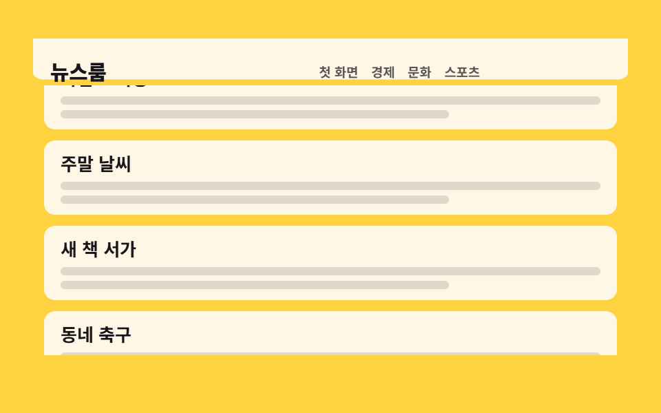
04Header that folds smaller as you scroll
As the page scrolls past, the empty bar background and the logo shrink together and the page is pulled up by that much, then it all restores on the way back.
Best forLong-scrolling lists and magazine-style pages
scaleYIntersectionObservertransform-origin
<main class="stage">
  <div class="ns is-demo">
    <header class="ns__head">
      <div class="ns__inner">
        <p class="ns__brand">Newsroom</p>
        <nav class="ns__nav">
          <a class="ns__link" href="#">Home</a>
          <a class="ns__link" href="#">Business</a>
          <a class="ns__link" href="#">Culture</a>
          <a class="ns__link" href="#">Sports</a>
        </nav>
      </div>
    </header>
    <div class="ns__main">
      <div class="ns__feed" tabindex="0">
        <div class="ns__sentinel" aria-hidden="true"></div>
        <div class="ns__track">
          <article class="ns__card">
            <h3 class="ns__t">Morning brief</h3>
            <i class="ns__bar"></i><i class="ns__bar ns__bar--s"></i>
          </article>
          <article class="ns__card">
            <h3 class="ns__t">Weekend weather</h3>
            <i class="ns__bar"></i><i class="ns__bar ns__bar--s"></i>
          </article>
          <article class="ns__card">
            <h3 class="ns__t">New books shelf</h3>
            <i class="ns__bar"></i><i class="ns__bar ns__bar--s"></i>
          </article>
          <article class="ns__card">
            <h3 class="ns__t">Local football</h3>
            <i class="ns__bar"></i><i class="ns__bar ns__bar--s"></i>
          </article>
          <article class="ns__card">
            <h3 class="ns__t">Metro delays</h3>
            <i class="ns__bar"></i><i class="ns__bar ns__bar--s"></i>
          </article>
          <article class="ns__card">
            <h3 class="ns__t">Night opening</h3>
            <i class="ns__bar"></i><i class="ns__bar ns__bar--s"></i>
          </article>
        </div>
      </div>
    </div>
  </div>
</main>@use "../../../../site/static/demo-tokens" as *;
// ── 변수 3개 ──────────────────────────────────────────
$duration: $dur-loop; // 격자 미리보기 루프 한 바퀴 2초
$easing: $ease-out; // 스크롤 관성 — 빠르게 시작해 천천히 멈춘다
$color: $subject-ink; // 노랑 무대 위 브랜드·기사 제목 글자
@include stage($stage-yellow);
.ns, .ns * { box-sizing: border-box; }
.ns { width: min(432px, 94vw); }
// ── 헤더 ── 배경은 비어 있는 ::before 막대가 담당한다(absolute, 좌우 0 위 0).
// 축소는 막대 scaleY · 내용 scale · 본문 translateY 셋 다 transform 이라 reflow 가 0 — 이게 이 데모의 원리.
.ns__head { position: relative; height: 48px; }
.ns__head::before {
content: "";
position: absolute;
top: 0; left: 0; right: 0; bottom: 0;
background: $subject-cream;
border-radius: 0 0 $r-sm $r-sm;
transform: scaleY(1);
transform-origin: top; // 규칙8: 헤더배경 top에서 줄어듦
transition: transform 220ms $ease-out;
}
.ns__inner {
position: relative;
z-index: 1;
display: flex;
align-items: center;
justify-content: space-between;
height: 100%;
padding: 0 $sp-4;
transform: scale(1);
transform-origin: left center; // 규칙8: 왼쪽 브랜드 고정 축소
transition: transform 220ms $ease-out;
}
.ns__brand { margin: 0; color: $color; font-size: 19px; line-height: 24px; font-weight: 800; }
.ns__nav { display: flex; gap: $sp-3; }
.ns__link { color: rgba(23, 20, 26, .72); font-size: 12px; line-height: 16px; font-weight: 600; text-decoration: none; }
// ── 실제 동작: 센티넬이 화면에서 벗어나면 헤더에 .is-compact 가 붙는다(JS) ──
.ns__head.is-compact::before { transform: scaleY(.62); }
.ns__head.is-compact .ns__inner { transform: scale(.78); }
.ns__head.is-compact + .ns__main { transform: translateY(-14px); }
.ns__main { transition: transform 220ms $ease-out; }
.ns__feed {
height: min(200px, calc(100vh - 104px));
overflow-y: auto;
scrollbar-width: none;
&::-webkit-scrollbar { display: none; }
}
.ns__sentinel { height: 1px; }
.ns__track { display: grid; gap: $sp-2; padding: $sp-2; }
.ns__card { padding: $sp-2 $sp-3; background: $subject-cream; border-radius: $r-sm; }
.ns__t { margin: 0 0 $sp-1; color: $color; font-size: 13px; line-height: 18px; font-weight: 700; }
.ns__bar { display: block; height: 6px; margin-top: $sp-1; border-radius: $r-xs; background: rgba(23, 20, 26, .14); }
.ns__bar--s { width: 72%; }
// ── 격자 미리보기 루프 ──
// 움직이는 건 안쪽 트랙뿐 — 스크롤 상자(viewport)에 transform 을 걸면
// 100% 기준이 상자 폭이 되어 내용이 통째로 날아간다(051 실측).
// 헤더 축소는 steps(1, end) 컷 — 반투명하게 겹치는 중간 프레임이 없다.
// 0~36% 평화 → 40% 컷(축소가 최대 변화 프레임) → 74% 유지 → 78~88% 원상복귀.
.ns.is-demo .ns__track {
animation-name: ns-scroll;
animation-duration: $duration;
animation-timing-function: $easing;
animation-iteration-count: infinite;
}
.ns.is-demo .ns__head::before,
.ns.is-demo .ns__inner,
.ns.is-demo .ns__main {
animation-duration: $duration;
animation-timing-function: steps(1, end);
animation-iteration-count: infinite;
}
.ns.is-demo .ns__head::before { animation-name: ns-cut-bar; }
.ns.is-demo .ns__inner { animation-name: ns-cut-inner; }
.ns.is-demo .ns__main { animation-name: ns-cut-main; }
@keyframes ns-scroll {
0%, 36% { transform: translateY(0); }
74%, 78% { transform: translateY(-132px); }
88%, 100% { transform: translateY(0); }
}
@keyframes ns-cut-bar {
0% { transform: scaleY(1); }
40% { transform: scaleY(.62); }
78%, 100% { transform: scaleY(1); }
}
@keyframes ns-cut-inner {
0% { transform: scale(1); }
40% { transform: scale(.78); }
78%, 100% { transform: scale(1); }
}
@keyframes ns-cut-main {
0% { transform: translateY(0); }
40% { transform: translateY(-14px); }
78%, 100% { transform: translateY(0); }
}
@media (max-width: 340px) {
.ns__inner { padding: 0 $sp-3; }
.ns__brand { font-size: 17px; line-height: 22px; }
.ns__nav { gap: $sp-2; }
.ns__link { font-size: 11px; }
.ns__card { padding: $sp-2; }
.ns__t { font-size: 12px; }
}
@media (prefers-reduced-motion: reduce) {
.ns.is-demo .ns__track,
.ns.is-demo .ns__head::before,
.ns.is-demo .ns__inner,
.ns.is-demo .ns__main { animation: none !important; }
.ns.is-demo .ns__track { transform: none !important; }
.ns__head::before, .ns__inner, .ns__main { transition: none !important; }
}html, body {
margin: 0;
overflow: hidden;
}
.stage {
box-sizing: border-box;
min-height: 100vh;
display: grid;
place-items: center;
margin: 0;
background: #ffd23f;
font-family: -apple-system, "Segoe UI", "Noto Sans KR", sans-serif;
padding: clamp(8px, 4vw, 24px);
}
.ns, .ns * {
box-sizing: border-box;
}
.ns {
width: min(432px, 94vw);
}
.ns__head {
position: relative;
height: 48px;
}
.ns__head::before {
content: "";
position: absolute;
top: 0;
left: 0;
right: 0;
bottom: 0;
background: #fff7e6;
border-radius: 0 0 8px 8px;
transform: scaleY(1);
transform-origin: top;
transition: transform 220ms ease-out;
}
.ns__inner {
position: relative;
z-index: 1;
display: flex;
align-items: center;
justify-content: space-between;
height: 100%;
padding: 0 16px;
transform: scale(1);
transform-origin: left center;
transition: transform 220ms ease-out;
}
.ns__brand {
margin: 0;
color: #17141a;
font-size: 19px;
line-height: 24px;
font-weight: 800;
}
.ns__nav {
display: flex;
gap: 12px;
}
.ns__link {
color: rgba(23, 20, 26, 0.72);
font-size: 12px;
line-height: 16px;
font-weight: 600;
text-decoration: none;
}
.ns__head.is-compact::before {
transform: scaleY(0.62);
}
.ns__head.is-compact .ns__inner {
transform: scale(0.78);
}
.ns__head.is-compact + .ns__main {
transform: translateY(-14px);
}
.ns__main {
transition: transform 220ms ease-out;
}
.ns__feed {
height: min(200px, 100vh - 104px);
overflow-y: auto;
scrollbar-width: none;
}
.ns__feed::-webkit-scrollbar {
display: none;
}
.ns__sentinel {
height: 1px;
}
.ns__track {
display: grid;
gap: 8px;
padding: 8px;
}
.ns__card {
padding: 8px 12px;
background: #fff7e6;
border-radius: 8px;
}
.ns__t {
margin: 0 0 4px;
color: #17141a;
font-size: 13px;
line-height: 18px;
font-weight: 700;
}
.ns__bar {
display: block;
height: 6px;
margin-top: 4px;
border-radius: 4px;
background: rgba(23, 20, 26, 0.14);
}
.ns__bar--s {
width: 72%;
}
.ns.is-demo .ns__track {
animation-name: ns-scroll;
animation-duration: 2s;
animation-timing-function: ease-out;
animation-iteration-count: infinite;
}
.ns.is-demo .ns__head::before,
.ns.is-demo .ns__inner,
.ns.is-demo .ns__main {
animation-duration: 2s;
animation-timing-function: steps(1, end);
animation-iteration-count: infinite;
}
.ns.is-demo .ns__head::before {
animation-name: ns-cut-bar;
}
.ns.is-demo .ns__inner {
animation-name: ns-cut-inner;
}
.ns.is-demo .ns__main {
animation-name: ns-cut-main;
}
@keyframes ns-scroll {
0%, 36% {
transform: translateY(0);
}
74%, 78% {
transform: translateY(-132px);
}
88%, 100% {
transform: translateY(0);
}
}
@keyframes ns-cut-bar {
0% {
transform: scaleY(1);
}
40% {
transform: scaleY(0.62);
}
78%, 100% {
transform: scaleY(1);
}
}
@keyframes ns-cut-inner {
0% {
transform: scale(1);
}
40% {
transform: scale(0.78);
}
78%, 100% {
transform: scale(1);
}
}
@keyframes ns-cut-main {
0% {
transform: translateY(0);
}
40% {
transform: translateY(-14px);
}
78%, 100% {
transform: translateY(0);
}
}
@media (max-width: 340px) {
.ns__inner {
padding: 0 12px;
}
.ns__brand {
font-size: 17px;
line-height: 22px;
}
.ns__nav {
gap: 8px;
}
.ns__link {
font-size: 11px;
}
.ns__card {
padding: 8px;
}
.ns__t {
font-size: 12px;
}
}
@media (prefers-reduced-motion: reduce) {
.ns.is-demo .ns__track,
.ns.is-demo .ns__head::before,
.ns.is-demo .ns__inner,
.ns.is-demo .ns__main {
animation: none !important;
}
.ns.is-demo .ns__track {
transform: none !important;
}
.ns__head::before, .ns__inner, .ns__main {
transition: none !important;
}
}// 실제 동작: 스크롤 상자 맨 위의 센티넬이 화면에서 벗어나는 순간이 축소 신호다.
// 축소는 전부 transform 이라 리플로우가 0이다.
var ns = document.querySelector('.ns');
var feed = ns.querySelector('.ns__feed');
var head = ns.querySelector('.ns__head');
function stopDemo() { ns.classList.remove('is-demo'); } // 사람이 만졌으니 자동 루프를 끈다
ns.addEventListener('pointerdown', stopDemo);
feed.addEventListener('scroll', stopDemo, { passive: true });
new IntersectionObserver(function (entries) {
head.classList.toggle('is-compact', !entries[0].isIntersecting);
}, { root: feed }).observe(ns.querySelector('.ns__sentinel'));import { useState, useEffect, useRef } from "react";
import type { CSSProperties } from "react";
import styles from "./ShrinkScrollHeader.module.scss";
export type ShrinkScrollHeaderProps = {
labels?: { brand?: string; nav?: string[]; articles?: string[] };
/** 격자 미리보기용 2초 자동 루프. 사람이 손대면 꺼진다 */
demo?: boolean;
duration?: number;
easing?: string;
color?: string;
};
type Vars = CSSProperties & { "--duration"?: string; "--easing"?: string; "--color"?: string };
type Box<T> = { current: T | null };
const NAV = ["Home", "Business", "Culture", "Sports"];
const ARTICLES = ["Morning briefing", "Weekend weather", "New book shelf", "Neighborhood soccer", "Subway delays", "Night opening"];
export default function ShrinkScrollHeader({
labels,
demo = true,
duration = 2000,
easing = "ease-out",
color = "#17141a",
}: ShrinkScrollHeaderProps) {
const brand = labels?.brand ?? "Newsroom";
const nav = labels?.nav ?? NAV;
const articles = labels?.articles ?? ARTICLES;
const [live, setLive] = useState(demo);
const [compact, setCompact] = useState(false);
const feedRef: Box<HTMLDivElement> = useRef(null);
const sentRef: Box<HTMLDivElement> = useRef(null);
// 센티넬이 스크롤 상자 밖으로 나가는 순간이 축소 신호다 — 축소는 전부 transform
useEffect(() => {
const feed = feedRef.current;
const sent = sentRef.current;
if (feed === null || sent === null) return;
const io = new IntersectionObserver(
(entries) => entries.forEach((e) => setCompact(!e.isIntersecting)),
{ root: feed }
);
io.observe(sent);
return () => io.disconnect();
}, []);
function touch() {
setLive(false); // 사람이 만졌으니 자동 루프를 끈다
}
const vars: Vars = { "--duration": `${duration}ms`, "--easing": easing, "--color": color };
const cls = [styles.ns, live ? styles.isDemo : "", compact ? styles.isCompact : ""].filter(Boolean).join(" ");
return (
<section className={cls} style={vars} onPointerDown={touch}>
<header className={styles.head}>
<div className={styles.inner}>
<p className={styles.brand}>{brand}</p>
<nav className={styles.nav}>
{nav.map((item) => (
<a className={styles.link} key={item} href="#">{item}</a>
))}
</nav>
</div>
</header>
<div className={styles.main}>
<div className={styles.feed} ref={feedRef} tabIndex={0} onScroll={touch}>
<div className={styles.sentinel} aria-hidden="true" ref={sentRef} />
<div className={styles.track}>
{articles.map((t) => (
<article className={styles.card} key={t}>
<h3 className={styles.t}>{t}</h3>
<i className={styles.bar} />
<i className={styles.barS} />
</article>
))}
</div>
</div>
</div>
</section>
);
}04 Header that folds smaller as you scroll — Measured area 63.282% · moving frames 14/23Original by GODRICH · SCSS and React ship in the zip · 9 mega menu ui patterns, link list to site map
The post this demo lives in
 9 mega menu ui patterns, link list to site mapA mega menu ui opens a screen-wide panel from one top-row item, turning the site into one readable map. The nine running See all demos in this post