01Pattern-sea hero
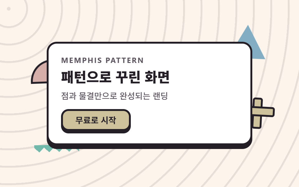
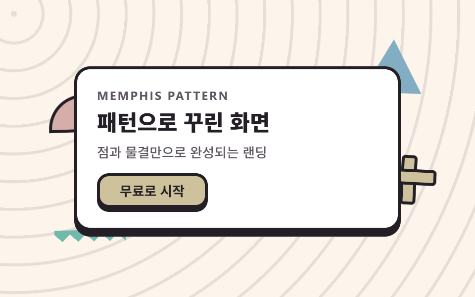
A white message panel floats over a ground of concentric ripples while a half circle, a triangle, and a cross shape drift around it, each on its own phase.
Best forFirst screens for startup and education services
repeating-radial-gradientclip-pathanimation-delay
<main class="stage">
  <section class="herom">
    <span class="herom__shape herom__shape--half" aria-hidden="true"></span>
    <span class="herom__shape herom__shape--tri" aria-hidden="true"></span>
    <span class="herom__shape herom__shape--cross" aria-hidden="true"></span>
    <span class="herom__shape herom__shape--zig" aria-hidden="true"></span>
    <div class="herom__panel">
      <p class="herom__eyebrow">Memphis pattern</p>
      <h1 class="herom__title">A screen built from patterns</h1>
      <p class="herom__desc">A landing page made of dots and waves</p>
      <button class="herom__cta" type="button">Start free</button>
    </div>
  </section>
</main>
@use "../../../../site/static/demo-tokens" as *;
// 멤피스 팔레트 — 밝은 코랄·레몬·스카이. 글자는 전부 잉크(밝은 면 위 검은 글자가 멤피스의 원칙).
// 대비 실측(WCAG 상대휘도 공식): ink/base 14.88:1 · ink/sheet 16.17:1 · stone/base 6.59:1 · ink/coral 5.29:1
$mem-base: #fdf4ec;
$mem-sheet: #ffffff;
$mem-ink: #241f26;
$mem-stone: #5d5560;
$mem-coral: #d5aea9;
$mem-lemon: #cec29c;
$mem-sky: #82adc2;
$mem-mint: #71b9ab;
$mem-pink: #ebd6db;
$duration: $dur-loop; // 도형 하나가 바다에서 떠오르는 한 주기
$easing: $ease-out; // 부유는 튀지 않고 같은 속도로 왕복한다
$color: $mem-coral; // 반원 형상의 대표색
@include stage($mem-base);
// 무대 자체가 점 무늬 바다 — 반복 반경 그라디언트 한 줄로 타일을 만든다
.stage {
background-image: repeating-radial-gradient(circle at 14px 14px, rgba($mem-ink, .1) 0 2.5px, transparent 3.5px 28px);
}
.herom {
position: relative;
width: clamp(224px, 72vw, 330px);
isolation: isolate;
}
// 판 주변의 멤피스 형상 — 같은 2초 주기에 서로 다른 위상(음수 delay)으로 부유한다
.herom__shape {
position: absolute;
z-index: 0;
animation: shapeFloat $duration $easing infinite;
}
.herom__shape--half {
left: -26px;
top: 30px;
width: 64px;
height: 32px;
border-radius: $r-pill $r-pill 0 0; // 반원 — 파일 값은 알약 토큰
background: $color;
border: 3px solid $mem-ink;
animation-delay: -.5s;
}
.herom__shape--tri {
right: -22px;
top: -18px;
width: 60px;
height: 54px;
background: $mem-sky;
clip-path: polygon(50% 0, 100% 100%, 0 100%); // 삼각형 — 외곽선 대신 면이 주역
animation-delay: -1s;
}
// 십자 — 가로·세로 막대 두 개로 만든다(손그림 아이콘이 아니라 순수 장식 도형)
.herom__shape--cross {
right: -30px;
bottom: 22px;
width: 44px;
height: 44px;
animation-delay: -1.5s;
}
.herom__shape--cross::before,
.herom__shape--cross::after {
content: "";
position: absolute;
background: $mem-lemon;
border: 3px solid $mem-ink;
border-radius: $r-xs;
}
.herom__shape--cross::before { left: 50%; top: 0; width: 10px; height: 100%; transform: translateX(-50%); }
.herom__shape--cross::after { top: 50%; left: 0; height: 10px; width: 100%; transform: translateY(-50%); }
// 지그재그 줄 — 원뿔 그라디언트 톱니 한 줄(07 구분선과 같은 재료)
.herom__shape--zig {
left: -20px;
bottom: -14px;
width: 72px;
height: 12px;
background: conic-gradient(from 315deg at 50% 100%, $mem-mint 0 90deg, transparent 90deg 360deg) 0 0 / 16px 12px repeat-x;
}
// 흰 안내판 — 무늬 바다 위 본문은 반드시 흰 판 위에 올린다(대비 확보)
.herom__panel {
position: relative;
z-index: 1;
box-sizing: border-box;
display: flex;
flex-direction: column;
align-items: flex-start;
gap: $sp-2;
padding: $sp-5;
border-radius: $r-card;
background: $mem-sheet;
border: 3px solid $mem-ink;
box-shadow: 0 6px 0 $mem-ink; // 딱 붙은 그림자 = 멤피스의 두께
}
.herom__eyebrow {
margin: 0;
color: $mem-stone;
font-weight: 700; font-size: clamp(10px, 2.6vw, 12px); line-height: 1;
font-family: inherit;
letter-spacing: .12em;
text-transform: uppercase;
}
.herom__title {
margin: 0;
color: $mem-ink;
font-weight: 800; font-size: clamp(18px, 4.6vw, 27px); line-height: 1.2;
font-family: inherit;
}
.herom__desc {
margin: 0;
color: $mem-stone;
font-weight: 500; font-size: clamp(12px, 2.8vw, 14px); line-height: 1.4;
font-family: inherit;
}
.herom__cta {
margin-top: $sp-1;
border: 3px solid $mem-ink;
border-radius: $r-control;
background: $mem-lemon;
color: $mem-ink;
padding: $sp-2 $sp-5;
font-weight: 700; font-size: clamp(12px, 2.8vw, 14px); line-height: 1;
font-family: inherit;
box-shadow: 0 4px 0 $mem-ink;
}
.herom__cta:active { transform: translateY(4px); box-shadow: 0 0 0 $mem-ink; }
.herom__cta:focus-visible { outline: 3px solid $mem-sky; outline-offset: 2px; }
// 데모: 네 형상이 서로 반대 위상으로 왕복한다 — 바다 위에서 서로 엇갈려 떠다니는 것처럼 보인다
@keyframes shapeFloat {
0%, 100% { transform: translateY(0) rotate(-3deg); }
50% { transform: translateY(-12px) rotate(4deg); }
}
@media (max-width: 340px), (max-height: 220px) {
.herom { width: 208px; }
.herom__panel { padding: $sp-3 $sp-4; gap: $sp-1; }
.herom__eyebrow { display: none; }
.herom__title { font-size: 17px; line-height: 1.15; }
.herom__desc { display: none; }
.herom__cta { padding: $sp-1 $sp-4; margin-top: 0; }
.herom__shape--half { width: 44px; height: 22px; left: -14px; top: 24px; }
.herom__shape--tri { width: 44px; height: 40px; right: -14px; top: -12px; }
.herom__shape--cross { width: 32px; height: 32px; right: -18px; bottom: 16px; }
.herom__shape--zig { width: 56px; height: 10px; left: -12px; bottom: -10px;
background: conic-gradient(from 315deg at 50% 100%, $mem-mint 0 90deg, transparent 90deg 360deg) 0 0 / 13px 10px repeat-x;
}
}
@media (prefers-reduced-motion: reduce) {
.herom__shape { animation: none !important; transform: none; }
}html, body {
margin: 0;
overflow: hidden;
}
.stage {
box-sizing: border-box;
min-height: 100vh;
display: grid;
place-items: center;
margin: 0;
background: #fdf4ec;
font-family: -apple-system, "Segoe UI", "Noto Sans KR", sans-serif;
padding: clamp(8px, 4vw, 24px);
}
.stage {
background-image: repeating-radial-gradient(circle at 14px 14px, rgba(36, 31, 38, 0.1) 0 2.5px, transparent 3.5px 28px);
}
.herom {
position: relative;
width: clamp(224px, 72vw, 330px);
isolation: isolate;
}
.herom__shape {
position: absolute;
z-index: 0;
animation: shapeFloat 2s ease-out infinite;
}
.herom__shape--half {
left: -26px;
top: 30px;
width: 64px;
height: 32px;
border-radius: 999px 999px 0 0;
background: #d5aea9;
border: 3px solid #241f26;
animation-delay: -0.5s;
}
.herom__shape--tri {
right: -22px;
top: -18px;
width: 60px;
height: 54px;
background: #82adc2;
clip-path: polygon(50% 0, 100% 100%, 0 100%);
animation-delay: -1s;
}
.herom__shape--cross {
right: -30px;
bottom: 22px;
width: 44px;
height: 44px;
animation-delay: -1.5s;
}
.herom__shape--cross::before,
.herom__shape--cross::after {
content: "";
position: absolute;
background: #cec29c;
border: 3px solid #241f26;
border-radius: 4px;
}
.herom__shape--cross::before {
left: 50%;
top: 0;
width: 10px;
height: 100%;
transform: translateX(-50%);
}
.herom__shape--cross::after {
top: 50%;
left: 0;
height: 10px;
width: 100%;
transform: translateY(-50%);
}
.herom__shape--zig {
left: -20px;
bottom: -14px;
width: 72px;
height: 12px;
background: conic-gradient(from 315deg at 50% 100%, #71b9ab 0 90deg, transparent 90deg 360deg) 0 0/16px 12px repeat-x;
}
.herom__panel {
position: relative;
z-index: 1;
box-sizing: border-box;
display: flex;
flex-direction: column;
align-items: flex-start;
gap: 8px;
padding: 20px;
border-radius: 16px;
background: #ffffff;
border: 3px solid #241f26;
box-shadow: 0 6px 0 #241f26;
}
.herom__eyebrow {
margin: 0;
color: #5d5560;
font-weight: 700;
font-size: clamp(10px, 2.6vw, 12px);
line-height: 1;
font-family: inherit;
letter-spacing: 0.12em;
text-transform: uppercase;
}
.herom__title {
margin: 0;
color: #241f26;
font-weight: 800;
font-size: clamp(18px, 4.6vw, 27px);
line-height: 1.2;
font-family: inherit;
}
.herom__desc {
margin: 0;
color: #5d5560;
font-weight: 500;
font-size: clamp(12px, 2.8vw, 14px);
line-height: 1.4;
font-family: inherit;
}
.herom__cta {
margin-top: 4px;
border: 3px solid #241f26;
border-radius: 12px;
background: #cec29c;
color: #241f26;
padding: 8px 20px;
font-weight: 700;
font-size: clamp(12px, 2.8vw, 14px);
line-height: 1;
font-family: inherit;
box-shadow: 0 4px 0 #241f26;
}
.herom__cta:active {
transform: translateY(4px);
box-shadow: 0 0 0 #241f26;
}
.herom__cta:focus-visible {
outline: 3px solid #82adc2;
outline-offset: 2px;
}
@keyframes shapeFloat {
0%, 100% {
transform: translateY(0) rotate(-3deg);
}
50% {
transform: translateY(-12px) rotate(4deg);
}
}
@media (max-width: 340px), (max-height: 220px) {
.herom {
width: 208px;
}
.herom__panel {
padding: 12px 16px;
gap: 4px;
}
.herom__eyebrow {
display: none;
}
.herom__title {
font-size: 17px;
line-height: 1.15;
}
.herom__desc {
display: none;
}
.herom__cta {
padding: 4px 16px;
margin-top: 0;
}
.herom__shape--half {
width: 44px;
height: 22px;
left: -14px;
top: 24px;
}
.herom__shape--tri {
width: 44px;
height: 40px;
right: -14px;
top: -12px;
}
.herom__shape--cross {
width: 32px;
height: 32px;
right: -18px;
bottom: 16px;
}
.herom__shape--zig {
width: 56px;
height: 10px;
left: -12px;
bottom: -10px;
background: conic-gradient(from 315deg at 50% 100%, #71b9ab 0 90deg, transparent 90deg 360deg) 0 0/13px 10px repeat-x;
}
}
@media (prefers-reduced-motion: reduce) {
.herom__shape {
animation: none !important;
transform: none;
}
}import type { CSSProperties } from "react";
import styles from "./HeroMemphis.module.scss";
export type HeroMemphisProps = {
eyebrow?: string;
title?: string;
desc?: string;
cta?: string;
/** 한 주기(기본 2000ms) */
duration?: number;
easing?: string;
/** 반원 형상의 대표색 */
color?: string;
};
type Vars = CSSProperties & { "--duration"?: string; "--easing"?: string; "--color"?: string };
export default function HeroMemphis({
eyebrow = "Memphis pattern",
title = "패턴으로 꾸린 화면",
desc = "점과 물결만으로 완성되는 랜딩",
cta = "무료로 시작",
duration = 2000,
easing = "ease-out",
color = "#ff5c47",
}: HeroMemphisProps) {
const vars: Vars = { "--duration": `${duration}ms`, "--easing": easing, "--color": color };
return (
<section className={styles.herom} style={vars}>
<span className={`${styles.shape} ${styles.shapeHalf}`} aria-hidden="true" />
<span className={`${styles.shape} ${styles.shapeTri}`} aria-hidden="true" />
<span className={`${styles.shape} ${styles.shapeCross}`} aria-hidden="true" />
<span className={`${styles.shape} ${styles.shapeZig}`} aria-hidden="true" />
<div className={styles.panel}>
<p className={styles.eyebrow}>{eyebrow}</p>
<h1 className={styles.title}>{title}</h1>
<p className={styles.desc}>{desc}</p>
<button className={styles.cta} type="button">{cta}</button>
</div>
</section>
);
}01 Pattern-sea hero — Measured area 2.806% · moving frames 23/23Original by GODRICH · SCSS and React ship in the zip · Memphis Design Patterns: 9 Bold Landing Sections
The post this demo lives in
 Memphis Design Patterns: 9 Bold Landing SectionsMemphis design patterns repeat dots, squiggles, zigzags, and bold geometry across bright color fields. This kit rebuilds See all demos in this post