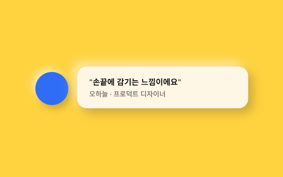
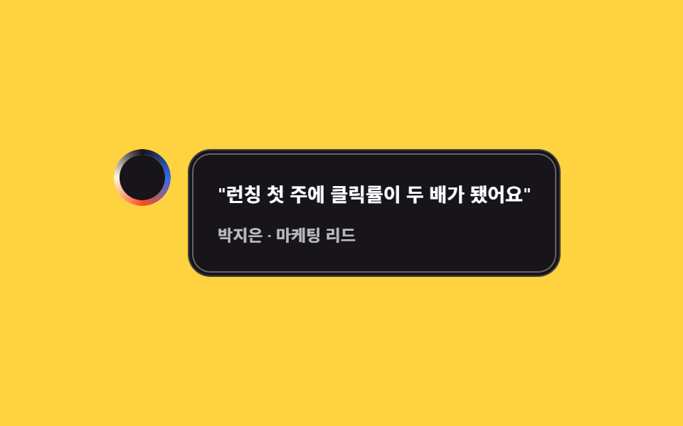
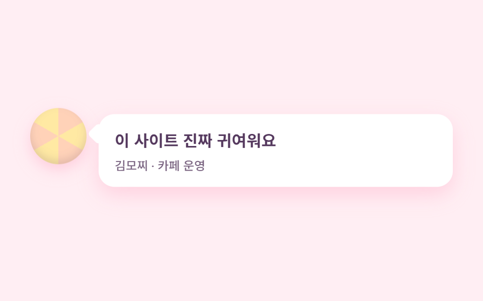
06Socketed avatar + bubble
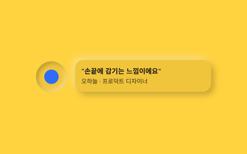
The avatar sinks into a round socket with an inset shadow while the quote bubble beside it puffs outward, each drifting on its own offset timing.
Best forCustomer testimonials, partner quotes
inset 아바타raised 말풍선어긋난 부유
<main class="stage">
  <div class="testneu is-demo">
    <span class="testneu__avatar" aria-hidden="true"></span>
    <div class="testneu__bubble">
      <p class="testneu__quote">"It feels like it wraps around your fingertip."</p>
      <p class="testneu__who">Oh Ha-neul · Product Designer</p>
    </div>
  </div>
</main>
@use "../../../../site/static/demo-tokens" as *;
$duration: $dur-loop; // 아바타·말풍선이 어긋난 박자로 떠도는 한 주기
$easing: $ease-spring; // 떠오르는 곡선
$color: $subject-blue; // 아바타 강조 색
@include stage($stage-yellow);
$neu-surface: mix($stage-yellow, black, 94%);
$neu-light: rgba(mix($neu-surface, white, 40%), .6);
$neu-dark: rgba(mix($neu-surface, black, 40%), .35);
.testneu {
display: flex;
align-items: center;
gap: $sp-4;
width: clamp(220px, 78vw, 340px);
}
.testneu__avatar {
flex: none;
width: clamp(48px, 15vw, 60px);
height: clamp(48px, 15vw, 60px);
border-radius: 50%;
background: $neu-surface;
// 아바타는 소켓에 파묻힌 듯 안쪽 그림자 — 말풍선(볼록)과 대비되는 오목 표면
box-shadow: inset 4px 4px 8px $neu-dark, inset -4px -4px 8px $neu-light;
position: relative;
animation: bob $duration $easing infinite;
}
.testneu__avatar::after {
content: "";
position: absolute;
inset: 26%;
border-radius: 50%;
background: $color;
}
.testneu__bubble {
flex: 1;
box-sizing: border-box;
padding: $sp-3;
border-radius: $r-card;
background: $neu-surface;
box-shadow: 6px 6px 12px $neu-dark, -6px -6px 12px $neu-light;
animation: bob $duration $easing infinite;
animation-delay: -0.7s;
}
.testneu__quote {
margin: 0;
color: $subject-ink;
font-weight: 600; font-size: clamp(12px, 2.8vw, 14px); line-height: 1.4;
}
.testneu__who {
margin: $sp-1 0 0;
color: rgba($subject-ink, .72);
font-weight: 500; font-size: clamp(10.5px, 2.4vw, 12px); line-height: 1.3;
}
// 데모: 아바타와 말풍선이 서로 다른 시작 시각으로 살짝 떠오른다
@keyframes bob {
0%, 100% { transform: translateY(0); }
50% { transform: translateY(-5px); }
}
@media (prefers-reduced-motion: reduce) {
.testneu__avatar, .testneu__bubble { animation: none !important; transform: none; }
}html, body {
margin: 0;
overflow: hidden;
}
.stage {
box-sizing: border-box;
min-height: 100vh;
display: grid;
place-items: center;
margin: 0;
background: #ffd23f;
font-family: -apple-system, "Segoe UI", "Noto Sans KR", sans-serif;
padding: clamp(8px, 4vw, 24px);
}
.testneu {
display: flex;
align-items: center;
gap: 16px;
width: clamp(220px, 78vw, 340px);
}
.testneu__avatar {
flex: none;
width: clamp(48px, 15vw, 60px);
height: clamp(48px, 15vw, 60px);
border-radius: 50%;
background: rgb(94%, 77.4117647059%, 23.2235294118%);
box-shadow: inset 4px 4px 8px rgba(37.6%, 30.9647058824%, 9.2894117647%, 0.35), inset -4px -4px 8px rgba(97.6%, 90.9647058824%, 69.2894117647%, 0.6);
position: relative;
animation: bob 2s cubic-bezier(0.2, 0.8, 0.2, 1) infinite;
}
.testneu__avatar::after {
content: "";
position: absolute;
inset: 26%;
border-radius: 50%;
background: #2f6df6;
}
.testneu__bubble {
flex: 1;
box-sizing: border-box;
padding: 12px;
border-radius: 16px;
background: rgb(94%, 77.4117647059%, 23.2235294118%);
box-shadow: 6px 6px 12px rgba(37.6%, 30.9647058824%, 9.2894117647%, 0.35), -6px -6px 12px rgba(97.6%, 90.9647058824%, 69.2894117647%, 0.6);
animation: bob 2s cubic-bezier(0.2, 0.8, 0.2, 1) infinite;
animation-delay: -0.7s;
}
.testneu__quote {
margin: 0;
color: #17141a;
font-weight: 600;
font-size: clamp(12px, 2.8vw, 14px);
line-height: 1.4;
}
.testneu__who {
margin: 4px 0 0;
color: rgba(23, 20, 26, 0.72);
font-weight: 500;
font-size: clamp(10.5px, 2.4vw, 12px);
line-height: 1.3;
}
@keyframes bob {
0%, 100% {
transform: translateY(0);
}
50% {
transform: translateY(-5px);
}
}
@media (prefers-reduced-motion: reduce) {
.testneu__avatar, .testneu__bubble {
animation: none !important;
transform: none;
}
}import type { CSSProperties } from "react";
import styles from "./TestimonialNeu.module.scss";
export type TestimonialNeuProps = {
quote?: string;
who?: string;
duration?: number;
easing?: string;
color?: string;
};
type Vars = CSSProperties & { "--duration"?: string; "--easing"?: string; "--color"?: string };
export default function TestimonialNeu({
quote = '"손끝에 감기는 느낌이에요"',
who = "오하늘 · 프로덕트 디자이너",
duration = 2000,
easing = "cubic-bezier(.2,.8,.2,1)",
color = "#2f6df6",
}: TestimonialNeuProps) {
const vars: Vars = { "--duration": `${duration}ms`, "--easing": easing, "--color": color };
return (
<div className={styles.wrap} style={vars}>
<span className={styles.avatar} aria-hidden="true" />
<div className={styles.bubble}>
<p className={styles.quote}>{quote}</p>
<p className={styles.who}>{who}</p>
</div>
</div>
);
}06 Socketed avatar + bubble — Measured area 8.492% · moving frames 23/23Original by GODRICH · SCSS and React ship in the zip · Neumorphism Design Kit: 9 Soft-Shadow Sections
The post this demo lives in
 Neumorphism Design Kit: 9 Soft-Shadow SectionsNeumorphism design keeps a card's background nearly identical to the page behind it, then adds one light shadow and one See all demos in this post