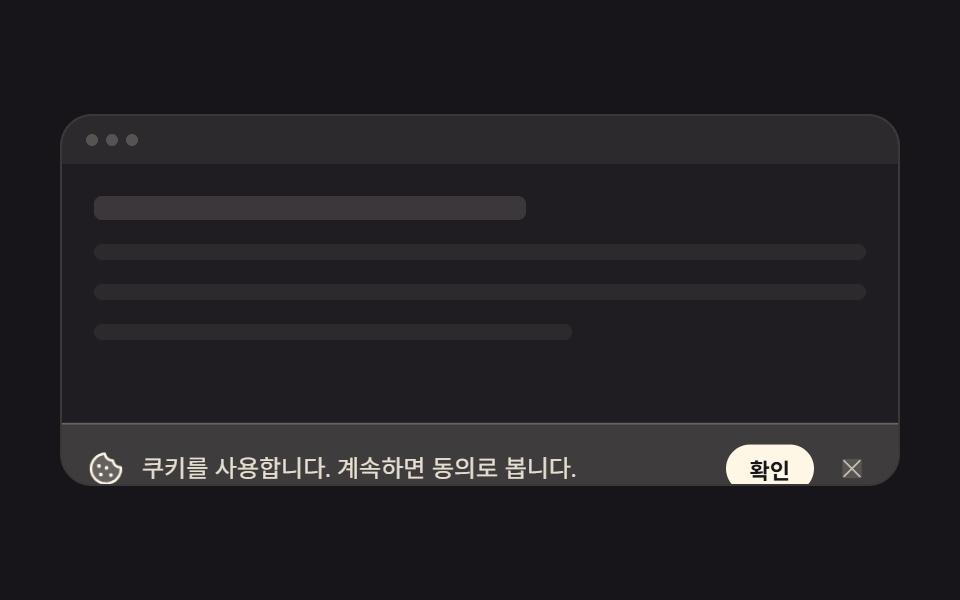
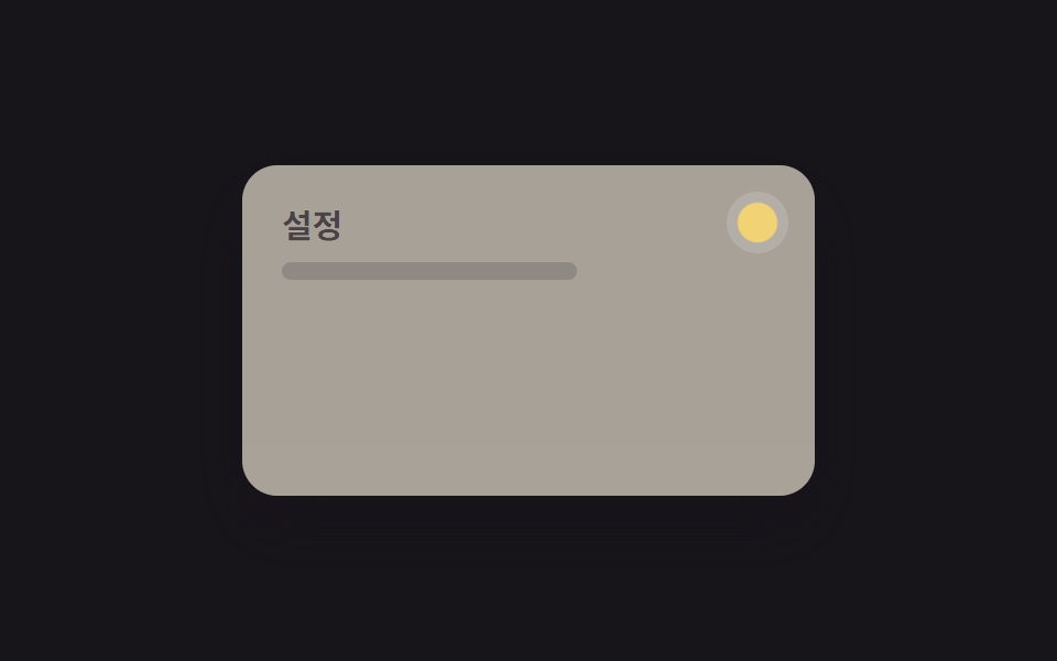
06Hint balloon
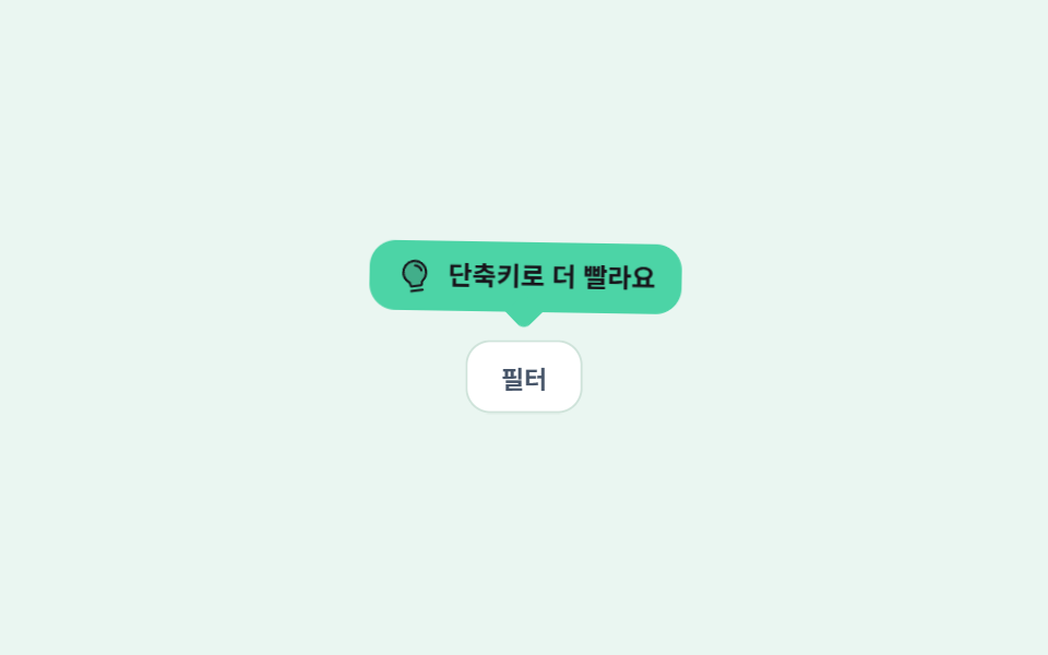
A mint speech balloon drifts 4px up and down beside the icon, and the triangular tail underneath moves as one piece with the balloon so it never looks detached.
Best forNudges beside underused buttons and small help hints on settings screens
translateY 4px꼬리 일체형radius 12
<main class="stage is-demo">
  <div class="wrap">
    <p class="hint">
      <span class="bi" aria-hidden="true"><svg xmlns="http://www.w3.org/2000/svg" viewBox="0 0 256 256" fill="currentColor"><path d="M208,104a79.86,79.86,0,0,1-30.59,62.92A24.29,24.29,0,0,0,168,186v6a8,8,0,0,1-8,8H96a8,8,0,0,1-8-8v-6a24.11,24.11,0,0,0-9.3-19A79.87,79.87,0,0,1,48,104.45C47.76,61.09,82.72,25,126.07,24A80,80,0,0,1,208,104Z" opacity="0.2"/><path d="M176,232a8,8,0,0,1-8,8H88a8,8,0,0,1,0-16h80A8,8,0,0,1,176,232Zm40-128a87.55,87.55,0,0,1-33.64,69.21A16.24,16.24,0,0,0,176,186v6a16,16,0,0,1-16,16H96a16,16,0,0,1-16-16v-6a16,16,0,0,0-6.23-12.66A87.59,87.59,0,0,1,40,104.49C39.74,56.83,78.26,17.14,125.88,16A88,88,0,0,1,216,104Zm-16,0a72,72,0,0,0-73.74-72c-39,.92-70.47,33.39-70.26,72.39a71.65,71.65,0,0,0,27.64,56.3A32,32,0,0,1,96,186v6h64v-6a32.15,32.15,0,0,1,12.47-25.35A71.65,71.65,0,0,0,200,104Zm-16.11-9.34a57.6,57.6,0,0,0-46.56-46.55,8,8,0,0,0-2.66,15.78c16.57,2.79,30.63,16.85,33.44,33.45A8,8,0,0,0,176,104a9,9,0,0,0,1.35-.11A8,8,0,0,0,183.89,94.66Z"/></svg></span>
      <span class="tx">Shortcuts make it faster</span>
    </p>
    <span class="target" aria-hidden="true">Filter</span>
  </div>
</main>
@use "../../../../site/static/demo-tokens" as *;
// ── 변수 3개 ──────────────────────────────────────────
$duration: $dur-loop; // 2s — 위아래 4px 한 왕복
$easing: $ease-spring;
$color: $subject-mint; // 큐트 계열 — 배경으로만. 글자는 잉크
@include stage(#eaf6f1);
.wrap { display: grid; justify-items: center; gap: $sp-3; }
// 말풍선 — 꼬리는 ::after 로 붙은 한 몸이라 흔들려도 따로 놀지 않는다
.hint {
position: relative;
box-sizing: border-box;
margin: 0;
max-width: 232px;
display: inline-flex; align-items: center; gap: $sp-2;
padding: $sp-2 $sp-3;
border-radius: $r-control;
background: $color;
color: $subject-ink; // 민트 위 잉크 — 민트를 글자색으로 쓰면 대비가 안 나온다
transform: translateY(0);
transform-origin: 50% 100%; // 꼬리 끝이 축 — 몸통이 매달려 흔들린다
}
.hint::after {
content: "";
position: absolute;
left: 50%; bottom: -6px;
width: 12px; height: 12px;
background: $color;
transform: translateX(-50%) rotate(45deg);
border-bottom-right-radius: $r-xs;
}
.stage.is-demo .hint { animation: nudge $duration $ease-lerp-settle infinite; }
// 한 겹(전구 아이콘 탄성 lerp) — 2026-09-15 형태 2차. 말풍선이 뜰 때 아이콘이 통통 튀어 시선을 잡는다
// 한 겹 더(감쇠 진자 rotate — 개별 속성) — bi-spring(scale) 과 병렬 합성. 매달린 전구가 진폭 13→8→4.5→2→0 으로 감쇠해 멈춘다
.stage.is-demo .bi {
transform-origin: 50% 12%; // 위 고정 — 풍선 아래 매달림
rotate: 0deg; // 중립 자세
animation: bi-spring $duration $ease-lerp-settle infinite, swing $duration ease-in-out infinite;
}
.bi { display: block; width: 16px; height: 16px; flex: 0 0 auto; }
.bi svg { width: 100%; height: 100%; display: block; }
.tx { font-size: 12px; font-weight: 700; line-height: 1.3; }
.target {
display: inline-flex; align-items: center; justify-content: center;
padding: $sp-2 $sp-4;
border-radius: $r-control;
background: #fff;
border: 1px solid #cfe3da;
font-size: 12px; font-weight: 600;
color: #475569;
scale: 1; // 중립 자세 — 애니메이션 꺼져도 원형
}
// 한 겹(칩 탄성 pop — 개별 속성 scale) — 힌트 nudge 20% 정점에 맞춘 delay 로 튀어오른다
.stage.is-demo .target { animation: pop $duration $ease-spring infinite .4s; }
// 한 겹(감쇠 진자 회전 결합) — 2026-09-15 형태 2차. 상하 왕복에 회전 감쇠 진동(γ≈.5)을 얹어 꼬리를 축으로 살아난다
@keyframes nudge {
0%, 100% { transform: translateY(0) rotate(0); }
20% { transform: translateY(-4px) rotate(-1.5deg); }
45% { transform: translateY(0) rotate(1deg); }
70% { transform: translateY(-1px) rotate(-.5deg); }
88% { transform: translateY(0) rotate(0); }
}
@keyframes bi-spring {
0% { transform: scale(1); }
25% { transform: scale(1.22); }
45% { transform: scale(.9); }
62% { transform: scale(1.06); }
78%,100% { transform: scale(1); }
}
// 한 겹(개별 속성 키프레임 — rotate/scale 만. 기존 transform 키프레임은 건드리지 않는다)
// 감쇠 진자 — 진폭 비율 1 → .62 → .35 → .15 → 0. 키프레임은 극값에 찍고 easing 은 구간 사이
@keyframes swing {
0% { rotate: 0deg; }
8% { rotate: 13deg; }
28% { rotate: -8deg; }
48% { rotate: 4.5deg; }
66% { rotate: -2deg; }
80%, 100% { rotate: 0deg; }
}
// 탄성 lerp — 칩이 활성 순간 1.38 로 튀어오르고 0.88 → 1.07 → 1 로 안착
@keyframes pop {
0% { scale: 1; }
6% { scale: 1.38; }
16% { scale: .88; }
28% { scale: 1.07; }
38%, 100% { scale: 1; }
}
@media (prefers-reduced-motion: reduce) {
.stage.is-demo .hint { animation: none; transform: none; }
.stage.is-demo .bi { animation: none; transform: none; rotate: 0deg; }
.stage.is-demo .target { animation: none; scale: 1; }
}html, body {
margin: 0;
overflow: hidden;
}
.stage {
box-sizing: border-box;
min-height: 100vh;
display: grid;
place-items: center;
margin: 0;
background: #eaf6f1;
font-family: -apple-system, "Segoe UI", "Noto Sans KR", sans-serif;
padding: clamp(8px, 4vw, 24px);
}
.wrap {
display: grid;
justify-items: center;
gap: 12px;
}
.hint {
position: relative;
box-sizing: border-box;
margin: 0;
max-width: 232px;
display: inline-flex;
align-items: center;
gap: 8px;
padding: 8px 12px;
border-radius: 12px;
background: #4cd4a6;
color: #17141a;
transform: translateY(0);
transform-origin: 50% 100%;
}
.hint::after {
content: "";
position: absolute;
left: 50%;
bottom: -6px;
width: 12px;
height: 12px;
background: #4cd4a6;
transform: translateX(-50%) rotate(45deg);
border-bottom-right-radius: 4px;
}
.stage.is-demo .hint {
animation: nudge 2s linear(0, 0.051, 0.176, 0.341, 0.518, 0.685, 0.831, 0.947, 1.032, 1.087, 1.117, 1.126, 1.121, 1.105, 1.085, 1.062, 1.041, 1.022, 1.008, 0.997, 1) infinite;
}
.stage.is-demo .bi {
transform-origin: 50% 12%;
rotate: 0deg;
animation: bi-spring 2s linear(0, 0.051, 0.176, 0.341, 0.518, 0.685, 0.831, 0.947, 1.032, 1.087, 1.117, 1.126, 1.121, 1.105, 1.085, 1.062, 1.041, 1.022, 1.008, 0.997, 1) infinite, swing 2s ease-in-out infinite;
}
.bi {
display: block;
width: 16px;
height: 16px;
flex: 0 0 auto;
}
.bi svg {
width: 100%;
height: 100%;
display: block;
}
.tx {
font-size: 12px;
font-weight: 700;
line-height: 1.3;
}
.target {
display: inline-flex;
align-items: center;
justify-content: center;
padding: 8px 16px;
border-radius: 12px;
background: #fff;
border: 1px solid #cfe3da;
font-size: 12px;
font-weight: 600;
color: #475569;
scale: 1;
}
.stage.is-demo .target {
animation: pop 2s cubic-bezier(0.2, 0.8, 0.2, 1) infinite 0.4s;
}
@keyframes nudge {
0%, 100% {
transform: translateY(0) rotate(0);
}
20% {
transform: translateY(-4px) rotate(-1.5deg);
}
45% {
transform: translateY(0) rotate(1deg);
}
70% {
transform: translateY(-1px) rotate(-0.5deg);
}
88% {
transform: translateY(0) rotate(0);
}
}
@keyframes bi-spring {
0% {
transform: scale(1);
}
25% {
transform: scale(1.22);
}
45% {
transform: scale(0.9);
}
62% {
transform: scale(1.06);
}
78%, 100% {
transform: scale(1);
}
}
@keyframes swing {
0% {
rotate: 0deg;
}
8% {
rotate: 13deg;
}
28% {
rotate: -8deg;
}
48% {
rotate: 4.5deg;
}
66% {
rotate: -2deg;
}
80%, 100% {
rotate: 0deg;
}
}
@keyframes pop {
0% {
scale: 1;
}
6% {
scale: 1.38;
}
16% {
scale: 0.88;
}
28% {
scale: 1.07;
}
38%, 100% {
scale: 1;
}
}
@media (prefers-reduced-motion: reduce) {
.stage.is-demo .hint {
animation: none;
transform: none;
}
.stage.is-demo .bi {
animation: none;
transform: none;
rotate: 0deg;
}
.stage.is-demo .target {
animation: none;
scale: 1;
}
}import type { CSSProperties } from "react";
import styles from "./HintBalloon.module.scss";
export type HintBalloonProps = {
duration?: number;
easing?: string;
color?: string;
text?: string;
targetLabel?: string;
};
export default function HintBalloon({
duration = 2000,
easing = "cubic-bezier(.2, .8, .2, 1)",
color = "#4cd4a6",
text = "Shortcuts make it faster",
targetLabel = "Filter",
}: HintBalloonProps) {
const vars: CSSProperties = {
"--duration": `${duration}ms`,
"--easing": easing,
"--color": color,
} as CSSProperties;
return (
<div className={styles.wrap} style={vars}>
{/* 꼬리는 ::after 라 말풍선과 한 몸으로 움직인다 — 따로 두면 흔들릴 때 떨어져 보인다 */}
<p className={styles.hint}>
<span className={styles.bi} aria-hidden="true">
<svg xmlns="http://www.w3.org/2000/svg" viewBox="0 0 256 256" fill="currentColor">
<path d="M208,104a79.86,79.86,0,0,1-30.59,62.92A24.29,24.29,0,0,0,168,186v6a8,8,0,0,1-8,8H96a8,8,0,0,1-8-8v-6a24.11,24.11,0,0,0-9.3-19A79.87,79.87,0,0,1,48,104.45C47.76,61.09,82.72,25,126.07,24A80,80,0,0,1,208,104Z" opacity="0.2" />
<path d="M176,232a8,8,0,0,1-8,8H88a8,8,0,0,1,0-16h80A8,8,0,0,1,176,232Zm40-128a87.55,87.55,0,0,1-33.64,69.21A16.24,16.24,0,0,0,176,186v6a16,16,0,0,1-16,16H96a16,16,0,0,1-16-16v-6a16,16,0,0,0-6.23-12.66A87.59,87.59,0,0,1,40,104.49C39.74,56.83,78.26,17.14,125.88,16A88,88,0,0,1,216,104Zm-16,0a72,72,0,0,0-73.74-72c-39,.92-70.47,33.39-70.26,72.39a71.65,71.65,0,0,0,27.64,56.3A32,32,0,0,1,96,186v6h64v-6a32.15,32.15,0,0,1,12.47-25.35A71.65,71.65,0,0,0,200,104Zm-16.11-9.34a57.6,57.6,0,0,0-46.56-46.55,8,8,0,0,0-2.66,15.78c16.57,2.79,30.63,16.85,33.44,33.45A8,8,0,0,0,176,104a9,9,0,0,0,1.35-.11A8,8,0,0,0,183.89,94.66Z" />
</svg>
</span>
<span className={styles.tx}>{text}</span>
</p>
<span className={styles.target}>{targetLabel}</span>
</div>
);
}06 Hint balloon — Measured area 4.122% · moving frames 22/23Original by GODRICH · SCSS and React ship in the zip · Onboarding UI Design — 9 Copy-Paste Tour Widgets
The post this demo lives in
 Onboarding UI Design — 9 Copy-Paste Tour WidgetsGood onboarding ui design points to the next thing to click, on the screen the user already sees. The shapes are fixed — See all demos in this post