09Completion confetti
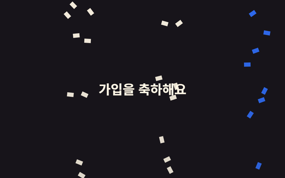
Finishing the last step squashes the orange check circle and springs it back, while twelve pieces fall above it at different angles and delays so they never look released on the same frame.
Best forThe final onboarding screen and payment or submission confirmations
12조각 시차scale 0.8→1.12radius 50%

<main class="stage is-demo">
  <div class="scene">
    <div class="bits" aria-hidden="true">
      <i class="b b1"></i><i class="b b2"></i><i class="b b3"></i><i class="b b4"></i>
      <i class="b b5"></i><i class="b b6"></i><i class="b b7"></i><i class="b b8"></i>
      <i class="b b9"></i><i class="b b10"></i><i class="b b11"></i><i class="b b12"></i>
    </div>
    <span class="seal" role="img" aria-label="Onboarding complete">
      <svg xmlns="http://www.w3.org/2000/svg" viewBox="0 0 256 256" fill="currentColor"><path d="M232,56V200a16,16,0,0,1-16,16H40a16,16,0,0,1-16-16V56A16,16,0,0,1,40,40H216A16,16,0,0,1,232,56Z" opacity="0.2"/><path d="M205.66,85.66l-96,96a8,8,0,0,1-11.32,0l-40-40a8,8,0,0,1,11.32-11.32L104,164.69l90.34-90.35a8,8,0,0,1,11.32,11.32Z"/></svg>
    </span>
    <p class="msg">All done</p>
  </div>
</main>
@use "../../../../site/static/demo-tokens" as *;
// ── 변수 3개 ──────────────────────────────────────────
$duration: $dur-loop; // 2s — 도장 한 번 + 조각 열두 개가 떨어지는 한 바퀴
$easing: $ease-pop;
$color: $stage-orange;
@include stage(#fff4ee);
// 조각이 밖으로 나가지 않게 자른다 — 안 자르면 scrollHeight 가 늘어 BD8 이 막는다
.scene {
position: relative;
box-sizing: border-box;
width: min(100%, 240px);
height: 152px;
overflow: hidden;
display: grid; place-content: center; justify-items: center;
gap: $sp-2;
}
.seal {
display: inline-flex; align-items: center; justify-content: center;
width: 56px; height: 56px;
border-radius: 50%;
background: $color;
color: #fff;
transform: scale(1);
}
.seal svg { width: 30px; height: 30px; display: block; }
// 한 겹(도장 착지 감쇠 진자 settle — 개별 속성 rotate, 콤마 확장) — stamp 52% 착지 뒤 56% 부터
// 3.5 → -2 → 1 → 0 으로 비틀렸다 제자리를 잡는다. delay 없는 요소라 단축+콤마 OK
.seal { transform-origin: 50% 50%; rotate: 0deg; }
.stage.is-demo .seal { animation: stamp $duration $easing infinite, settle $duration ease-in-out infinite; }
// 한 겹(도장 감쇠 진자 회전 + 메시지 탄성 팝) — 2026-09-15 형태 2차. 쾅 찍히며 비틀리고, 26% 찍힘 시점에 메시지가 같이 튄다
.stage.is-demo .msg { animation: msg-pop $duration $ease-lerp-settle infinite; }
.msg {
margin: 0;
font-size: 13px; font-weight: 700;
color: $subject-ink; // 주황 위 흰 글자는 대비가 안 나온다 — 글자는 바탕 위 잉크로
}
.bits { position: absolute; inset: 0; }
.b {
position: absolute;
top: -12px;
width: 6px; height: 10px;
border-radius: $r-xs;
opacity: 0;
}
// 열두 조각 — 가로 위치·각도·시차가 전부 다르다. 같이 뿌려진 티가 나면 가짜로 보인다
.b1 { left: 6%; background: $color; animation-delay: 0s; --r: 24deg; }
.b2 { left: 16%; background: $subject-pink; animation-delay: .09s; --r: -38deg; }
.b3 { left: 26%; background: $subject-blue; animation-delay: .21s; --r: 61deg; }
.b4 { left: 34%; background: $subject-mint; animation-delay: .05s; --r: -17deg; }
.b5 { left: 44%; background: $color; animation-delay: .33s; --r: 44deg; }
.b6 { left: 52%; background: $subject-lilac; animation-delay: .14s; --r: -55deg; }
.b7 { left: 61%; background: $subject-blue; animation-delay: .27s; --r: 12deg; }
.b8 { left: 69%; background: $subject-mint; animation-delay: .4s; --r: -29deg; }
.b9 { left: 77%; background: $color; animation-delay: .17s; --r: 71deg; }
.b10 { left: 85%; background: $subject-pink; animation-delay: .3s; --r: -46deg; }
.b11 { left: 92%; background: $subject-sky; animation-delay: .11s; --r: 33deg; }
.b12 { left: 47%; background: $subject-sky; animation-delay: .45s; --r: -63deg; }
.stage.is-demo .b { animation-name: fall; animation-duration: $duration; animation-timing-function: $easing; animation-iteration-count: infinite; }
// 한 겹(기존 scale 압축에 rotate 결합 — 도장이 찍히며 비틀린다)
@keyframes stamp {
0% { transform: scale(1) rotate(0); }
10% { transform: scale(.8) rotate(-6deg); }
26% { transform: scale(1.12) rotate(4deg); }
36% { transform: scale(.98) rotate(-2deg); }
44% { transform: scale(1.02) rotate(1deg); }
52%, 100% { transform: scale(1) rotate(0); }
}
@keyframes msg-pop {
0% { transform: scale(1); }
15% { transform: scale(.96); }
30% { transform: scale(1.06); }
42% { transform: scale(.99); }
52%,100% { transform: scale(1); }
}
// 한 겹(개별 속성 키프레임) — 기존 stamp(transform) 와 병렬 합성
// 감쇠 진자 settle — 도장이 찍힌 뒤(56%~) 비틀림이 3.5 → -2 → 1 → 0 으로 감쇠해 자리를 잡는다
@keyframes settle {
0%, 56% { rotate: 0deg; }
62% { rotate: 3.5deg; }
74% { rotate: -2deg; }
85% { rotate: 1deg; }
93%, 100% { rotate: 0deg; }
}
@keyframes fall {
0% { opacity: 0; transform: translateY(0) rotate(0deg); }
12% { opacity: 1; }
78% { opacity: 1; }
100% { opacity: 0; transform: translateY(168px) rotate(var(--r)); }
}
@media (prefers-reduced-motion: reduce) {
.stage.is-demo .seal { animation: none; transform: none; rotate: 0deg; }
.stage.is-demo .msg { animation: none; transform: none; }
.stage.is-demo .b { animation: none; opacity: 0; }
}html, body {
margin: 0;
overflow: hidden;
}
.stage {
box-sizing: border-box;
min-height: 100vh;
display: grid;
place-items: center;
margin: 0;
background: #fff4ee;
font-family: -apple-system, "Segoe UI", "Noto Sans KR", sans-serif;
padding: clamp(8px, 4vw, 24px);
}
.scene {
position: relative;
box-sizing: border-box;
width: min(100%, 240px);
height: 152px;
overflow: hidden;
display: grid;
place-content: center;
justify-items: center;
gap: 8px;
}
.seal {
display: inline-flex;
align-items: center;
justify-content: center;
width: 56px;
height: 56px;
border-radius: 50%;
background: #ff4d1f;
color: #fff;
transform: scale(1);
}
.seal svg {
width: 30px;
height: 30px;
display: block;
}
.seal {
transform-origin: 50% 50%;
rotate: 0deg;
}
.stage.is-demo .seal {
animation: stamp 2s cubic-bezier(0.2, 1.4, 0.4, 1) infinite, settle 2s ease-in-out infinite;
}
.stage.is-demo .msg {
animation: msg-pop 2s linear(0, 0.051, 0.176, 0.341, 0.518, 0.685, 0.831, 0.947, 1.032, 1.087, 1.117, 1.126, 1.121, 1.105, 1.085, 1.062, 1.041, 1.022, 1.008, 0.997, 1) infinite;
}
.msg {
margin: 0;
font-size: 13px;
font-weight: 700;
color: #17141a;
}
.bits {
position: absolute;
inset: 0;
}
.b {
position: absolute;
top: -12px;
width: 6px;
height: 10px;
border-radius: 4px;
opacity: 0;
}
.b1 {
left: 6%;
background: #ff4d1f;
animation-delay: 0s;
--r: 24deg;
}
.b2 {
left: 16%;
background: #ff9ebb;
animation-delay: 0.09s;
--r: -38deg;
}
.b3 {
left: 26%;
background: #2f6df6;
animation-delay: 0.21s;
--r: 61deg;
}
.b4 {
left: 34%;
background: #4cd4a6;
animation-delay: 0.05s;
--r: -17deg;
}
.b5 {
left: 44%;
background: #ff4d1f;
animation-delay: 0.33s;
--r: 44deg;
}
.b6 {
left: 52%;
background: #b9a0ff;
animation-delay: 0.14s;
--r: -55deg;
}
.b7 {
left: 61%;
background: #2f6df6;
animation-delay: 0.27s;
--r: 12deg;
}
.b8 {
left: 69%;
background: #4cd4a6;
animation-delay: 0.4s;
--r: -29deg;
}
.b9 {
left: 77%;
background: #ff4d1f;
animation-delay: 0.17s;
--r: 71deg;
}
.b10 {
left: 85%;
background: #ff9ebb;
animation-delay: 0.3s;
--r: -46deg;
}
.b11 {
left: 92%;
background: #6ec8ff;
animation-delay: 0.11s;
--r: 33deg;
}
.b12 {
left: 47%;
background: #6ec8ff;
animation-delay: 0.45s;
--r: -63deg;
}
.stage.is-demo .b {
animation-name: fall;
animation-duration: 2s;
animation-timing-function: cubic-bezier(0.2, 1.4, 0.4, 1);
animation-iteration-count: infinite;
}
@keyframes stamp {
0% {
transform: scale(1) rotate(0);
}
10% {
transform: scale(0.8) rotate(-6deg);
}
26% {
transform: scale(1.12) rotate(4deg);
}
36% {
transform: scale(0.98) rotate(-2deg);
}
44% {
transform: scale(1.02) rotate(1deg);
}
52%, 100% {
transform: scale(1) rotate(0);
}
}
@keyframes msg-pop {
0% {
transform: scale(1);
}
15% {
transform: scale(0.96);
}
30% {
transform: scale(1.06);
}
42% {
transform: scale(0.99);
}
52%, 100% {
transform: scale(1);
}
}
@keyframes settle {
0%, 56% {
rotate: 0deg;
}
62% {
rotate: 3.5deg;
}
74% {
rotate: -2deg;
}
85% {
rotate: 1deg;
}
93%, 100% {
rotate: 0deg;
}
}
@keyframes fall {
0% {
opacity: 0;
transform: translateY(0) rotate(0deg);
}
12% {
opacity: 1;
}
78% {
opacity: 1;
}
100% {
opacity: 0;
transform: translateY(168px) rotate(var(--r));
}
}
@media (prefers-reduced-motion: reduce) {
.stage.is-demo .seal {
animation: none;
transform: none;
rotate: 0deg;
}
.stage.is-demo .msg {
animation: none;
transform: none;
}
.stage.is-demo .b {
animation: none;
opacity: 0;
}
}import type { CSSProperties } from "react";
import styles from "./CompletionConfetti.module.scss";
export type CompletionConfettiProps = {
duration?: number;
easing?: string;
color?: string;
message?: string;
label?: string;
};
// 조각마다 가로 위치·색·각도·시차가 다르다. 같은 순간에 같은 각도로 뿌려지면 가짜로 보인다
const BITS: { left: number; bg: string; delay: number; rotate: number }[] = [
{ left: 6, bg: "#ff4d1f", delay: 0, rotate: 24 },
{ left: 16, bg: "#ff9ebb", delay: 90, rotate: -38 },
{ left: 26, bg: "#2f6df6", delay: 210, rotate: 61 },
{ left: 34, bg: "#4cd4a6", delay: 50, rotate: -17 },
{ left: 44, bg: "#ff4d1f", delay: 330, rotate: 44 },
{ left: 52, bg: "#b9a0ff", delay: 140, rotate: -55 },
{ left: 61, bg: "#2f6df6", delay: 270, rotate: 12 },
{ left: 69, bg: "#4cd4a6", delay: 400, rotate: -29 },
{ left: 77, bg: "#ff4d1f", delay: 170, rotate: 71 },
{ left: 85, bg: "#ff9ebb", delay: 300, rotate: -46 },
{ left: 92, bg: "#6ec8ff", delay: 110, rotate: 33 },
{ left: 47, bg: "#6ec8ff", delay: 450, rotate: -63 },
];
export default function CompletionConfetti({
duration = 2000,
easing = "cubic-bezier(.2, 1.4, .4, 1)",
color = "#ff4d1f",
message = "All done",
label = "Onboarding complete",
}: CompletionConfettiProps) {
const vars: CSSProperties = {
"--duration": `${duration}ms`,
"--easing": easing,
"--color": color,
} as CSSProperties;
return (
<div className={styles.scene} style={vars}>
<div className={styles.bits} aria-hidden="true">
{BITS.map((b, i) => (
<i
key={i}
className={styles.b}
style={{
left: `${b.left}%`,
background: b.bg,
animationDelay: `${b.delay}ms`,
"--r": `${b.rotate}deg`,
} as CSSProperties}
/>
))}
</div>
<span className={styles.seal} role="img" aria-label={label}>
<svg xmlns="http://www.w3.org/2000/svg" viewBox="0 0 256 256" fill="currentColor">
<path d="M232,56V200a16,16,0,0,1-16,16H40a16,16,0,0,1-16-16V56A16,16,0,0,1,40,40H216A16,16,0,0,1,232,56Z" opacity="0.2" />
<path d="M205.66,85.66l-96,96a8,8,0,0,1-11.32,0l-40-40a8,8,0,0,1,11.32-11.32L104,164.69l90.34-90.35a8,8,0,0,1,11.32,11.32Z" />
</svg>
</span>
<p className={styles.msg}>{message}</p>
</div>
);
}09 Completion confetti — Measured area 5.094% · moving frames 21/23Original by GODRICH · SCSS and React ship in the zip · Onboarding UI Design — 9 Copy-Paste Tour Widgets
The post this demo lives in
 Onboarding UI Design — 9 Copy-Paste Tour WidgetsGood onboarding ui design points to the next thing to click, on the screen the user already sees. The shapes are fixed — See all demos in this post