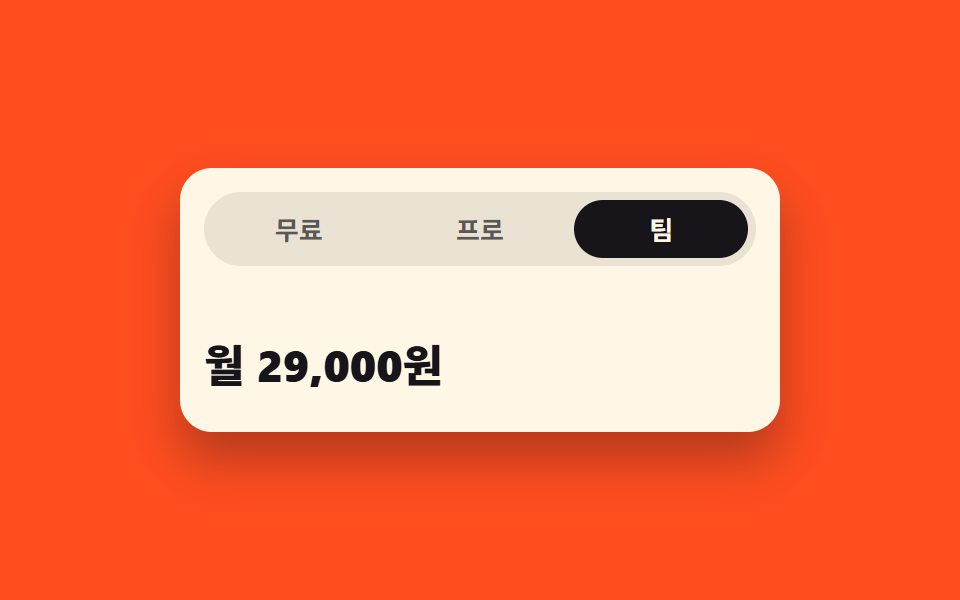
07Panel whose height stretches along as you move between tabs
The panel interpolates between 0fr and 1fr in grid-template-rows, so it stretches smoothly without knowing the content height, and aria-selected holds which tab is current.
Best forPricing and detail tabs where each description is a different length
grid-template-rows0fraria-selected
<main class="stage">
  <section class="th is-demo" id="th">
    <div class="th__tabs" role="tablist" aria-label="Pricing tabs">
      <button class="th__tab" type="button" role="tab" id="th-t1" aria-controls="th-p1" aria-selected="true">Free</button>
      <button class="th__tab" type="button" role="tab" id="th-t2" aria-controls="th-p2" aria-selected="false" tabindex="-1">Pro</button>
      <button class="th__tab" type="button" role="tab" id="th-t3" aria-controls="th-p3" aria-selected="false" tabindex="-1">Team</button>
    </div>

    <div class="th__panels">
      <div class="th__panel is-open" role="tabpanel" id="th-p1" aria-labelledby="th-t1">
        <div class="th__clip">
          <div class="th__body">
            <p class="th__price">$0</p>
            <p class="th__desc">Enough when it is just you.</p>
          </div>
        </div>
      </div>
      <div class="th__panel" role="tabpanel" id="th-p2" aria-labelledby="th-t2" aria-hidden="true">
        <div class="th__clip">
          <div class="th__body">
            <p class="th__price">$9 / month</p>
            <p class="th__desc">Keep an unlimited history, use every export format, and roll back anything you changed in the last 30 days. Replies arrive within a day.</p>
          </div>
        </div>
      </div>
      <div class="th__panel" role="tabpanel" id="th-p3" aria-labelledby="th-t3" aria-hidden="true">
        <div class="th__clip">
          <div class="th__body">
            <p class="th__price">$24 / month</p>
            <p class="th__desc">Up to five people share one workspace.</p>
          </div>
        </div>
      </div>
    </div>
  </section>
</main>@use "../../../../site/static/demo-tokens" as *;
// 탭 높이 모프 — 패널을 grid-template-rows 의 0fr 과 1fr 사이에서 보간해
// 내용 높이를 미리 모르고도 부드럽게 늘린다. 내용 교체는 컷, 높이만 보간한다.
$duration: $dur-base;
$easing: $ease-spring;
$color: $subject-cream;
@include stage($stage-orange);
$ink-soft: rgba(23, 20, 26, .68);
$ink-track: rgba(23, 20, 26, .09);
.th {
box-sizing: border-box;
display: grid;
gap: $sp-2;
width: min(300px, 92vw);
padding: $sp-3;
border-radius: $r-card;
background: $color;
color: $subject-ink;
box-shadow: $shadow-raised;
}
.th * { box-sizing: border-box; }
// ── 탭 줄: 인디케이터를 고정 px 로 옮기지 않는다. 칸은 1fr 3등분, 표시는 배경으로 ──
.th__tabs {
display: grid;
grid-template-columns: repeat(3, 1fr);
gap: $sp-1;
padding: $sp-1;
border-radius: $r-pill;
background: $ink-track;
}
.th__tab {
margin: 0;
padding: $sp-2 0;
border: 0;
border-radius: $r-pill;
background: transparent;
color: $ink-soft;
font-family: inherit;
font-size: 13px;
font-weight: 700;
line-height: 1;
cursor: pointer;
transition: background-color $duration $easing, color $duration $easing;
}
.th__tab:focus-visible { outline: 2px solid $subject-ink; outline-offset: 2px; }
.th__tab[aria-selected="true"] { background: $subject-ink; color: $color; }
// ── 패널: 0fr ↔ 1fr 보간 ──
// 0fr 칸의 자식에 min-height: 0 과 overflow: hidden 이 둘 다 있어야 실제로 접힌다.
// 접히는 칸에 세로 패딩을 주면 0fr 에서도 그만큼 남으므로 패딩은 안쪽 래퍼에 둔다.
.th__panel {
display: grid;
grid-template-rows: 0fr;
transition: grid-template-rows $duration $easing;
}
.th__panel.is-open { grid-template-rows: 1fr; }
.th__clip { min-height: 0; overflow: hidden; }
.th__body {
padding: $sp-2 0 0;
opacity: 0;
transition: opacity $duration steps(1, end);
}
// 펼침은 바로 보이고, 접힘은 높이가 다 줄어든 뒤 한 프레임에 컷 — 크로스페이드가 생기지 않는다
.th__panel.is-open .th__body { opacity: 1; transition-duration: 0s; }
.th__price {
margin: 0;
font-size: 22px;
font-weight: 800;
line-height: 1.1;
}
.th__desc {
margin: $sp-1 0 0;
color: $ink-soft;
font-size: 12px;
font-weight: 500;
line-height: 1.5;
}
// ── 격자 미리보기 전용 2초 루프 ──
// 높이는 이징으로 보간하고(아래 th-row-*), 글자와 탭 표시는 steps(1, end) 컷으로 갈아 끼운다.
@keyframes th-row-1 {
0%, 20% { grid-template-rows: 1fr; }
28%, 82% { grid-template-rows: 0fr; }
90%, 100% { grid-template-rows: 1fr; }
}
@keyframes th-row-2 {
0%, 20% { grid-template-rows: 0fr; }
28%, 48% { grid-template-rows: 1fr; }
56%, 100% { grid-template-rows: 0fr; }
}
@keyframes th-row-3 {
0%, 48% { grid-template-rows: 0fr; }
56%, 74% { grid-template-rows: 1fr; }
82%, 100% { grid-template-rows: 0fr; }
}
@keyframes th-body-1 {
0% { opacity: 1; }
28% { opacity: 0; }
82%, 100% { opacity: 1; }
}
@keyframes th-body-2 {
0% { opacity: 0; }
20% { opacity: 1; }
56%, 100% { opacity: 0; }
}
@keyframes th-body-3 {
0% { opacity: 0; }
48% { opacity: 1; }
82%, 100% { opacity: 0; }
}
@keyframes th-tab-1 {
0% { background-color: $subject-ink; color: $color; }
20% { background-color: transparent; color: $ink-soft; }
82%, 100% { background-color: $subject-ink; color: $color; }
}
@keyframes th-tab-2 {
0% { background-color: transparent; color: $ink-soft; }
20% { background-color: $subject-ink; color: $color; }
48%, 100% { background-color: transparent; color: $ink-soft; }
}
@keyframes th-tab-3 {
0% { background-color: transparent; color: $ink-soft; }
48% { background-color: $subject-ink; color: $color; }
82%, 100% { background-color: transparent; color: $ink-soft; }
}
.th.is-demo {
.th__panel:nth-child(1) { animation-name: th-row-1; }
.th__panel:nth-child(2) { animation-name: th-row-2; }
.th__panel:nth-child(3) { animation-name: th-row-3; }
.th__panel {
animation-duration: $dur-loop;
animation-timing-function: $easing;
animation-iteration-count: infinite;
animation-fill-mode: backwards;
}
.th__panel:nth-child(1) .th__body { animation-name: th-body-1; }
.th__panel:nth-child(2) .th__body { animation-name: th-body-2; }
.th__panel:nth-child(3) .th__body { animation-name: th-body-3; }
.th__tab:nth-child(1) { animation-name: th-tab-1; }
.th__tab:nth-child(2) { animation-name: th-tab-2; }
.th__tab:nth-child(3) { animation-name: th-tab-3; }
.th__body,
.th__tab {
animation-duration: $dur-loop;
animation-timing-function: steps(1, end);
animation-iteration-count: infinite;
animation-fill-mode: backwards;
}
}
@media (max-width: 340px) {
.th { gap: $sp-1; width: min(292px, 96vw); padding: $sp-2; }
.th__tabs { gap: 0; }
.th__tab { padding: $sp-1 0; font-size: 11px; }
.th__body { padding: $sp-1 0 0; }
.th__price { font-size: 17px; }
.th__desc { margin: 0; font-size: 10px; }
}
@media (prefers-reduced-motion: reduce) {
.th.is-demo .th__panel,
.th.is-demo .th__body,
.th.is-demo .th__tab { animation: none !important; transition: none !important; }
// 움직임만 끄고 첫 탭이 펼쳐진 결과는 그대로 남긴다
.th.is-demo .th__panel:nth-child(1) { grid-template-rows: 1fr !important; }
.th.is-demo .th__panel:nth-child(1) .th__body { opacity: 1 !important; }
.th.is-demo .th__tab:nth-child(1) { background-color: $subject-ink !important; color: $color !important; }
}html, body {
margin: 0;
overflow: hidden;
}
.stage {
box-sizing: border-box;
min-height: 100vh;
display: grid;
place-items: center;
margin: 0;
background: #ff4d1f;
font-family: -apple-system, "Segoe UI", "Noto Sans KR", sans-serif;
padding: clamp(8px, 4vw, 24px);
}
.th {
box-sizing: border-box;
display: grid;
gap: 8px;
width: min(300px, 92vw);
padding: 12px;
border-radius: 16px;
background: #fff7e6;
color: #17141a;
box-shadow: 0 14px 24px rgba(23, 20, 26, 0.32);
}
.th * {
box-sizing: border-box;
}
.th__tabs {
display: grid;
grid-template-columns: repeat(3, 1fr);
gap: 4px;
padding: 4px;
border-radius: 999px;
background: rgba(23, 20, 26, 0.09);
}
.th__tab {
margin: 0;
padding: 8px 0;
border: 0;
border-radius: 999px;
background: transparent;
color: rgba(23, 20, 26, 0.68);
font-family: inherit;
font-size: 13px;
font-weight: 700;
line-height: 1;
cursor: pointer;
transition: background-color 300ms cubic-bezier(0.2, 0.8, 0.2, 1), color 300ms cubic-bezier(0.2, 0.8, 0.2, 1);
}
.th__tab:focus-visible {
outline: 2px solid #17141a;
outline-offset: 2px;
}
.th__tab[aria-selected=true] {
background: #17141a;
color: #fff7e6;
}
.th__panel {
display: grid;
grid-template-rows: 0fr;
transition: grid-template-rows 300ms cubic-bezier(0.2, 0.8, 0.2, 1);
}
.th__panel.is-open {
grid-template-rows: 1fr;
}
.th__clip {
min-height: 0;
overflow: hidden;
}
.th__body {
padding: 8px 0 0;
opacity: 0;
transition: opacity 300ms steps(1, end);
}
.th__panel.is-open .th__body {
opacity: 1;
transition-duration: 0s;
}
.th__price {
margin: 0;
font-size: 22px;
font-weight: 800;
line-height: 1.1;
}
.th__desc {
margin: 4px 0 0;
color: rgba(23, 20, 26, 0.68);
font-size: 12px;
font-weight: 500;
line-height: 1.5;
}
@keyframes th-row-1 {
0%, 20% {
grid-template-rows: 1fr;
}
28%, 82% {
grid-template-rows: 0fr;
}
90%, 100% {
grid-template-rows: 1fr;
}
}
@keyframes th-row-2 {
0%, 20% {
grid-template-rows: 0fr;
}
28%, 48% {
grid-template-rows: 1fr;
}
56%, 100% {
grid-template-rows: 0fr;
}
}
@keyframes th-row-3 {
0%, 48% {
grid-template-rows: 0fr;
}
56%, 74% {
grid-template-rows: 1fr;
}
82%, 100% {
grid-template-rows: 0fr;
}
}
@keyframes th-body-1 {
0% {
opacity: 1;
}
28% {
opacity: 0;
}
82%, 100% {
opacity: 1;
}
}
@keyframes th-body-2 {
0% {
opacity: 0;
}
20% {
opacity: 1;
}
56%, 100% {
opacity: 0;
}
}
@keyframes th-body-3 {
0% {
opacity: 0;
}
48% {
opacity: 1;
}
82%, 100% {
opacity: 0;
}
}
@keyframes th-tab-1 {
0% {
background-color: #17141a;
color: #fff7e6;
}
20% {
background-color: transparent;
color: rgba(23, 20, 26, 0.68);
}
82%, 100% {
background-color: #17141a;
color: #fff7e6;
}
}
@keyframes th-tab-2 {
0% {
background-color: transparent;
color: rgba(23, 20, 26, 0.68);
}
20% {
background-color: #17141a;
color: #fff7e6;
}
48%, 100% {
background-color: transparent;
color: rgba(23, 20, 26, 0.68);
}
}
@keyframes th-tab-3 {
0% {
background-color: transparent;
color: rgba(23, 20, 26, 0.68);
}
48% {
background-color: #17141a;
color: #fff7e6;
}
82%, 100% {
background-color: transparent;
color: rgba(23, 20, 26, 0.68);
}
}
.th.is-demo .th__panel:nth-child(1) {
animation-name: th-row-1;
}
.th.is-demo .th__panel:nth-child(2) {
animation-name: th-row-2;
}
.th.is-demo .th__panel:nth-child(3) {
animation-name: th-row-3;
}
.th.is-demo .th__panel {
animation-duration: 2s;
animation-timing-function: cubic-bezier(0.2, 0.8, 0.2, 1);
animation-iteration-count: infinite;
animation-fill-mode: backwards;
}
.th.is-demo .th__panel:nth-child(1) .th__body {
animation-name: th-body-1;
}
.th.is-demo .th__panel:nth-child(2) .th__body {
animation-name: th-body-2;
}
.th.is-demo .th__panel:nth-child(3) .th__body {
animation-name: th-body-3;
}
.th.is-demo .th__tab:nth-child(1) {
animation-name: th-tab-1;
}
.th.is-demo .th__tab:nth-child(2) {
animation-name: th-tab-2;
}
.th.is-demo .th__tab:nth-child(3) {
animation-name: th-tab-3;
}
.th.is-demo .th__body,
.th.is-demo .th__tab {
animation-duration: 2s;
animation-timing-function: steps(1, end);
animation-iteration-count: infinite;
animation-fill-mode: backwards;
}
@media (max-width: 340px) {
.th {
gap: 4px;
width: min(292px, 96vw);
padding: 8px;
}
.th__tabs {
gap: 0;
}
.th__tab {
padding: 4px 0;
font-size: 11px;
}
.th__body {
padding: 4px 0 0;
}
.th__price {
font-size: 17px;
}
.th__desc {
margin: 0;
font-size: 10px;
}
}
@media (prefers-reduced-motion: reduce) {
.th.is-demo .th__panel,
.th.is-demo .th__body,
.th.is-demo .th__tab {
animation: none !important;
transition: none !important;
}
.th.is-demo .th__panel:nth-child(1) {
grid-template-rows: 1fr !important;
}
.th.is-demo .th__panel:nth-child(1) .th__body {
opacity: 1 !important;
}
.th.is-demo .th__tab:nth-child(1) {
background-color: #17141a !important;
color: #fff7e6 !important;
}
}// 탭 높이 모프: 고른 탭은 aria-selected 가 들고, 패널은 0fr ↔ 1fr 사이에서 높이가 보간된다.
var th = document.getElementById('th');
var thTabs = [].slice.call(th.querySelectorAll('.th__tab'));
function thSelect(i) {
th.classList.remove('is-demo');
thTabs.forEach(function (t, n) {
var on = n === i;
t.setAttribute('aria-selected', on ? 'true' : 'false');
t.tabIndex = on ? 0 : -1;
var p = document.getElementById(t.getAttribute('aria-controls'));
p.classList.toggle('is-open', on);
p.setAttribute('aria-hidden', on ? 'false' : 'true');
});
}
thTabs.forEach(function (t, i) {
t.addEventListener('click', function () { thSelect(i); });
t.addEventListener('keydown', function (e) {
var d = e.key === 'ArrowRight' ? 1 : e.key === 'ArrowLeft' ? -1 : 0;
if (!d) return;
e.preventDefault();
var n = (i + d + thTabs.length) % thTabs.length;
thSelect(n);
thTabs[n].focus({ preventScroll: true });
});
});import { useState, useRef } from "react";
import type { CSSProperties } from "react";
import styles from "./TabHeightMorph.module.scss";
export type TabHeightMorphItem = { tab: string; price: string; desc: string };
export type TabHeightMorphProps = {
/** 탭 라벨과 그 안의 내용. 설명 길이가 제각각이어도 높이가 따라 늘어난다 */
items?: TabHeightMorphItem[];
groupLabel?: string;
/** 격자 미리보기용 2초 자동 루프. 사람이 손대면 꺼진다 */
demo?: boolean;
duration?: number;
easing?: string;
color?: string;
};
type Vars = CSSProperties & { "--duration"?: string; "--easing"?: string; "--color"?: string };
// ambient 가 얇아 KeyboardEvent·HTMLElement 를 못 쓴다 — 필요한 꼴만 로컬 타입으로 선언
type KeyEvt = { key: string; preventDefault(): void };
type Focusable = { focus(o: { preventScroll: boolean }): void };
type Box<T> = { current: T };
const DEFAULT_ITEMS: TabHeightMorphItem[] = [
{ tab: "Free", price: "$0", desc: "Enough when it is just you." },
{
tab: "Pro",
price: "$9 / month",
desc:
"Keep an unlimited history, use every export format, and roll back anything you changed in the last 30 days. Replies arrive within a day.",
},
{ tab: "Team", price: "$24 / month", desc: "Up to five people share one workspace." },
];
let seq = 0;
export default function TabHeightMorph({
items = DEFAULT_ITEMS,
groupLabel = "Pricing tabs",
demo = true,
duration = 300,
easing = "cubic-bezier(.2,.8,.2,1)",
color = "#fff7e6",
}: TabHeightMorphProps) {
const [current, setCurrent] = useState(0);
const [live, setLive] = useState(demo);
const [uid] = useState<string>(() => "tab-height-morph-" + String(++seq));
// useRef 는 { current: T | null } 이라 배열로 쓸 땐 단언이 필요하다
const tabRefs = useRef<(Focusable | null)[]>([]) as Box<(Focusable | null)[]>;
const vars: Vars = { "--duration": `${duration}ms`, "--easing": easing, "--color": color };
function select(i: number) {
setLive(false);
setCurrent(i);
}
function onKeyDown(e: KeyEvt, i: number) {
const step = e.key === "ArrowRight" ? 1 : e.key === "ArrowLeft" ? -1 : 0;
if (step === 0) return;
e.preventDefault();
const next = (i + step + items.length) % items.length;
select(next);
const el = tabRefs.current[next];
// iframe 안에서 무가드 focus 는 부모 페이지를 끌어당긴다
if (el) el.focus({ preventScroll: true });
}
const cls = [styles.th, live ? styles.isDemo : ""].filter(Boolean).join(" ");
return (
<section className={cls} style={vars}>
<div className={styles.tabs} role="tablist" aria-label={groupLabel}>
{items.map((it, i) => (
<button
key={it.tab}
className={styles.tab}
type="button"
role="tab"
id={`${uid}-t${i}`}
aria-controls={`${uid}-p${i}`}
aria-selected={i === current}
tabIndex={i === current ? 0 : -1}
ref={(el: Focusable | null) => {
tabRefs.current[i] = el;
}}
onClick={() => select(i)}
onKeyDown={(e: KeyEvt) => onKeyDown(e, i)}
>
{it.tab}
</button>
))}
</div>
<div className={styles.panels}>
{items.map((it, i) => (
<div
key={it.tab}
className={[styles.panel, i === current ? styles.isOpen : ""].filter(Boolean).join(" ")}
role="tabpanel"
id={`${uid}-p${i}`}
aria-labelledby={`${uid}-t${i}`}
aria-hidden={i !== current}
>
{/* 0fr 칸이 실제로 접히려면 이 래퍼에 min-height: 0 과 overflow: hidden 이 둘 다 있어야 한다 */}
<div className={styles.clip}>
<div className={styles.body}>
<p className={styles.price}>{it.price}</p>
<p className={styles.desc}>{it.desc}</p>
</div>
</div>
</div>
))}
</div>
</section>
);
}07 Panel whose height stretches along as you move between tabs — Measured area 36.456% · moving frames 11/23Original by GODRICH · SCSS and React ship in the zip · Page Loading Animation CSS: 9 Route-Change Demos
The post this demo lives in
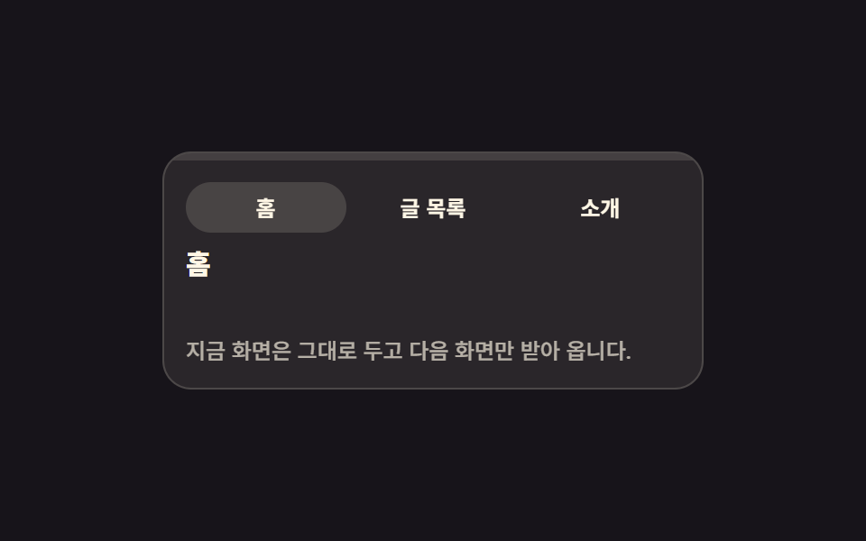 Page Loading Animation CSS: 9 Route-Change DemosPage loading animation css is the feedback layer covering the moment one screen gives way to the next. The nine here are See all demos in this post
If you like this effect - similar demos
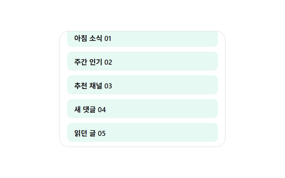 Loaders02 Skeleton row append — a list computing its preview row count from the viewport heightInfinite Scroll Loading: 9 Essential UI Patterns
 Loaders05 Icon progress ring — an indicator whose circular progress value fills with the pulled distance and morphs into a checkmark once completePull to Refresh CSS: 9 Loading Patterns
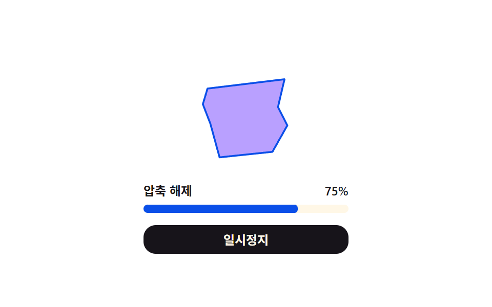 Loaders05 Extraction progress and form values changing together — while the extraction progress value fills, a form value changes along with itDownload Progress Bar: 9 Loading UI Patterns