04Radial Hue Burst
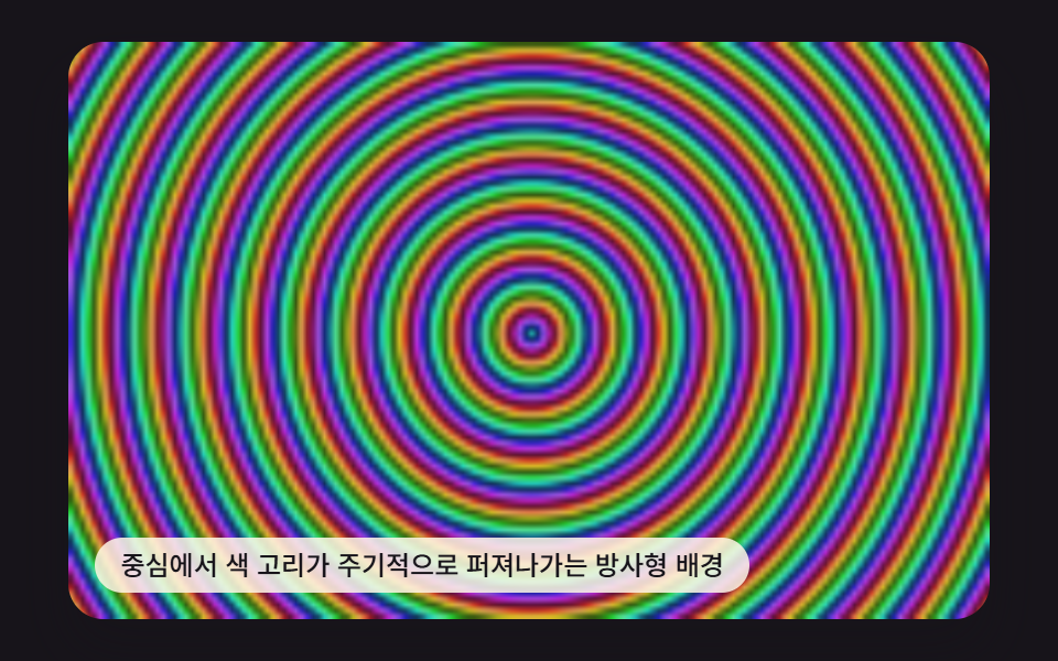
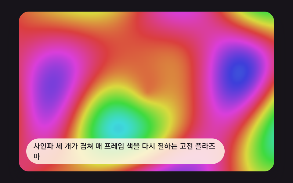
Color rings burst outward from the center of the screen and repeat on a loop.
Best forEvent banners, notification highlights
PLASMA_RING_FREQPLASMA_RING_SPEEDrenderField
<main class="stage">
<div class="pv is-demo" id="pvRoot">
  <canvas class="pv__canvas" id="pvCanvas" width="480" height="300"></canvas>
  <p class="pv__caption">A radial background where color rings periodically burst outward from the center</p>
</div>
</main>
@use "../../../../site/static/demo-tokens" as *;
@include stage($stage-ink);
.pv {
position: relative;
width: min(92vw, calc(160vh - 12.8vw));
aspect-ratio: 480 / 300;
margin: 0 auto;
border-radius: $r-card;
overflow: hidden;
box-shadow: $shadow-raised;
}
.pv__canvas {
display: block;
width: 100%;
height: 100%;
}
.pv__caption {
position: absolute;
left: $sp-3;
bottom: $sp-3;
max-width: 72%;
margin: 0;
padding: $sp-1 $sp-3;
border-radius: $r-pill;
background: rgba(255, 247, 230, .85);
color: $subject-ink;
font-weight: 500;
font-size: 12px;
line-height: 1.4;
pointer-events: none;
}
.pv__step {
position: absolute;
right: $sp-3;
top: $sp-3;
margin: 0;
padding: $sp-1 $sp-3;
border-radius: $r-pill;
background: rgba(255, 247, 230, .85);
color: $subject-ink;
font-weight: 700;
font-size: 11px;
font-variant-numeric: tabular-nums;
pointer-events: none;
}
@media (max-width: 340px) {
.pv__caption, .pv__step { font-size: 10px; padding: $sp-1 $sp-2; }
}
@media (prefers-reduced-motion: reduce) {
.pv { cursor: default; }
}html, body {
margin: 0;
overflow: hidden;
}
.stage {
box-sizing: border-box;
min-height: 100vh;
display: grid;
place-items: center;
margin: 0;
background: #17141a;
font-family: -apple-system, "Segoe UI", "Noto Sans KR", sans-serif;
padding: clamp(8px, 4vw, 24px);
}
.pv {
position: relative;
width: min(92vw, 160vh - 12.8vw);
aspect-ratio: 480/300;
margin: 0 auto;
border-radius: 16px;
overflow: hidden;
box-shadow: 0 14px 24px rgba(23, 20, 26, 0.32);
}
.pv__canvas {
display: block;
width: 100%;
height: 100%;
}
.pv__caption {
position: absolute;
left: 12px;
bottom: 12px;
max-width: 72%;
margin: 0;
padding: 4px 12px;
border-radius: 999px;
background: rgba(255, 247, 230, 0.85);
color: #17141a;
font-weight: 500;
font-size: 12px;
line-height: 1.4;
pointer-events: none;
}
.pv__step {
position: absolute;
right: 12px;
top: 12px;
margin: 0;
padding: 4px 12px;
border-radius: 999px;
background: rgba(255, 247, 230, 0.85);
color: #17141a;
font-weight: 700;
font-size: 11px;
font-variant-numeric: tabular-nums;
pointer-events: none;
}
@media (max-width: 340px) {
.pv__caption, .pv__step {
font-size: 10px;
padding: 4px 8px;
}
}
@media (prefers-reduced-motion: reduce) {
.pv {
cursor: default;
}
}(function () {
// 기법: 화면 중심으로부터의 거리(dist)에 주기(PLASMA_RING_FREQ)를 곱하고 시간을 빼서
// 위상을 만들고, 위상을 hue 로 바꾼다 — 고리가 중심에서 바깥으로 흘러나가는 것처럼 보인다.
var root = document.getElementById('pvRoot');
var canvas = document.getElementById('pvCanvas');
var ctx = canvas.getContext('2d');
var wrap = canvas.parentElement;
var CALC_W = 160, CALC_H = 100;
var LOOP_MS = 2000;
var PLASMA_RING_FREQ = 0.115;
var PLASMA_RING_SPEED = 1.15;
function hslToRgb(h, s, l) {
h = ((h % 360) + 360) % 360;
var c = (1 - Math.abs(2 * l - 1)) * s;
var x = c * (1 - Math.abs((h / 60) % 2 - 1));
var m = l - c / 2;
var r, g, b;
if (h < 60) { r = c; g = x; b = 0; }
else if (h < 120) { r = x; g = c; b = 0; }
else if (h < 180) { r = 0; g = c; b = x; }
else if (h < 240) { r = 0; g = x; b = c; }
else if (h < 300) { r = x; g = 0; b = c; }
else { r = c; g = 0; b = x; }
return [(r + m) * 255, (g + m) * 255, (b + m) * 255];
}
var off = document.createElement('canvas');
off.width = CALC_W; off.height = CALC_H;
var octx = off.getContext('2d');
var offImg = octx.createImageData(CALC_W, CALC_H);
var offBuf = offImg.data;
function renderField(t) {
var cx = CALC_W / 2, cy = CALC_H / 2;
var tt = t / LOOP_MS;
var idx = 0;
for (var y = 0; y < CALC_H; y += 1) {
for (var x = 0; x < CALC_W; x += 1) {
var dx = x - cx, dy = y - cy;
var dist = Math.sqrt(dx * dx + dy * dy);
var ringPhase = dist * PLASMA_RING_FREQ - tt * PLASMA_RING_SPEED;
var hue = ringPhase * 360;
var light = 0.4 + 0.2 * Math.sin(ringPhase * Math.PI * 6);
var rgb = hslToRgb(hue, 0.7, light);
offBuf[idx] = rgb[0]; offBuf[idx + 1] = rgb[1]; offBuf[idx + 2] = rgb[2]; offBuf[idx + 3] = 255;
idx += 4;
}
}
}
var cw = 480, ch = 300;
function fit() {
var r = wrap.getBoundingClientRect();
cw = Math.max(1, Math.round(r.width));
ch = Math.max(1, Math.round(r.height));
canvas.width = cw; canvas.height = ch;
draw(lastElapsed);
}
var lastElapsed = 0;
function draw(elapsed) {
lastElapsed = elapsed;
renderField(elapsed);
octx.putImageData(offImg, 0, 0);
ctx.clearRect(0, 0, cw, ch);
ctx.drawImage(off, 0, 0, CALC_W, CALC_H, 0, 0, cw, ch);
}
var reduce = window.matchMedia('(prefers-reduced-motion: reduce)').matches;
var playing = !reduce;
var elapsed = reduce ? LOOP_MS * 0.5 : 0;
if (reduce) { root.classList.remove('is-demo'); }
var lastTs = null;
function tick(ts) {
if (lastTs === null) lastTs = ts;
var dt = ts - lastTs;
lastTs = ts;
if (playing) {
elapsed += dt;
if (elapsed >= LOOP_MS) elapsed -= LOOP_MS;
}
draw(elapsed);
requestAnimationFrame(tick);
}
fit();
window.addEventListener('resize', fit);
draw(elapsed);
requestAnimationFrame(tick);
})();import { useEffect, useRef } from "react";
import styles from "./PlasmaRadialHueBurst.module.scss";
export default function PlasmaRadialHueBurst() {
const rootRef = useRef<HTMLDivElement>(null);
const canvasRef = useRef<HTMLCanvasElement>(null);
useEffect(() => {
const root = rootRef.current;
const canvas = canvasRef.current;
if (!root || !canvas) return;
const ctx = canvas.getContext("2d");
if (!ctx) return;
const wrap = canvas.parentElement as HTMLElement;
const CALC_W = 160, CALC_H = 100;
const LOOP_MS = 2000;
const PLASMA_RING_FREQ = 0.115;
const PLASMA_RING_SPEED = 1.15;
function hslToRgb(h: number, s: number, l: number): [number, number, number] {
h = ((h % 360) + 360) % 360;
const c = (1 - Math.abs(2 * l - 1)) * s;
const x = c * (1 - Math.abs(((h / 60) % 2) - 1));
const m = l - c / 2;
let r = 0, g = 0, b = 0;
if (h < 60) { r = c; g = x; b = 0; }
else if (h < 120) { r = x; g = c; b = 0; }
else if (h < 180) { r = 0; g = c; b = x; }
else if (h < 240) { r = 0; g = x; b = c; }
else if (h < 300) { r = x; g = 0; b = c; }
else { r = c; g = 0; b = x; }
return [(r + m) * 255, (g + m) * 255, (b + m) * 255];
}
const off = document.createElement("canvas");
off.width = CALC_W; off.height = CALC_H;
const octx = off.getContext("2d") as CanvasRenderingContext2D;
const offImg = octx.createImageData(CALC_W, CALC_H);
const offBuf = offImg.data;
const cx0 = CALC_W / 2, cy0 = CALC_H / 2;
function renderField(t: number) {
const tt = t / LOOP_MS;
let idx = 0;
for (let y = 0; y < CALC_H; y += 1) {
for (let x = 0; x < CALC_W; x += 1) {
const dist = Math.sqrt((x - cx0) * (x - cx0) + (y - cy0) * (y - cy0));
const ringPhase = dist * PLASMA_RING_FREQ - tt * PLASMA_RING_SPEED;
const hue = ringPhase * 360;
const light = 0.4 + 0.2 * Math.sin(ringPhase * Math.PI * 6);
const rgb = hslToRgb(hue, 0.75, light);
offBuf[idx] = rgb[0]; offBuf[idx + 1] = rgb[1]; offBuf[idx + 2] = rgb[2]; offBuf[idx + 3] = 255;
idx += 4;
}
}
}
let cw = 480, ch = 300;
function fit() {
const r = wrap.getBoundingClientRect();
cw = Math.max(1, Math.round(r.width));
ch = Math.max(1, Math.round(r.height));
canvas!.width = cw; canvas!.height = ch;
draw(lastElapsed);
}
let lastElapsed = 0;
function draw(elapsed: number) {
lastElapsed = elapsed;
renderField(elapsed);
octx.putImageData(offImg, 0, 0);
ctx!.imageSmoothingEnabled = false;
ctx!.clearRect(0, 0, cw, ch);
ctx!.drawImage(off, 0, 0, CALC_W, CALC_H, 0, 0, cw, ch);
}
const reduce = window.matchMedia("(prefers-reduced-motion: reduce)").matches;
let playing = !reduce;
let elapsed = reduce ? LOOP_MS * 0.5 : 0;
if (reduce) { root.classList.remove("is-demo"); }
let lastTs: number | null = null;
let raf = 0;
function tick(ts: number) {
if (lastTs === null) lastTs = ts;
const dt = ts - lastTs;
lastTs = ts;
if (playing) {
elapsed += dt;
if (elapsed >= LOOP_MS) elapsed -= LOOP_MS;
}
draw(elapsed);
raf = requestAnimationFrame(tick);
}
fit();
window.addEventListener("resize", fit);
draw(elapsed);
raf = requestAnimationFrame(tick);
return () => {
cancelAnimationFrame(raf);
window.removeEventListener("resize", fit);
};
}, []);
return (
<main className={styles.stage}>
<div className={`${styles.pv} is-demo`} ref={rootRef}>
<canvas className={styles.pv__canvas} ref={canvasRef} width={480} height={300} />
<p className={styles.pv__caption}>중심에서 색 고리가 주기적으로 퍼져나가는 방사형 배경</p>
</div>
</main>
);
}04 Radial Hue Burst — Measured area 75.385% · moving frames 23/23Original by GODRICH · SCSS and React ship in the zip · Rainbow Gradient Background CSS: 9 Patterns
The post this demo lives in
 Rainbow Gradient Background CSS: 9 PatternsA rainbow gradient background css, explained: Light, you start out with no color. Item 1 layers three sine waves onto yo See all demos in this post