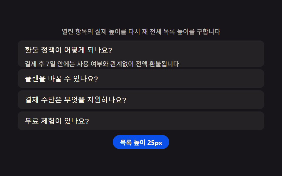
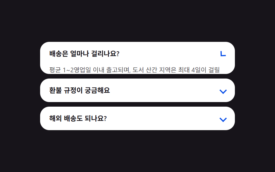
05Pricing FAQ — an accordion that remeasures the list height by how many entries are open
Every time an entry opens or closes, the actual height of the open entries gets remeasured to work out the whole list's new height, and the entries below smoothly shift into that new position.
Best forPricing-page FAQ sections, billing help accordions
grid-template-rowsscrollHeightaria-expanded
<main class="stage">
<section class="panel">
  <p class="hint">It re-measures the real height of the open item to find the whole list's total height.</p>
  <div class="acc" id="acc">
    <div class="item">
      <button class="q" id="q0" aria-expanded="false" aria-controls="a0">What is the refund policy?</button>
      <div class="a" id="a0" role="region" aria-labelledby="q0">
        <p class="aText">Within 7 days of payment you get a full refund regardless of usage.</p>
      </div>
    </div>
    <div class="item">
      <button class="q" id="q1" aria-expanded="false" aria-controls="a1">Can I change plans?</button>
      <div class="a" id="a1" role="region" aria-labelledby="q1">
        <p class="aText">You can upgrade or downgrade anytime, and the remaining balance is adjusted on your next bill.</p>
      </div>
    </div>
    <div class="item">
      <button class="q" id="q2" aria-expanded="false" aria-controls="a2">What payment methods are supported?</button>
      <div class="a" id="a2" role="region" aria-labelledby="q2">
        <p class="aText">We support credit cards and bank auto-debit, and team plans can also issue tax invoices.</p>
      </div>
    </div>
    <div class="item">
      <button class="q" id="q3" aria-expanded="false" aria-controls="a3">Is there a free trial?</button>
      <div class="a" id="a3" role="region" aria-labelledby="q3">
        <p class="aText">Every plan offers 14 days of full-feature access for free, with no card required.</p>
      </div>
    </div>
  </div>
  <p class="chip" id="heightChip">List height 0px</p>
</section>
</main>@use "../../../../site/static/demo-tokens" as *;
$duration: $dur-enter;
$easing: $ease-spring;
$color: $subject-blue-deep;
@include stage($stage-ink);
.panel {
width: 100%;
max-width: 420px;
display: flex;
flex-direction: column;
align-items: center;
gap: $sp-2;
}
.hint {
margin: 0;
padding: 0 $sp-2;
text-align: center;
font-weight: 400;
font-size: 11px;
line-height: 1.4;
color: rgba($subject-cream, .72);
}
.acc {
width: 100%;
display: flex;
flex-direction: column;
gap: $sp-1;
}
.item {
border-radius: $r-sm;
background: rgba($subject-cream, .06);
overflow: hidden;
}
.q {
width: 100%;
text-align: left;
border: 0;
background: transparent;
padding: $sp-2 $sp-3;
font-weight: 500;
font-size: 12px;
color: $subject-cream;
cursor: pointer;
}
.a {
display: grid;
grid-template-rows: 0px;
overflow: hidden;
transition: grid-template-rows $duration $easing;
}
.aText {
min-height: 0;
margin: 0;
padding: 0 $sp-3 $sp-2;
font-weight: 400;
font-size: 11px;
line-height: 1.5;
color: rgba($subject-cream, .80);
overflow: hidden;
}
.chip {
margin: 0;
padding: $sp-1 $sp-3;
border-radius: $r-pill;
background: $color;
color: $subject-cream;
font-weight: 700;
font-size: 11px;
}
@media (max-width: 340px) {
.panel { max-width: 300px; gap: $sp-1; }
.hint { font-size: 9px; }
.q { font-size: 11px; padding: $sp-1 $sp-2; }
.aText { font-size: 10px; padding: 0 $sp-2 $sp-1; }
}
@media (prefers-reduced-motion: reduce) {
.a {
transition: none;
}
}html, body {
margin: 0;
overflow: hidden;
}
.stage {
box-sizing: border-box;
min-height: 100vh;
display: grid;
place-items: center;
margin: 0;
background: #17141a;
font-family: -apple-system, "Segoe UI", "Noto Sans KR", sans-serif;
padding: clamp(8px, 4vw, 24px);
}
.panel {
width: 100%;
max-width: 420px;
display: flex;
flex-direction: column;
align-items: center;
gap: 8px;
}
.hint {
margin: 0;
padding: 0 8px;
text-align: center;
font-weight: 400;
font-size: 11px;
line-height: 1.4;
color: rgba(255, 247, 230, 0.72);
}
.acc {
width: 100%;
display: flex;
flex-direction: column;
gap: 4px;
}
.item {
border-radius: 8px;
background: rgba(255, 247, 230, 0.06);
overflow: hidden;
}
.q {
width: 100%;
text-align: left;
border: 0;
background: transparent;
padding: 8px 12px;
font-weight: 500;
font-size: 12px;
color: #fff7e6;
cursor: pointer;
}
.a {
display: grid;
grid-template-rows: 0px;
overflow: hidden;
transition: grid-template-rows 600ms cubic-bezier(0.2, 0.8, 0.2, 1);
}
.aText {
min-height: 0;
margin: 0;
padding: 0 12px 8px;
font-weight: 400;
font-size: 11px;
line-height: 1.5;
color: rgba(255, 247, 230, 0.8);
overflow: hidden;
}
.chip {
margin: 0;
padding: 4px 12px;
border-radius: 999px;
background: #0a4fe8;
color: #fff7e6;
font-weight: 700;
font-size: 11px;
}
@media (max-width: 340px) {
.panel {
max-width: 300px;
gap: 4px;
}
.hint {
font-size: 9px;
}
.q {
font-size: 11px;
padding: 4px 8px;
}
.aText {
font-size: 10px;
padding: 0 8px 4px;
}
}
@media (prefers-reduced-motion: reduce) {
.a {
transition: none;
}
}// 요금 FAQ(05) — 항목을 열 때마다 열린 패널들의 실제 scrollHeight 를 다시 재 합산하고,
// 그 총합을 칩에 표시한다(계산 한 겹). 패널 자체는 grid-template-rows 로 접혀 아래 항목이
// 그 값만큼 자연스럽게 자리를 옮긴다. 자동 시연은 항목을 순서대로 하나씩 연다.
(function () {
var acc = document.getElementById('acc');
var chip = document.getElementById('heightChip');
if (!acc || !chip) return;
var reduce = window.matchMedia('(prefers-reduced-motion: reduce)').matches;
var items = Array.prototype.slice.call(acc.querySelectorAll('.item'));
// 패널은 grid-template-rows 로 접혀 있어 열리는 도중에 scrollHeight 를 읽으면 전환 시작 전
// 값(0 근처)이 잡힌다 — 그래서 실제 콘텐츠 높이는 시작할 때 한 번, 열림 상태를 순간 강제해
// 재고 원래대로 되돌리는 방식으로 미리 재 캐시해 둔다(자연 높이 캐시).
var NATURAL_HEIGHTS = items.map(function (item) {
var panel = item.querySelector('.a');
if (!panel) return 0;
// grid-template-rows 를 잠깐 auto 로 풀어 전환·클래스와 무관하게 콘텐츠의 실제 높이를 잰다.
var prevTransition = panel.style.transition;
panel.style.transition = 'none';
panel.style.gridTemplateRows = 'auto';
var h = panel.scrollHeight;
panel.style.gridTemplateRows = '0px';
void panel.offsetHeight; // 0px 을 실제로 반영(플러시)해야 다음 전환이 이 값에서 시작한다
panel.style.transition = prevTransition;
return h;
});
function measureAndReport() {
var total = 0;
items.forEach(function (item, i) {
if (item.classList.contains('is-open')) total += NATURAL_HEIGHTS[i];
});
chip.textContent = 'List height ' + total + 'px';
}
function setOpen(openIndex) {
items.forEach(function (item, i) {
var q = item.querySelector('.q');
var panel = item.querySelector('.a');
var open = i === openIndex;
item.classList.toggle('is-open', open);
if (panel) panel.style.gridTemplateRows = open ? NATURAL_HEIGHTS[i] + 'px' : '0px';
if (q) q.setAttribute('aria-expanded', open ? 'true' : 'false');
});
measureAndReport();
}
items.forEach(function (item, i) {
var q = item.querySelector('.q');
if (!q) return;
q.addEventListener('click', function () {
var willOpen = !item.classList.contains('is-open');
setOpen(willOpen ? i : -1);
});
});
setOpen(0);
if (!reduce) {
var idx = 0;
setInterval(function () {
idx = (idx + 1) % items.length;
setOpen(idx);
}, 550);
}
})();// PricingFaq — vanilla 판(run/339/demo/05-pricing-faq/index.html) 의 React 포트.
// 항목을 열 때마다 열린 패널들의 실제 콘텐츠 높이를 다시 재 합산하고, 그 총합을 칩에 표시한다(계산 한 겹).
// 패널은 고정 px 값을 인라인으로 대입해 grid-template-rows 를 전환한다 — fr 단위 재축소 오차를 피하려
// auto 로 잠깐 풀어 잰 뒤 0px 로 되돌릴 때 강제 리플로우(offsetHeight 읽기)를 끼워 그 값이 실제로
// 반영되게 한다(그렇지 않으면 다음 전환이 직전 auto 상태에서 시작해 첫 프레임이 어긋난다).
import { useEffect, useRef } from "react";
import styles from "./PricingFaq.module.scss";
export type PricingFaqProps = {
duration?: string;
easing?: string;
color?: string;
};
const HINT = "열린 항목의 실제 높이를 다시 재 전체 목록 높이를 구합니다";
type Item = { q: string; a: string };
const ITEMS: Item[] = [
{ q: "환불 정책이 어떻게 되나요?", a: "결제 후 7일 안에는 사용 여부와 관계없이 전액 환불됩니다." },
{ q: "플랜을 바꿀 수 있나요?", a: "언제든 상위·하위 플랜으로 바꿀 수 있고 남은 기간 요금은 다음 결제에서 조정됩니다." },
{ q: "결제 수단은 무엇을 지원하나요?", a: "신용카드와 계좌 자동이체를 지원하며, 팀 플랜은 세금계산서 발행도 가능합니다." },
{ q: "무료 체험이 있나요?", a: "모든 플랜은 카드 등록 없이 14일 동안 전체 기능을 무료로 써볼 수 있습니다." }
];
export default function PricingFaq({
duration = "600ms",
easing = "cubic-bezier(.2,.8,.2,1)",
color = "#0a4fe8"
}: PricingFaqProps) {
const qRefs = useRef<(HTMLButtonElement | null)[]>([]);
const panelRefs = useRef<(HTMLDivElement | null)[]>([]);
const itemRefs = useRef<(HTMLDivElement | null)[]>([]);
const chipRef = useRef<HTMLParagraphElement | null>(null);
useEffect(() => {
const chip = chipRef.current;
if (!chip) return;
const reduce = window.matchMedia("(prefers-reduced-motion: reduce)").matches;
// grid-template-rows 를 잠깐 auto 로 풀어 전환·상태와 무관하게 콘텐츠의 실제 높이를 잰다.
const naturalHeights = panelRefs.current!.map((panel) => {
if (!panel) return 0;
const prevTransition = panel.style.transition;
panel.style.transition = "none";
panel.style.gridTemplateRows = "auto";
const h = panel.scrollHeight;
panel.style.gridTemplateRows = "0px";
void panel.offsetHeight; // 0px 을 실제로 반영(플러시)해야 다음 전환이 이 값에서 시작한다
panel.style.transition = prevTransition;
return h;
});
function measureAndReport(openIndex: number): void {
let total = 0;
itemRefs.current!.forEach((item, i) => {
if (item && i === openIndex) total += naturalHeights[i];
});
chip!.textContent = "목록 높이 " + total + "px";
}
function setOpen(openIndex: number): void {
itemRefs.current!.forEach((item, i) => {
const q = qRefs.current![i];
const panel = panelRefs.current![i];
const open = i === openIndex;
if (item) item.classList.toggle(styles.isOpen, open);
if (panel) panel.style.gridTemplateRows = open ? naturalHeights[i] + "px" : "0px";
if (q) q.setAttribute("aria-expanded", open ? "true" : "false");
});
measureAndReport(openIndex);
}
const cleanups: (() => void)[] = [];
qRefs.current!.forEach((q, i) => {
if (!q) return;
const handler = (): void => {
const item = itemRefs.current![i];
const willOpen = !(item && item.classList.contains(styles.isOpen));
setOpen(willOpen ? i : -1);
};
q.addEventListener("click", handler);
cleanups.push(() => q.removeEventListener("click", handler));
});
setOpen(0);
let timer = 0;
if (!reduce) {
let idx = 0;
timer = window.setInterval(() => {
idx = (idx + 1) % ITEMS.length;
setOpen(idx);
}, 550);
}
return () => {
if (timer) window.clearInterval(timer);
cleanups.forEach((fn) => fn());
};
// eslint-disable-next-line react-hooks/exhaustive-deps
}, []);
return (
<main className={styles.stage}>
<section className={styles.panel}>
<p className={styles.hint}>{HINT}</p>
<div className={styles.acc}>
{ITEMS.map((item, i) => (
<div
key={item.q}
className={styles.item}
ref={(el: HTMLDivElement | null) => {
itemRefs.current![i] = el;
}}
>
<button
className={styles.q}
id={"q" + i}
aria-expanded="false"
aria-controls={"a" + i}
ref={(el: HTMLButtonElement | null) => {
qRefs.current![i] = el;
}}
>
{item.q}
</button>
<div
className={styles.a}
id={"a" + i}
role="region"
aria-labelledby={"q" + i}
ref={(el: HTMLDivElement | null) => {
panelRefs.current![i] = el;
}}
>
<p className={styles.aText}>{item.a}</p>
</div>
</div>
))}
</div>
<p className={styles.chip} ref={chipRef}>
목록 높이 0px
</p>
</section>
</main>
);
}05 Pricing FAQ — an accordion that remeasures the list height by how many entries are open — Measured area 34.936% · moving frames 9/23Original by GODRICH · SCSS and React ship in the zip · 9 Pricing Page Design Sections (Copy-Paste)
The post this demo lives in
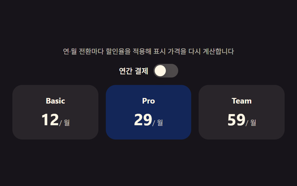 9 Pricing Page Design Sections (Copy-Paste)Nine pricing sections that compute: the billing switch reworks every plan's price on the spot, the discount badge derive See all demos in this post
If you like this effect - similar demos
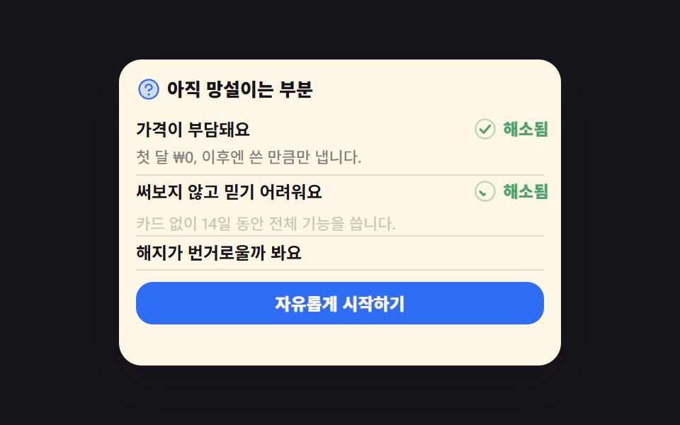 Landing sections05 Objection-handling FAQ that arms the CTALanding Page Conversion: 9 Sections That Convert
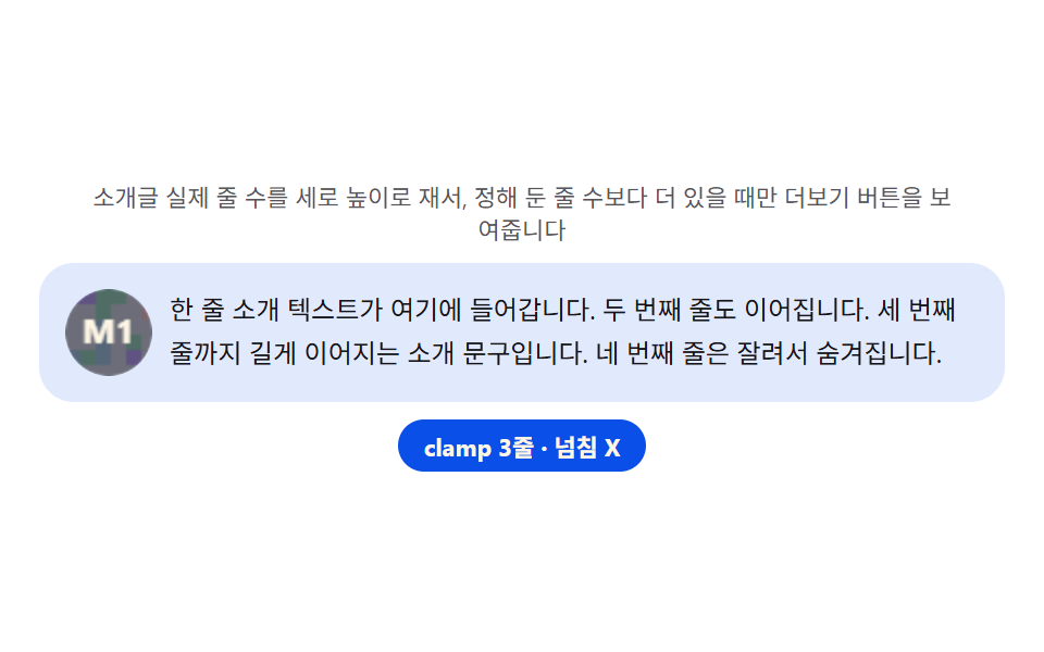 Landing sections04 Profile detail — a card that measures bio height to decide whether read-more even appears9 Team Page Design Patterns (Copy-Paste)
 Landing sections05 FAQ accordion — a list recomputing answer height from content lengthHero Section Design Examples: 9 Patterns