07Comparison table folds group by group
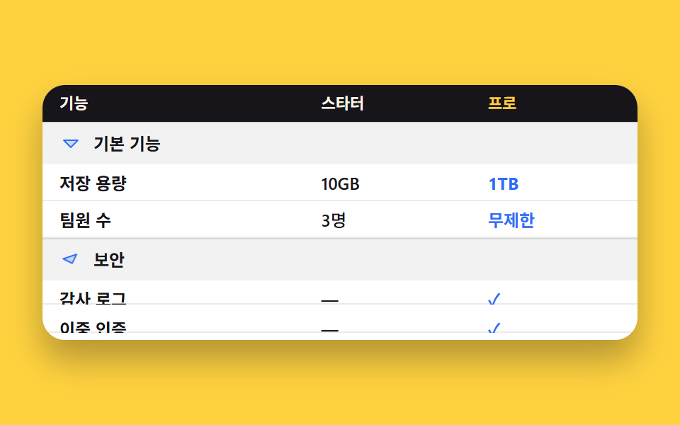
Clicking a group heading folds and unfolds the rows beneath it without measuring any height, while the table stays a real table with its row and column headers intact.
Best forPlan comparison tables that run past twenty rows
grid-template-rowsscope="row"aria-controls
<main class="stage">
<div class="ca is-demo">
<table class="ca__table">
<thead>
<tr class="ca__headrow">
<th scope="col"><span class="ca__cap">Feature</span></th>
<th scope="col"><span class="ca__cap">Starter</span></th>
<th scope="col"><span class="ca__cap ca__cap--hi">Pro</span></th>
</tr>
</thead>
<tbody class="ca__group" id="ca-g1" data-g="a" data-open="1">
<tr class="ca__grow">
<th colspan="3" scope="colgroup" class="ca__gth">
<button class="ca__btn" type="button" aria-expanded="true" aria-controls="ca-g1">
<span class="ca__caret" aria-hidden="true"><svg viewBox="0 0 256 256" width="16" height="16"><g fill="currentColor"><path d="m208 96l-80 80l-80-80Z" opacity=".2"/><path d="M215.39 92.94A8 8 0 0 0 208 88H48a8 8 0 0 0-5.66 13.66l80 80a8 8 0 0 0 11.32 0l80-80a8 8 0 0 0 1.73-8.72M128 164.69L67.31 104h121.38Z"/></g></svg></span>
<span class="ca__gname">Essentials</span>
</button>
</th>
</tr>
<tr class="ca__row">
<th scope="row"><span class="ca__box"><span class="cell">Storage</span></span></th>
<td><span class="ca__box"><span class="cell">10GB</span></span></td>
<td><span class="ca__box"><span class="cell cell--hi">1TB</span></span></td>
</tr>
<tr class="ca__row">
<th scope="row"><span class="ca__box"><span class="cell">Team size</span></span></th>
<td><span class="ca__box"><span class="cell">3 people</span></span></td>
<td><span class="ca__box"><span class="cell cell--hi">Unlimited</span></span></td>
</tr>
</tbody>
<tbody class="ca__group" id="ca-g2" data-g="b" data-open="1">
<tr class="ca__grow">
<th colspan="3" scope="colgroup" class="ca__gth">
<button class="ca__btn" type="button" aria-expanded="true" aria-controls="ca-g2">
<span class="ca__caret" aria-hidden="true"><svg viewBox="0 0 256 256" width="16" height="16"><g fill="currentColor"><path d="m208 96l-80 80l-80-80Z" opacity=".2"/><path d="M215.39 92.94A8 8 0 0 0 208 88H48a8 8 0 0 0-5.66 13.66l80 80a8 8 0 0 0 11.32 0l80-80a8 8 0 0 0 1.73-8.72M128 164.69L67.31 104h121.38Z"/></g></svg></span>
<span class="ca__gname">Security</span>
</button>
</th>
</tr>
<tr class="ca__row">
<th scope="row"><span class="ca__box"><span class="cell">Audit log</span></span></th>
<td><span class="ca__box"><span class="cell">—</span></span></td>
<td><span class="ca__box"><span class="cell cell--hi">✓</span></span></td>
</tr>
<tr class="ca__row">
<th scope="row"><span class="ca__box"><span class="cell">Two-factor login</span></span></th>
<td><span class="ca__box"><span class="cell">—</span></span></td>
<td><span class="ca__box"><span class="cell cell--hi">✓</span></span></td>
</tr>
</tbody>
</table>
</div>
</main>@use "../../../../site/static/demo-tokens" as *;
$duration: $dur-base;
$easing: $ease-out;
$color: $subject-blue;
@include stage($stage-yellow);
.ca {
box-sizing: border-box;
width: min(420px, 88vw);
border-radius: $r-card;
overflow: hidden;
background: $stage-paper;
box-shadow: $shadow-raised;
font-family: -apple-system, "Segoe UI", "Noto Sans KR", sans-serif;
color: $subject-ink;
}
.ca__table {
width: 100%;
border-collapse: collapse;
table-layout: fixed;
}
// 칸의 패딩은 0 이어야 한다 — 접힌 칸에 패딩이 남으면 행이 완전히 닫히지 않는다
.ca__table th,
.ca__table td {
padding: 0;
text-align: left;
vertical-align: middle;
}
// ── 머리글 줄 ──
.ca__headrow th { background: $subject-ink; }
.ca__headrow th:nth-child(1) { width: 44%; }
.ca__headrow th:nth-child(2) { width: 28%; }
.ca__headrow th:nth-child(3) { width: 28%; }
.ca__cap {
display: block;
line-height: 26px;
padding-left: $sp-3;
padding-right: $sp-3;
font-size: 11px;
font-weight: 700;
color: $subject-cream;
white-space: nowrap;
overflow: hidden;
text-overflow: ellipsis;
}
.ca__cap--hi { color: $stage-yellow; }
// ── 묶음 제목 줄 (접히지 않는다) ──
.ca__gth { box-shadow: inset 0 1px 0 rgba(0, 0, 0, .1); }
.ca__btn {
box-sizing: border-box;
display: flex;
align-items: center;
gap: $sp-2;
width: 100%;
margin: 0;
padding-top: $sp-1;
padding-bottom: $sp-1;
padding-left: $sp-3;
padding-right: $sp-3;
border: 0;
border-radius: 0;
background-color: rgba(0, 0, 0, .05);
color: $subject-ink;
font-family: inherit;
font-size: 12px;
line-height: 22px;
font-weight: 700;
text-align: left;
cursor: pointer;
}
.ca__btn:focus-visible { outline: 2px solid $color; outline-offset: -2px; }
.ca__caret {
display: inline-flex;
flex: 0 0 auto;
color: $color;
transition: transform $duration $easing;
}
.ca__caret svg { display: block; }
.ca__gname {
flex: 1 1 auto;
min-width: 0;
white-space: nowrap;
overflow: hidden;
text-overflow: ellipsis;
}
// ── 접히는 칸 ──
// 높이를 재지 않는 접기: 칸 안쪽 상자가 grid 이고, 그 한 줄짜리 트랙이 1fr → 0fr 로 보간된다.
// .cell 은 min-height:0 이라 트랙이 0 이 되면 기여 높이도 0 이다 — 세로 패딩을 주면 그만큼 남으니 line-height 로만 높이를 만든다.
.ca__box {
display: grid;
grid-template-rows: 1fr;
overflow: hidden;
transition: grid-template-rows $duration $easing;
}
.ca__group[data-open="0"] .ca__box { grid-template-rows: 0fr; }
.ca__group[data-open="0"] .ca__caret { transform: rotate(-90deg); }
.cell {
display: block;
min-height: 0;
line-height: 26px;
padding-left: $sp-3;
padding-right: $sp-3;
font-size: 12px;
font-weight: 500;
color: $subject-ink;
white-space: nowrap;
overflow: hidden;
text-overflow: ellipsis;
box-shadow: inset 0 -1px 0 rgba(0, 0, 0, .08);
}
.ca__row th .cell { font-weight: 700; }
.cell--hi {
color: $color;
font-weight: 700;
}
// ── 자동 루프: 두 묶음이 번갈아 닫혔다 열린다. 88% 에 둘 다 열린 원상태로 돌아온다 ──
.ca.is-demo .ca__box {
animation-duration: $dur-loop;
animation-timing-function: $easing;
animation-iteration-count: infinite;
}
.ca.is-demo .ca__caret {
animation-duration: $dur-loop;
animation-timing-function: $easing;
animation-iteration-count: infinite;
}
.ca.is-demo .ca__group[data-g="a"] .ca__box { animation-name: ca-shut-a; }
.ca.is-demo .ca__group[data-g="b"] .ca__box { animation-name: ca-shut-b; }
.ca.is-demo .ca__group[data-g="a"] .ca__caret { animation-name: ca-caret-a; }
.ca.is-demo .ca__group[data-g="b"] .ca__caret { animation-name: ca-caret-b; }
@keyframes ca-shut-a {
0% { grid-template-rows: 1fr; }
20% { grid-template-rows: 0fr; }
34% { grid-template-rows: 0fr; }
48% { grid-template-rows: 1fr; }
100% { grid-template-rows: 1fr; }
}
@keyframes ca-shut-b {
0% { grid-template-rows: 1fr; }
48% { grid-template-rows: 1fr; }
66% { grid-template-rows: 0fr; }
76% { grid-template-rows: 0fr; }
88% { grid-template-rows: 1fr; }
100% { grid-template-rows: 1fr; }
}
@keyframes ca-caret-a {
0% { transform: rotate(0deg); }
20% { transform: rotate(-90deg); }
34% { transform: rotate(-90deg); }
48% { transform: rotate(0deg); }
100% { transform: rotate(0deg); }
}
@keyframes ca-caret-b {
0% { transform: rotate(0deg); }
48% { transform: rotate(0deg); }
66% { transform: rotate(-90deg); }
76% { transform: rotate(-90deg); }
88% { transform: rotate(0deg); }
100% { transform: rotate(0deg); }
}
@media (max-width: 340px) {
.ca__cap {
line-height: 20px;
padding-left: $sp-2;
padding-right: $sp-2;
font-size: 10px;
}
.ca__btn {
padding-top: 0;
padding-bottom: 0;
padding-left: $sp-2;
padding-right: $sp-2;
font-size: 11px;
line-height: 18px;
}
.cell {
line-height: 20px;
padding-left: $sp-2;
padding-right: $sp-2;
font-size: 10px;
}
}
@media (prefers-reduced-motion: reduce) {
.ca.is-demo .ca__box,
.ca.is-demo .ca__caret { animation: none !important; }
.ca__box,
.ca__caret { transition: none; }
.ca.is-demo .ca__box { grid-template-rows: 1fr; }
}html, body {
margin: 0;
overflow: hidden;
}
.stage {
box-sizing: border-box;
min-height: 100vh;
display: grid;
place-items: center;
margin: 0;
background: #ffd23f;
font-family: -apple-system, "Segoe UI", "Noto Sans KR", sans-serif;
padding: clamp(8px, 4vw, 24px);
}
.ca {
box-sizing: border-box;
width: min(420px, 88vw);
border-radius: 16px;
overflow: hidden;
background: #ffffff;
box-shadow: 0 14px 24px rgba(23, 20, 26, 0.32);
font-family: -apple-system, "Segoe UI", "Noto Sans KR", sans-serif;
color: #17141a;
}
.ca__table {
width: 100%;
border-collapse: collapse;
table-layout: fixed;
}
.ca__table th,
.ca__table td {
padding: 0;
text-align: left;
vertical-align: middle;
}
.ca__headrow th {
background: #17141a;
}
.ca__headrow th:nth-child(1) {
width: 44%;
}
.ca__headrow th:nth-child(2) {
width: 28%;
}
.ca__headrow th:nth-child(3) {
width: 28%;
}
.ca__cap {
display: block;
line-height: 26px;
padding-left: 12px;
padding-right: 12px;
font-size: 11px;
font-weight: 700;
color: #fff7e6;
white-space: nowrap;
overflow: hidden;
text-overflow: ellipsis;
}
.ca__cap--hi {
color: #ffd23f;
}
.ca__gth {
box-shadow: inset 0 1px 0 rgba(0, 0, 0, 0.1);
}
.ca__btn {
box-sizing: border-box;
display: flex;
align-items: center;
gap: 8px;
width: 100%;
margin: 0;
padding-top: 4px;
padding-bottom: 4px;
padding-left: 12px;
padding-right: 12px;
border: 0;
border-radius: 0;
background-color: rgba(0, 0, 0, 0.05);
color: #17141a;
font-family: inherit;
font-size: 12px;
line-height: 22px;
font-weight: 700;
text-align: left;
cursor: pointer;
}
.ca__btn:focus-visible {
outline: 2px solid #2f6df6;
outline-offset: -2px;
}
.ca__caret {
display: inline-flex;
flex: 0 0 auto;
color: #2f6df6;
transition: transform 300ms ease-out;
}
.ca__caret svg {
display: block;
}
.ca__gname {
flex: 1 1 auto;
min-width: 0;
white-space: nowrap;
overflow: hidden;
text-overflow: ellipsis;
}
.ca__box {
display: grid;
grid-template-rows: 1fr;
overflow: hidden;
transition: grid-template-rows 300ms ease-out;
}
.ca__group[data-open="0"] .ca__box {
grid-template-rows: 0fr;
}
.ca__group[data-open="0"] .ca__caret {
transform: rotate(-90deg);
}
.cell {
display: block;
min-height: 0;
line-height: 26px;
padding-left: 12px;
padding-right: 12px;
font-size: 12px;
font-weight: 500;
color: #17141a;
white-space: nowrap;
overflow: hidden;
text-overflow: ellipsis;
box-shadow: inset 0 -1px 0 rgba(0, 0, 0, 0.08);
}
.ca__row th .cell {
font-weight: 700;
}
.cell--hi {
color: #2f6df6;
font-weight: 700;
}
.ca.is-demo .ca__box {
animation-duration: 2s;
animation-timing-function: ease-out;
animation-iteration-count: infinite;
}
.ca.is-demo .ca__caret {
animation-duration: 2s;
animation-timing-function: ease-out;
animation-iteration-count: infinite;
}
.ca.is-demo .ca__group[data-g=a] .ca__box {
animation-name: ca-shut-a;
}
.ca.is-demo .ca__group[data-g=b] .ca__box {
animation-name: ca-shut-b;
}
.ca.is-demo .ca__group[data-g=a] .ca__caret {
animation-name: ca-caret-a;
}
.ca.is-demo .ca__group[data-g=b] .ca__caret {
animation-name: ca-caret-b;
}
@keyframes ca-shut-a {
0% {
grid-template-rows: 1fr;
}
20% {
grid-template-rows: 0fr;
}
34% {
grid-template-rows: 0fr;
}
48% {
grid-template-rows: 1fr;
}
100% {
grid-template-rows: 1fr;
}
}
@keyframes ca-shut-b {
0% {
grid-template-rows: 1fr;
}
48% {
grid-template-rows: 1fr;
}
66% {
grid-template-rows: 0fr;
}
76% {
grid-template-rows: 0fr;
}
88% {
grid-template-rows: 1fr;
}
100% {
grid-template-rows: 1fr;
}
}
@keyframes ca-caret-a {
0% {
transform: rotate(0deg);
}
20% {
transform: rotate(-90deg);
}
34% {
transform: rotate(-90deg);
}
48% {
transform: rotate(0deg);
}
100% {
transform: rotate(0deg);
}
}
@keyframes ca-caret-b {
0% {
transform: rotate(0deg);
}
48% {
transform: rotate(0deg);
}
66% {
transform: rotate(-90deg);
}
76% {
transform: rotate(-90deg);
}
88% {
transform: rotate(0deg);
}
100% {
transform: rotate(0deg);
}
}
@media (max-width: 340px) {
.ca__cap {
line-height: 20px;
padding-left: 8px;
padding-right: 8px;
font-size: 10px;
}
.ca__btn {
padding-top: 0;
padding-bottom: 0;
padding-left: 8px;
padding-right: 8px;
font-size: 11px;
line-height: 18px;
}
.cell {
line-height: 20px;
padding-left: 8px;
padding-right: 8px;
font-size: 10px;
}
}
@media (prefers-reduced-motion: reduce) {
.ca.is-demo .ca__box,
.ca.is-demo .ca__caret {
animation: none !important;
}
.ca__box,
.ca__caret {
transition: none;
}
.ca.is-demo .ca__box {
grid-template-rows: 1fr;
}
}// 실제 동작: 묶음 제목 버튼이 aria-expanded 와 tbody 의 data-open 을 뒤집는다.
// 높이는 아무도 재지 않는다 — 칸 안쪽 상자의 grid-template-rows 가 1fr↔0fr 로 보간될 뿐이다.
var root = document.querySelector('.ca');
var btns = [].slice.call(document.querySelectorAll('.ca__btn'));
function toggle(btn) {
root.classList.remove('is-demo');
var open = btn.getAttribute('aria-expanded') === 'true';
var group = document.getElementById(btn.getAttribute('aria-controls'));
btn.setAttribute('aria-expanded', String(!open));
group.setAttribute('data-open', open ? '0' : '1');
}
btns.forEach(function (b) {
b.addEventListener('click', function () { toggle(b); });
});import { useState } from "react";
import type { CSSProperties } from "react";
import styles from "./ComparisonAccordion.module.scss";
export type PlanRow = { name: string; starter: string; pro: string };
export type PlanGroup = { id: string; title: string; rows: PlanRow[] };
export type ComparisonAccordionProps = {
columns?: [string, string, string];
groups?: PlanGroup[];
duration?: number;
easing?: string;
color?: string;
};
type Vars = CSSProperties & { "--duration"?: string; "--easing"?: string; "--color"?: string };
const CARET = (
<g fill="currentColor">
<path d="m208 96l-80 80l-80-80Z" opacity=".2" />
<path d="M215.39 92.94A8 8 0 0 0 208 88H48a8 8 0 0 0-5.66 13.66l80 80a8 8 0 0 0 11.32 0l80-80a8 8 0 0 0 1.73-8.72M128 164.69L67.31 104h121.38Z" />
</g>
);
const DEFAULT_GROUPS: PlanGroup[] = [
{
id: "ca-essentials",
title: "Essentials",
rows: [
{ name: "Storage", starter: "10GB", pro: "1TB" },
{ name: "Team size", starter: "3 people", pro: "Unlimited" },
],
},
{
id: "ca-security",
title: "Security",
rows: [
{ name: "Audit log", starter: "—", pro: "✓" },
{ name: "Two-factor login", starter: "—", pro: "✓" },
],
},
];
export default function ComparisonAccordion({
columns = ["Feature", "Starter", "Pro"],
groups = DEFAULT_GROUPS,
duration = 300,
easing = "ease-out",
color = "#2f6df6",
}: ComparisonAccordionProps) {
const [demo, setDemo] = useState(true);
const [shut, setShut] = useState<Record<string, boolean>>({});
const vars: Vars = { "--duration": `${duration}ms`, "--easing": easing, "--color": color };
// 높이는 아무도 재지 않는다 — 칸 안쪽 상자의 grid-template-rows 가 1fr↔0fr 로 보간될 뿐이다
function toggle(id: string) {
setDemo(false);
setShut((v) => ({ ...v, [id]: !v[id] }));
}
return (
<div className={`${styles.ca} ${demo ? styles.isDemo : ""}`} style={vars}>
<table className={styles.table}>
<thead>
<tr className={styles.headrow}>
<th scope="col"><span className={styles.cap}>{columns[0]}</span></th>
<th scope="col"><span className={styles.cap}>{columns[1]}</span></th>
<th scope="col"><span className={`${styles.cap} ${styles.capHi}`}>{columns[2]}</span></th>
</tr>
</thead>
{groups.map((g, gi) => (
<tbody
key={g.id}
id={g.id}
className={styles.group}
data-g={gi === 0 ? "a" : "b"}
data-open={shut[g.id] ? "0" : "1"}
>
<tr>
<th colSpan={3} scope="colgroup" className={styles.gth}>
<button
className={styles.btn}
type="button"
aria-expanded={!shut[g.id]}
aria-controls={g.id}
onClick={() => toggle(g.id)}
>
<span className={styles.caret} aria-hidden="true">
<svg viewBox="0 0 256 256" width="16" height="16">{CARET}</svg>
</span>
<span className={styles.gname}>{g.title}</span>
</button>
</th>
</tr>
{g.rows.map((r) => (
<tr key={r.name} className={styles.row}>
<th scope="row"><span className={styles.box}><span className={styles.cell}>{r.name}</span></span></th>
<td><span className={styles.box}><span className={styles.cell}>{r.starter}</span></span></td>
<td><span className={styles.box}><span className={`${styles.cell} ${styles.cellHi}`}>{r.pro}</span></span></td>
</tr>
))}
</tbody>
))}
</table>
</div>
);
}07 Comparison table folds group by group — Measured area 62.638% · moving frames 16/23Original by GODRICH · SCSS and React ship in the zip · Pricing Table Design: 9 Live Interactions
The post this demo lives in
 Pricing Table Design: 9 Live InteractionsIn pricing table design, the work happens on top of the cards, not inside them. All nine run on vanilla JS and SCSS, and See all demos in this post