06Dark glow ring
On a dark card a ring around the avatar breathes brighter and dimmer, and the same bleed of color carries over to the name and the follow button.
Best forAccount cards in gaming, music, and developer tools where the dark screen is the default
box-shadowdrop-shadowaria-pressed

<main class="stage">
  <div class="dg is-demo">
    <article class="dg__card">
      <div class="dg__ava">
        <span class="dg__halo" aria-hidden="true"></span>
        <span class="dg__ring" aria-hidden="true"></span>
        <span class="dg__avatar" aria-hidden="true"><span class="dg__init">MJ</span></span>
        <span class="dg__dot" aria-hidden="true"></span>
      </div>
      <h2 class="dg__name">Minjae Seo</h2>
      <p class="dg__role">Sound engineer</p>
      <p class="dg__stats">
        <span class="dg__stat"><strong>3,325</strong>Followers</span>
        <span class="dg__stat"><strong>57</strong>Posts</span>
      </p>
      <button class="dg__follow" type="button" id="dg-follow" aria-pressed="false">
        <svg class="dg__i dg__i--plus" viewBox="0 0 256 256" width="16" height="16" aria-hidden="true"><g fill="currentColor"><path d="M168 100a60 60 0 1 1-60-60a60 60 0 0 1 60 60" opacity=".2"/><path d="M256 136a8 8 0 0 1-8 8h-16v16a8 8 0 0 1-16 0v-16h-16a8 8 0 0 1 0-16h16v-16a8 8 0 0 1 16 0v16h16a8 8 0 0 1 8 8m-57.87 58.85a8 8 0 0 1-12.26 10.3C165.75 181.19 138.09 168 108 168s-57.75 13.19-77.87 37.15a8 8 0 0 1-12.25-10.3c14.94-17.78 33.52-30.41 54.17-37.17a68 68 0 1 1 71.9 0c20.65 6.76 39.23 19.39 54.18 37.17M108 152a52 52 0 1 0-52-52a52.06 52.06 0 0 0 52 52"/></g></svg>
        <svg class="dg__i dg__i--check" viewBox="0 0 256 256" width="16" height="16" aria-hidden="true"><g fill="currentColor"><path d="M232 56v144a16 16 0 0 1-16 16H40a16 16 0 0 1-16-16V56a16 16 0 0 1 16-16h176a16 16 0 0 1 16 16" opacity=".2"/><path d="m205.66 85.66l-96 96a8 8 0 0 1-11.32 0l-40-40a8 8 0 0 1 11.32-11.32L104 164.69l90.34-90.35a8 8 0 0 1 11.32 11.32"/></g></svg>
        <span class="dg__label" id="dg-label">Follow</span>
      </button>
    </article>
  </div>
</main>
@use "../../../../site/static/demo-tokens" as *;
$duration: $dur-enter;
$easing: $ease-spring;
$color: $subject-mint;
@include stage($stage-ink);
.dg {
display: grid;
place-items: center;
user-select: none;
-webkit-user-select: none;
}
.dg__card {
display: flex;
flex-direction: column;
align-items: center;
width: 300px;
padding: $sp-4;
background: rgba(255, 255, 255, .05);
border: 1px solid rgba(255, 255, 255, .10);
border-radius: $r-card;
}
.dg__ava {
position: relative;
width: 68px;
height: 68px;
}
.dg__ring {
position: absolute;
inset: 0;
border: 2px solid $subject-mint;
border-radius: 50%;
box-shadow: 0 0 18px rgba($subject-mint, .55), inset 0 0 10px rgba($subject-mint, .45);
}
.dg__halo {
position: absolute;
inset: -8px;
border-radius: 50%;
box-shadow: 0 0 26px 4px rgba($subject-mint, .55);
opacity: .35;
pointer-events: none;
}
.dg__avatar {
position: absolute;
inset: 8px;
display: grid;
place-items: center;
border-radius: 50%;
background: linear-gradient(rgba($subject-mint, .28), rgba($subject-blue, .20)), rgba(255, 255, 255, .05);
font-size: 16px;
line-height: 20px;
font-weight: 700;
}
.dg__init {
color: $subject-cream;
filter: drop-shadow(0 0 6px rgba($subject-mint, .9));
}
.dg__dot {
position: absolute;
right: 0;
bottom: 2px;
width: 12px;
height: 12px;
border-radius: 50%;
background: $subject-mint;
box-shadow: 0 0 10px rgba($subject-mint, .8);
}
.dg__name {
margin: $sp-2 0 0;
font-size: 16px;
line-height: 20px;
font-weight: 700;
color: $subject-cream;
}
.dg__role {
margin: $sp-1 0 0;
font-size: 12px;
line-height: 16px;
font-weight: 500;
color: rgba(255, 255, 255, .6);
}
.dg__stats {
display: flex;
gap: $sp-4;
margin: $sp-3 0 0;
font-size: 12px;
line-height: 18px;
font-weight: 500;
color: rgba(255, 255, 255, .6);
}
.dg__stat strong {
margin-right: $sp-1;
font-weight: 700;
color: $subject-cream;
font-variant-numeric: tabular-nums;
}
.dg__follow {
display: inline-flex;
align-items: center;
justify-content: center;
gap: $sp-1;
height: 36px;
margin: $sp-3 0 0;
padding: 0 $sp-4;
background: rgba($subject-mint, .10);
border: 1px solid rgba($subject-mint, .7);
border-radius: $r-control;
color: $subject-cream;
font-family: inherit;
font-size: 13px;
line-height: 16px;
font-weight: 600;
cursor: pointer;
box-shadow: 0 0 14px rgba($subject-mint, .3);
transition: box-shadow $duration $easing, background $dur-quick $easing;
}
.dg__follow:hover { background: rgba($subject-mint, .2); box-shadow: 0 0 22px rgba($subject-mint, .55); }
.dg__follow:focus-visible { outline: 2px solid $color; outline-offset: 2px; }
.dg__follow[aria-pressed="true"] { box-shadow: 0 0 20px rgba($subject-mint, .5); }
.dg__i { display: inline-flex; }
.dg__i--check { display: none; color: $subject-mint; }
.dg__follow[aria-pressed="true"] .dg__i--plus { display: none; }
.dg__follow[aria-pressed="true"] .dg__i--check { display: inline-flex; }
// ── 자동 루프: 고리 번짐이 숨 쉬듯 오르내린다(아바타 고리·상태 점만 — 카드 바탕·무대는 고정).
// box-shadow 값은 고정하고 halo/dot 의 opacity·scale 만 움직인다. 복귀는 88% 안 ──
.dg.is-demo .dg__halo {
animation-name: dg-breathe;
animation-duration: $dur-loop;
animation-timing-function: $ease-out;
animation-iteration-count: infinite;
}
.dg.is-demo .dg__dot {
animation-name: dg-dot-breathe;
animation-duration: $dur-loop;
animation-timing-function: $ease-out;
animation-iteration-count: infinite;
animation-delay: 120ms;
animation-fill-mode: backwards; // 지연 구간에 선언 상태가 한 프레임 찍히는 것을 막는다
}
// 번짐의 양끝을 벌린다 — backwards 로 첫 프레임의 밝은 장이 빠지면서 강도가 14.3 까지
// 내려가 임계(15) 를 못 넘었다 (실측 2026-09-12). 밝기 폭을 넓혀 다시 올린다
@keyframes dg-breathe {
0% { opacity: .18; transform: scale(.92); }
38% { opacity: 1; transform: scale(1.10); }
62% { opacity: 1; transform: scale(1.10); }
88% { opacity: .18; transform: scale(.92); }
100% { opacity: .18; transform: scale(.92); }
}
@keyframes dg-dot-breathe {
0% { opacity: .4; transform: scale(.86); }
38% { opacity: 1; transform: scale(1.12); }
62% { opacity: 1; transform: scale(1.12); }
88% { opacity: .4; transform: scale(.86); }
100% { opacity: .4; transform: scale(.86); }
}
@media (max-width: 340px) {
.dg__card { width: 272px; padding: $sp-2 $sp-3; }
.dg__ava { width: 56px; height: 56px; }
.dg__avatar { inset: 6px; font-size: 14px; line-height: 16px; }
.dg__halo { inset: -6px; }
.dg__dot { width: 10px; height: 10px; bottom: 0; }
.dg__name { margin-top: $sp-1; font-size: 13px; line-height: 16px; }
.dg__role { margin-top: 0; font-size: 11px; line-height: 14px; }
.dg__stats { margin-top: $sp-1; gap: $sp-3; font-size: 11px; line-height: 15px; }
.dg__follow { height: 32px; margin-top: $sp-1; padding: 0 $sp-3; font-size: 12px; line-height: 14px; }
}
@media (prefers-reduced-motion: reduce) {
.dg.is-demo .dg__halo,
.dg.is-demo .dg__dot { animation: none !important; }
.dg__follow { transition: none; }
}html, body {
margin: 0;
overflow: hidden;
}
.stage {
box-sizing: border-box;
min-height: 100vh;
display: grid;
place-items: center;
margin: 0;
background: #17141a;
font-family: -apple-system, "Segoe UI", "Noto Sans KR", sans-serif;
padding: clamp(8px, 4vw, 24px);
}
.dg {
display: grid;
place-items: center;
user-select: none;
-webkit-user-select: none;
}
.dg__card {
display: flex;
flex-direction: column;
align-items: center;
width: 300px;
padding: 16px;
background: rgba(255, 255, 255, 0.05);
border: 1px solid rgba(255, 255, 255, 0.1);
border-radius: 16px;
}
.dg__ava {
position: relative;
width: 68px;
height: 68px;
}
.dg__ring {
position: absolute;
inset: 0;
border: 2px solid #4cd4a6;
border-radius: 50%;
box-shadow: 0 0 18px rgba(76, 212, 166, 0.55), inset 0 0 10px rgba(76, 212, 166, 0.45);
}
.dg__halo {
position: absolute;
inset: -8px;
border-radius: 50%;
box-shadow: 0 0 26px 4px rgba(76, 212, 166, 0.55);
opacity: 0.35;
pointer-events: none;
}
.dg__avatar {
position: absolute;
inset: 8px;
display: grid;
place-items: center;
border-radius: 50%;
background: linear-gradient(rgba(76, 212, 166, 0.28), rgba(47, 109, 246, 0.2)), rgba(255, 255, 255, 0.05);
font-size: 16px;
line-height: 20px;
font-weight: 700;
}
.dg__init {
color: #fff7e6;
filter: drop-shadow(0 0 6px rgba(76, 212, 166, 0.9));
}
.dg__dot {
position: absolute;
right: 0;
bottom: 2px;
width: 12px;
height: 12px;
border-radius: 50%;
background: #4cd4a6;
box-shadow: 0 0 10px rgba(76, 212, 166, 0.8);
}
.dg__name {
margin: 8px 0 0;
font-size: 16px;
line-height: 20px;
font-weight: 700;
color: #fff7e6;
}
.dg__role {
margin: 4px 0 0;
font-size: 12px;
line-height: 16px;
font-weight: 500;
color: rgba(255, 255, 255, 0.6);
}
.dg__stats {
display: flex;
gap: 16px;
margin: 12px 0 0;
font-size: 12px;
line-height: 18px;
font-weight: 500;
color: rgba(255, 255, 255, 0.6);
}
.dg__stat strong {
margin-right: 4px;
font-weight: 700;
color: #fff7e6;
font-variant-numeric: tabular-nums;
}
.dg__follow {
display: inline-flex;
align-items: center;
justify-content: center;
gap: 4px;
height: 36px;
margin: 12px 0 0;
padding: 0 16px;
background: rgba(76, 212, 166, 0.1);
border: 1px solid rgba(76, 212, 166, 0.7);
border-radius: 12px;
color: #fff7e6;
font-family: inherit;
font-size: 13px;
line-height: 16px;
font-weight: 600;
cursor: pointer;
box-shadow: 0 0 14px rgba(76, 212, 166, 0.3);
transition: box-shadow 600ms cubic-bezier(0.2, 0.8, 0.2, 1), background 220ms cubic-bezier(0.2, 0.8, 0.2, 1);
}
.dg__follow:hover {
background: rgba(76, 212, 166, 0.2);
box-shadow: 0 0 22px rgba(76, 212, 166, 0.55);
}
.dg__follow:focus-visible {
outline: 2px solid #4cd4a6;
outline-offset: 2px;
}
.dg__follow[aria-pressed=true] {
box-shadow: 0 0 20px rgba(76, 212, 166, 0.5);
}
.dg__i {
display: inline-flex;
}
.dg__i--check {
display: none;
color: #4cd4a6;
}
.dg__follow[aria-pressed=true] .dg__i--plus {
display: none;
}
.dg__follow[aria-pressed=true] .dg__i--check {
display: inline-flex;
}
.dg.is-demo .dg__halo {
animation-name: dg-breathe;
animation-duration: 2s;
animation-timing-function: ease-out;
animation-iteration-count: infinite;
}
.dg.is-demo .dg__dot {
animation-name: dg-dot-breathe;
animation-duration: 2s;
animation-timing-function: ease-out;
animation-iteration-count: infinite;
animation-delay: 120ms;
animation-fill-mode: backwards;
}
@keyframes dg-breathe {
0% {
opacity: 0.18;
transform: scale(0.92);
}
38% {
opacity: 1;
transform: scale(1.1);
}
62% {
opacity: 1;
transform: scale(1.1);
}
88% {
opacity: 0.18;
transform: scale(0.92);
}
100% {
opacity: 0.18;
transform: scale(0.92);
}
}
@keyframes dg-dot-breathe {
0% {
opacity: 0.4;
transform: scale(0.86);
}
38% {
opacity: 1;
transform: scale(1.12);
}
62% {
opacity: 1;
transform: scale(1.12);
}
88% {
opacity: 0.4;
transform: scale(0.86);
}
100% {
opacity: 0.4;
transform: scale(0.86);
}
}
@media (max-width: 340px) {
.dg__card {
width: 272px;
padding: 8px 12px;
}
.dg__ava {
width: 56px;
height: 56px;
}
.dg__avatar {
inset: 6px;
font-size: 14px;
line-height: 16px;
}
.dg__halo {
inset: -6px;
}
.dg__dot {
width: 10px;
height: 10px;
bottom: 0;
}
.dg__name {
margin-top: 4px;
font-size: 13px;
line-height: 16px;
}
.dg__role {
margin-top: 0;
font-size: 11px;
line-height: 14px;
}
.dg__stats {
margin-top: 4px;
gap: 12px;
font-size: 11px;
line-height: 15px;
}
.dg__follow {
height: 32px;
margin-top: 4px;
padding: 0 12px;
font-size: 12px;
line-height: 14px;
}
}
@media (prefers-reduced-motion: reduce) {
.dg.is-demo .dg__halo,
.dg.is-demo .dg__dot {
animation: none !important;
}
.dg__follow {
transition: none;
}
}// 실제 동작: Follow 토글(aria-pressed) · 첫 조작에 자동 루프 종료 (정적 번짐은 유지)
var root = document.querySelector('.dg');
var btn = document.getElementById('dg-follow');
var label = document.getElementById('dg-label');
function stopDemo() { root.classList.remove('is-demo'); }
root.addEventListener('pointerdown', stopDemo);
root.addEventListener('keydown', stopDemo);
btn.addEventListener('click', function () {
var on = btn.getAttribute('aria-pressed') === 'true';
btn.setAttribute('aria-pressed', on ? 'false' : 'true');
label.textContent = on ? 'Follow' : 'Following';
});import { useState } from "react";
import type { CSSProperties, ReactNode } from "react";
import styles from "./DarkGlowCard.module.scss";
export type DarkGlowCardProps = {
name?: string;
role?: string;
initials?: string;
followers?: string;
posts?: string;
duration?: number;
easing?: string;
color?: string;
};
type ClickEvt = { currentTarget: { blur(): void } };
type Vars = CSSProperties & { "--duration"?: string; "--easing"?: string; "--color"?: string };
const IconUserPlus = (): ReactNode => (
<svg viewBox="0 0 256 256" width="16" height="16" aria-hidden="true"><g fill="currentColor"><path d="M168 100a60 60 0 1 1-60-60a60 60 0 0 1 60 60" opacity=".2"/><path d="M256 136a8 8 0 0 1-8 8h-16v16a8 8 0 0 1-16 0v-16h-16a8 8 0 0 1 0-16h16v-16a8 8 0 0 1 16 0v16h16a8 8 0 0 1 8 8m-57.87 58.85a8 8 0 0 1-12.26 10.3C165.75 181.19 138.09 168 108 168s-57.75 13.19-77.87 37.15a8 8 0 0 1-12.25-10.3c14.94-17.78 33.52-30.41 54.17-37.17a68 68 0 1 1 71.9 0c20.65 6.76 39.23 19.39 54.18 37.17M108 152a52 52 0 1 0-52-52a52.06 52.06 0 0 0 52 52"/></g></svg>
);
const IconCheck = (): ReactNode => (
<svg viewBox="0 0 256 256" width="16" height="16" aria-hidden="true"><g fill="currentColor"><path d="M232 56v144a16 16 0 0 1-16 16H40a16 16 0 0 1-16-16V56a16 16 0 0 1 16-16h176a16 16 0 0 1 16 16" opacity=".2"/><path d="m205.66 85.66l-96 96a8 8 0 0 1-11.32 0l-40-40a8 8 0 0 1 11.32-11.32L104 164.69l90.34-90.35a8 8 0 0 1 11.32 11.32"/></g></svg>
);
export default function DarkGlowCard({
name = "서민재",
role = "사운드 엔지니어",
initials = "MJ",
followers = "3,325",
posts = "57",
duration = 600,
easing = "cubic-bezier(.2,.8,.2,1)",
color = "#4cd4a6",
}: DarkGlowCardProps): ReactNode {
const [on, setOn] = useState(false);
const vars: Vars = { "--duration": `${duration}ms`, "--easing": easing, "--color": color };
const toggle = (e: ClickEvt): void => {
setOn((v: boolean): boolean => !v);
e.currentTarget.blur();
};
return (
<div className={styles.dg} style={vars}>
<article className={styles.card}>
<div className={styles.ava}>
<span className={styles.halo} aria-hidden="true" />
<span className={styles.ring} aria-hidden="true" />
<span className={styles.avatar} aria-hidden="true"><span className={styles.init}>{initials}</span></span>
<span className={styles.dot} aria-hidden="true" />
</div>
<h2 className={styles.name}>{name}</h2>
<p className={styles.role}>{role}</p>
<p className={styles.stats}>
<span className={styles.stat}><strong>{followers}</strong>팔로워</span>
<span className={styles.stat}><strong>{posts}</strong>게시물</span>
</p>
<button type="button" className={styles.follow} aria-pressed={on} onClick={toggle}>
{on ? <IconCheck /> : <IconUserPlus />}
<span className={styles.label}>{on ? "팔로잉" : "팔로우"}</span>
</button>
</article>
</div>
);
}06 Dark glow ring — Measured area 5.456% · moving frames 14/23Original by GODRICH · SCSS and React ship in the zip · 9 Profile Card Design Styles, Copy-Paste Ready
The post this demo lives in
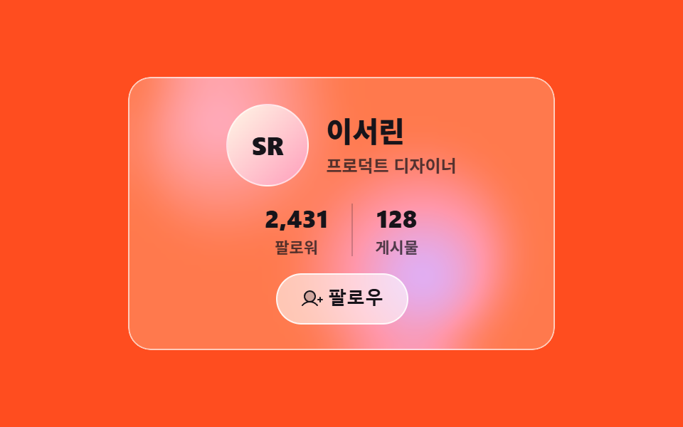 9 Profile Card Design Styles, Copy-Paste ReadyProfile card design is the job of deciding what material a fixed block of content wears: avatar, name, role, stats, foll See all demos in this post