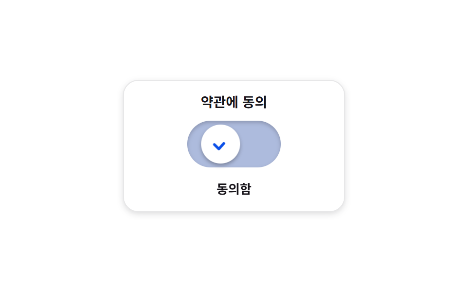
08Toggle that sets into a check
The check line only draws itself after the knob has arrived, so the arrival signal and the confirmation signal never blur together, and switching off erases the check first.
Best forA spot where commitment matters, such as agreeing to terms
stroke-dashoffsetanimation-delaypolyline
<main class="stage">
<div class="cm is-demo" id="cm">
  <section class="cm__panel">
    <p class="cm__label">Agree to the terms</p>
    <button class="cm__switch" id="cmSwitch" type="button" role="switch" aria-checked="false" aria-label="Terms agreement">
      <span class="cm__knob" aria-hidden="true">
        <svg class="cm__check" viewBox="0 0 24 24" aria-hidden="true">
          <polyline points="5,12.5 10,17.5 19,7.5"></polyline>
        </svg>
      </span>
    </button>
    <p class="cm__state" role="status"><span class="cm__wordOff">Not agreed yet</span><span class="cm__wordOn">Agreed</span></p>
  </section>
</div>
</main>
@use "../../../../site/static/demo-tokens" as *;
// 체크로 굳는 확인 토글 — 노브가 반대쪽에 "도착한 다음에야" 체크 선이 그려진다.
// 두 신호를 겹치지 않게 떼어 놓는 장치가 animation-delay 하나다: 이동은 $duration, 그리기는 그 뒤.
// 체크는 div 를 겹쳐 흉내 내지 않고 SVG polyline 을 stroke-dashoffset 으로 한 획에 긋는다(BD16 계열 함정 회피).
// role="switch" + aria-checked, 상태 글자도 함께 바뀐다 — 색만으로 말하지 않는다.
$duration: $dur-base;
$easing: $ease-spring;
$color: $subject-blue-deep;
@include stage($stage-paper);
.cm { display: grid; place-items: center; width: 100%; }
.cm__panel {
box-sizing: border-box; width: clamp(196px, 60vw, 228px);
display: flex; flex-direction: column; align-items: center; gap: $sp-3;
padding: $sp-4; border-radius: $r-card;
background: $stage-paper;
box-shadow: 0 2px 6px rgba($subject-ink, .14), inset 0 0 0 1px rgba($subject-ink, .10);
}
.cm__label {
margin: 0; font-weight: 700; font-size: clamp(12px, 3vw, 14px); line-height: 1;
color: $subject-ink;
}
// ── 트랙과 노브 ──────────────────────────────────────────────
.cm__switch {
--travel: 48px; // 노브가 건너가는 거리
position: relative; box-sizing: border-box;
width: 96px; height: 48px; margin: 0; padding: 0; border: 0; cursor: pointer;
border-radius: $r-pill;
background: rgba($subject-ink, .16);
box-shadow: inset 0 2px 4px rgba($subject-ink, .22);
transition: background-color $duration $easing;
}
.cm__switch:focus-visible { outline: 2px solid $color; outline-offset: 2px; }
.cm__knob {
position: absolute; left: 4px; top: 4px; display: grid; place-items: center;
width: 40px; height: 40px; border-radius: 50%;
background: $stage-paper;
box-shadow: 0 2px 4px rgba($subject-ink, .34);
transform: translateX(0);
transition: transform $duration $easing;
}
.cm__check { width: 22px; height: 22px; overflow: visible; }
.cm__check polyline {
fill: none; stroke: $color; stroke-width: 3;
stroke-linecap: round; stroke-linejoin: round;
stroke-dasharray: 26; stroke-dashoffset: 26;
transition: stroke-dashoffset $dur-quick $ease-out;
}
// ── 동의함 ───────────────────────────────────────────────────
// 노브가 먼저 건너가고(=$duration), 체크는 그 뒤에 그려진다
.cm.is-agreed .cm__switch { background: $color; }
.cm.is-agreed .cm__knob { transform: translateX(var(--travel)); }
.cm.is-agreed .cm__check polyline { stroke-dashoffset: 0; transition-delay: $duration; }
.cm.is-agreed .cm__wordOff { display: none; }
.cm.is-agreed .cm__wordOn { display: flex; }
// ── 상태 글자 ────────────────────────────────────────────────
.cm__state { position: relative; margin: 0; width: 128px; height: 18px; }
.cm__wordOff, .cm__wordOn {
position: absolute; inset: 0; display: flex; align-items: center; justify-content: center;
font-weight: 700; font-size: clamp(11px, 2.8vw, 13px); line-height: 1;
color: $subject-ink;
}
.cm__wordOn { display: none; }
// ── 미리보기 루프(2초 한 바퀴) ────────────────────────────────
// 이동 → (도착 후) 그리기 → 지우기 → 되돌아오기. 체크 그리기는 animation-delay 로 이동 뒤에 붙는다.
.cm.is-demo .cm__knob {
animation-name: cmSlide; animation-duration: $dur-loop;
animation-timing-function: $easing; animation-iteration-count: infinite;
}
@keyframes cmSlide {
0% { transform: translateX(0); }
8% { transform: translateX(0); }
28% { transform: translateX(var(--travel)); }
76% { transform: translateX(var(--travel)); }
88% { transform: translateX(0); }
100% { transform: translateX(0); }
}
.cm.is-demo .cm__switch {
animation-name: cmFill; animation-duration: $dur-loop;
animation-timing-function: $easing; animation-iteration-count: infinite;
}
@keyframes cmFill {
0% { background: rgba($subject-ink, .16); }
28% { background: $color; }
76% { background: $color; }
88% { background: rgba($subject-ink, .16); }
100% { background: rgba($subject-ink, .16); }
}
// 그리기는 도착(28%) 뒤에 시작한다 — animation-delay 로 이동 시간만큼 밀어 둔다
.cm.is-demo .cm__check polyline {
animation-name: cmDraw; animation-duration: $dur-loop;
animation-timing-function: $ease-out; animation-iteration-count: infinite;
animation-delay: $duration; animation-fill-mode: backwards;
}
@keyframes cmDraw {
0% { stroke-dashoffset: 26; }
16% { stroke-dashoffset: 0; }
62% { stroke-dashoffset: 0; }
70% { stroke-dashoffset: 26; }
100% { stroke-dashoffset: 26; }
}
.cm.is-demo .cm__wordOn { display: flex; opacity: 0; }
.cm.is-demo .cm__wordOff { opacity: 1; }
.cm.is-demo .cm__wordOn {
animation-name: cmWordOn; animation-duration: $dur-loop;
animation-timing-function: steps(1, end); animation-iteration-count: infinite;
}
@keyframes cmWordOn {
0% { opacity: 0; }
46% { opacity: 1; }
80% { opacity: 0; }
100% { opacity: 0; }
}
.cm.is-demo .cm__wordOff {
animation-name: cmWordOff; animation-duration: $dur-loop;
animation-timing-function: steps(1, end); animation-iteration-count: infinite;
}
@keyframes cmWordOff {
0% { opacity: 1; }
46% { opacity: 0; }
80% { opacity: 1; }
100% { opacity: 1; }
}
@media (max-width: 340px) {
.cm__panel { gap: $sp-2; padding: $sp-3; width: clamp(164px, 84vw, 196px); }
.cm__switch { --travel: 40px; width: 80px; height: 40px; }
.cm__knob { width: 32px; height: 32px; }
.cm__check { width: 18px; height: 18px; }
.cm__state { width: 112px; height: 16px; }
}
@media (prefers-reduced-motion: reduce) {
.cm .cm__knob { transition: none !important; }
.cm .cm__switch { transition: none !important; }
.cm .cm__check polyline { transition: none !important; }
.cm.is-demo .cm__knob { animation: none !important; transform: translateX(0) !important; }
.cm.is-demo .cm__switch { animation: none !important; }
.cm.is-demo .cm__check polyline { animation: none !important; stroke-dashoffset: 26 !important; }
.cm.is-demo .cm__wordOn { animation: none !important; opacity: 0 !important; }
.cm.is-demo .cm__wordOff { animation: none !important; opacity: 1 !important; }
}html, body {
margin: 0;
overflow: hidden;
}
.stage {
box-sizing: border-box;
min-height: 100vh;
display: grid;
place-items: center;
margin: 0;
background: #ffffff;
font-family: -apple-system, "Segoe UI", "Noto Sans KR", sans-serif;
padding: clamp(8px, 4vw, 24px);
}
.cm {
display: grid;
place-items: center;
width: 100%;
}
.cm__panel {
box-sizing: border-box;
width: clamp(196px, 60vw, 228px);
display: flex;
flex-direction: column;
align-items: center;
gap: 12px;
padding: 16px;
border-radius: 16px;
background: #ffffff;
box-shadow: 0 2px 6px rgba(23, 20, 26, 0.14), inset 0 0 0 1px rgba(23, 20, 26, 0.1);
}
.cm__label {
margin: 0;
font-weight: 700;
font-size: clamp(12px, 3vw, 14px);
line-height: 1;
color: #17141a;
}
.cm__switch {
--travel: 48px;
position: relative;
box-sizing: border-box;
width: 96px;
height: 48px;
margin: 0;
padding: 0;
border: 0;
cursor: pointer;
border-radius: 999px;
background: rgba(23, 20, 26, 0.16);
box-shadow: inset 0 2px 4px rgba(23, 20, 26, 0.22);
transition: background-color 300ms cubic-bezier(0.2, 0.8, 0.2, 1);
}
.cm__switch:focus-visible {
outline: 2px solid #0a4fe8;
outline-offset: 2px;
}
.cm__knob {
position: absolute;
left: 4px;
top: 4px;
display: grid;
place-items: center;
width: 40px;
height: 40px;
border-radius: 50%;
background: #ffffff;
box-shadow: 0 2px 4px rgba(23, 20, 26, 0.34);
transform: translateX(0);
transition: transform 300ms cubic-bezier(0.2, 0.8, 0.2, 1);
}
.cm__check {
width: 22px;
height: 22px;
overflow: visible;
}
.cm__check polyline {
fill: none;
stroke: #0a4fe8;
stroke-width: 3;
stroke-linecap: round;
stroke-linejoin: round;
stroke-dasharray: 26;
stroke-dashoffset: 26;
transition: stroke-dashoffset 220ms ease-out;
}
.cm.is-agreed .cm__switch {
background: #0a4fe8;
}
.cm.is-agreed .cm__knob {
transform: translateX(var(--travel));
}
.cm.is-agreed .cm__check polyline {
stroke-dashoffset: 0;
transition-delay: 300ms;
}
.cm.is-agreed .cm__wordOff {
display: none;
}
.cm.is-agreed .cm__wordOn {
display: flex;
}
.cm__state {
position: relative;
margin: 0;
width: 128px;
height: 18px;
}
.cm__wordOff, .cm__wordOn {
position: absolute;
inset: 0;
display: flex;
align-items: center;
justify-content: center;
font-weight: 700;
font-size: clamp(11px, 2.8vw, 13px);
line-height: 1;
color: #17141a;
}
.cm__wordOn {
display: none;
}
.cm.is-demo .cm__knob {
animation-name: cmSlide;
animation-duration: 2s;
animation-timing-function: cubic-bezier(0.2, 0.8, 0.2, 1);
animation-iteration-count: infinite;
}
@keyframes cmSlide {
0% {
transform: translateX(0);
}
8% {
transform: translateX(0);
}
28% {
transform: translateX(var(--travel));
}
76% {
transform: translateX(var(--travel));
}
88% {
transform: translateX(0);
}
100% {
transform: translateX(0);
}
}
.cm.is-demo .cm__switch {
animation-name: cmFill;
animation-duration: 2s;
animation-timing-function: cubic-bezier(0.2, 0.8, 0.2, 1);
animation-iteration-count: infinite;
}
@keyframes cmFill {
0% {
background: rgba(23, 20, 26, 0.16);
}
28% {
background: #0a4fe8;
}
76% {
background: #0a4fe8;
}
88% {
background: rgba(23, 20, 26, 0.16);
}
100% {
background: rgba(23, 20, 26, 0.16);
}
}
.cm.is-demo .cm__check polyline {
animation-name: cmDraw;
animation-duration: 2s;
animation-timing-function: ease-out;
animation-iteration-count: infinite;
animation-delay: 300ms;
animation-fill-mode: backwards;
}
@keyframes cmDraw {
0% {
stroke-dashoffset: 26;
}
16% {
stroke-dashoffset: 0;
}
62% {
stroke-dashoffset: 0;
}
70% {
stroke-dashoffset: 26;
}
100% {
stroke-dashoffset: 26;
}
}
.cm.is-demo .cm__wordOn {
display: flex;
opacity: 0;
}
.cm.is-demo .cm__wordOff {
opacity: 1;
}
.cm.is-demo .cm__wordOn {
animation-name: cmWordOn;
animation-duration: 2s;
animation-timing-function: steps(1, end);
animation-iteration-count: infinite;
}
@keyframes cmWordOn {
0% {
opacity: 0;
}
46% {
opacity: 1;
}
80% {
opacity: 0;
}
100% {
opacity: 0;
}
}
.cm.is-demo .cm__wordOff {
animation-name: cmWordOff;
animation-duration: 2s;
animation-timing-function: steps(1, end);
animation-iteration-count: infinite;
}
@keyframes cmWordOff {
0% {
opacity: 1;
}
46% {
opacity: 0;
}
80% {
opacity: 1;
}
100% {
opacity: 1;
}
}
@media (max-width: 340px) {
.cm__panel {
gap: 8px;
padding: 12px;
width: clamp(164px, 84vw, 196px);
}
.cm__switch {
--travel: 40px;
width: 80px;
height: 40px;
}
.cm__knob {
width: 32px;
height: 32px;
}
.cm__check {
width: 18px;
height: 18px;
}
.cm__state {
width: 112px;
height: 16px;
}
}
@media (prefers-reduced-motion: reduce) {
.cm .cm__knob {
transition: none !important;
}
.cm .cm__switch {
transition: none !important;
}
.cm .cm__check polyline {
transition: none !important;
}
.cm.is-demo .cm__knob {
animation: none !important;
transform: translateX(0) !important;
}
.cm.is-demo .cm__switch {
animation: none !important;
}
.cm.is-demo .cm__check polyline {
animation: none !important;
stroke-dashoffset: 26 !important;
}
.cm.is-demo .cm__wordOn {
animation: none !important;
opacity: 0 !important;
}
.cm.is-demo .cm__wordOff {
animation: none !important;
opacity: 1 !important;
}
}var cmRoot = document.getElementById('cm');
var cmSwitch = document.getElementById('cmSwitch');
function cmSet(agreed) {
cmSwitch.setAttribute('aria-checked', agreed ? 'true' : 'false');
cmRoot.classList.toggle('is-agreed', agreed);
}
cmSwitch.addEventListener('pointerdown', function () { cmRoot.classList.remove('is-demo'); });
cmSwitch.addEventListener('click', function () {
cmRoot.classList.remove('is-demo');
cmSet(cmSwitch.getAttribute('aria-checked') !== 'true');
});// CheckMorphSwitch — vanilla 판(run/076/demo/08-real-check-morph-switch/index.html) 의 React 포트.
// 노브가 도착한 다음에야 체크 선이 그려진다 — 이동과 확인 신호를 animation-delay 하나로 뗀다.
// 값·키프레임은 vanilla 와 같다(다시 타이핑하지 않는다). 클릭하면 미리보기 루프를 뗀다.
import { useState } from "react";
import styles from "./CheckMorphSwitch.module.scss";
export type CheckMorphSwitchProps = {
duration?: number;
easing?: string;
color?: string;
};
type Vars = { [k: string]: any };
const LABEL_TEXT = "약관에 동의";
const SWITCH_LABEL = "약관 동의";
const STATE_OFF = "아직 동의 전";
const STATE_ON = "동의함";
export default function CheckMorphSwitch({
duration = 300,
easing = "cubic-bezier(.2, .8, .2, 1)", // = $ease-spring
color = "#0a4fe8",
}: CheckMorphSwitchProps) {
const [agreed, setAgreed] = useState(false);
const [demo, setDemo] = useState(true);
const vars: Vars = {
"--duration": `${duration}ms`,
"--easing": easing,
"--color": color,
};
const cls = [styles.root, demo ? styles.isDemo : "", agreed ? styles.isAgreed : ""].filter(Boolean).join(" ");
function toggle() {
setDemo(false);
setAgreed((prev) => !prev);
}
function wake() {
setDemo(false);
}
return (
<main className={styles.stage}>
<div className={cls} style={vars}>
<section className={styles.panel}>
<p className={styles.label}>{LABEL_TEXT}</p>
<button
className={styles.switch}
type="button"
role="switch"
aria-checked={agreed}
aria-label={SWITCH_LABEL}
onPointerDown={wake}
onClick={toggle}
>
<span className={styles.knob} aria-hidden="true">
<svg className={styles.check} viewBox="0 0 24 24" aria-hidden="true">
<polyline points="5,12.5 10,17.5 19,7.5"></polyline>
</svg>
</span>
</button>
<p className={styles.state} role="status">
<span className={styles.wordOff}>{STATE_OFF}</span>
<span className={styles.wordOn}>{STATE_ON}</span>
</p>
</section>
</div>
</main>
);
}08 Toggle that sets into a check — Measured area 3.276% · moving frames 11/23Original by GODRICH · SCSS and React ship in the zip · CSS Toggle Switch: 9 Realistic Switches to Paste
The post this demo lives in
 CSS Toggle Switch: 9 Realistic Switches to PasteA css toggle switch is the small on-off control visitors flip without thinking, and here are nine built with no library, See all demos in this post