08Card corner grip
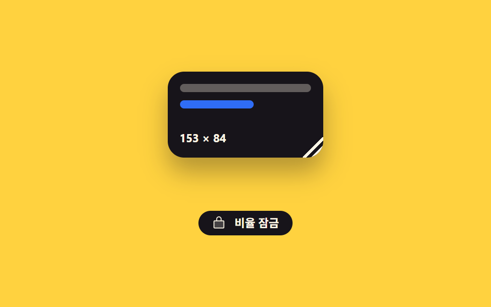
Grabbing the bottom-right corner of the card stretches width and height together, and with the lock button on it can only grow at its original ratio.
Best forEditing screens and board dashboards where people resize widgets or image boxes themselves
pointerdownaspectMath.round
<main class="stage">
  <div class="cg is-demo" id="cg-root">
    <div class="cg__field">
      <div class="cg__card" id="cg-card">
        <span class="cg__row"></span>
        <span class="cg__row cg__row--short"></span>
        <span class="cg__size"></span>
        <i class="cg__grip" id="cg-grip" role="slider" tabindex="0"
           aria-label="Card size" aria-valuemin="120" aria-valuemax="220" aria-valuenow="176"></i>
      </div>
    </div>
    <button class="cg__lock is-on" id="cg-lock" type="button" aria-pressed="true">
      <span class="cg__ico" aria-hidden="true"><svg viewBox="0 0 256 256"><g fill="currentColor"><path d="M216 96v112a8 8 0 0 1-8 8H48a8 8 0 0 1-8-8V96a8 8 0 0 1 8-8h160a8 8 0 0 1 8 8" opacity=".2"/><path d="M208 80h-32V56a48 48 0 0 0-96 0v24H48a16 16 0 0 0-16 16v112a16 16 0 0 0 16 16h160a16 16 0 0 0 16-16V96a16 16 0 0 0-16-16M96 56a32 32 0 0 1 64 0v24H96Zm112 152H48V96h160z"/></g></svg></span>
      Lock ratio
    </button>
  </div>
</main>
@use "../../../../site/static/demo-tokens" as *;
$duration: $dur-quick;
$easing: $ease-spring;
$color: $subject-blue;
@include stage($stage-yellow);
@property --w {
syntax: "<length>";
inherits: true;
initial-value: 176px;
}
@property --h {
syntax: "<length>";
inherits: true;
initial-value: 96px;
}
// 숫자도 등록해 둬야 키프레임에서 정수로 보간된다 — counter 가 이 값을 읽는다
@property --wn {
syntax: "<integer>";
inherits: true;
initial-value: 176;
}
@property --hn {
syntax: "<integer>";
inherits: true;
initial-value: 96;
}
.cg {
--w: 176px;
--h: 96px;
--wn: 176;
--hn: 96;
display: flex;
flex-direction: column;
align-items: center;
gap: $sp-3;
}
// 카드가 커져도 무대 높이가 안 흔들리게 자리를 미리 잡아 둔다
.cg__field {
display: grid;
place-items: start center;
width: 228px;
max-width: 92vw;
height: 124px;
}
.cg__card {
position: relative;
box-sizing: border-box;
width: min(var(--w), 100%);
height: var(--h);
display: flex;
flex-direction: column;
gap: $sp-2;
padding: $sp-3;
border-radius: $r-card;
background: $subject-ink;
box-shadow: $shadow-raised;
overflow: hidden;
}
.cg__row {
flex: 0 0 auto;
height: 8px;
border-radius: $r-xs;
background: rgba(255, 247, 230, .32);
}
.cg__row--short { width: 56%; background: $color; }
.cg__size {
margin-top: auto;
counter-reset: wn var(--wn) hn var(--hn);
color: $subject-cream;
font-size: 11px;
line-height: 14px;
font-weight: 700;
font-variant-numeric: tabular-nums;
}
.cg__size::after { content: counter(wn) " × " counter(hn); }
.cg__grip {
position: absolute;
right: 0;
bottom: 0;
width: 20px;
height: 20px;
cursor: nwse-resize;
touch-action: none;
// 코너 삼각형 — 두 줄이 같은 꼭짓점에서 갈라진다
background:
linear-gradient(135deg, transparent 48%, #{$subject-cream} 48%, #{$subject-cream} 58%, transparent 58%),
linear-gradient(135deg, transparent 70%, #{$subject-cream} 70%, #{$subject-cream} 80%, transparent 80%);
}
.cg__grip:focus-visible { outline: 2px solid $color; outline-offset: -2px; }
.cg__lock {
display: inline-flex;
align-items: center;
gap: $sp-2;
height: 24px;
padding: 0 $sp-3;
border: 1px solid rgba(23, 20, 26, .28);
border-radius: $r-pill;
background: transparent;
color: rgba(23, 20, 26, .8);
font-family: inherit;
font-size: 11px;
line-height: 20px;
font-weight: 700;
cursor: pointer;
transition: background $duration $easing, color $duration $easing;
}
.cg__lock.is-on {
background: $subject-ink;
border-color: $subject-ink;
color: $subject-cream;
}
.cg__ico { display: block; width: 14px; height: 14px; }
.cg__ico svg { display: block; width: 14px; height: 14px; }
.cg__lock:focus-visible { outline: 2px solid $subject-ink; outline-offset: 2px; }
// ── 자동 루프: 비율을 지킨 채 커졌다 작아진다 ──
.cg.is-demo {
animation-name: cg-size;
animation-duration: $dur-loop;
animation-timing-function: $easing;
animation-iteration-count: infinite;
}
@keyframes cg-size {
0%, 8% { --w: 176px; --h: 96px; --wn: 176; --hn: 96; }
40% { --w: 220px; --h: 120px; --wn: 220; --hn: 120; }
68% { --w: 124px; --h: 68px; --wn: 124; --hn: 68; }
88%, 100% { --w: 176px; --h: 96px; --wn: 176; --hn: 96; }
}
@media (prefers-reduced-motion: reduce) {
.cg.is-demo { animation: none !important; }
.cg__lock { transition: none; }
}
@media (max-width: 340px) {
.cg__card { padding: $sp-2; }
}@charset "UTF-8";
html, body {
margin: 0;
overflow: hidden;
}
.stage {
box-sizing: border-box;
min-height: 100vh;
display: grid;
place-items: center;
margin: 0;
background: #ffd23f;
font-family: -apple-system, "Segoe UI", "Noto Sans KR", sans-serif;
padding: clamp(8px, 4vw, 24px);
}
@property --w {
syntax: "<length>";
inherits: true;
initial-value: 176px;
}
@property --h {
syntax: "<length>";
inherits: true;
initial-value: 96px;
}
@property --wn {
syntax: "<integer>";
inherits: true;
initial-value: 176;
}
@property --hn {
syntax: "<integer>";
inherits: true;
initial-value: 96;
}
.cg {
--w: 176px;
--h: 96px;
--wn: 176;
--hn: 96;
display: flex;
flex-direction: column;
align-items: center;
gap: 12px;
}
.cg__field {
display: grid;
place-items: start center;
width: 228px;
max-width: 92vw;
height: 124px;
}
.cg__card {
position: relative;
box-sizing: border-box;
width: min(var(--w), 100%);
height: var(--h);
display: flex;
flex-direction: column;
gap: 8px;
padding: 12px;
border-radius: 16px;
background: #17141a;
box-shadow: 0 14px 24px rgba(23, 20, 26, 0.32);
overflow: hidden;
}
.cg__row {
flex: 0 0 auto;
height: 8px;
border-radius: 4px;
background: rgba(255, 247, 230, 0.32);
}
.cg__row--short {
width: 56%;
background: #2f6df6;
}
.cg__size {
margin-top: auto;
counter-reset: wn var(--wn) hn var(--hn);
color: #fff7e6;
font-size: 11px;
line-height: 14px;
font-weight: 700;
font-variant-numeric: tabular-nums;
}
.cg__size::after {
content: counter(wn) " × " counter(hn);
}
.cg__grip {
position: absolute;
right: 0;
bottom: 0;
width: 20px;
height: 20px;
cursor: nwse-resize;
touch-action: none;
background: linear-gradient(135deg, transparent 48%, #fff7e6 48%, #fff7e6 58%, transparent 58%), linear-gradient(135deg, transparent 70%, #fff7e6 70%, #fff7e6 80%, transparent 80%);
}
.cg__grip:focus-visible {
outline: 2px solid #2f6df6;
outline-offset: -2px;
}
.cg__lock {
display: inline-flex;
align-items: center;
gap: 8px;
height: 24px;
padding: 0 12px;
border: 1px solid rgba(23, 20, 26, 0.28);
border-radius: 999px;
background: transparent;
color: rgba(23, 20, 26, 0.8);
font-family: inherit;
font-size: 11px;
line-height: 20px;
font-weight: 700;
cursor: pointer;
transition: background 220ms cubic-bezier(0.2, 0.8, 0.2, 1), color 220ms cubic-bezier(0.2, 0.8, 0.2, 1);
}
.cg__lock.is-on {
background: #17141a;
border-color: #17141a;
color: #fff7e6;
}
.cg__ico {
display: block;
width: 14px;
height: 14px;
}
.cg__ico svg {
display: block;
width: 14px;
height: 14px;
}
.cg__lock:focus-visible {
outline: 2px solid #17141a;
outline-offset: 2px;
}
.cg.is-demo {
animation-name: cg-size;
animation-duration: 2s;
animation-timing-function: cubic-bezier(0.2, 0.8, 0.2, 1);
animation-iteration-count: infinite;
}
@keyframes cg-size {
0%, 8% {
--w: 176px;
--h: 96px;
--wn: 176;
--hn: 96;
}
40% {
--w: 220px;
--h: 120px;
--wn: 220;
--hn: 120;
}
68% {
--w: 124px;
--h: 68px;
--wn: 124;
--hn: 68;
}
88%, 100% {
--w: 176px;
--h: 96px;
--wn: 176;
--hn: 96;
}
}
@media (prefers-reduced-motion: reduce) {
.cg.is-demo {
animation: none !important;
}
.cg__lock {
transition: none;
}
}
@media (max-width: 340px) {
.cg__card {
padding: 8px;
}
}// 실제 동작: 코너 그립의 포인터 델타로 폭·높이를 함께 바꾼다. 잠금이 켜져 있으면 높이는 폭 × 처음 비율.
var root = document.getElementById('cg-root');
var card = document.getElementById('cg-card');
var grip = document.getElementById('cg-grip');
var lock = document.getElementById('cg-lock');
var RATIO = 96 / 176, locked = true, dragging = false, w0 = 0, h0 = 0, x0 = 0, y0 = 0;
function set(w, h) {
var W = Math.max(120, Math.min(Math.round(w), 220));
var H = locked ? Math.round(W * RATIO) : Math.max(64, Math.min(Math.round(h), 132));
root.style.setProperty('--w', W + 'px');
root.style.setProperty('--h', H + 'px');
// 숫자 표시는 counter 가 읽는 --wn/--hn 한 쌍이다. 자동 루프도 같은 값을 움직이므로
// 카드 크기와 글자가 어긋나는 프레임이 없다
root.style.setProperty('--wn', String(W));
root.style.setProperty('--hn', String(H));
grip.setAttribute('aria-valuenow', String(W));
}
lock.addEventListener('click', function () {
locked = !locked;
lock.classList.toggle('is-on', locked);
lock.setAttribute('aria-pressed', String(locked));
root.classList.toggle('is-aspect', locked);
});
grip.addEventListener('pointerdown', function (e) {
root.classList.remove('is-demo');
dragging = true;
var r = card.getBoundingClientRect();
w0 = r.width; h0 = r.height; x0 = e.clientX; y0 = e.clientY;
grip.setPointerCapture(e.pointerId);
e.preventDefault();
});
grip.addEventListener('pointermove', function (e) {
if (!dragging) return;
set(w0 + (e.clientX - x0), h0 + (e.clientY - y0));
});
grip.addEventListener('pointerup', function () { dragging = false; });
grip.addEventListener('keydown', function (e) {
var d = e.key === 'ArrowLeft' ? -8 : e.key === 'ArrowRight' ? 8 : 0;
if (!d) return;
root.classList.remove('is-demo');
var n = Number(grip.getAttribute('aria-valuenow')) + d;
set(n, n * RATIO);
grip.focus({ preventScroll: true });
e.preventDefault();
});import { useRef, useState } from "react";
import type { CSSProperties } from "react";
import styles from "./CornerResizeCard.module.scss";
export type CornerResizeCardProps = {
startWidth?: number;
startHeight?: number;
duration?: number;
easing?: string;
color?: string;
};
type PEvt = { clientX: number; clientY: number; pointerId: number; preventDefault(): void; currentTarget: { setPointerCapture(id: number): void } };
type KeyEvt = { key: string; preventDefault(): void };
type Box<T> = { current: T };
type Grab = { w: number; h: number; x: number; y: number; on: boolean };
type Vars = CSSProperties & {
"--w"?: string; "--h"?: string; "--wn"?: string; "--hn"?: string;
"--duration"?: string; "--easing"?: string; "--color"?: string;
};
export default function CornerResizeCard({
startWidth = 176,
startHeight = 96,
duration = 220,
easing = "cubic-bezier(.2,.8,.2,1)",
color = "#2f6df6",
}: CornerResizeCardProps) {
const ratio = startHeight / startWidth;
const [size, setSize] = useState({ w: startWidth, h: startHeight });
const [locked, setLocked] = useState(true);
const cardRef = useRef<HTMLDivElement>(null);
const from = useRef({ w: 0, h: 0, x: 0, y: 0, on: false }) as Box<Grab>;
function set(w: number, h: number): void {
const W = Math.max(120, Math.min(Math.round(w), 220));
const H = locked ? Math.round(W * ratio) : Math.max(64, Math.min(Math.round(h), 132));
setSize({ w: W, h: H });
}
function onDown(e: PEvt): void {
const card = cardRef.current;
if (!card) return;
const r = card.getBoundingClientRect();
from.current = { w: r.width, h: r.height, x: e.clientX, y: e.clientY, on: true };
e.currentTarget.setPointerCapture(e.pointerId);
e.preventDefault();
}
function onMove(e: PEvt): void {
if (!from.current.on) return;
set(from.current.w + (e.clientX - from.current.x), from.current.h + (e.clientY - from.current.y));
}
function onUp(): void { from.current.on = false; }
function onKey(e: KeyEvt): void {
const d = e.key === "ArrowLeft" ? -8 : e.key === "ArrowRight" ? 8 : 0;
if (!d) return;
set(size.w + d, (size.w + d) * ratio);
e.preventDefault();
}
const vars: Vars = {
"--w": `${size.w}px`,
"--h": `${size.h}px`,
"--wn": String(size.w),
"--hn": String(size.h),
"--duration": `${duration}ms`,
"--easing": easing,
"--color": color,
};
return (
<div className={locked ? `${styles.cg} ${styles.isAspect}` : styles.cg} style={vars}>
<div className={styles.field}>
<div className={styles.card} ref={cardRef}>
<span className={styles.row} />
<span className={`${styles.row} ${styles.rowShort}`} />
<span className={styles.size} />
<i
className={styles.grip}
role="slider"
tabIndex={0}
aria-label="Card size"
aria-valuemin={120}
aria-valuemax={220}
aria-valuenow={size.w}
onPointerDown={onDown}
onPointerMove={onMove}
onPointerUp={onUp}
onPointerCancel={onUp}
onKeyDown={onKey}
/>
</div>
</div>
<button
type="button"
className={locked ? `${styles.lock} ${styles.isOn}` : styles.lock}
aria-pressed={locked}
onClick={(): void => setLocked(!locked)}
>
<span className={styles.ico} aria-hidden="true">
<svg viewBox="0 0 256 256"><g fill="currentColor"><path d="M216 96v112a8 8 0 0 1-8 8H48a8 8 0 0 1-8-8V96a8 8 0 0 1 8-8h160a8 8 0 0 1 8 8" opacity=".2" /><path d="M208 80h-32V56a48 48 0 0 0-96 0v24H48a16 16 0 0 0-16 16v112a16 16 0 0 0 16 16h160a16 16 0 0 0 16-16V96a16 16 0 0 0-16-16M96 56a32 32 0 0 1 64 0v24H96Zm112 152H48V96h160z" /></g></svg>
</span>
Lock ratio
</button>
</div>
);
}08 Card corner grip — Measured area 18.377% · moving frames 20/23Original by GODRICH · SCSS and React ship in the zip · 9 Resizable Split Pane Layouts With No Library
The post this demo lives in
 9 Resizable Split Pane Layouts With No LibraryA resizable split pane is a layout whose panes share one draggable boundary, so widening one side narrows the other. Eig See all demos in this post