05Timeline stagger
Split the sentence into words, give each fragment a transition-delay based on its index, and one trigger plays them like a timeline. CSS owns the delay; the engine owns the moment.
Best forMagazine headline reveal
transition-delayvar(--i)data-stagger
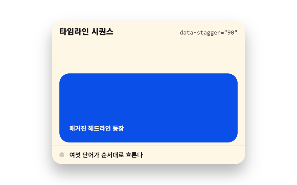
<main class="stage">
  <section class="sw is-demo" id="sw" aria-label="Timeline stagger demo">
    <header class="sw__head">
      <p class="sw__title">Timeline stagger</p>
      <p class="sw__attr"><code>data-stagger="90"</code></p>
    </header>
    <div class="sw__view" id="sw-view" tabindex="0" role="region" aria-label="Headline preview — scroll and words appear in order">
      <div class="sw__track">
        <p class="sw__hint">Scroll down</p>
        <article class="sw__card" id="sw-card" data-stagger="90">
          <h2 class="sw__line">One scroll turns a sentence into a timeline</h2>
          <p class="sw__meta">Magazine headline reveal</p>
        </article>
        <p class="sw__filler" aria-hidden="true">Next section</p>
      </div>
    </div>
    <footer class="sw__foot">
      <span class="sw__dot" aria-hidden="true"></span>
      <span class="sw__state">Six words flow in order</span>
    </footer>
  </section>
</main>
@use "../../../../site/static/demo-tokens" as *;
// 타임라인 시퀀스 — transition-delay: calc(var(--i) * var(--stagger)) 로 단어가 순번 지연을 받는다
// 진입 시점은 관찰자가 is-visible 로 연다. 미리보기(.is-demo)는 낱개 animation 속성으로 같은 시차를 재생한다
$duration: $dur-loop;
$easing: $ease-spring;
$color: $subject-blue;
@include stage($stage-paper);
.sw {
position: relative;
box-sizing: border-box;
width: min(312px, 92vw);
border-radius: $r-card;
background: $subject-cream;
color: $subject-ink;
font-family: -apple-system, "Segoe UI", "Noto Sans KR", sans-serif;
overflow: hidden;
box-shadow: $shadow-raised;
}
.sw__head {
display: flex;
align-items: baseline;
justify-content: space-between;
gap: $sp-2;
padding: $sp-2 $sp-3;
}
.sw__title {
margin: 0;
font-size: 13px;
font-weight: 800;
line-height: 1.3;
}
.sw__attr {
margin: 0;
font-size: 10px;
font-weight: 400;
line-height: 1.3;
color: rgba($subject-ink, .72);
code { font-family: "Consolas", "Menlo", monospace; }
}
.sw__view {
height: 168px;
overflow-y: auto;
padding: 0 $sp-3;
outline: none;
}
.sw__track {
display: grid;
gap: $sp-3;
padding-top: $sp-2;
padding-bottom: 96px;
}
.sw__hint {
margin: 0;
box-sizing: border-box;
font-size: 10px;
font-weight: 700;
line-height: 1.3;
color: rgba($subject-ink, .72);
border: 1px dashed rgba($subject-ink, .28);
border-radius: $r-control;
padding: $sp-3 0;
text-align: center;
}
// 카드는 접힌 아래에 있다가 관찰자가 부른다 — margin 으로 첫 화면 밖까지 민다
.sw__card {
box-sizing: border-box;
margin-top: 120px;
padding: $sp-4;
border-radius: $r-card;
background: $subject-blue-deep;
color: $subject-cream;
}
.sw__line {
margin: 0;
font-size: 22px;
font-weight: 800;
line-height: 1.35;
}
// 단어 조각 — 순번 지연의 주인공. delay 는 calc(var(--i) * var(--stagger)) 하나로 순번을 만든다
.sw__word {
display: inline-block;
opacity: 0;
transform: translateY(14px);
transition-property: opacity, transform;
transition-duration: $dur-quick, 420ms;
transition-timing-function: ease-out, $easing;
transition-delay: calc(var(--i) * var(--stagger, 90ms)), calc(var(--i) * var(--stagger, 90ms));
}
.sw__card.is-visible .sw__word {
opacity: 1;
transform: none;
}
.sw__meta {
margin: $sp-2 0 0;
font-size: 10px;
font-weight: 700;
line-height: 1.3;
color: $subject-cream;
}
.sw__filler {
margin: 0;
font-size: 10px;
font-weight: 700;
line-height: 1.3;
color: rgba($subject-ink, .72);
border-radius: $r-control;
background: rgba($subject-ink, .06);
padding: $sp-6 0;
text-align: center;
}
.sw__foot {
display: flex;
align-items: center;
gap: $sp-2;
padding: $sp-2 $sp-3;
border-top: 1px solid rgba($subject-ink, .12);
font-size: 10px;
font-weight: 700;
line-height: 1.3;
}
.sw__dot {
width: 8px;
height: 8px;
border-radius: $r-pill;
background: $color;
}
// 미리보기 — 트랙을 밀어 올리고 단어가 순번대로 들어온다
// animation: 단축을 쓰면 delay 가 0 으로 리셋되므로 낱개 속성으로만 쓴다 (240 함정)
.sw.is-demo {
.sw__track {
animation-name: sw-flow;
animation-duration: $duration;
animation-timing-function: $easing;
animation-iteration-count: infinite;
animation-fill-mode: backwards;
}
// 진 순간의 일괄 감춤은 라인 통째로 한 프레임 컷 — 페이드 중간 프레임이 유령으로 찍히지 않는다
.sw__line {
animation-name: sw-cut;
animation-duration: $duration;
animation-timing-function: steps(1, end);
animation-iteration-count: infinite;
}
// 나타남은 컷(sw-show), 떠오름은 이징(sw-rise)
.sw__word {
animation-name: sw-show, sw-rise;
animation-duration: $duration, $duration;
animation-timing-function: steps(1, end), $easing;
animation-iteration-count: infinite, infinite;
animation-fill-mode: backwards, backwards;
animation-delay: calc(#{$duration * .2} + var(--i) * var(--stagger, 90ms)), calc(#{$duration * .2} + var(--i) * var(--stagger, 90ms));
}
.sw__dot {
animation-name: sw-blink;
animation-duration: $duration;
animation-timing-function: steps(1, end);
animation-iteration-count: infinite;
}
}
@keyframes sw-flow {
0%, 8% { transform: translateY(0); }
20%, 84% { transform: translateY(-144px); }
86%, 100% { transform: translateY(0); }
}
@keyframes sw-cut {
0%, 84% { opacity: 1; }
86%, 96% { opacity: 0; }
100% { opacity: 1; }
}
@keyframes sw-show {
0% { opacity: 0; }
2%, 100% { opacity: 1; }
}
@keyframes sw-rise {
0% { transform: translateY(14px); }
20%, 100% { transform: none; }
}
@keyframes sw-blink {
0% { background: rgba($subject-ink, .2); }
24% { background: $color; }
88% { background: rgba($subject-ink, .2); }
}
@media (max-width: 340px) {
.sw { width: 100%; }
.sw__view { height: 112px; }
.sw__line { font-size: 18px; }
.sw__card { margin-top: 96px; }
.sw__filler { padding: $sp-4 0; }
}
@media (prefers-reduced-motion: reduce) {
.sw__word { transition: none !important; }
.sw.is-demo .sw__track,
.sw.is-demo .sw__line,
.sw.is-demo .sw__word,
.sw.is-demo .sw__dot { animation: none !important; }
// 정지 상태 — 단어가 전부 보인다
.sw.is-demo .sw__word { opacity: 1 !important; transform: none !important; }
.sw.is-demo .sw__dot { background: $color !important; }
}html, body {
margin: 0;
overflow: hidden;
}
.stage {
box-sizing: border-box;
min-height: 100vh;
display: grid;
place-items: center;
margin: 0;
background: #ffffff;
font-family: -apple-system, "Segoe UI", "Noto Sans KR", sans-serif;
padding: clamp(8px, 4vw, 24px);
}
.sw {
position: relative;
box-sizing: border-box;
width: min(312px, 92vw);
border-radius: 16px;
background: #fff7e6;
color: #17141a;
font-family: -apple-system, "Segoe UI", "Noto Sans KR", sans-serif;
overflow: hidden;
box-shadow: 0 14px 24px rgba(23, 20, 26, 0.32);
}
.sw__head {
display: flex;
align-items: baseline;
justify-content: space-between;
gap: 8px;
padding: 8px 12px;
}
.sw__title {
margin: 0;
font-size: 13px;
font-weight: 800;
line-height: 1.3;
}
.sw__attr {
margin: 0;
font-size: 10px;
font-weight: 400;
line-height: 1.3;
color: rgba(23, 20, 26, 0.72);
}
.sw__attr code {
font-family: "Consolas", "Menlo", monospace;
}
.sw__view {
height: 168px;
overflow-y: auto;
padding: 0 12px;
outline: none;
}
.sw__track {
display: grid;
gap: 12px;
padding-top: 8px;
padding-bottom: 96px;
}
.sw__hint {
margin: 0;
box-sizing: border-box;
font-size: 10px;
font-weight: 700;
line-height: 1.3;
color: rgba(23, 20, 26, 0.72);
border: 1px dashed rgba(23, 20, 26, 0.28);
border-radius: 12px;
padding: 12px 0;
text-align: center;
}
.sw__card {
box-sizing: border-box;
margin-top: 120px;
padding: 16px;
border-radius: 16px;
background: #0a4fe8;
color: #fff7e6;
}
.sw__line {
margin: 0;
font-size: 22px;
font-weight: 800;
line-height: 1.35;
}
.sw__word {
display: inline-block;
opacity: 0;
transform: translateY(14px);
transition-property: opacity, transform;
transition-duration: 220ms, 420ms;
transition-timing-function: ease-out, cubic-bezier(0.2, 0.8, 0.2, 1);
transition-delay: calc(var(--i) * var(--stagger, 90ms)), calc(var(--i) * var(--stagger, 90ms));
}
.sw__card.is-visible .sw__word {
opacity: 1;
transform: none;
}
.sw__meta {
margin: 8px 0 0;
font-size: 10px;
font-weight: 700;
line-height: 1.3;
color: #fff7e6;
}
.sw__filler {
margin: 0;
font-size: 10px;
font-weight: 700;
line-height: 1.3;
color: rgba(23, 20, 26, 0.72);
border-radius: 12px;
background: rgba(23, 20, 26, 0.06);
padding: 24px 0;
text-align: center;
}
.sw__foot {
display: flex;
align-items: center;
gap: 8px;
padding: 8px 12px;
border-top: 1px solid rgba(23, 20, 26, 0.12);
font-size: 10px;
font-weight: 700;
line-height: 1.3;
}
.sw__dot {
width: 8px;
height: 8px;
border-radius: 999px;
background: #2f6df6;
}
.sw.is-demo .sw__track {
animation-name: sw-flow;
animation-duration: 2s;
animation-timing-function: cubic-bezier(0.2, 0.8, 0.2, 1);
animation-iteration-count: infinite;
animation-fill-mode: backwards;
}
.sw.is-demo .sw__line {
animation-name: sw-cut;
animation-duration: 2s;
animation-timing-function: steps(1, end);
animation-iteration-count: infinite;
}
.sw.is-demo .sw__word {
animation-name: sw-show, sw-rise;
animation-duration: 2s, 2s;
animation-timing-function: steps(1, end), cubic-bezier(0.2, 0.8, 0.2, 1);
animation-iteration-count: infinite, infinite;
animation-fill-mode: backwards, backwards;
animation-delay: calc(0.4s + var(--i) * var(--stagger, 90ms)), calc(0.4s + var(--i) * var(--stagger, 90ms));
}
.sw.is-demo .sw__dot {
animation-name: sw-blink;
animation-duration: 2s;
animation-timing-function: steps(1, end);
animation-iteration-count: infinite;
}
@keyframes sw-flow {
0%, 8% {
transform: translateY(0);
}
20%, 84% {
transform: translateY(-144px);
}
86%, 100% {
transform: translateY(0);
}
}
@keyframes sw-cut {
0%, 84% {
opacity: 1;
}
86%, 96% {
opacity: 0;
}
100% {
opacity: 1;
}
}
@keyframes sw-show {
0% {
opacity: 0;
}
2%, 100% {
opacity: 1;
}
}
@keyframes sw-rise {
0% {
transform: translateY(14px);
}
20%, 100% {
transform: none;
}
}
@keyframes sw-blink {
0% {
background: rgba(23, 20, 26, 0.2);
}
24% {
background: #2f6df6;
}
88% {
background: rgba(23, 20, 26, 0.2);
}
}
@media (max-width: 340px) {
.sw {
width: 100%;
}
.sw__view {
height: 112px;
}
.sw__line {
font-size: 18px;
}
.sw__card {
margin-top: 96px;
}
.sw__filler {
padding: 16px 0;
}
}
@media (prefers-reduced-motion: reduce) {
.sw__word {
transition: none !important;
}
.sw.is-demo .sw__track,
.sw.is-demo .sw__line,
.sw.is-demo .sw__word,
.sw.is-demo .sw__dot {
animation: none !important;
}
.sw.is-demo .sw__word {
opacity: 1 !important;
transform: none !important;
}
.sw.is-demo .sw__dot {
background: #2f6df6 !important;
}
}// Timeline stagger — 문장을 단어로 쪼개 각 조각에 순번(--i) 을 물려준다
// 딜레이는 CSS 의 transition-delay calc(var(--i) * var(--stagger)) 가 계산하고 시점은 관찰자가 is-visible 로 연다
var root = document.getElementById('sw');
var view = document.getElementById('sw-view');
var card = document.getElementById('sw-card');
var line = card.querySelector('.sw__line');
var stag = parseInt(card.getAttribute('data-stagger'), 10) || 90;
card.style.setProperty('--stagger', stag + 'ms');
var words = line.textContent.trim().split(/\s+/);
line.textContent = '';
words.forEach(function (word, i) {
var span = document.createElement('span');
span.className = 'sw__word';
span.textContent = word;
span.style.setProperty('--i', i);
line.appendChild(span);
if (i < words.length - 1) line.appendChild(document.createTextNode(' '));
});
var started = false;
function start() {
root.classList.remove('is-demo');
if (started) return;
started = true;
var io = new IntersectionObserver(function (entries) {
entries.forEach(function (entry) {
if (entry.isIntersecting) entry.target.classList.add('is-visible');
else entry.target.classList.remove('is-visible');
});
}, { root: view, threshold: 0.35 });
io.observe(card);
}
view.addEventListener('scroll', start, { passive: true });
view.addEventListener('pointerdown', start);
view.addEventListener('keydown', function (e) {
if (e.key === 'ArrowDown' || e.key === 'ArrowUp') start();
});import { useEffect, useRef, useState } from "react";
import type { CSSProperties } from "react";
import styles from "./StaggerWordReveal.module.scss";
export type StaggerWordRevealProps = {
title?: string;
attr?: string;
hint?: string;
headline?: string;
meta?: string;
state?: string;
groupLabel?: string;
listLabel?: string;
filler?: string;
stagger?: number;
/** 격자 미리보기용 2초 자동 루프. 사람이 손대면 꺼진다 */
demo?: boolean;
duration?: number;
easing?: string;
color?: string;
};
type Vars = CSSProperties & { "--duration"?: string; "--easing"?: string; "--color"?: string; "--stagger"?: string };
// ambient 가 얇아 DOM 요소 타입을 못 쓴다 — 필요한 꼴만 로컬 타입으로 선언
type Box<T> = { current: T };
type KeyEvt = { key: string };
export default function StaggerWordReveal({
title = "타임라인 시퀀스",
attr = 'data-stagger="90"',
hint = "아래로 스크롤",
headline = "스크롤 한 번에 문장이 시간선이 된다",
meta = "매거진 헤드라인 등장",
state = "여섯 단어가 순서대로 흐른다",
groupLabel = "타임라인 시퀀스 데모",
listLabel = "헤드라인 미리보기 — 스크롤하면 단어가 순서대로 나타납니다",
filler = "다음 섹션",
stagger = 90,
demo = true,
duration = 2000,
easing = "cubic-bezier(.2, .8, .2, 1)",
color = "#2f6df6",
}: StaggerWordRevealProps) {
const [live, setLive] = useState(demo);
const [visible, setVisible] = useState(false);
const viewRef = useRef<HTMLDivElement>(null) as unknown as Box<HTMLDivElement | null>;
const cardRef = useRef<HTMLElement | null>(null) as unknown as Box<HTMLElement | null>;
useEffect(() => {
if (live) return;
const root = viewRef.current;
const card = cardRef.current;
if (!root || !card) return;
// 진입마다 재생 — 카드가 화면을 벗어나면 단어를 되돌려 다시 흐르게 한다
const io = new IntersectionObserver(
(entries) => {
entries.forEach((entry) => setVisible(entry.isIntersecting));
},
{ root, threshold: 0.35 }
);
io.observe(card);
return () => io.disconnect();
}, [live]);
// 문장을 단어로 쪼개 각 조각에 순번(--i) 을 물려준다 — 딜레이는 CSS 가 계산한다
const words = headline.trim().split(/\s+/);
const vars: Vars = {
"--duration": `${duration}ms`,
"--easing": easing,
"--color": color,
"--stagger": `${stagger}ms`,
};
return (
<section
className={`${styles.sw} ${live ? styles.isDemo : ""}`}
style={vars}
aria-label={groupLabel}
>
<header className={styles.head}>
<p className={styles.title}>{title}</p>
<p className={styles.attr}><code>{attr}</code></p>
</header>
<div
className={styles.view}
ref={viewRef as unknown as Box<HTMLDivElement>}
onScroll={() => setLive(false)}
onPointerDown={() => setLive(false)}
onKeyDown={(e: KeyEvt) => {
if (e.key === "ArrowDown" || e.key === "ArrowUp") setLive(false);
}}
tabIndex={0}
role="region"
aria-label={listLabel}
>
<div className={styles.track}>
<p className={styles.hint}>{hint}</p>
<article
ref={(el: HTMLElement | null) => {
cardRef.current = el;
}}
className={`${styles.card} ${visible ? styles.isVisible : ""}`}
>
<h2 className={styles.line}>
{words.map((word, i) => (
<span key={word + String(i)} className={styles.word} style={{ "--i": String(i) } as CSSProperties}>
{word}
{i < words.length - 1 ? " " : ""}
</span>
))}
</h2>
<p className={styles.meta}>{meta}</p>
</article>
<p className={styles.filler} aria-hidden="true">{filler}</p>
</div>
</div>
<footer className={styles.foot}>
<span className={styles.dot} aria-hidden="true" />
<span className={styles.state}>{state}</span>
</footer>
</section>
);
}05 Timeline stagger — Measured area 27.501% · moving frames 14/23Original by GODRICH · SCSS and React ship in the zip · Scroll Trigger Animation: 9 Engines, No GSAP
The post this demo lives in
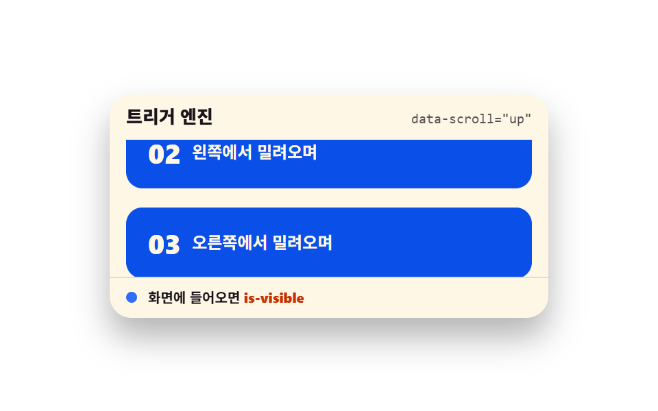 Scroll Trigger Animation: 9 Engines, No GSAPScroll trigger animation is the device that fires a movement the moment an element enters the viewport. It runs with no See all demos in this post