03Rotary dial knob
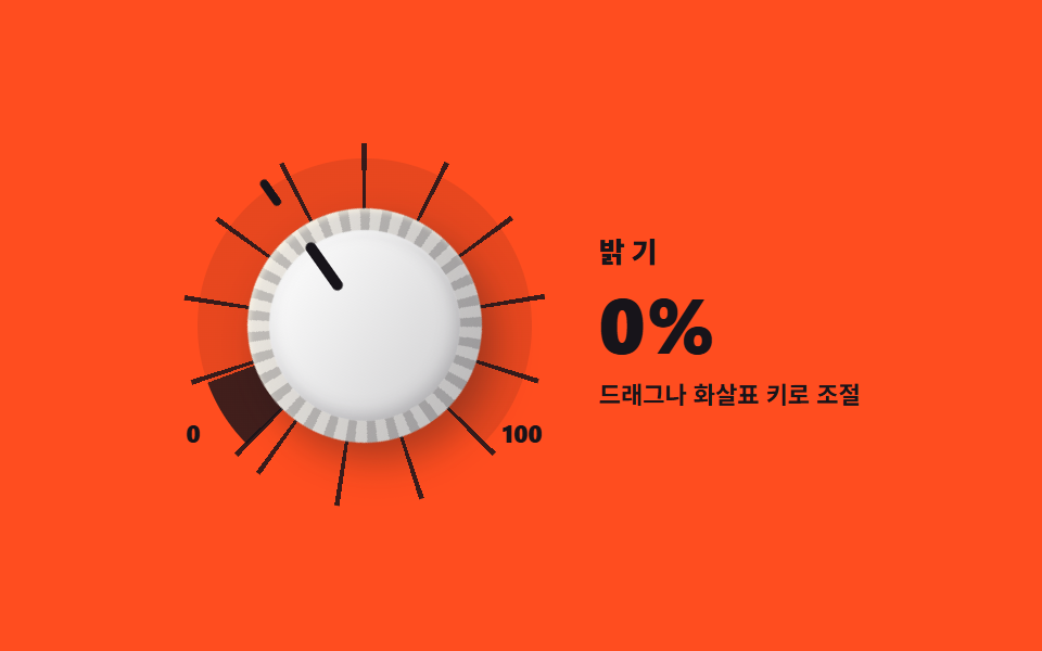
Drag the knob and the value climbs and falls with the angle while the needle on the tick ring follows. Through role="slider" it announces its minimum, maximum and current value together.
Best forAudio volume and EQ, a lighting brightness panel
role="slider"aria-valuenowpointermoveconic-gradient
<main class="stage">
<div class="dk is-demo" id="dk">
  <div class="dk__ring" id="dkRing">
    <span class="dk__ticks" aria-hidden="true"></span>
    <span class="dk__arc" aria-hidden="true"></span>
    <span class="dk__needle" aria-hidden="true"></span>
    <div class="dk__knobWrap">
      <button class="dk__knob" id="dkKnob" type="button" role="slider" aria-label="Brightness dial"
        aria-valuemin="0" aria-valuemax="100" aria-valuenow="0" aria-valuetext="0%"></button>
    </div>
    <span class="dk__scaleMin" aria-hidden="true">0</span>
    <span class="dk__scaleMax" aria-hidden="true">100</span>
  </div>
  <div class="dk__side">
    <p class="dk__label">Brightness</p>
    <p class="dk__readout">
      <b class="dk__value" id="dkValue">0%</b>
      <span class="dk__demoDigits" aria-hidden="true"><i class="dk__digit dk__digit--0">0%</i><i class="dk__digit dk__digit--1">20%</i><i class="dk__digit dk__digit--2">40%</i><i class="dk__digit dk__digit--3">60%</i><i class="dk__digit dk__digit--4">80%</i><i class="dk__digit dk__digit--5">100%</i></span>
    </p>
    <p class="dk__hint">Drag or use arrow keys</p>
  </div>
</div>
</main>
@use "../../../../site/static/demo-tokens" as *;
// 회전 다이얼 노브 — 노브를 드래그해 돌리면 각도만큼 값이 오르내린다.
// 눈금 링은 repeating-conic-gradient(눈금 11개, 27도 간격), 진행 호는 conic-gradient 가
// --fill(0~1) 에 따라 채운다. 바늘과 노브 각인은 같은 각도로 돈다.
// role="slider" + aria-valuemin/max/now, 화살표 키·Home·End 지원. 드래그는 pointermove.
// 미리보기(.is-demo)는 노브가 좌우로 왕복 트는 것을 CSS 로 재생하고 값 글자는 steps(1,end) 컷.
// 진행 호를 애니메이션하려면 --fill 이 숫자로 등록되어 있어야 한다(262-08 실측 계열)
@property --fill {
syntax: '<number>';
inherits: true;
initial-value: 0;
}
$duration: $dur-quick;
$easing: $ease-spring;
$color: $stage-paper;
@include stage($stage-orange);
.dk { display: flex; align-items: center; justify-content: center; gap: $sp-6; width: 100%; }
// ── 눈금 링 + 노브 ───────────────────────────────────────────
.dk__ring { position: relative; width: 168px; height: 168px; flex: 0 0 auto; }
.dk__ticks {
position: absolute; inset: 0; border-radius: 50%;
background: repeating-conic-gradient(from 224deg,
rgba($subject-ink, .85) 0 1.6deg, rgba($subject-ink, 0) 1.6deg 27deg);
}
.dk__arc {
position: absolute; inset: 7px; border-radius: 50%;
background: conic-gradient(from 225deg,
rgba($subject-ink, .82) 0 calc(var(--fill, 0) * 270deg),
rgba($subject-ink, .10) calc(var(--fill, 0) * 270deg) 270deg,
rgba($subject-ink, 0) 270deg 360deg);
}
.dk__needle { position: absolute; inset: 0; transform: rotate(calc(var(--angle, -135) * 1deg)); }
.dk__needle::before {
content: ""; position: absolute; top: 2px; left: calc(50% - 2px); width: 4px; height: 14px;
border-radius: $r-pill; background: $subject-ink;
}
.dk__knobWrap {
position: absolute; inset: 30px; display: grid; place-items: center;
}
.dk__knob {
position: relative; width: 108px; height: 108px; margin: 0; padding: 0; border: 0; border-radius: 50%;
cursor: grab; touch-action: none; font-family: inherit;
transform: rotate(calc(var(--angle, -135) * 1deg));
transition: transform $duration $easing;
background: repeating-conic-gradient(rgba($subject-ink, .24) 0 5deg, rgba($subject-ink, .05) 5deg 11deg),
linear-gradient(145deg, rgba($subject-cream, .55), rgba($subject-ink, .28)), $color;
box-shadow: 0 10px 18px rgba($subject-ink, .35), inset 0 2px 2px rgba($subject-cream, .55);
}
.dk__knob:active { cursor: grabbing; }
.dk__knob:focus-visible { outline: 2px solid $subject-ink; outline-offset: 3px; }
// 노브 얼굴 — 새김 눈금(위쪽 각인)은 ::after, 얼굴면은 ::before
.dk__knob::before {
content: ""; position: absolute; inset: 10px; border-radius: 50%;
background: linear-gradient(160deg, rgba($stage-paper, .95), rgba($subject-ink, .20)), $color;
box-shadow: inset 0 -3px 8px rgba($subject-ink, .22), inset 0 2px 2px rgba($stage-paper, .8);
}
.dk__knob::after {
content: ""; position: absolute; top: 8px; left: calc(50% - 2.5px); width: 5px; height: 26px;
border-radius: $r-pill; background: $subject-ink;
}
.dk__scaleMin, .dk__scaleMax {
position: absolute; top: 128px; font-weight: 800; font-size: 11px; line-height: 1; color: $subject-ink;
}
.dk__scaleMin { left: 2px; }
.dk__scaleMax { right: 2px; }
// ── 값 판 ────────────────────────────────────────────────────
.dk__side { display: flex; flex-direction: column; align-items: flex-start; gap: $sp-1; }
.dk__label {
margin: 0; font-weight: 800; font-size: clamp(11px, 2.8vw, 13px); line-height: 1;
letter-spacing: .22em; color: $subject-ink;
}
.dk__readout { position: relative; margin: 0; height: 44px; min-width: 108px; }
.dk__value {
display: flex; align-items: center; font-weight: 800;
font-size: clamp(28px, 7.5vw, 38px); line-height: 1; color: $subject-ink;
}
// 루프용 값 글자 — 정적 경로에서는 실제 값(.dk__value)이 자리를 지킨다
.dk__demoDigits { display: none; position: absolute; inset: 0; }
.dk__digit {
position: absolute; inset: 0; display: flex; align-items: center;
margin: 0; padding: 0; font-style: normal; font-weight: 800;
font-size: clamp(28px, 7.5vw, 38px); line-height: 1; color: $subject-ink;
}
.dk__hint {
margin: 0; font-weight: 700; font-size: clamp(9px, 2.4vw, 11px); line-height: 1.5;
color: $subject-ink;
}
// ── 미리보기 루프(2초 한 바퀴) ────────────────────────────────
// 바늘·노브는 -135도 에서 135도 로 트고 돌아온다. 호(--fill)와 값 글자가 같은 시간표를 따른다.
.dk.is-demo .dk__needle, .dk.is-demo .dk__knob {
animation-name: dkSweep; animation-duration: $dur-loop;
animation-timing-function: $easing; animation-iteration-count: infinite;
}
@keyframes dkSweep {
0% { transform: rotate(-135deg); }
45% { transform: rotate(135deg); }
50% { transform: rotate(135deg); }
95% { transform: rotate(-135deg); }
100% { transform: rotate(-135deg); }
}
.dk.is-demo {
animation-name: dkFill; animation-duration: $dur-loop;
animation-timing-function: linear; animation-iteration-count: infinite;
}
@keyframes dkFill {
0% { --fill: 0; }
45% { --fill: 1; }
50% { --fill: 1; }
95% { --fill: 0; }
100% { --fill: 0; }
}
// 루프에서는 실제 값 글자를 비우고(공간은 유지) 6단계 값 글자가 컷으로 갈아 낀다
.dk.is-demo .dk__value { visibility: hidden; }
.dk.is-demo .dk__demoDigits { display: block; }
.dk.is-demo .dk__digit {
opacity: 0;
animation-duration: $dur-loop;
animation-timing-function: steps(1, end);
animation-iteration-count: infinite;
}
.dk.is-demo .dk__digit--0 { animation-name: dkDigit-0; }
.dk.is-demo .dk__digit--1 { animation-name: dkDigit-1; }
.dk.is-demo .dk__digit--2 { animation-name: dkDigit-2; }
.dk.is-demo .dk__digit--3 { animation-name: dkDigit-3; }
.dk.is-demo .dk__digit--4 { animation-name: dkDigit-4; }
.dk.is-demo .dk__digit--5 { animation-name: dkDigit-5; }
// 45% 까지 올라갔다 50% 부터 내려오는 트는 시간표에 맞춘 값 창(위 [9i, 9(i+1)) · 아래 (95-9(i+1), 95-9i])
@keyframes dkDigit-0 {
0% { opacity: 1; }
9% { opacity: 0; }
86% { opacity: 1; }
100% { opacity: 1; }
}
@keyframes dkDigit-1 {
0% { opacity: 0; }
9% { opacity: 1; }
18% { opacity: 0; }
77% { opacity: 1; }
86% { opacity: 0; }
100% { opacity: 0; }
}
@keyframes dkDigit-2 {
0% { opacity: 0; }
18% { opacity: 1; }
27% { opacity: 0; }
68% { opacity: 1; }
77% { opacity: 0; }
100% { opacity: 0; }
}
@keyframes dkDigit-3 {
0% { opacity: 0; }
27% { opacity: 1; }
36% { opacity: 0; }
59% { opacity: 1; }
68% { opacity: 0; }
100% { opacity: 0; }
}
@keyframes dkDigit-4 {
0% { opacity: 0; }
36% { opacity: 1; }
45% { opacity: 0; }
50% { opacity: 1; }
59% { opacity: 0; }
100% { opacity: 0; }
}
@keyframes dkDigit-5 {
0% { opacity: 0; }
45% { opacity: 1; }
50% { opacity: 0; }
100% { opacity: 0; }
}
@media (max-width: 340px) {
.dk { gap: $sp-3; }
.dk__ring { width: 128px; height: 128px; }
.dk__arc { inset: 5px; }
.dk__knobWrap { inset: 24px; }
.dk__knob { width: 80px; height: 80px; }
.dk__knob::after { height: 19px; top: 6px; }
.dk__needle::before { height: 11px; }
.dk__scaleMin, .dk__scaleMax { top: 98px; font-size: 9px; }
.dk__readout { height: 36px; min-width: 84px; }
}
@media (prefers-reduced-motion: reduce) {
.dk.is-demo .dk__needle { animation: none !important; transform: rotate(-135deg) !important; }
.dk.is-demo .dk__knob { animation: none !important; transform: rotate(calc(var(--angle, -135) * 1deg)) !important; }
.dk.is-demo { animation: none !important; --fill: 0 !important; }
.dk.is-demo .dk__value { visibility: visible !important; }
.dk.is-demo .dk__demoDigits { display: none !important; }
}@property --fill {
syntax: "<number>";
inherits: true;
initial-value: 0;
}
html, body {
margin: 0;
overflow: hidden;
}
.stage {
box-sizing: border-box;
min-height: 100vh;
display: grid;
place-items: center;
margin: 0;
background: #ff4d1f;
font-family: -apple-system, "Segoe UI", "Noto Sans KR", sans-serif;
padding: clamp(8px, 4vw, 24px);
}
.dk {
display: flex;
align-items: center;
justify-content: center;
gap: 24px;
width: 100%;
}
.dk__ring {
position: relative;
width: 168px;
height: 168px;
flex: 0 0 auto;
}
.dk__ticks {
position: absolute;
inset: 0;
border-radius: 50%;
background: repeating-conic-gradient(from 224deg, rgba(23, 20, 26, 0.85) 0 1.6deg, rgba(23, 20, 26, 0) 1.6deg 27deg);
}
.dk__arc {
position: absolute;
inset: 7px;
border-radius: 50%;
background: conic-gradient(from 225deg, rgba(23, 20, 26, 0.82) 0 calc(var(--fill, 0) * 270deg), rgba(23, 20, 26, 0.1) calc(var(--fill, 0) * 270deg) 270deg, rgba(23, 20, 26, 0) 270deg 360deg);
}
.dk__needle {
position: absolute;
inset: 0;
transform: rotate(calc(var(--angle, -135) * 1deg));
}
.dk__needle::before {
content: "";
position: absolute;
top: 2px;
left: calc(50% - 2px);
width: 4px;
height: 14px;
border-radius: 999px;
background: #17141a;
}
.dk__knobWrap {
position: absolute;
inset: 30px;
display: grid;
place-items: center;
}
.dk__knob {
position: relative;
width: 108px;
height: 108px;
margin: 0;
padding: 0;
border: 0;
border-radius: 50%;
cursor: grab;
touch-action: none;
font-family: inherit;
transform: rotate(calc(var(--angle, -135) * 1deg));
transition: transform 220ms cubic-bezier(0.2, 0.8, 0.2, 1);
background: repeating-conic-gradient(rgba(23, 20, 26, 0.24) 0 5deg, rgba(23, 20, 26, 0.05) 5deg 11deg), linear-gradient(145deg, rgba(255, 247, 230, 0.55), rgba(23, 20, 26, 0.28)), #ffffff;
box-shadow: 0 10px 18px rgba(23, 20, 26, 0.35), inset 0 2px 2px rgba(255, 247, 230, 0.55);
}
.dk__knob:active {
cursor: grabbing;
}
.dk__knob:focus-visible {
outline: 2px solid #17141a;
outline-offset: 3px;
}
.dk__knob::before {
content: "";
position: absolute;
inset: 10px;
border-radius: 50%;
background: linear-gradient(160deg, rgba(255, 255, 255, 0.95), rgba(23, 20, 26, 0.2)), #ffffff;
box-shadow: inset 0 -3px 8px rgba(23, 20, 26, 0.22), inset 0 2px 2px rgba(255, 255, 255, 0.8);
}
.dk__knob::after {
content: "";
position: absolute;
top: 8px;
left: calc(50% - 2.5px);
width: 5px;
height: 26px;
border-radius: 999px;
background: #17141a;
}
.dk__scaleMin, .dk__scaleMax {
position: absolute;
top: 128px;
font-weight: 800;
font-size: 11px;
line-height: 1;
color: #17141a;
}
.dk__scaleMin {
left: 2px;
}
.dk__scaleMax {
right: 2px;
}
.dk__side {
display: flex;
flex-direction: column;
align-items: flex-start;
gap: 4px;
}
.dk__label {
margin: 0;
font-weight: 800;
font-size: clamp(11px, 2.8vw, 13px);
line-height: 1;
letter-spacing: 0.22em;
color: #17141a;
}
.dk__readout {
position: relative;
margin: 0;
height: 44px;
min-width: 108px;
}
.dk__value {
display: flex;
align-items: center;
font-weight: 800;
font-size: clamp(28px, 7.5vw, 38px);
line-height: 1;
color: #17141a;
}
.dk__demoDigits {
display: none;
position: absolute;
inset: 0;
}
.dk__digit {
position: absolute;
inset: 0;
display: flex;
align-items: center;
margin: 0;
padding: 0;
font-style: normal;
font-weight: 800;
font-size: clamp(28px, 7.5vw, 38px);
line-height: 1;
color: #17141a;
}
.dk__hint {
margin: 0;
font-weight: 700;
font-size: clamp(9px, 2.4vw, 11px);
line-height: 1.5;
color: #17141a;
}
.dk.is-demo .dk__needle, .dk.is-demo .dk__knob {
animation-name: dkSweep;
animation-duration: 2s;
animation-timing-function: cubic-bezier(0.2, 0.8, 0.2, 1);
animation-iteration-count: infinite;
}
@keyframes dkSweep {
0% {
transform: rotate(-135deg);
}
45% {
transform: rotate(135deg);
}
50% {
transform: rotate(135deg);
}
95% {
transform: rotate(-135deg);
}
100% {
transform: rotate(-135deg);
}
}
.dk.is-demo {
animation-name: dkFill;
animation-duration: 2s;
animation-timing-function: linear;
animation-iteration-count: infinite;
}
@keyframes dkFill {
0% {
--fill: 0;
}
45% {
--fill: 1;
}
50% {
--fill: 1;
}
95% {
--fill: 0;
}
100% {
--fill: 0;
}
}
.dk.is-demo .dk__value {
visibility: hidden;
}
.dk.is-demo .dk__demoDigits {
display: block;
}
.dk.is-demo .dk__digit {
opacity: 0;
animation-duration: 2s;
animation-timing-function: steps(1, end);
animation-iteration-count: infinite;
}
.dk.is-demo .dk__digit--0 {
animation-name: dkDigit-0;
}
.dk.is-demo .dk__digit--1 {
animation-name: dkDigit-1;
}
.dk.is-demo .dk__digit--2 {
animation-name: dkDigit-2;
}
.dk.is-demo .dk__digit--3 {
animation-name: dkDigit-3;
}
.dk.is-demo .dk__digit--4 {
animation-name: dkDigit-4;
}
.dk.is-demo .dk__digit--5 {
animation-name: dkDigit-5;
}
@keyframes dkDigit-0 {
0% {
opacity: 1;
}
9% {
opacity: 0;
}
86% {
opacity: 1;
}
100% {
opacity: 1;
}
}
@keyframes dkDigit-1 {
0% {
opacity: 0;
}
9% {
opacity: 1;
}
18% {
opacity: 0;
}
77% {
opacity: 1;
}
86% {
opacity: 0;
}
100% {
opacity: 0;
}
}
@keyframes dkDigit-2 {
0% {
opacity: 0;
}
18% {
opacity: 1;
}
27% {
opacity: 0;
}
68% {
opacity: 1;
}
77% {
opacity: 0;
}
100% {
opacity: 0;
}
}
@keyframes dkDigit-3 {
0% {
opacity: 0;
}
27% {
opacity: 1;
}
36% {
opacity: 0;
}
59% {
opacity: 1;
}
68% {
opacity: 0;
}
100% {
opacity: 0;
}
}
@keyframes dkDigit-4 {
0% {
opacity: 0;
}
36% {
opacity: 1;
}
45% {
opacity: 0;
}
50% {
opacity: 1;
}
59% {
opacity: 0;
}
100% {
opacity: 0;
}
}
@keyframes dkDigit-5 {
0% {
opacity: 0;
}
45% {
opacity: 1;
}
50% {
opacity: 0;
}
100% {
opacity: 0;
}
}
@media (max-width: 340px) {
.dk {
gap: 12px;
}
.dk__ring {
width: 128px;
height: 128px;
}
.dk__arc {
inset: 5px;
}
.dk__knobWrap {
inset: 24px;
}
.dk__knob {
width: 80px;
height: 80px;
}
.dk__knob::after {
height: 19px;
top: 6px;
}
.dk__needle::before {
height: 11px;
}
.dk__scaleMin, .dk__scaleMax {
top: 98px;
font-size: 9px;
}
.dk__readout {
height: 36px;
min-width: 84px;
}
}
@media (prefers-reduced-motion: reduce) {
.dk.is-demo .dk__needle {
animation: none !important;
transform: rotate(-135deg) !important;
}
.dk.is-demo .dk__knob {
animation: none !important;
transform: rotate(calc(var(--angle, -135) * 1deg)) !important;
}
.dk.is-demo {
animation: none !important;
--fill: 0 !important;
}
.dk.is-demo .dk__value {
visibility: visible !important;
}
.dk.is-demo .dk__demoDigits {
display: none !important;
}
}var root = document.getElementById('dk');
var ring = document.getElementById('dkRing');
var knob = document.getElementById('dkKnob');
var valueEl = document.getElementById('dkValue');
var MIN = -135, MAX = 135; // 도(°). 0도는 정위(12시 방향)
var VAL_TEXT = '{v}%';
var value = 0;
var dragging = false;
function apply() {
var angle = MIN + (MAX - MIN) * value / 100; // 백분율 값을 각도로
root.style.setProperty('--angle', String(Math.round(angle)));
root.style.setProperty('--fill', (value / 100).toFixed(3));
knob.setAttribute('aria-valuenow', String(value));
knob.setAttribute('aria-valuetext', VAL_TEXT.replace('{v}', String(value)));
valueEl.textContent = value + '%';
}
function angleOf(x, y) {
var r = ring.getBoundingClientRect();
var cx = r.left + r.width / 2, cy = r.top + r.height / 2;
var deg = Math.atan2(x - cx, cy - y) * 180 / Math.PI; // 정위가 0도, 시계 방향이 양수
return Math.max(MIN, Math.min(MAX, deg));
}
knob.addEventListener('pointerdown', function (e) {
root.classList.remove('is-demo');
dragging = true;
knob.setPointerCapture(e.pointerId);
value = Math.round((angleOf(e.clientX, e.clientY) - MIN) / (MAX - MIN) * 100);
apply();
});
knob.addEventListener('pointermove', function (e) {
if (!dragging) { root.classList.remove('is-demo'); return; }
value = Math.round((angleOf(e.clientX, e.clientY) - MIN) / (MAX - MIN) * 100);
apply();
});
knob.addEventListener('pointerup', function () { dragging = false; });
knob.addEventListener('pointercancel', function () { dragging = false; });
knob.addEventListener('keydown', function (e) {
var step = e.shiftKey ? 10 : 5;
if (e.key === 'ArrowRight' || e.key === 'ArrowUp') { value = Math.min(100, value + step); }
else if (e.key === 'ArrowLeft' || e.key === 'ArrowDown') { value = Math.max(0, value - step); }
else if (e.key === 'Home') { value = 0; }
else if (e.key === 'End') { value = 100; }
else { return; }
e.preventDefault();
root.classList.remove('is-demo');
apply();
});
apply();// DialKnob — vanilla 판(run/013/demo/03-skeuo-dial-knob/index.html) 의 React 포트.
// 노브를 드래그해 돌리면 각도만큼 값이 오르내리고 눈금 링의 바늘이 따라 섭니다.
// role="slider" + aria-valuemin/max/now, 화살표 키·Home·End 지원. 값·키프레임은 vanilla 와 같다.
// 이벤트 제네릭 대신 로컬 타입으로 선언한다(ambient 타입만 있어 implicit any 를 피한다).
import { useRef, useState } from "react";
import styles from "./DialKnob.module.scss";
export type DialKnobProps = {
duration?: number;
easing?: string;
color?: string;
};
type Vars = { [k: string]: any };
type PtrEvt = {
clientX: number;
clientY: number;
pointerId: number;
currentTarget: { setPointerCapture: (id: number) => void };
};
type KeyEvt = { key: string; shiftKey: boolean; preventDefault: () => void };
const MIN = -135; // 도(°). 0도는 정위(12시 방향)
const MAX = 135;
const KNOB_LABEL = "밝기 조절 다이얼";
const LABEL_TEXT = "밝기";
const HINT_TEXT = "드래그나 화살표 키로 조절";
const VAL_TEXT = "{v}퍼센트";
const DIGITS = ["0%", "20%", "40%", "60%", "80%", "100%"];
export default function DialKnob({
duration = 220,
easing = "cubic-bezier(.2, .8, .2, 1)", // = $ease-spring
color = "#ffffff",
}: DialKnobProps) {
const [value, setValue] = useState(0);
const [demo, setDemo] = useState(true);
const ringRef = useRef<HTMLDivElement | null>(null);
const dragging = useRef(false);
const angle = Math.round(MIN + (MAX - MIN) * value / 100); // 백분율 값을 각도로
const vars: Vars = {
"--duration": `${duration}ms`,
"--easing": easing,
"--color": color,
"--angle": String(angle),
"--fill": (value / 100).toFixed(3),
};
const cls = [styles.root, demo ? styles.isDemo : ""].filter(Boolean).join(" ");
function angleOf(x: number, y: number): number {
const el = ringRef.current;
if (!el) { return MIN; }
const r = el.getBoundingClientRect();
const cx = r.left + r.width / 2;
const cy = r.top + r.height / 2;
const deg = Math.atan2(x - cx, cy - y) * 180 / Math.PI; // 정위가 0도, 시계 방향이 양수
return Math.max(MIN, Math.min(MAX, deg));
}
function valueAt(x: number, y: number): number {
return Math.round((angleOf(x, y) - MIN) / (MAX - MIN) * 100);
}
function onPointerDown(e: PtrEvt) {
setDemo(false);
dragging.current = true;
e.currentTarget.setPointerCapture(e.pointerId);
setValue(valueAt(e.clientX, e.clientY));
}
function onPointerMove(e: PtrEvt) {
if (!dragging.current) {
setDemo(false);
return;
}
setValue(valueAt(e.clientX, e.clientY));
}
function onPointerUp() {
dragging.current = false;
}
function onKeyDown(e: KeyEvt) {
const step = e.shiftKey ? 10 : 5;
if (e.key === "ArrowRight" || e.key === "ArrowUp") {
setValue((v) => Math.min(100, v + step));
} else if (e.key === "ArrowLeft" || e.key === "ArrowDown") {
setValue((v) => Math.max(0, v - step));
} else if (e.key === "Home") {
setValue(0);
} else if (e.key === "End") {
setValue(100);
} else {
return;
}
e.preventDefault();
setDemo(false);
}
return (
<main className={styles.stage}>
<div className={cls} style={vars}>
<div className={styles.ring} ref={ringRef}>
<span className={styles.ticks} aria-hidden="true"></span>
<span className={styles.arc} aria-hidden="true"></span>
<span className={styles.needle} aria-hidden="true"></span>
<div className={styles.knobWrap}>
<button
className={styles.knob}
type="button"
role="slider"
aria-label={KNOB_LABEL}
aria-valuemin={0}
aria-valuemax={100}
aria-valuenow={value}
aria-valuetext={VAL_TEXT.replace("{v}", String(value))}
onPointerDown={onPointerDown}
onPointerMove={onPointerMove}
onPointerUp={onPointerUp}
onPointerCancel={onPointerUp}
onKeyDown={onKeyDown}
></button>
</div>
<span className={styles.scaleMin} aria-hidden="true">0</span>
<span className={styles.scaleMax} aria-hidden="true">100</span>
</div>
<div className={styles.side}>
<p className={styles.label}>{LABEL_TEXT}</p>
<p className={styles.readout}>
<b className={styles.value}>{value}%</b>
<span className={styles.demoDigits} aria-hidden="true">
{DIGITS.map((d, i) => (
<i className={`${styles.digit} ${styles["digit" + String(i)]}`} key={d}>{d}</i>
))}
</span>
</p>
<p className={styles.hint}>{HINT_TEXT}</p>
</div>
</div>
</main>
);
}03 Rotary dial knob — Measured area 13.382% · moving frames 23/23Original by GODRICH · SCSS and React ship in the zip · CSS Switch Button 9 Ways — Rocker to Tape Eject
The post this demo lives in
 CSS Switch Button 9 Ways — Rocker to Tape EjectA css switch button is a control drawn to behave like the physical switch it stands in for: a lever that tilts, a knob t See all demos in this post