02Member grid — computing the last row's count to avoid an orphan card
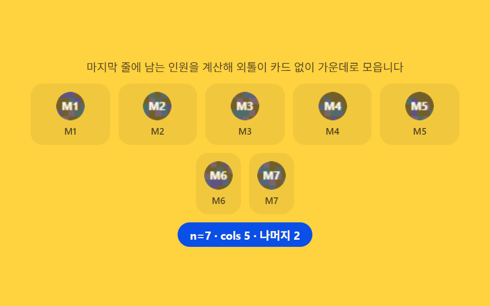
Dividing the member count by the column count and reading the remainder computes how many end up in the last row, and only when that remainder is one or two does a --cols variable shrink that row's column count to center it; a ResizeObserver reruns the same math whenever a width change alters the column count itself.
Best forFull company roster, department member cards
CSS GridResizeObserverCSS custom properties
<main class="stage">
<section class="grid" id="grid">
  <p class="grid__hint" id="gridHint">It calculates the leftover members on the last row and centers them so no card is left stranded alone.</p>
  <div class="grid__head" id="gridHead" role="list" aria-label="Team member list"></div>
  <div class="grid__tail" id="gridTail" role="list" aria-label="Last row"></div>
  <p class="grid__meta"><span class="grid__chip" id="gridChip">n=8 · cols 4 · remainder 0</span></p>
</section>
</main>
@use "../../../../site/static/demo-tokens" as *;
$duration: $dur-base; // 300ms — 카드 팝인
$easing: $ease-pop;
$color: $subject-blue-deep;
@include stage($stage-yellow);
.grid {
width: 100%;
max-width: 420px;
display: flex;
flex-direction: column;
gap: $sp-2;
align-items: center;
text-align: center;
}
.grid__hint {
margin: 0;
padding: 0 $sp-2;
font-weight: 400;
font-size: 11px;
line-height: 1.4;
color: rgba($subject-ink, .72);
}
.grid__head {
display: grid;
grid-template-columns: repeat(var(--cols, 4), 1fr);
gap: $sp-2;
width: 100%;
}
.grid__tail {
display: flex;
justify-content: center;
gap: $sp-2;
width: 100%;
}
.grid__card {
display: flex;
flex-direction: column;
align-items: center;
gap: $sp-1;
padding: $sp-2;
border-radius: $r-control;
background: rgba($subject-ink, .06);
opacity: 0;
transform: scale(.8);
transition: opacity $dur-quick $ease-out, transform $duration $easing;
}
.grid.is-in .grid__card {
opacity: 1;
transform: scale(1);
}
.grid__cv {
display: block;
width: 28px;
height: 28px;
border-radius: $r-pill;
}
.grid__tag {
font-weight: 500;
font-size: 9px;
color: rgba($subject-ink, .72);
}
.grid__meta { margin: 0; }
.grid__chip {
display: inline-flex;
padding: $sp-1 $sp-3;
border-radius: $r-pill;
background: $color;
color: $subject-cream;
font-weight: 700;
font-size: 11px;
}
@media (max-width: 340px) {
.grid { max-width: 300px; gap: $sp-1; }
.grid__hint { font-size: 8px; line-height: 1.3; }
.grid__head, .grid__tail { gap: $sp-1; }
.grid__card { padding: 0; gap: 0; }
.grid__cv { width: 18px; height: 18px; }
.grid__tag { font-size: 7px; }
.grid__chip { font-size: 9px; padding: 0 $sp-2; }
}
@media (prefers-reduced-motion: reduce) {
.grid__card {
transition: none;
opacity: 1;
transform: none;
}
}html, body {
margin: 0;
overflow: hidden;
}
.stage {
box-sizing: border-box;
min-height: 100vh;
display: grid;
place-items: center;
margin: 0;
background: #ffd23f;
font-family: -apple-system, "Segoe UI", "Noto Sans KR", sans-serif;
padding: clamp(8px, 4vw, 24px);
}
.grid {
width: 100%;
max-width: 420px;
display: flex;
flex-direction: column;
gap: 8px;
align-items: center;
text-align: center;
}
.grid__hint {
margin: 0;
padding: 0 8px;
font-weight: 400;
font-size: 11px;
line-height: 1.4;
color: rgba(23, 20, 26, 0.72);
}
.grid__head {
display: grid;
grid-template-columns: repeat(var(--cols, 4), 1fr);
gap: 8px;
width: 100%;
}
.grid__tail {
display: flex;
justify-content: center;
gap: 8px;
width: 100%;
}
.grid__card {
display: flex;
flex-direction: column;
align-items: center;
gap: 4px;
padding: 8px;
border-radius: 12px;
background: rgba(23, 20, 26, 0.06);
opacity: 0;
transform: scale(0.8);
transition: opacity 220ms ease-out, transform 300ms cubic-bezier(0.2, 1.4, 0.4, 1);
}
.grid.is-in .grid__card {
opacity: 1;
transform: scale(1);
}
.grid__cv {
display: block;
width: 28px;
height: 28px;
border-radius: 999px;
}
.grid__tag {
font-weight: 500;
font-size: 9px;
color: rgba(23, 20, 26, 0.72);
}
.grid__meta {
margin: 0;
}
.grid__chip {
display: inline-flex;
padding: 4px 12px;
border-radius: 999px;
background: #0a4fe8;
color: #fff7e6;
font-weight: 700;
font-size: 11px;
}
@media (max-width: 340px) {
.grid {
max-width: 300px;
gap: 4px;
}
.grid__hint {
font-size: 8px;
line-height: 1.3;
}
.grid__head, .grid__tail {
gap: 4px;
}
.grid__card {
padding: 0;
gap: 0;
}
.grid__cv {
width: 18px;
height: 18px;
}
.grid__tag {
font-size: 7px;
}
.grid__chip {
font-size: 9px;
padding: 0 8px;
}
}
@media (prefers-reduced-motion: reduce) {
.grid__card {
transition: none;
opacity: 1;
transform: none;
}
}// Members 그리드(02) — 인원수를 열 수로 나눈 나머지로 마지막 줄에 몇 명이 남는지 계산하고,
// 나머지가 1~2명일 때만 그 인원을 별도 flex 줄로 떼어 가운데로 모은다. ResizeObserver 로
// 컨테이너 폭이 바뀌어 열 수 자체가 바뀔 때도 같은 계산을 다시 돌린다(계산 한 겹).
(function () {
var grid = document.getElementById('grid');
var head = document.getElementById('gridHead');
var tail = document.getElementById('gridTail');
var chip = document.getElementById('gridChip');
if (!grid || !head || !tail || !chip) return;
var reduce = window.matchMedia('(prefers-reduced-motion: reduce)').matches;
function mulberry32(a) {
return function () {
a |= 0; a = a + 0x6D2B79F5 | 0;
var t = Math.imul(a ^ a >>> 15, 1 | a);
t = t + Math.imul(t ^ t >>> 7, 61 | t) ^ t;
return ((t ^ t >>> 14) >>> 0) / 4294967296;
};
}
var HEXES = ['#9fc9ec', '#93d9c0', '#b9a0ff', '#f6c6d3'];
function drawAvatar(cv, seed, label) {
var ctx = cv.getContext('2d');
if (!ctx) return;
var rnd = mulberry32(seed);
var s = cv.width;
ctx.clearRect(0, 0, s, s);
ctx.save();
ctx.beginPath(); ctx.arc(s / 2, s / 2, s / 2, 0, Math.PI * 2); ctx.clip();
var cell = 6;
for (var y = 0; y < s; y += cell) {
for (var x = 0; x < s; x += cell) {
var v = rnd();
ctx.fillStyle = v > .5 ? HEXES[Math.floor(rnd() * HEXES.length)] : 'rgba(23,20,26,.08)';
ctx.fillRect(x, y, cell, cell);
}
}
ctx.restore();
ctx.fillStyle = 'rgba(23,20,26,.55)';
ctx.beginPath(); ctx.arc(s / 2, s / 2, s / 2, 0, Math.PI * 2); ctx.fill();
ctx.fillStyle = '#fff7e6';
ctx.font = '700 ' + Math.round(s * .4) + 'px -apple-system, "Segoe UI", sans-serif';
ctx.textAlign = 'center'; ctx.textBaseline = 'middle';
ctx.fillText(label, s / 2, s / 2 + 1);
}
function card(i) {
var el = document.createElement('div');
el.className = 'grid__card';
el.setAttribute('role', 'listitem');
var cv = document.createElement('canvas');
cv.className = 'grid__cv'; cv.width = 28; cv.height = 28;
cv.setAttribute('aria-hidden', 'true');
var tag = document.createElement('span');
tag.className = 'grid__tag';
tag.textContent = 'M' + (i + 1);
el.appendChild(cv); el.appendChild(tag);
drawAvatar(cv, 11 + i * 13, 'M' + (i + 1));
return el;
}
var cols = 4; // 기본값 — ResizeObserver 가 실측 폭으로 다시 계산한다
var MIN_CARD = 76;
function computeCols(width) {
var c = Math.floor(width / MIN_CARD);
return Math.max(2, Math.min(5, c || 4));
}
function layout(count) {
var remainder = count % cols;
var tailCount = (remainder === 1 || remainder === 2) ? remainder : 0;
var headCount = count - tailCount;
head.style.setProperty('--cols', String(cols));
head.innerHTML = '';
tail.innerHTML = '';
for (var i = 0; i < headCount; i++) head.appendChild(card(i));
for (var j = 0; j < tailCount; j++) tail.appendChild(card(headCount + j));
tail.style.display = tailCount > 0 ? 'flex' : 'none';
chip.textContent = 'n=' + count + ' · cols ' + cols + ' · remainder ' + tailCount;
grid.classList.remove('is-in');
void grid.offsetWidth;
grid.classList.add('is-in');
}
var ro = new ResizeObserver(function (entries) {
var w = entries[0] ? entries[0].contentRect.width : grid.clientWidth;
var next = computeCols(w);
if (next !== cols) { cols = next; layout(counts[idx]); }
});
ro.observe(grid);
var counts = [7, 8, 9, 10];
var idx = 0;
layout(counts[0]);
if (!reduce) {
setInterval(function () {
idx = (idx + 1) % counts.length;
layout(counts[idx]);
}, 700);
}
})();// TeamMemberGrid — vanilla 판(run/338/demo/02-team-member-grid/index.html) 의 React 포트.
// 인원수를 열 수로 나눈 나머지로 마지막 줄에 몇 명이 남는지 계산하고, 나머지가 1~2명일 때만
// 그 인원을 별도 flex 줄로 떼어 가운데로 모은다. ResizeObserver 로 컨테이너 폭이 바뀌어 열 수
// 자체가 바뀔 때도 같은 계산을 다시 돌린다(계산 한 겹).
import { useEffect, useRef } from "react";
import styles from "./TeamMemberGrid.module.scss";
export type TeamMemberGridProps = {
duration?: string;
easing?: string;
color?: string;
};
const HINT = "마지막 줄에 남는 인원을 계산해 외톨이 카드 없이 가운데로 모읍니다";
const HEAD_LABEL = "팀원 목록";
const TAIL_LABEL = "마지막 줄";
function mulberry32(a: number): () => number {
return function (): number {
a |= 0; a = a + 0x6d2b79f5 | 0;
let t = Math.imul(a ^ (a >>> 15), 1 | a);
t = (t + Math.imul(t ^ (t >>> 7), 61 | t)) ^ t;
return ((t ^ (t >>> 14)) >>> 0) / 4294967296;
};
}
const HEXES = ["#9fc9ec", "#93d9c0", "#b9a0ff", "#f6c6d3"];
const COUNTS = [7, 8, 9, 10];
const MIN_CARD = 76;
function drawAvatar(cv: HTMLCanvasElement, seed: number, label: string): void {
const ctx = cv.getContext("2d");
if (!ctx) return;
const rnd = mulberry32(seed);
const s = cv.width;
ctx.clearRect(0, 0, s, s);
ctx.save();
ctx.beginPath();
ctx.arc(s / 2, s / 2, s / 2, 0, Math.PI * 2);
ctx.clip();
const cell = 6;
for (let y = 0; y < s; y += cell) {
for (let x = 0; x < s; x += cell) {
const v = rnd();
ctx.fillStyle = v > 0.5 ? HEXES[Math.floor(rnd() * HEXES.length)] : "rgba(23,20,26,.08)";
ctx.fillRect(x, y, cell, cell);
}
}
ctx.restore();
ctx.fillStyle = "rgba(23,20,26,.55)";
ctx.beginPath();
ctx.arc(s / 2, s / 2, s / 2, 0, Math.PI * 2);
ctx.fill();
ctx.fillStyle = "#fff7e6";
ctx.font = "700 " + Math.round(s * 0.4) + 'px -apple-system, "Segoe UI", sans-serif';
ctx.textAlign = "center";
ctx.textBaseline = "middle";
ctx.fillText(label, s / 2, s / 2 + 1);
}
function computeCols(width: number): number {
const c = Math.floor(width / MIN_CARD);
return Math.max(2, Math.min(5, c || 4));
}
function makeCard(i: number): HTMLDivElement {
const el = document.createElement("div");
el.className = styles.card;
el.setAttribute("role", "listitem");
const cv = document.createElement("canvas");
cv.className = styles.cv;
cv.width = 28;
cv.height = 28;
cv.setAttribute("aria-hidden", "true");
const tag = document.createElement("span");
tag.className = styles.tag;
tag.textContent = "M" + (i + 1);
el.appendChild(cv);
el.appendChild(tag);
drawAvatar(cv, 11 + i * 13, "M" + (i + 1));
return el;
}
export default function TeamMemberGrid({
duration = "300ms",
easing = "cubic-bezier(.2,1.4,.4,1)",
color = "#0a4fe8"
}: TeamMemberGridProps) {
const gridRef = useRef<HTMLElement | null>(null);
const headRef = useRef<HTMLDivElement | null>(null);
const tailRef = useRef<HTMLDivElement | null>(null);
const chipRef = useRef<HTMLSpanElement | null>(null);
useEffect(() => {
const grid = gridRef.current;
const head = headRef.current;
const tail = tailRef.current;
const chip = chipRef.current;
if (!grid || !head || !tail || !chip) return;
const reduce = window.matchMedia("(prefers-reduced-motion: reduce)").matches;
let cols = 4;
let idx = 0;
function layout(count: number): void {
const remainder = count % cols;
const tailCount = remainder === 1 || remainder === 2 ? remainder : 0;
const headCount = count - tailCount;
head!.style.setProperty("--cols", String(cols));
head!.innerHTML = "";
tail!.innerHTML = "";
for (let i = 0; i < headCount; i++) head!.appendChild(makeCard(i));
for (let j = 0; j < tailCount; j++) tail!.appendChild(makeCard(headCount + j));
tail!.style.display = tailCount > 0 ? "flex" : "none";
chip!.textContent = "n=" + count + " · cols " + cols + " · 나머지 " + tailCount;
grid!.classList.remove(styles.gridIn);
void grid!.offsetWidth;
grid!.classList.add(styles.gridIn);
}
const ro = new ResizeObserver((entries) => {
const w = entries[0] ? entries[0].contentRect.width : grid!.clientWidth;
const next = computeCols(w);
if (next !== cols) { cols = next; layout(COUNTS[idx]); }
});
ro.observe(grid);
layout(COUNTS[0]);
let timer = 0;
if (!reduce) {
timer = window.setInterval(() => {
idx = (idx + 1) % COUNTS.length;
layout(COUNTS[idx]);
}, 700);
}
return () => {
ro.disconnect();
if (timer) window.clearInterval(timer);
};
// eslint-disable-next-line react-hooks/exhaustive-deps
}, []);
return (
<main className={styles.stage}>
<section className={styles.grid} ref={gridRef}>
<p className={styles.hint}>{HINT}</p>
<div className={styles.head} ref={headRef} role="list" aria-label={HEAD_LABEL} />
<div className={styles.tail} ref={tailRef} role="list" aria-label={TAIL_LABEL} />
<p className={styles.meta}>
<span className={styles.chip} ref={chipRef} style={{ background: color }}>n=8 · cols 4 · 나머지 0</span>
</p>
</section>
</main>
);
}02 Member grid — computing the last row's count to avoid an orphan card — Measured area 29.079% · moving frames 8/23Original by GODRICH · SCSS and React ship in the zip · 9 Team Page Design Patterns (Copy-Paste)
The post this demo lives in
 9 Team Page Design Patterns (Copy-Paste)Nine team-page sections that compute their layout: columns balance by headcount, bios get read-more only past overflow, See all demos in this post