04Retro Letters Whose Shadow Stretches by a Diagonal Length Value
The shadow repeats one step at a time along a diagonal until it stretches out to the length value, forming the long-shadow lettering seen on retro posters.
Best forVintage campaign headline
RETRO_MAX_LENbuildRetroShadowrenderRetro
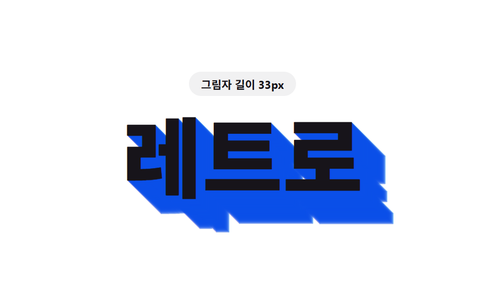
<main class="stage">
<div class="rt is-demo" id="rt">
  <p class="rt__badge"><span class="rt__badgeLabel">Shadow length</span> <span class="rt__badgeValue" id="rtValue">4px</span></p>
  <h1 class="rt__word" id="rtWord">Retro</h1>
</div>
</main>
@use "../../../../site/static/demo-tokens" as *;
// 핵심: 길이 값(len) 하나를 대각선 방향으로 1px 씩 반복해 그 값만큼 길게 늘어뜨린다.
// 복고 포스터에서 보던 긴 그림자 글자 — 값이 커질수록 그림자가 길어진다.
$duration: $dur-loop;
$easing: linear;
$color: $subject-ink;
@include stage($stage-paper);
.rt {
display: grid;
gap: $sp-4;
justify-items: center;
text-align: center;
padding-bottom: $sp-8;
}
.rt__badge {
margin: 0;
padding: $sp-1 $sp-3;
border-radius: $r-pill;
background: rgba(23, 20, 26, .06);
color: $subject-ink;
font-weight: 700;
font-size: 11px;
font-variant-numeric: tabular-nums;
}
.rt__word {
margin: 0;
font-weight: 800;
font-size: clamp(56px, 18vw, 104px);
line-height: 1;
white-space: nowrap;
color: $color;
will-change: text-shadow;
}
@media (max-width: 340px) {
.rt__word { font-size: clamp(40px, 20vw, 68px); }
}
@media (prefers-reduced-motion: reduce) {
.rt__word { transition: none; }
}html, body {
margin: 0;
overflow: hidden;
}
.stage {
box-sizing: border-box;
min-height: 100vh;
display: grid;
place-items: center;
margin: 0;
background: #ffffff;
font-family: -apple-system, "Segoe UI", "Noto Sans KR", sans-serif;
padding: clamp(8px, 4vw, 24px);
}
.rt {
display: grid;
gap: 16px;
justify-items: center;
text-align: center;
padding-bottom: 32px;
}
.rt__badge {
margin: 0;
padding: 4px 12px;
border-radius: 999px;
background: rgba(23, 20, 26, 0.06);
color: #17141a;
font-weight: 700;
font-size: 11px;
font-variant-numeric: tabular-nums;
}
.rt__word {
margin: 0;
font-weight: 800;
font-size: clamp(56px, 18vw, 104px);
line-height: 1;
white-space: nowrap;
color: #17141a;
will-change: text-shadow;
}
@media (max-width: 340px) {
.rt__word {
font-size: clamp(40px, 20vw, 68px);
}
}
@media (prefers-reduced-motion: reduce) {
.rt__word {
transition: none;
}
}(function () {
var RETRO_MAX_LEN = 34;
var RETRO_MIN_LEN = 4;
var PERIOD_MS = 1000;
var word = document.getElementById('rtWord');
var value = document.getElementById('rtValue');
var reduce = window.matchMedia('(prefers-reduced-motion: reduce)').matches;
// 값(len) 하나를 대각선 방향으로 한 칸(1px)씩 반복해 길이만큼 길게 늘어뜨린다
function buildRetroShadow(len) {
var parts = [];
var n = Math.round(len);
for (var i = 1; i <= n; i++) {
parts.push(i + 'px ' + i + 'px 0 rgba(10,79,232,' + (0.9 - (i / n) * 0.35).toFixed(2) + ')');
}
return parts.join(', ');
}
function renderRetro(len) {
word.style.textShadow = buildRetroShadow(len);
value.textContent = Math.round(len) + 'px';
}
var startTime = null;
function loop(now) {
if (startTime === null) startTime = now;
var t = (now - startTime) % PERIOD_MS;
var phase = (Math.sin((t / PERIOD_MS) * Math.PI * 2 - Math.PI / 2) + 1) / 2;
renderRetro(RETRO_MIN_LEN + (RETRO_MAX_LEN - RETRO_MIN_LEN) * phase);
requestAnimationFrame(loop);
}
if (reduce) {
renderRetro(RETRO_MAX_LEN);
} else {
requestAnimationFrame(loop);
}
})();// TextShadowLongDiagonalRetro — vanilla 판(run/412/demo/04-text-shadow-long-diagonal-retro/index.html) 의 React 포트.
// 길이 값(len) 하나를 대각선 방향으로 1px 씩 반복해 그 값만큼 길게 늘어뜨린다.
import { useEffect, useRef, useState } from "react";
import styles from "./TextShadowLongDiagonalRetro.module.scss";
type Box<T> = { current: T };
const RETRO_MAX_LEN = 34;
const RETRO_MIN_LEN = 4;
const PERIOD_MS = 1000;
function buildRetroShadow(len: number): string {
const parts: string[] = [];
const n = Math.round(len);
for (let i = 1; i <= n; i++) {
parts.push(i + "px " + i + "px 0 rgba(10,79,232," + (0.9 - (i / n) * 0.35).toFixed(2) + ")");
}
return parts.join(", ");
}
export default function TextShadowLongDiagonalRetro() {
const wordRef = useRef<HTMLHeadingElement | null>(null);
const valueRef = useRef<HTMLSpanElement | null>(null);
const t0Ref = useRef<number>(0) as Box<number>;
const frameRef = useRef<number>(0) as Box<number>;
const [demo] = useState(true);
const [reduce, setReduce] = useState(false);
function render(len: number): void {
const word = wordRef.current;
const value = valueRef.current;
if (!word || !value) return;
word.style.textShadow = buildRetroShadow(len);
value.textContent = Math.round(len) + "px";
}
useEffect(() => {
setReduce(window.matchMedia("(prefers-reduced-motion: reduce)").matches);
}, []);
useEffect(() => {
if (reduce) {
render(RETRO_MAX_LEN);
return;
}
function loop(now: number): void {
if (t0Ref.current === 0) t0Ref.current = now;
const t = (now - t0Ref.current) % PERIOD_MS;
const phase = (Math.sin((t / PERIOD_MS) * Math.PI * 2 - Math.PI / 2) + 1) / 2;
render(RETRO_MIN_LEN + (RETRO_MAX_LEN - RETRO_MIN_LEN) * phase);
frameRef.current = requestAnimationFrame(loop);
}
frameRef.current = requestAnimationFrame(loop);
return () => cancelAnimationFrame(frameRef.current);
}, [reduce]);
const cls = [styles.rt, demo ? styles.isDemo : ""].filter(Boolean).join(" ");
return (
<main className={styles.stage}>
<div className={cls}>
<p className={styles.badge}><span>그림자 길이</span> <span ref={valueRef}>4px</span></p>
<h1 className={styles.word} ref={wordRef}>레트로</h1>
</div>
</main>
);
}04 Retro Letters Whose Shadow Stretches by a Diagonal Length Value — Measured area 10.081% · moving frames 22/23Original by GODRICH · SCSS and React ship in the zip · CSS Text Shadow Effects — 9 Patterns
The post this demo lives in
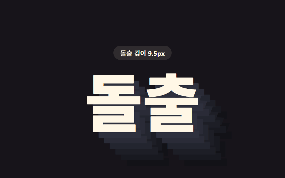 CSS Text Shadow Effects — 9 Patternscss text shadow effects: A shadow is where light goes missing, yet these nine letters shine by shadow alone — item 1 sta See all demos in this post
If you like this effect - similar demos
 Feedback09 Text shadow pop9 CSS Text Highlight Animations, Copy-Paste
 Feedback02 Diagonal wipe mask9 CSS Text Animation Effects for Reveals
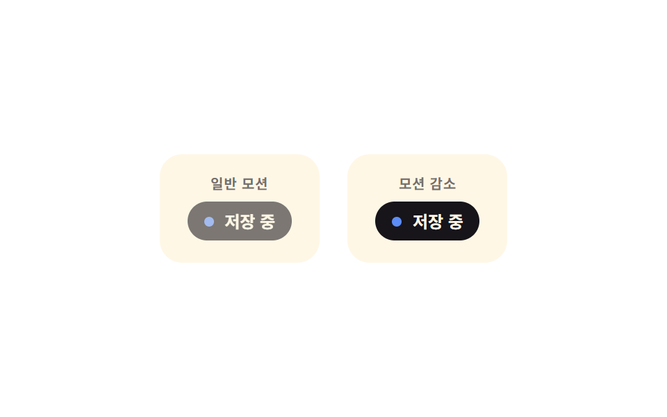 Feedback09 Reduced-motion static save notice — with reduced motion, only the label's text value changes instead of animatingAutosave Indicator: 9 Save-Status Patterns