04Nested Transition That Moves Parent and Child as One Group
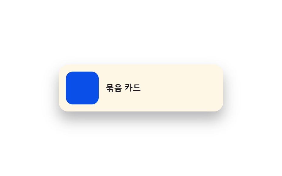
An outer element carrying a name value and its several child elements are declared as one group value, so while the outer frame moves the children scale along at the same ratio, removing the lag where only the parent grows and children snap late.
Best forImage-plus-text card to detail-panel transitions
::view-transition-group(gn-card)::view-transition-group(gn-thumb)::view-transition-group(gn-title)
<main class="stage">
<div class="gn is-demo" id="gn">
  <button type="button" class="gn__card" id="gnCard" aria-label="Expand card">
    <span class="gn__thumb" id="gnThumb"></span>
    <span class="gn__title" id="gnTitle">Grouped card</span>
  </button>
</div>
</main>
@use "../../../../site/static/demo-tokens" as *;
// ── 변수 3개 ──────────────────────────────────────────
$duration: $dur-enter;
$easing: $ease-spring;
$color: $subject-blue-deep;
@include stage($stage-paper);
.gn { width: min(100%, 280px); }
.gn__card {
view-transition-name: gn-card;
position: relative; width: 100%; box-sizing: border-box; border: none; cursor: pointer;
display: flex; align-items: center; gap: $sp-3; text-align: left;
background: $subject-cream; border-radius: $r-card; padding: $sp-3;
box-shadow: $shadow-raised;
}
.gn__card:focus-visible { outline: 2px solid $color; outline-offset: 2px; }
.gn__thumb {
view-transition-name: gn-thumb;
view-transition-group: nearest;
width: 56px; height: 56px; border-radius: $r-control; background: $color; flex: 0 0 auto;
}
.gn__title {
view-transition-name: gn-title;
view-transition-group: nearest;
font: 700 14px/1.3 -apple-system, "Segoe UI", sans-serif; color: $subject-ink;
}
.gn__card.is-open {
flex-direction: column; align-items: flex-start; gap: $sp-3; padding: $sp-5;
}
.gn__card.is-open .gn__thumb { width: 100%; height: 96px; border-radius: $r-card; }
.gn__card.is-open .gn__title { font-size: 18px; }
// 실사용 원리: 바깥 카드가 gn-card 값으로, 안쪽 썸네일·제목이 각각 gn-thumb·gn-title 값으로
// 스스로 전환에 참여하면서 view-transition-group:nearest 가 자식 그룹을 부모(gn-card) 그룹
// 아래에 중첩시켜, 부모 크기 변화와 같은 비율로 자식도 함께 보간된다(따로 놀지 않는다).
::view-transition-group(gn-card),
::view-transition-group(gn-thumb),
::view-transition-group(gn-title) {
animation-duration: $duration;
animation-timing-function: $easing;
}
@media (max-width: 340px) {
.gn__card { padding: $sp-2; gap: $sp-2; }
.gn__thumb { width: 44px; height: 44px; }
.gn__title { font-size: 12px; }
.gn__card.is-open { padding: $sp-3; }
.gn__card.is-open .gn__thumb { height: 70px; }
.gn__card.is-open .gn__title { font-size: 15px; }
}
@media (prefers-reduced-motion: reduce) {
::view-transition-group(*),
::view-transition-old(*),
::view-transition-new(*) { animation: none !important; }
}html, body {
margin: 0;
overflow: hidden;
}
.stage {
box-sizing: border-box;
min-height: 100vh;
display: grid;
place-items: center;
margin: 0;
background: #ffffff;
font-family: -apple-system, "Segoe UI", "Noto Sans KR", sans-serif;
padding: clamp(8px, 4vw, 24px);
}
.gn {
width: min(100%, 280px);
}
.gn__card {
view-transition-name: gn-card;
position: relative;
width: 100%;
box-sizing: border-box;
border: none;
cursor: pointer;
display: flex;
align-items: center;
gap: 12px;
text-align: left;
background: #fff7e6;
border-radius: 16px;
padding: 12px;
box-shadow: 0 14px 24px rgba(23, 20, 26, 0.32);
}
.gn__card:focus-visible {
outline: 2px solid #0a4fe8;
outline-offset: 2px;
}
.gn__thumb {
view-transition-name: gn-thumb;
view-transition-group: nearest;
width: 56px;
height: 56px;
border-radius: 12px;
background: #0a4fe8;
flex: 0 0 auto;
}
.gn__title {
view-transition-name: gn-title;
view-transition-group: nearest;
font: 700 14px/1.3 -apple-system, "Segoe UI", sans-serif;
color: #17141a;
}
.gn__card.is-open {
flex-direction: column;
align-items: flex-start;
gap: 12px;
padding: 20px;
}
.gn__card.is-open .gn__thumb {
width: 100%;
height: 96px;
border-radius: 16px;
}
.gn__card.is-open .gn__title {
font-size: 18px;
}
::view-transition-group(gn-card),
::view-transition-group(gn-thumb),
::view-transition-group(gn-title) {
animation-duration: 600ms;
animation-timing-function: cubic-bezier(0.2, 0.8, 0.2, 1);
}
@media (max-width: 340px) {
.gn__card {
padding: 8px;
gap: 8px;
}
.gn__thumb {
width: 44px;
height: 44px;
}
.gn__title {
font-size: 12px;
}
.gn__card.is-open {
padding: 12px;
}
.gn__card.is-open .gn__thumb {
height: 70px;
}
.gn__card.is-open .gn__title {
font-size: 15px;
}
}
@media (prefers-reduced-motion: reduce) {
::view-transition-group(*),
::view-transition-old(*),
::view-transition-new(*) {
animation: none !important;
}
}(function () {
var SUPPORTS_VT = 'startViewTransition' in document;
var root = document.getElementById('gn');
var card = document.getElementById('gnCard');
var thumb = document.getElementById('gnThumb');
var title = document.getElementById('gnTitle');
var reduce = window.matchMedia('(prefers-reduced-motion: reduce)').matches;
var open = false;
var isDemo = true;
function human() {
if (isDemo) { root.classList.remove('is-demo'); isDemo = false; }
}
function render() {
card.classList.toggle('is-open', open);
}
function change(fn) {
if (SUPPORTS_VT) { document.startViewTransition(fn); }
else { fn(); }
}
function toggle() {
open = !open;
change(render);
}
card.addEventListener('click', function () { human(); toggle(); });
root.addEventListener('keydown', function (e) {
if (e.key === 'Enter' || e.key === ' ') { human(); e.preventDefault(); toggle(); }
});
var HOLD_MS = 1000;
function loop() {
if (!isDemo) return;
toggle();
window.setTimeout(loop, HOLD_MS);
}
if (!reduce) {
window.setTimeout(loop, HOLD_MS);
} else {
root.classList.remove('is-demo');
}
})();// GroupNested — vanilla 판(run/401/demo/04-view-transition-group-nested/index.html) 의 React 포트.
// 계산 겹 없음(브리프 지정) — view-transition-group: nearest 로 부모·자식이 중첩 그룹을 이룬다.
import { useEffect, useRef } from "react";
import styles from "./GroupNested.module.scss";
type Box<T> = { current: T };
const HOLD_MS = 1000;
export default function GroupNested() {
const rootRef = useRef(null) as unknown as Box<HTMLDivElement>;
const cardRef = useRef(null) as unknown as Box<HTMLButtonElement>;
const timerRef = useRef(0) as unknown as Box<number>;
useEffect(() => {
const SUPPORTS_VT = "startViewTransition" in document;
const reduce = window.matchMedia("(prefers-reduced-motion: reduce)").matches;
let isDemo = true;
let open = false;
function human() {
if (isDemo) { rootRef.current?.classList.remove(styles.isDemo); isDemo = false; }
}
function render() {
cardRef.current?.classList.toggle(styles.isOpen, open);
}
function change(fn: () => void) {
if (SUPPORTS_VT) { document.startViewTransition(fn); }
else { fn(); }
}
function toggle() {
open = !open;
change(render);
}
function onClick() { human(); toggle(); }
function onKeydown(e: KeyboardEvent) {
if (e.key === "Enter" || e.key === " ") { human(); e.preventDefault(); toggle(); }
}
cardRef.current?.addEventListener("click", onClick);
rootRef.current?.addEventListener("keydown", onKeydown);
function loop() {
if (!isDemo) return;
toggle();
timerRef.current = window.setTimeout(loop, HOLD_MS);
}
if (!reduce) {
timerRef.current = window.setTimeout(loop, HOLD_MS);
} else {
rootRef.current?.classList.remove(styles.isDemo);
}
return () => {
window.clearTimeout(timerRef.current);
cardRef.current?.removeEventListener("click", onClick);
rootRef.current?.removeEventListener("keydown", onKeydown);
};
}, []);
return (
<main className={styles.stage}>
<div className={styles.gn + " " + styles.isDemo} ref={rootRef}>
<button type="button" className={styles.card} ref={cardRef} aria-label="카드 펼치기">
<span className={styles.thumb} />
<span className={styles.title}>묶음 카드</span>
</button>
</div>
</main>
);
}04 Nested Transition That Moves Parent and Child as One Group — Measured area 44.171% · moving frames 12/23Original by GODRICH · SCSS and React ship in the zip · View Transitions API: 9 Patterns by One Value
The post this demo lives in
 View Transitions API: 9 Patterns by One ValueView transitions api: The page seems to carry over, but the browser keeps the outgoing view as a snapshot value layered See all demos in this post
If you like this effect - similar demos
 Transitions01 Active-indicator slide-morph toggle — when the selected tab changes, the highlight's position and width values shift together from the old spot to the new oneCSS Bottom Navigation Bar: 9 Transition Patterns
 Transitions05 Carousel That Autoplays and Pauses on HoverCarousel Slider UI Design — 9 Transitions
 Transitions02 Header List That Collapses by a Date-group ValueNotification Animation CSS: 9 Panel UI Patterns