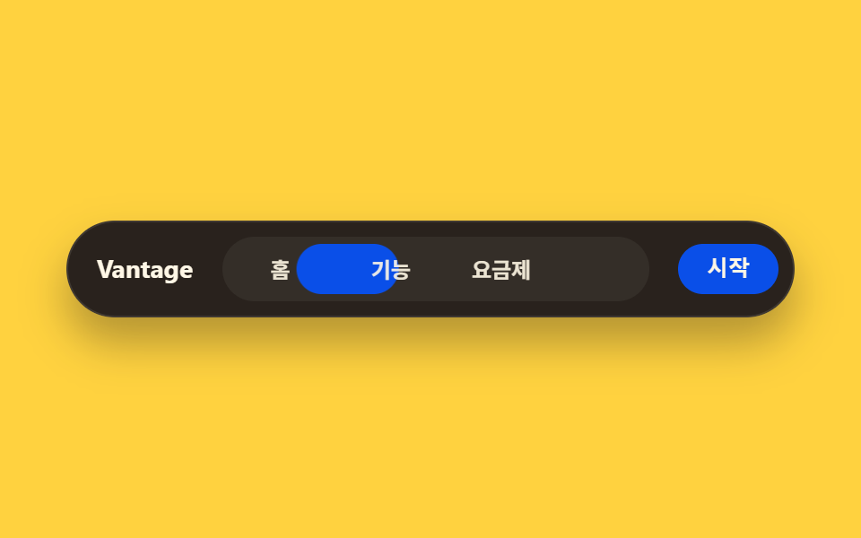
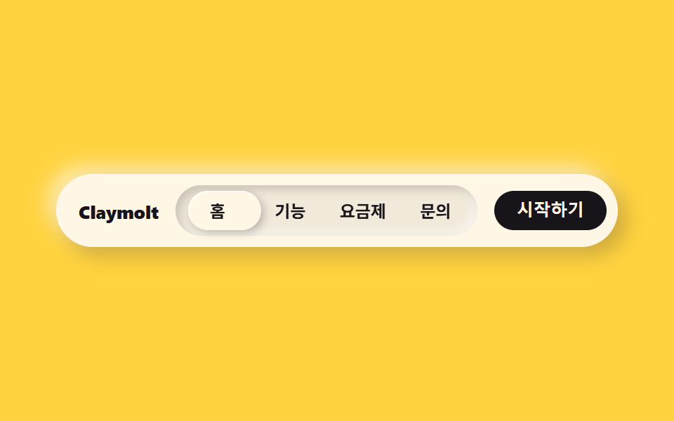
02丸ピル型ナビ
メニュー全体が一つのピル型に収まり、現在地は内側のチップが追従して示す。
使いどころLP上部バー・アプリ内タブ切替
radius 999padding 6px그림자 얕게
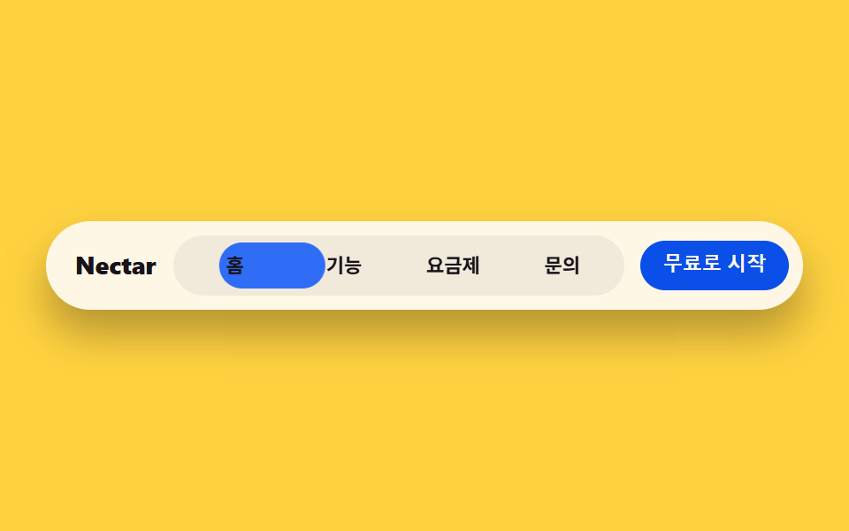
<main class="stage">
  <nav class="navbar">
    <span class="navbar__brand">Nectar</span>
    <div class="navbar__pill is-demo">
      <span class="navbar__indicator" aria-hidden="true"></span>
      <span class="navbar__item">ホーム</span>
      <span class="navbar__item">機能</span>
      <span class="navbar__item">料金</span>
      <span class="navbar__item">お問い合わせ</span>
    </div>
    <button class="navbar__cta" type="button">無料で始める</button>
  </nav>
</main>
@use "../../../../site/static/demo-tokens" as *;
$duration: $dur-loop; // 표시등이 네 항목을 도는 한 주기
$easing: $ease-spring; // 이동 곡선
$color: $subject-blue; // 표시등 색
@include stage($stage-yellow);
.navbar {
width: clamp(260px, 84vw, 420px);
display: flex;
align-items: center;
gap: clamp(8px, 2vw, 14px);
background: $subject-cream;
border-radius: $r-pill;
padding: 8px 8px 8px 16px;
box-shadow: $shadow-raised;
}
.navbar__brand {
color: $subject-ink;
font-weight: 800; font-size: clamp(12px, 3vw, 14px); line-height: 1;
flex: none;
}
.navbar__pill {
position: relative;
flex: 1;
display: grid;
grid-template-columns: repeat(4, 1fr);
background: rgba($subject-ink, .06);
border-radius: $r-pill;
padding: 4px;
}
.navbar__indicator {
position: absolute;
inset: 4px auto 4px 4px;
width: calc(25% - 4px);
border-radius: $r-pill;
background: $color;
animation: navSlide $duration $easing infinite;
}
.navbar__item {
position: relative;
z-index: 1;
text-align: center;
color: $subject-ink;
font-weight: 600; font-size: clamp(9.5px, 2.3vw, 11.5px); line-height: 1;
padding: clamp(6px, 1.6vw, 8px) 2px;
}
.navbar__cta {
flex: none;
border: 0;
border-radius: $r-pill;
background: $subject-blue-deep;
color: $subject-cream;
padding: clamp(7px, 1.8vw, 9px) clamp(12px, 2.6vw, 15px);
font-weight: 700; font-size: clamp(9.5px, 2.3vw, 11.5px); line-height: 1;
}
// 데모: 표시등이 홈 → 기능 → 요금제 → 문의 순으로 옮겨간 뒤 처음으로 돌아온다
@keyframes navSlide {
0% { transform: translateX(0%); }
12% { transform: translateX(0%); }
25% { transform: translateX(100%); }
37% { transform: translateX(100%); }
50% { transform: translateX(200%); }
62% { transform: translateX(200%); }
75% { transform: translateX(300%); }
87% { transform: translateX(300%); }
100% { transform: translateX(0%); }
}
@media (prefers-reduced-motion: reduce) {
.navbar__indicator {
animation: none !important;
transform: translateX(0%);
}
}html, body {
margin: 0;
overflow: hidden;
}
.stage {
box-sizing: border-box;
min-height: 100vh;
display: grid;
place-items: center;
margin: 0;
background: #ffd23f;
font-family: -apple-system, "Segoe UI", "Noto Sans KR", sans-serif;
padding: clamp(8px, 4vw, 24px);
}
.navbar {
width: clamp(260px, 84vw, 420px);
display: flex;
align-items: center;
gap: clamp(8px, 2vw, 14px);
background: #fff7e6;
border-radius: 999px;
padding: 8px 8px 8px 16px;
box-shadow: 0 14px 24px rgba(23, 20, 26, 0.32);
}
.navbar__brand {
color: #17141a;
font-weight: 800;
font-size: clamp(12px, 3vw, 14px);
line-height: 1;
flex: none;
}
.navbar__pill {
position: relative;
flex: 1;
display: grid;
grid-template-columns: repeat(4, 1fr);
background: rgba(23, 20, 26, 0.06);
border-radius: 999px;
padding: 4px;
}
.navbar__indicator {
position: absolute;
inset: 4px auto 4px 4px;
width: calc(25% - 4px);
border-radius: 999px;
background: #2f6df6;
animation: navSlide 2s cubic-bezier(0.2, 0.8, 0.2, 1) infinite;
}
.navbar__item {
position: relative;
z-index: 1;
text-align: center;
color: #17141a;
font-weight: 600;
font-size: clamp(9.5px, 2.3vw, 11.5px);
line-height: 1;
padding: clamp(6px, 1.6vw, 8px) 2px;
}
.navbar__cta {
flex: none;
border: 0;
border-radius: 999px;
background: #0a4fe8;
color: #fff7e6;
padding: clamp(7px, 1.8vw, 9px) clamp(12px, 2.6vw, 15px);
font-weight: 700;
font-size: clamp(9.5px, 2.3vw, 11.5px);
line-height: 1;
}
@keyframes navSlide {
0% {
transform: translateX(0%);
}
12% {
transform: translateX(0%);
}
25% {
transform: translateX(100%);
}
37% {
transform: translateX(100%);
}
50% {
transform: translateX(200%);
}
62% {
transform: translateX(200%);
}
75% {
transform: translateX(300%);
}
87% {
transform: translateX(300%);
}
100% {
transform: translateX(0%);
}
}
@media (prefers-reduced-motion: reduce) {
.navbar__indicator {
animation: none !important;
transform: translateX(0%);
}
}import type { CSSProperties } from "react";
import styles from "./BentoNav.module.scss";
export type BentoNavProps = {
brand?: string;
items?: string[];
cta?: string;
duration?: number;
easing?: string;
color?: string;
};
type Vars = CSSProperties & { "--duration"?: string; "--easing"?: string; "--color"?: string };
export default function BentoNav({
brand = "Nectar",
items = ["Home", "Features", "Pricing", "Contact"],
cta = "Start for free",
duration = 2000,
easing = "cubic-bezier(.2,.8,.2,1)",
color = "#2f6df6",
}: BentoNavProps) {
const vars: Vars = { "--duration": `${duration}ms`, "--easing": easing, "--color": color };
return (
<nav className={styles.navbar} style={vars}>
<span className={styles.brand}>{brand}</span>
<div className={styles.pill}>
<span className={styles.indicator} aria-hidden="true" />
{items.map((label) => (
<span key={label} className={styles.item}>{label}</span>
))}
</div>
<button type="button" className={styles.cta}>{cta}</button>
</nav>
);
}02 丸ピル型ナビ — 計測 累積面積 4.193% · 動いたフレーム 15/23GODRICH オリジナル · SCSS と React は zip に同梱 · 【コピペOK】ベントグリッド 今どきのLPパーツ9選
このデモが属する記事
 【コピペOK】ベントグリッド 今どきのLPパーツ9選ベントグリッドは、日本の弁当箱のように大きさの異なる区画を隙間なく組み合わせ、ランディングページ全体を一枚の格子に見せるレイアウト手法です。ヒーローから料金表まで、すべてのセクションが同じ角丸と影の強さの上に乗ります。 この記事のデモをすべて見る