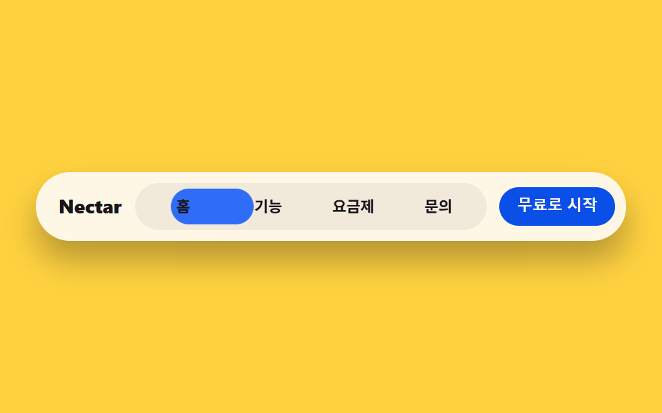
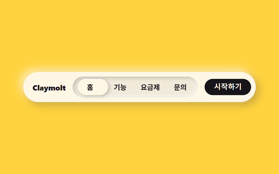
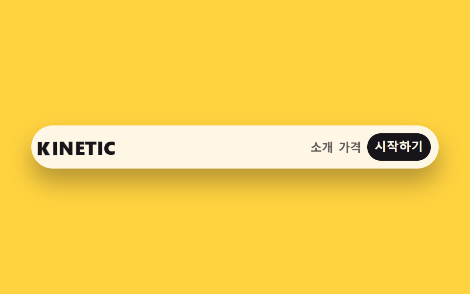
02ブラースティッキーナビ
backdrop-filterでぼかしたナビバーの中で、現在地を示す小さなピルがメニュー項目の間を移動する。
使いどころスティッキー上部ナビ・ダークアプリヘッダー
backdrop-filter: blur(10px)radius 999flex 0 0 auto
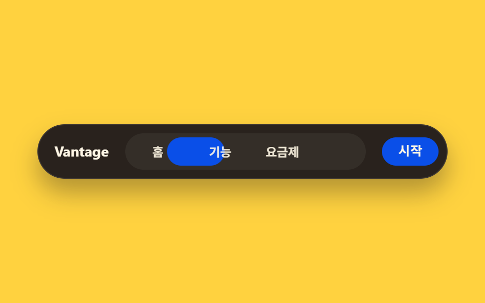
<main class="stage">
  <nav class="navbar">
    <span class="navbar__brand">Vantage</span>
    <div class="navbar__items is-demo">
      <span class="navbar__pill" aria-hidden="true"></span>
      <span class="navbar__item">ホーム</span>
      <span class="navbar__item">機能</span>
      <span class="navbar__item">料金</span>
    </div>
    <button class="navbar__cta" type="button">開始</button>
  </nav>
</main>
@use "../../../../site/static/demo-tokens" as *;
$duration: $dur-loop; // 필이 두 항목 사이를 오가는 한 주기
$easing: $ease-spring;
$color: $subject-blue;
@include stage($stage-yellow);
$item-gap: $sp-1;
.navbar {
--item-w: clamp(32px, 12vw, 64px); // 3개 항목이 320px 폭에서도 브랜드·CTA 와 함께 들어가도록 반응형
display: flex;
align-items: center;
gap: $sp-4;
width: clamp(240px, 84vw, 380px);
border-radius: $r-pill;
background: rgba($subject-ink, .92);
border: 1px solid rgba($subject-cream, .1);
box-shadow: $shadow-raised;
padding: $sp-2 $sp-2 $sp-2 $sp-4;
backdrop-filter: blur(10px);
}
.navbar__brand {
flex: 0 0 auto;
color: $subject-cream;
font: 700 clamp(12px, 3vw, 14px)/1 -apple-system, "Segoe UI", "Noto Sans KR", sans-serif;
}
.navbar__items {
position: relative;
display: flex;
gap: $item-gap;
flex: 1 1 auto;
background: rgba($subject-cream, .05);
border-radius: $r-pill;
padding: $sp-1;
}
.navbar__pill {
position: absolute;
left: $sp-1;
top: $sp-1;
bottom: $sp-1;
width: var(--item-w);
border-radius: $r-pill;
background: $subject-blue-deep;
animation: pillMove $duration $easing infinite;
}
.navbar__item {
position: relative;
z-index: 1;
flex: 0 0 var(--item-w);
width: var(--item-w);
text-align: center;
padding: $sp-2 0;
color: rgba($subject-cream, .9); // 파란 알약($subject-blue-deep) 위에서 .7 은 3.68:1 이었다 — AA 4.5 (5.10:1)
font-weight: 600; font-size: clamp(10.5px, 2.6vw, 12px); line-height: 1;
}
.navbar__cta {
flex: 0 0 auto;
border: 0;
border-radius: $r-pill;
background: $subject-blue-deep;
color: $subject-cream;
padding: $sp-2 $sp-4;
font-weight: 600; font-size: clamp(10.5px, 2.6vw, 12px); line-height: 1;
}
@keyframes pillMove {
0%, 20% { transform: translateX(0); }
50%, 70% { transform: translateX(calc(var(--item-w) + #{$item-gap})); }
100% { transform: translateX(0); }
}
@media (prefers-reduced-motion: reduce) {
.navbar__pill { animation: none !important; transform: translateX(0); }
}html, body {
margin: 0;
overflow: hidden;
}
.stage {
box-sizing: border-box;
min-height: 100vh;
display: grid;
place-items: center;
margin: 0;
background: #ffd23f;
font-family: -apple-system, "Segoe UI", "Noto Sans KR", sans-serif;
padding: clamp(8px, 4vw, 24px);
}
.navbar {
--item-w: clamp(32px, 12vw, 64px);
display: flex;
align-items: center;
gap: 16px;
width: clamp(240px, 84vw, 380px);
border-radius: 999px;
background: rgba(23, 20, 26, 0.92);
border: 1px solid rgba(255, 247, 230, 0.1);
box-shadow: 0 14px 24px rgba(23, 20, 26, 0.32);
padding: 8px 8px 8px 16px;
backdrop-filter: blur(10px);
}
.navbar__brand {
flex: 0 0 auto;
color: #fff7e6;
font: 700 clamp(12px, 3vw, 14px)/1 -apple-system, "Segoe UI", "Noto Sans KR", sans-serif;
}
.navbar__items {
position: relative;
display: flex;
gap: 4px;
flex: 1 1 auto;
background: rgba(255, 247, 230, 0.05);
border-radius: 999px;
padding: 4px;
}
.navbar__pill {
position: absolute;
left: 4px;
top: 4px;
bottom: 4px;
width: var(--item-w);
border-radius: 999px;
background: #0a4fe8;
animation: pillMove 2s cubic-bezier(0.2, 0.8, 0.2, 1) infinite;
}
.navbar__item {
position: relative;
z-index: 1;
flex: 0 0 var(--item-w);
width: var(--item-w);
text-align: center;
padding: 8px 0;
color: rgba(255, 247, 230, 0.9);
font-weight: 600;
font-size: clamp(10.5px, 2.6vw, 12px);
line-height: 1;
}
.navbar__cta {
flex: 0 0 auto;
border: 0;
border-radius: 999px;
background: #0a4fe8;
color: #fff7e6;
padding: 8px 16px;
font-weight: 600;
font-size: clamp(10.5px, 2.6vw, 12px);
line-height: 1;
}
@keyframes pillMove {
0%, 20% {
transform: translateX(0);
}
50%, 70% {
transform: translateX(calc(var(--item-w) + 4px));
}
100% {
transform: translateX(0);
}
}
@media (prefers-reduced-motion: reduce) {
.navbar__pill {
animation: none !important;
transform: translateX(0);
}
}import type { CSSProperties } from "react";
import styles from "./NavLinear.module.scss";
export type NavLinearProps = {
brand?: string;
items?: [string, string, string];
cta?: string;
/** 필이 두 항목 사이를 오가는 한 주기(기본 2000ms) */
duration?: number;
easing?: string;
color?: string;
};
type Vars = CSSProperties & { "--duration"?: string; "--easing"?: string; "--color"?: string };
export default function NavLinear({
brand = "Vantage",
items = ["홈", "기능", "요금제"],
cta = "시작",
duration = 2000,
easing = "cubic-bezier(.2,1.4,.4,1)",
color = "#0a4fe8",
}: NavLinearProps) {
const vars: Vars = { "--duration": `${duration}ms`, "--easing": easing, "--color": color };
return (
<nav className={styles.navbar} style={vars}>
<span className={styles.brand}>{brand}</span>
<div className={styles.items}>
<span className={styles.pill} aria-hidden="true" />
{items.map((label) => (
<span key={label} className={styles.item}>{label}</span>
))}
</div>
<button type="button" className={styles.cta}>{cta}</button>
</nav>
);
}02 ブラースティッキーナビ — 計測 累積面積 2.219% · 動いたフレーム 15/23GODRICH オリジナル · SCSS と React は zip に同梱 · 現場で使う ダークモード デザインシステム LPパーツ9選
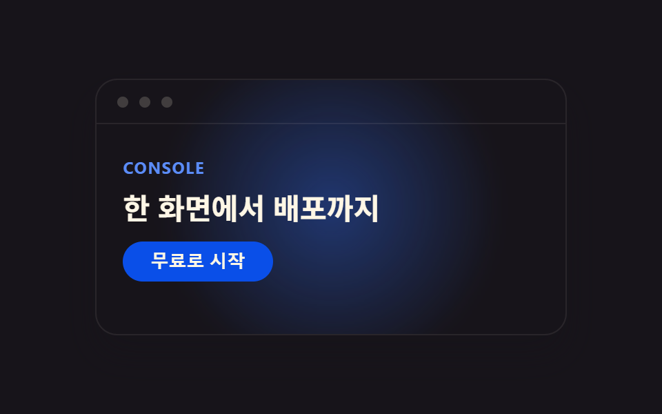
このデモが属する記事
 現場で使う ダークモード デザインシステム LPパーツ9選今、Pinterestで保存され続けているダークモード デザインシステムは、開発者向けツールLinear.appの画面をきっかけに広まった配色のルールで、濃いインク色の背景に青いグローや枠線のハイライトだけで階層を表現します。この記事では同 この記事のデモをすべて見る