05両端の引用符が内側へ滑り込む引用
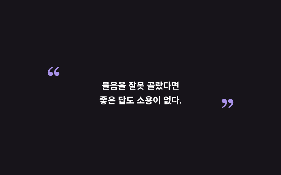
引用文の両端の大きな引用符が外から内側へ滑り込んで枠を締め、文は中央で一度浮かび上がります。
使いどころインタビュー記事、調査レポート
translateXopacity::before
<main class="stage">
  <figure class="qs is-demo" aria-label="両端の引用符が締まる引用">
    <blockquote class="qs__body">問いを誤れば、<br>いい答えも役に立たない。</blockquote>
  </figure>
</main>
@use "../../../../site/static/demo-tokens" as *;
// 인터뷰용 인용구 — ::before/::after 로 얹은 커다란 따옴표 글리프가 바깥에서 안으로 미끄러져
// 들어와 문장을 틀 안에 가두고, 문장은 가운데서 한 번 떠오른다.
// 따옴표는 아이콘이 아니라 타이포그래피 글리프(세리프) — 문장보다 크게 벌려 두는 게 핵심.
$duration: $dur-loop;
$easing: $ease-spring;
$color: $stage-paper;
@include stage($stage-ink);
.qs {
box-sizing: border-box;
width: min(320px, 92vw);
margin: 0;
padding: $sp-6 $sp-8;
font-family: inherit;
}
.qs * { box-sizing: border-box; }
.qs__body {
position: relative;
z-index: 1;
margin: 0;
font-size: 15px;
font-weight: 600;
line-height: 1.7;
text-align: center;
color: $color;
}
// 양 끝 따옴표 — 문장보다 위·아래로 크게 벌어져 있는 글리프
.qs__body::before,
.qs__body::after {
position: absolute;
z-index: -1;
font-family: Georgia, "Times New Roman", serif;
font-size: 52px;
font-weight: 700;
line-height: 1;
color: $subject-lilac;
opacity: .9;
pointer-events: none;
}
.qs__body::before { content: "\201C"; top: -28px; left: -20px; }
.qs__body::after { content: "\201D"; bottom: -28px; right: -20px; }
// ── 미리보기 루프 ─────────────────
.qs.is-demo .qs__body {
animation-name: qsLift;
animation-duration: $duration;
animation-timing-function: $easing;
animation-iteration-count: infinite;
}
.qs.is-demo .qs__body::before {
animation-name: qsMarkBefore;
animation-duration: $duration;
animation-timing-function: $easing;
animation-iteration-count: infinite;
}
.qs.is-demo .qs__body::after {
animation-name: qsMarkAfter;
animation-duration: $duration;
animation-timing-function: $easing;
animation-iteration-count: infinite;
}
// 문장·따옴표 모두 opacity 램프를 쓰지 않는다 — 텍스트 페이드의 중간값이 poster 에
// 반투명 유령으로 남는다(237 계열 함정). 문장은 translateY 로, 따옴표는 슬라이드+스케일로
// 처음부터 불투명하게 움직인다. 복귀: 문장은 되돌아 내려가고, 따옴표는 바깥으로 슬라이드.
@keyframes qsLift {
0%, 20% { opacity: 1; transform: translateY(10px); }
32%, 68% { opacity: 1; transform: translateY(0); }
74%, 100% { opacity: 1; transform: translateY(10px); }
}
// 여는 따옴표: 왼바깥 → 제자리 → 다시 바깥으로(불투명 유지)
@keyframes qsMarkBefore {
0% { opacity: .9; transform: translateX(-30px) scale(.7); }
28%, 68% { opacity: .9; transform: translateX(0) scale(1); }
92%, 100% { opacity: .9; transform: translateX(-30px) scale(.7); }
}
// 닫는 따옴표: 오른바깥 → 제자리 → 다시 바깥으로(같은 시간, 반대 방향 — 두 글리프가
// 동시에 움직이는 입장 프레임이 최대 변화)
@keyframes qsMarkAfter {
0% { opacity: .9; transform: translateX(30px) scale(.7); }
28%, 68% { opacity: .9; transform: translateX(0) scale(1); }
92%, 100% { opacity: .9; transform: translateX(30px) scale(.7); }
}
@media (prefers-reduced-motion: reduce) {
.qs.is-demo .qs__body,
.qs.is-demo .qs__body::before,
.qs.is-demo .qs__body::after {
animation: none !important;
}
}
@media (max-width: 340px) {
.qs { padding: $sp-5 $sp-6; }
.qs__body { font-size: 14px; }
.qs__body::before, .qs__body::after { font-size: 44px; }
.qs__body::before { top: -24px; left: -16px; }
.qs__body::after { bottom: -24px; right: -16px; }
}@charset "UTF-8";
html, body {
margin: 0;
overflow: hidden;
}
.stage {
box-sizing: border-box;
min-height: 100vh;
display: grid;
place-items: center;
margin: 0;
background: #17141a;
font-family: -apple-system, "Segoe UI", "Noto Sans KR", sans-serif;
padding: clamp(8px, 4vw, 24px);
}
.qs {
box-sizing: border-box;
width: min(320px, 92vw);
margin: 0;
padding: 24px 32px;
font-family: inherit;
}
.qs * {
box-sizing: border-box;
}
.qs__body {
position: relative;
z-index: 1;
margin: 0;
font-size: 15px;
font-weight: 600;
line-height: 1.7;
text-align: center;
color: #ffffff;
}
.qs__body::before,
.qs__body::after {
position: absolute;
z-index: -1;
font-family: Georgia, "Times New Roman", serif;
font-size: 52px;
font-weight: 700;
line-height: 1;
color: #b9a0ff;
opacity: 0.9;
pointer-events: none;
}
.qs__body::before {
content: "“";
top: -28px;
left: -20px;
}
.qs__body::after {
content: "”";
bottom: -28px;
right: -20px;
}
.qs.is-demo .qs__body {
animation-name: qsLift;
animation-duration: 2s;
animation-timing-function: cubic-bezier(0.2, 0.8, 0.2, 1);
animation-iteration-count: infinite;
}
.qs.is-demo .qs__body::before {
animation-name: qsMarkBefore;
animation-duration: 2s;
animation-timing-function: cubic-bezier(0.2, 0.8, 0.2, 1);
animation-iteration-count: infinite;
}
.qs.is-demo .qs__body::after {
animation-name: qsMarkAfter;
animation-duration: 2s;
animation-timing-function: cubic-bezier(0.2, 0.8, 0.2, 1);
animation-iteration-count: infinite;
}
@keyframes qsLift {
0%, 20% {
opacity: 1;
transform: translateY(10px);
}
32%, 68% {
opacity: 1;
transform: translateY(0);
}
74%, 100% {
opacity: 1;
transform: translateY(10px);
}
}
@keyframes qsMarkBefore {
0% {
opacity: 0.9;
transform: translateX(-30px) scale(0.7);
}
28%, 68% {
opacity: 0.9;
transform: translateX(0) scale(1);
}
92%, 100% {
opacity: 0.9;
transform: translateX(-30px) scale(0.7);
}
}
@keyframes qsMarkAfter {
0% {
opacity: 0.9;
transform: translateX(30px) scale(0.7);
}
28%, 68% {
opacity: 0.9;
transform: translateX(0) scale(1);
}
92%, 100% {
opacity: 0.9;
transform: translateX(30px) scale(0.7);
}
}
@media (prefers-reduced-motion: reduce) {
.qs.is-demo .qs__body,
.qs.is-demo .qs__body::before,
.qs.is-demo .qs__body::after {
animation: none !important;
}
}
@media (max-width: 340px) {
.qs {
padding: 20px 24px;
}
.qs__body {
font-size: 14px;
}
.qs__body::before, .qs__body::after {
font-size: 44px;
}
.qs__body::before {
top: -24px;
left: -16px;
}
.qs__body::after {
bottom: -24px;
right: -16px;
}
}// QuoteBracketSlide — vanilla 판(run/282/demo/05-quote-bracket-slide) 의 React 포트.
import { useState } from "react";
import type { CSSProperties } from "react";
import styles from "./QuoteBracketSlide.module.scss";
export type QuoteBracketSlideProps = {
line1?: string;
line2?: string;
groupLabel?: string;
demo?: boolean;
duration?: number;
easing?: string;
color?: string;
};
type Vars = CSSProperties & { "--duration"?: string; "--easing"?: string; "--color"?: string };
export default function QuoteBracketSlide({
line1 = "물음을 잘못 골랐다면",
line2 = "좋은 답도 소용이 없다.",
groupLabel = "양 끝 따옴표가 닫히는 인용구",
demo = true,
duration = 2000,
easing = "cubic-bezier(.2, .8, .2, 1)",
color = "#ffffff",
}: QuoteBracketSlideProps) {
const [live, setLive] = useState(demo);
const vars: Vars = { "--duration": `${duration}ms`, "--easing": easing, "--color": color };
function onEnter() {
setLive(false);
}
const cls = [styles.qs, live ? styles.isDemo : ""].filter(Boolean).join(" ");
return (
<figure className={cls} style={vars} aria-label={groupLabel} onMouseEnter={onEnter}>
<blockquote className={styles.body}>{line1}<br />{line2}</blockquote>
</figure>
);
}05 両端の引用符が内側へ滑り込む引用 — 計測 累積面積 4.822% · 動いたフレーム 14/23GODRICH オリジナル · SCSS と React は zip に同梱 · 引用 デザイン CSS 9選 — コピペで決まる引用ブロック
このデモが属する記事
 引用 デザイン CSS 9選 — コピペで決まる引用ブロック引用 デザインとは、他人の一文を自分の文章の中にきれいに座らせるための引用ブロックのことです。このページにはそのブロックを9種、実際に動いた状態で並べてあり、グリッドの下のコードはそっくりコピーしてブログにコピペで決まる形にしてあります。左 この記事のデモをすべて見る