02ストーリーグリッド — インパクトスコアを自分で求めてタイルの大きさを決めるグリッド
各事例に添えた成果数値の大きさを互いに比べてインパクトスコアを自分で求め、スコアが大きい事例ほどタイルが広い場所を占めるようにグリッド配置を組み直します。
使いどころ事例一覧ページ、ポートフォリオのグリッドセクション
querySelectorAllclassList.addtransform-origin
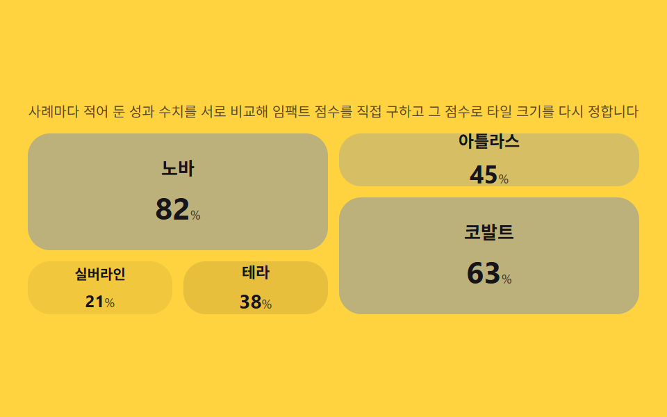
<main class="stage">
<section class="panel">
  <p class="hint" id="hint">事例ごとの成果指標を互いに比較してインパクトスコアを直接求め、そのスコアでタイルの大きさを決め直します</p>
  <div class="grid" id="grid" role="list" aria-label="事例一覧">
    <article class="tile" role="listitem"><p class="tileName">ノヴァ</p><p class="tileNum"><span class="tileVal">0</span><span class="tileUnit">%</span></p></article>
    <article class="tile" role="listitem"><p class="tileName">アトラス</p><p class="tileNum"><span class="tileVal">0</span><span class="tileUnit">%</span></p></article>
    <article class="tile" role="listitem"><p class="tileName">コバルト</p><p class="tileNum"><span class="tileVal">0</span><span class="tileUnit">%</span></p></article>
    <article class="tile" role="listitem"><p class="tileName">シルバーライン</p><p class="tileNum"><span class="tileVal">0</span><span class="tileUnit">%</span></p></article>
    <article class="tile" role="listitem"><p class="tileName">テラ</p><p class="tileNum"><span class="tileVal">0</span><span class="tileUnit">%</span></p></article>
  </div>
</section>
</main>
@use "../../../../site/static/demo-tokens" as *;
$duration: $dur-base;
$easing: $ease-pop;
$color: $subject-blue;
@include stage($stage-yellow);
.panel {
width: 100%;
max-width: 440px;
display: flex;
flex-direction: column;
gap: $sp-2;
}
.hint {
margin: 0;
text-align: center;
color: rgba($subject-ink, .72);
font-weight: 400;
font-size: 10px;
line-height: 1.35;
}
.grid {
display: grid;
grid-template-columns: repeat(4, 1fr);
grid-auto-rows: 38px;
grid-auto-flow: dense;
gap: $sp-2;
}
.tile {
border-radius: $r-card;
background: rgba($subject-ink, .06);
display: flex;
flex-direction: column;
align-items: center;
justify-content: center;
gap: $sp-1;
padding: $sp-1;
transform-origin: center;
transition: background $duration $easing, transform $duration $easing, opacity $duration $easing;
&[data-pad="p0"] { background: rgba($subject-ink, .06); }
&[data-pad="p1"] { padding: $sp-2; background: rgba($subject-ink, .10); }
&[data-pad="p2"] { padding: $sp-3; background: rgba($color, .20); }
&[data-pad="p3"] { padding: $sp-4; background: rgba($color, .32); }
}
.tile--pulse {
animation: pulse $duration $easing;
}
.tileName {
margin: 0;
color: $subject-ink;
font-weight: 600;
font-size: 10px;
[data-font="f1"] & { font-size: 11px; }
[data-font="f2"] & { font-size: 12px; }
[data-font="f3"] & { font-size: 13px; }
}
.tileNum {
margin: 0;
display: flex;
align-items: baseline;
gap: 0;
}
.tileVal {
color: $subject-ink;
font-weight: 700;
font-size: 12px;
[data-font="f1"] & { font-size: 14px; }
[data-font="f2"] & { font-size: 18px; }
[data-font="f3"] & { font-size: 22px; }
}
.tileUnit {
color: rgba($subject-ink, .72);
font-weight: 500;
font-size: 9px;
}
@keyframes pulse {
0% { transform: scale(1.1); opacity: .55; }
100% { transform: scale(1); opacity: 1; }
}
@media (max-width: 340px) {
.panel { max-width: 300px; gap: $sp-1; }
.hint { font-size: 9px; }
.grid { grid-auto-rows: 30px; gap: $sp-1; }
.tileName { font-size: 9px; }
.tileVal { font-size: 11px; }
.tileUnit { font-size: 8px; }
}
@media (prefers-reduced-motion: reduce) {
.tile, .tile--pulse {
transition: none;
animation: none;
}
}html, body {
margin: 0;
overflow: hidden;
}
.stage {
box-sizing: border-box;
min-height: 100vh;
display: grid;
place-items: center;
margin: 0;
background: #ffd23f;
font-family: -apple-system, "Segoe UI", "Noto Sans KR", sans-serif;
padding: clamp(8px, 4vw, 24px);
}
.panel {
width: 100%;
max-width: 440px;
display: flex;
flex-direction: column;
gap: 8px;
}
.hint {
margin: 0;
text-align: center;
color: rgba(23, 20, 26, 0.72);
font-weight: 400;
font-size: 10px;
line-height: 1.35;
}
.grid {
display: grid;
grid-template-columns: repeat(4, 1fr);
grid-auto-rows: 38px;
grid-auto-flow: dense;
gap: 8px;
}
.tile {
border-radius: 16px;
background: rgba(23, 20, 26, 0.06);
display: flex;
flex-direction: column;
align-items: center;
justify-content: center;
gap: 4px;
padding: 4px;
transform-origin: center;
transition: background 300ms cubic-bezier(0.2, 1.4, 0.4, 1), transform 300ms cubic-bezier(0.2, 1.4, 0.4, 1), opacity 300ms cubic-bezier(0.2, 1.4, 0.4, 1);
}
.tile[data-pad=p0] {
background: rgba(23, 20, 26, 0.06);
}
.tile[data-pad=p1] {
padding: 8px;
background: rgba(23, 20, 26, 0.1);
}
.tile[data-pad=p2] {
padding: 12px;
background: rgba(47, 109, 246, 0.2);
}
.tile[data-pad=p3] {
padding: 16px;
background: rgba(47, 109, 246, 0.32);
}
.tile--pulse {
animation: pulse 300ms cubic-bezier(0.2, 1.4, 0.4, 1);
}
.tileName {
margin: 0;
color: #17141a;
font-weight: 600;
font-size: 10px;
}
[data-font=f1] .tileName {
font-size: 11px;
}
[data-font=f2] .tileName {
font-size: 12px;
}
[data-font=f3] .tileName {
font-size: 13px;
}
.tileNum {
margin: 0;
display: flex;
align-items: baseline;
gap: 0;
}
.tileVal {
color: #17141a;
font-weight: 700;
font-size: 12px;
}
[data-font=f1] .tileVal {
font-size: 14px;
}
[data-font=f2] .tileVal {
font-size: 18px;
}
[data-font=f3] .tileVal {
font-size: 22px;
}
.tileUnit {
color: rgba(23, 20, 26, 0.72);
font-weight: 500;
font-size: 9px;
}
@keyframes pulse {
0% {
transform: scale(1.1);
opacity: 0.55;
}
100% {
transform: scale(1);
opacity: 1;
}
}
@media (max-width: 340px) {
.panel {
max-width: 300px;
gap: 4px;
}
.hint {
font-size: 9px;
}
.grid {
grid-auto-rows: 30px;
gap: 4px;
}
.tileName {
font-size: 9px;
}
.tileVal {
font-size: 11px;
}
.tileUnit {
font-size: 8px;
}
}
@media (prefers-reduced-motion: reduce) {
.tile, .tile--pulse {
transition: none;
animation: none;
}
}// 스토리 그리드(02) — 사례별 성과 수치를 이번 데이터셋의 최댓값과 비교해 0~1 로 정규화하고,
// IMPACT_WEIGHT 거듭제곱을 적용해 임팩트 점수를 직접 구한다. 점수 구간마다 grid-column/grid-row
// span·패딩·숫자 크기를 다시 정해 타일 배치를 매번 다시 계산한다(계산 한 겹).
// 자동 시연은 두 데이터셋을 번갈아 넣어 점수와 배치가 매번 다시 구해지는 것을 보여준다.
(function () {
var grid = document.getElementById('grid');
if (!grid) return;
var tiles = Array.prototype.slice.call(grid.querySelectorAll('.tile'));
var reduce = window.matchMedia('(prefers-reduced-motion: reduce)').matches;
var IMPACT_WEIGHT = 1; // 변형: .5 → 1.5
var DATASETS = [
[82, 45, 63, 21, 38],
[30, 71, 55, 90, 24]
];
function tierFor(weighted) {
if (weighted >= .75) return { col: 2, row: 2, pad: 'p3', font: 'f3' };
if (weighted >= .5) return { col: 2, row: 1, pad: 'p2', font: 'f2' };
if (weighted >= .28) return { col: 1, row: 1, pad: 'p1', font: 'f1' };
return { col: 1, row: 1, pad: 'p0', font: 'f0' };
}
function apply(values) {
var max = Math.max.apply(null, values);
tiles.forEach(function (tile, i) {
var value = values[i];
var normalized = max > 0 ? value / max : 0;
var weighted = Math.pow(normalized, IMPACT_WEIGHT);
var tier = tierFor(weighted);
tile.style.gridColumn = 'span ' + tier.col;
tile.style.gridRow = 'span ' + tier.row;
tile.dataset.pad = tier.pad;
tile.dataset.font = tier.font;
var valEl = tile.querySelector('.tileVal');
if (valEl) valEl.textContent = String(value);
if (!reduce) {
tile.classList.remove('tile--pulse');
void tile.offsetWidth;
tile.classList.add('tile--pulse');
}
});
}
var idx = 0;
apply(DATASETS[0]);
if (!reduce) {
setInterval(function () {
idx = (idx + 1) % DATASETS.length;
apply(DATASETS[idx]);
}, 600);
}
})();// CaseStoryGrid — vanilla 판(run/340/demo/02-case-story-grid/index.html) 의 React 포트.
// 사례별 성과 수치를 이번 데이터셋의 최댓값과 비교해 정규화하고 IMPACT_WEIGHT 거듭제곱으로
// 임팩트 점수를 구해, 점수 구간마다 grid-column/grid-row span·패딩·숫자 크기를 다시 정한다.
import { useEffect, useRef } from "react";
import styles from "./CaseStoryGrid.module.scss";
export type CaseStoryGridProps = {
duration?: string;
easing?: string;
color?: string;
};
const HINT = "사례마다 적어 둔 성과 수치를 서로 비교해 임팩트 점수를 직접 구하고 그 점수로 타일 크기를 다시 정합니다";
const NAMES = ["노바", "아틀라스", "코발트", "실버라인", "테라"];
const IMPACT_WEIGHT = 1;
const DATASETS: number[][] = [
[82, 45, 63, 21, 38],
[30, 71, 55, 90, 24]
];
type Tier = { col: number; row: number; pad: string; font: string };
function tierFor(weighted: number): Tier {
if (weighted >= 0.75) return { col: 2, row: 2, pad: "p3", font: "f3" };
if (weighted >= 0.5) return { col: 2, row: 1, pad: "p2", font: "f2" };
if (weighted >= 0.28) return { col: 1, row: 1, pad: "p1", font: "f1" };
return { col: 1, row: 1, pad: "p0", font: "f0" };
}
export default function CaseStoryGrid({
duration = "220ms",
easing = "cubic-bezier(.2,1.4,.4,1)",
color = "#2f6df6"
}: CaseStoryGridProps) {
const tileRefs = useRef<(HTMLElement | null)[]>([]);
const valRefs = useRef<(HTMLSpanElement | null)[]>([]);
useEffect(() => {
const reduce = window.matchMedia("(prefers-reduced-motion: reduce)").matches;
function apply(values: number[]): void {
const max = Math.max.apply(null, values);
values.forEach((value, i) => {
const tile = tileRefs.current![i];
const valEl = valRefs.current![i];
if (!tile) return;
const normalized = max > 0 ? value / max : 0;
const weighted = Math.pow(normalized, IMPACT_WEIGHT);
const tier = tierFor(weighted);
tile.style.gridColumn = "span " + tier.col;
tile.style.gridRow = "span " + tier.row;
tile.dataset.pad = tier.pad;
tile.dataset.font = tier.font;
if (valEl) valEl.textContent = String(value);
if (!reduce) {
tile.classList.remove(styles.tilePulse);
void tile.offsetWidth;
tile.classList.add(styles.tilePulse);
}
});
}
let idx = 0;
apply(DATASETS[0]);
let timer = 0;
if (!reduce) {
timer = window.setInterval(() => {
idx = (idx + 1) % DATASETS.length;
apply(DATASETS[idx]);
}, 600);
}
return () => {
if (timer) window.clearInterval(timer);
};
// eslint-disable-next-line react-hooks/exhaustive-deps
}, []);
return (
<main className={styles.stage}>
<section className={styles.panel}>
<p className={styles.hint}>{HINT}</p>
<div className={styles.grid}>
{NAMES.map((name, i) => (
<article
key={name}
className={styles.tile}
ref={(el: HTMLElement | null) => {
tileRefs.current![i] = el;
}}
>
<p className={styles.tileName}>{name}</p>
<p className={styles.tileNum}>
<span
className={styles.tileVal}
ref={(el: HTMLSpanElement | null) => {
valRefs.current![i] = el;
}}
>
0
</span>
<span className={styles.tileUnit}>%</span>
</p>
</article>
))}
</div>
</section>
</main>
);
}02 ストーリーグリッド — インパクトスコアを自分で求めてタイルの大きさを決めるグリッド — 計測 累積面積 52.497% · 動いたフレーム 7/23GODRICH オリジナル · SCSS と React は zip に同梱 · 導入事例 web デザイン9選 — 成果数値まで計算して見せる
このデモが属する記事
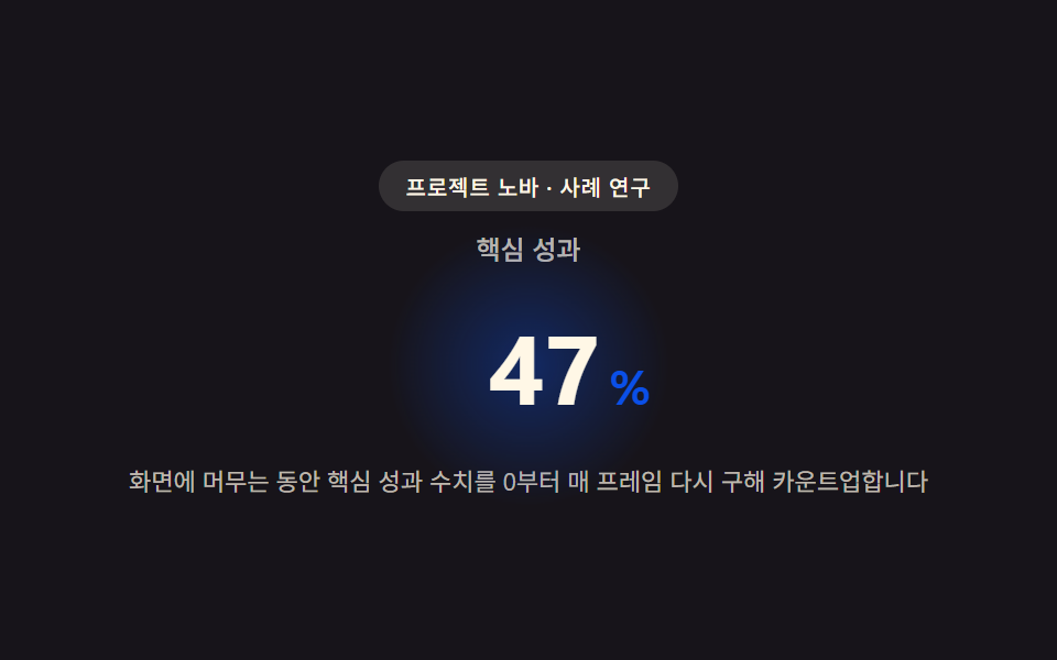 導入事例 web デザイン9選 — 成果数値まで計算して見せる導入事例 web デザインは色や余白より先に、数字がどう動くかで差がつきます。画面に入った瞬間から成果数値がフレームごとに求め直されカウントアップし、事例ごとに計算したインパクトスコアでグリッドタイルの大きさが決まり、引用文の長さに合わせて この記事のデモをすべて見る