02ロゴ組み立て
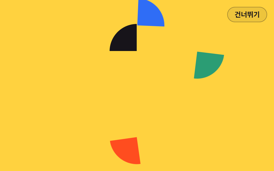
四方から飛んできた 4 つの欠片が animation-delay を一段ずつずらして中央に集まり、最後の欠片が着いた瞬間にロゴが一つになります。
使いどころロゴを先に見せる会社紹介
clip-pathtransform-originanimation-delay
<main class="stage">
<div class="la is-demo" id="la">
  <div class="la__mark" aria-hidden="true">
    <i class="la__q la__q--tl"></i>
    <i class="la__q la__q--tr"></i>
    <i class="la__q la__q--br"></i>
    <i class="la__q la__q--bl"></i>
  </div>
  <p class="la__word">GODRICH</p>
  <p class="la__tag">新しいブランドの最初のあいさつ</p>
  <button class="la__go" type="button">見てみる</button>
  <button class="la__skip" id="la-skip" type="button">スキップ</button>
  <p class="la__live" id="la-live" aria-live="polite"></p>
</div>
</main>
@use "../../../../site/static/demo-tokens" as *;
// 로고 조각 결합 — 사방에서 날아온 조각 네 개가 animation-delay 를 한 칸씩 달리해 가운데로 모이는 인트로.
// 조각은 같은 크기의 원을 clip-path 로 4분면으로 자른 것이다. 기본 transform 은 "맞춰진 자리"라
// 건너뛰기·Esc·재방문·reduced-motion 모두 애니메이션을 끄는 것만으로 완성 로고가 된다.
// 회전축 transform-origin 은 각 조각(원)의 중심 = 로고의 중심. 조각이 붙는 지점이라 원점을 옮기지 않는다.
// 대비 실측(run/016/_probe/a1_대비.py): 워드마크 $subject-ink on $stage-yellow 12.63:1 ·
// 태그라인 rgba($subject-ink,.72) 합성 6.08:1 · CTA $subject-cream on $subject-blue-deep 5.98:1 (조각은 글자가 없는 면)
$duration: $dur-enter; // 정적(실사용) 재생 시간 — 변형1: $dur-base
$easing: $ease-spring; // 변형2: $ease-pop
$color: $subject-blue; // 오른쪽 위 조각 색 — 변형3: $stage-orange
@include stage($stage-yellow);
.la {
position: fixed; inset: 0;
display: flex; flex-direction: column; align-items: center; justify-content: center;
gap: $sp-2; text-align: center;
}
// ── 로고 마크. 4분면 조각 네 개(약 2px 틈)
.la__mark { position: relative; width: 96px; height: 96px; }
.la__q {
position: absolute; inset: 0; border-radius: 50%;
transform-origin: 50% 50%; // 회전축 = 원의 중심 = 조각이 로고에 붙는 지점
}
.la__q--tl { background: $subject-ink; clip-path: inset(0 51% 51% 0); }
.la__q--tr { background: $color; clip-path: inset(0 0 51% 51%); }
.la__q--br { background: $chart-3; clip-path: inset(51% 0 0 51%); }
.la__q--bl { background: $stage-orange; clip-path: inset(51% 51% 0 0); }
.la__word {
margin: $sp-2 0 0; color: $subject-ink;
font-weight: 800; font-size: 22px; line-height: 1.2;
letter-spacing: .3em; text-indent: .3em;
}
.la__tag {
margin: 0; color: rgba($subject-ink, .72);
font-weight: 500; font-size: 13px; line-height: 1.5;
}
.la__go {
margin-top: $sp-2; padding: $sp-2 $sp-5; border: 0; border-radius: $r-pill;
background: $subject-blue-deep; color: $subject-cream;
font-family: inherit; font-weight: 700; font-size: 13px; line-height: 1.4; cursor: pointer;
}
// ── 건너뛰기 (무대 우상단)
.la__skip {
position: absolute; top: $sp-3; right: $sp-3; z-index: 4;
padding: $sp-1 $sp-3; border: 1px solid rgba($subject-ink, .32); border-radius: $r-pill;
background: rgba($subject-ink, .08); color: $subject-ink;
font-family: inherit; font-weight: 600; font-size: 12px; line-height: 1.4; cursor: pointer;
}
.la__live {
position: absolute; width: 1px; height: 1px; overflow: hidden;
clip-path: inset(50%); white-space: nowrap;
}
// ── 정적(실사용): 조각이 한 번씩 지연되어 날아와 앉는다. 낱개 속성 + fill-mode: both 로
// 지연 구간에는 0%(화면 밖)가 채워진다
.la__q--tl {
animation-name: laInTl; animation-duration: $duration; animation-timing-function: $easing;
animation-delay: 0s; animation-fill-mode: both;
}
.la__q--tr {
animation-name: laInTr; animation-duration: $duration; animation-timing-function: $easing;
animation-delay: .08s; animation-fill-mode: both;
}
.la__q--br {
animation-name: laInBr; animation-duration: $duration; animation-timing-function: $easing;
animation-delay: .16s; animation-fill-mode: both;
}
.la__q--bl {
animation-name: laInBl; animation-duration: $duration; animation-timing-function: $easing;
animation-delay: .24s; animation-fill-mode: both;
}
.la__word {
animation-name: laRiseOnce; animation-duration: $duration; animation-timing-function: $easing;
animation-delay: .44s; animation-fill-mode: both;
}
.la__tag {
animation-name: laRiseOnce; animation-duration: $duration; animation-timing-function: $easing;
animation-delay: .54s; animation-fill-mode: both;
}
.la__go {
animation-name: laRiseOnce; animation-duration: $duration; animation-timing-function: $easing;
animation-delay: .64s; animation-fill-mode: both;
}
@keyframes laInTl { from { transform: translate(-150px, 0) rotate(-10deg); } to { transform: none; } }
@keyframes laInTr { from { transform: translate(0, -150px) rotate(8deg); } to { transform: none; } }
@keyframes laInBr { from { transform: translate(150px, 0) rotate(10deg); } to { transform: none; } }
@keyframes laInBl { from { transform: translate(0, 150px) rotate(-8deg); } to { transform: none; } }
@keyframes laRiseOnce { from { opacity: 0; transform: translateY(12px); } to { opacity: 1; transform: none; } }
// ── 격자 미리보기 루프(2초). 도착 0~26%(조각마다 4% 시차) · 워드마크 30~42% ·
// 흩어짐 64~86%(늦게 온 조각이 먼저 떠난다) — 86% 안에 끝나 마지막 장은 frame 0 와 같다.
// 흩어짐 구간은 linear — 컷으로 끊으면 그 한 프레임이 최대 변화가 되어 poster 가 빈 노랑이 된다
.la.is-demo .la__q--tl {
animation-name: laTlLoop; animation-duration: $dur-loop; animation-timing-function: $easing;
animation-iteration-count: infinite; animation-fill-mode: backwards; animation-delay: 0s;
}
.la.is-demo .la__q--tr {
animation-name: laTrLoop; animation-duration: $dur-loop; animation-timing-function: $easing;
animation-iteration-count: infinite; animation-fill-mode: backwards; animation-delay: 0s;
}
.la.is-demo .la__q--br {
animation-name: laBrLoop; animation-duration: $dur-loop; animation-timing-function: $easing;
animation-iteration-count: infinite; animation-fill-mode: backwards; animation-delay: 0s;
}
.la.is-demo .la__q--bl {
animation-name: laBlLoop; animation-duration: $dur-loop; animation-timing-function: $easing;
animation-iteration-count: infinite; animation-fill-mode: backwards; animation-delay: 0s;
}
.la.is-demo .la__word {
animation-name: laWordLoop; animation-duration: $dur-loop; animation-timing-function: $easing;
animation-iteration-count: infinite; animation-fill-mode: backwards; animation-delay: 0s;
}
.la.is-demo .la__tag {
animation-name: laTagLoop; animation-duration: $dur-loop; animation-timing-function: $easing;
animation-iteration-count: infinite; animation-fill-mode: backwards; animation-delay: 0s;
}
.la.is-demo .la__go {
animation-name: laGoLoop; animation-duration: $dur-loop; animation-timing-function: $easing;
animation-iteration-count: infinite; animation-fill-mode: backwards; animation-delay: 0s;
}
@keyframes laTlLoop {
0% { transform: translate(-150px, 0) rotate(-10deg); }
14%, 76% { transform: none; animation-timing-function: linear; }
86%, 100% { transform: translate(-150px, 0) rotate(-10deg); }
}
@keyframes laTrLoop {
0%, 4% { transform: translate(0, -150px) rotate(8deg); }
18%, 72% { transform: none; animation-timing-function: linear; }
82%, 100% { transform: translate(0, -150px) rotate(8deg); }
}
@keyframes laBrLoop {
0%, 8% { transform: translate(150px, 0) rotate(10deg); }
22%, 68% { transform: none; animation-timing-function: linear; }
78%, 100% { transform: translate(150px, 0) rotate(10deg); }
}
@keyframes laBlLoop {
0%, 12% { transform: translate(0, 150px) rotate(-8deg); }
26%, 64% { transform: none; animation-timing-function: linear; }
74%, 100% { transform: translate(0, 150px) rotate(-8deg); }
}
@keyframes laWordLoop {
0%, 30% { opacity: 0; transform: translateY(12px); }
42%, 60% { opacity: 1; transform: none; }
68%, 100% { opacity: 0; transform: translateY(12px); }
}
@keyframes laTagLoop {
0%, 36% { opacity: 0; transform: translateY(10px); }
48%, 60% { opacity: 1; transform: none; }
68%, 100% { opacity: 0; transform: translateY(10px); }
}
@keyframes laGoLoop {
0%, 42% { opacity: 0; transform: translateY(10px); }
54%, 62% { opacity: 1; transform: none; }
70%, 100% { opacity: 0; transform: translateY(10px); }
}
// 건너뛰기·Esc·재방문: 애니메이션을 끄면 기본 상태(완성 로고)가 드러난다
.la.is-done .la__q--tl, .la.is-done .la__q--tr, .la.is-done .la__q--br, .la.is-done .la__q--bl,
.la.is-done .la__word, .la.is-done .la__tag, .la.is-done .la__go { animation: none; }
.la.is-done .la__skip { display: none; }
// ── 좁은 화면: 마크와 글자를 줄여 무대(174px) 안에 들어온다
@media (max-width: 340px) {
.la { gap: $sp-1; }
.la__mark { width: 64px; height: 64px; }
.la__word { font-size: 18px; }
.la__tag { font-size: 12px; }
.la__go { padding: $sp-1 $sp-4; font-size: 12px; }
}
@media (prefers-reduced-motion: reduce) {
// !important — .la.is-demo 계열(클래스 3개) 특이도에 지지 않으려면 필요하다
.la .la__q--tl, .la .la__q--tr, .la .la__q--br, .la .la__q--bl,
.la .la__word, .la .la__tag, .la .la__go { animation: none !important; }
}html, body {
margin: 0;
overflow: hidden;
}
.stage {
box-sizing: border-box;
min-height: 100vh;
display: grid;
place-items: center;
margin: 0;
background: #ffd23f;
font-family: -apple-system, "Segoe UI", "Noto Sans KR", sans-serif;
padding: clamp(8px, 4vw, 24px);
}
.la {
position: fixed;
inset: 0;
display: flex;
flex-direction: column;
align-items: center;
justify-content: center;
gap: 8px;
text-align: center;
}
.la__mark {
position: relative;
width: 96px;
height: 96px;
}
.la__q {
position: absolute;
inset: 0;
border-radius: 50%;
transform-origin: 50% 50%;
}
.la__q--tl {
background: #17141a;
clip-path: inset(0 51% 51% 0);
}
.la__q--tr {
background: #2f6df6;
clip-path: inset(0 0 51% 51%);
}
.la__q--br {
background: #2b9d74;
clip-path: inset(51% 0 0 51%);
}
.la__q--bl {
background: #ff4d1f;
clip-path: inset(51% 51% 0 0);
}
.la__word {
margin: 8px 0 0;
color: #17141a;
font-weight: 800;
font-size: 22px;
line-height: 1.2;
letter-spacing: 0.3em;
text-indent: 0.3em;
}
.la__tag {
margin: 0;
color: rgba(23, 20, 26, 0.72);
font-weight: 500;
font-size: 13px;
line-height: 1.5;
}
.la__go {
margin-top: 8px;
padding: 8px 20px;
border: 0;
border-radius: 999px;
background: #0a4fe8;
color: #fff7e6;
font-family: inherit;
font-weight: 700;
font-size: 13px;
line-height: 1.4;
cursor: pointer;
}
.la__skip {
position: absolute;
top: 12px;
right: 12px;
z-index: 4;
padding: 4px 12px;
border: 1px solid rgba(23, 20, 26, 0.32);
border-radius: 999px;
background: rgba(23, 20, 26, 0.08);
color: #17141a;
font-family: inherit;
font-weight: 600;
font-size: 12px;
line-height: 1.4;
cursor: pointer;
}
.la__live {
position: absolute;
width: 1px;
height: 1px;
overflow: hidden;
clip-path: inset(50%);
white-space: nowrap;
}
.la__q--tl {
animation-name: laInTl;
animation-duration: 600ms;
animation-timing-function: cubic-bezier(0.2, 0.8, 0.2, 1);
animation-delay: 0s;
animation-fill-mode: both;
}
.la__q--tr {
animation-name: laInTr;
animation-duration: 600ms;
animation-timing-function: cubic-bezier(0.2, 0.8, 0.2, 1);
animation-delay: 0.08s;
animation-fill-mode: both;
}
.la__q--br {
animation-name: laInBr;
animation-duration: 600ms;
animation-timing-function: cubic-bezier(0.2, 0.8, 0.2, 1);
animation-delay: 0.16s;
animation-fill-mode: both;
}
.la__q--bl {
animation-name: laInBl;
animation-duration: 600ms;
animation-timing-function: cubic-bezier(0.2, 0.8, 0.2, 1);
animation-delay: 0.24s;
animation-fill-mode: both;
}
.la__word {
animation-name: laRiseOnce;
animation-duration: 600ms;
animation-timing-function: cubic-bezier(0.2, 0.8, 0.2, 1);
animation-delay: 0.44s;
animation-fill-mode: both;
}
.la__tag {
animation-name: laRiseOnce;
animation-duration: 600ms;
animation-timing-function: cubic-bezier(0.2, 0.8, 0.2, 1);
animation-delay: 0.54s;
animation-fill-mode: both;
}
.la__go {
animation-name: laRiseOnce;
animation-duration: 600ms;
animation-timing-function: cubic-bezier(0.2, 0.8, 0.2, 1);
animation-delay: 0.64s;
animation-fill-mode: both;
}
@keyframes laInTl {
from {
transform: translate(-150px, 0) rotate(-10deg);
}
to {
transform: none;
}
}
@keyframes laInTr {
from {
transform: translate(0, -150px) rotate(8deg);
}
to {
transform: none;
}
}
@keyframes laInBr {
from {
transform: translate(150px, 0) rotate(10deg);
}
to {
transform: none;
}
}
@keyframes laInBl {
from {
transform: translate(0, 150px) rotate(-8deg);
}
to {
transform: none;
}
}
@keyframes laRiseOnce {
from {
opacity: 0;
transform: translateY(12px);
}
to {
opacity: 1;
transform: none;
}
}
.la.is-demo .la__q--tl {
animation-name: laTlLoop;
animation-duration: 2s;
animation-timing-function: cubic-bezier(0.2, 0.8, 0.2, 1);
animation-iteration-count: infinite;
animation-fill-mode: backwards;
animation-delay: 0s;
}
.la.is-demo .la__q--tr {
animation-name: laTrLoop;
animation-duration: 2s;
animation-timing-function: cubic-bezier(0.2, 0.8, 0.2, 1);
animation-iteration-count: infinite;
animation-fill-mode: backwards;
animation-delay: 0s;
}
.la.is-demo .la__q--br {
animation-name: laBrLoop;
animation-duration: 2s;
animation-timing-function: cubic-bezier(0.2, 0.8, 0.2, 1);
animation-iteration-count: infinite;
animation-fill-mode: backwards;
animation-delay: 0s;
}
.la.is-demo .la__q--bl {
animation-name: laBlLoop;
animation-duration: 2s;
animation-timing-function: cubic-bezier(0.2, 0.8, 0.2, 1);
animation-iteration-count: infinite;
animation-fill-mode: backwards;
animation-delay: 0s;
}
.la.is-demo .la__word {
animation-name: laWordLoop;
animation-duration: 2s;
animation-timing-function: cubic-bezier(0.2, 0.8, 0.2, 1);
animation-iteration-count: infinite;
animation-fill-mode: backwards;
animation-delay: 0s;
}
.la.is-demo .la__tag {
animation-name: laTagLoop;
animation-duration: 2s;
animation-timing-function: cubic-bezier(0.2, 0.8, 0.2, 1);
animation-iteration-count: infinite;
animation-fill-mode: backwards;
animation-delay: 0s;
}
.la.is-demo .la__go {
animation-name: laGoLoop;
animation-duration: 2s;
animation-timing-function: cubic-bezier(0.2, 0.8, 0.2, 1);
animation-iteration-count: infinite;
animation-fill-mode: backwards;
animation-delay: 0s;
}
@keyframes laTlLoop {
0% {
transform: translate(-150px, 0) rotate(-10deg);
}
14%, 76% {
transform: none;
animation-timing-function: linear;
}
86%, 100% {
transform: translate(-150px, 0) rotate(-10deg);
}
}
@keyframes laTrLoop {
0%, 4% {
transform: translate(0, -150px) rotate(8deg);
}
18%, 72% {
transform: none;
animation-timing-function: linear;
}
82%, 100% {
transform: translate(0, -150px) rotate(8deg);
}
}
@keyframes laBrLoop {
0%, 8% {
transform: translate(150px, 0) rotate(10deg);
}
22%, 68% {
transform: none;
animation-timing-function: linear;
}
78%, 100% {
transform: translate(150px, 0) rotate(10deg);
}
}
@keyframes laBlLoop {
0%, 12% {
transform: translate(0, 150px) rotate(-8deg);
}
26%, 64% {
transform: none;
animation-timing-function: linear;
}
74%, 100% {
transform: translate(0, 150px) rotate(-8deg);
}
}
@keyframes laWordLoop {
0%, 30% {
opacity: 0;
transform: translateY(12px);
}
42%, 60% {
opacity: 1;
transform: none;
}
68%, 100% {
opacity: 0;
transform: translateY(12px);
}
}
@keyframes laTagLoop {
0%, 36% {
opacity: 0;
transform: translateY(10px);
}
48%, 60% {
opacity: 1;
transform: none;
}
68%, 100% {
opacity: 0;
transform: translateY(10px);
}
}
@keyframes laGoLoop {
0%, 42% {
opacity: 0;
transform: translateY(10px);
}
54%, 62% {
opacity: 1;
transform: none;
}
70%, 100% {
opacity: 0;
transform: translateY(10px);
}
}
.la.is-done .la__q--tl, .la.is-done .la__q--tr, .la.is-done .la__q--br, .la.is-done .la__q--bl,
.la.is-done .la__word, .la.is-done .la__tag, .la.is-done .la__go {
animation: none;
}
.la.is-done .la__skip {
display: none;
}
@media (max-width: 340px) {
.la {
gap: 4px;
}
.la__mark {
width: 64px;
height: 64px;
}
.la__word {
font-size: 18px;
}
.la__tag {
font-size: 12px;
}
.la__go {
padding: 4px 16px;
font-size: 12px;
}
}
@media (prefers-reduced-motion: reduce) {
.la .la__q--tl, .la .la__q--tr, .la .la__q--br, .la .la__q--bl,
.la .la__word, .la .la__tag, .la .la__go {
animation: none !important;
}
}(function () {
var root = document.getElementById('la');
var live = document.getElementById('la-live');
var KEY = 'godrich-intro-016-02';
// 인트로를 완료 상태로 보낸다 — 조각의 기본 상태는 맞춰진 자리라 애니메이션을 끄면 로고가 완성되어 있다
function finish(announce) {
root.classList.remove('is-demo');
root.classList.add('is-done');
try { sessionStorage.setItem(KEY, '1'); } catch (e) {}
if (announce) live.textContent = 'イントロをスキップしました';
}
document.getElementById('la-skip').addEventListener('click', function () { finish(true); });
document.addEventListener('keydown', function (e) {
if (e.key === 'Escape') finish(true);
});
var seen = false;
try { seen = sessionStorage.getItem(KEY) !== null; } catch (e) {}
if (seen) finish(false);
})();// LogoAssemble — vanilla 판(run/016/demo/02-intro-logo-assemble/index.html) 의 React 포트.
// 사방에서 날아온 조각 네 개가 animation-delay 를 한 칸씩 달리해 가운데로 모이는 인트로.
// @keyframes 본문은 vanilla 와 같은 글자다 (값을 다시 타이핕하지 않는다).
import { useEffect, useState } from "react";
import type { CSSProperties } from "react";
import styles from "./LogoAssemble.module.scss";
export type LogoAssembleProps = {
duration?: number;
easing?: string;
color?: string;
};
type Vars = CSSProperties & { "--duration"?: string; "--easing"?: string; "--color"?: string };
// ambient 타입에 맞춰 로컬 타입을 쓴다 — 이벤트 제네릭을 react 에서 import 하면 tsc 가 죽는다
type KeyEvt = { key: string };
const KEY = "godrich-intro-016-02";
const WORD = "GODRICH";
const TAG = "새 브랜드의 첫 인사";
const GO = "둘러보기";
const SKIP = "건너뛰기";
const SKIPPED = "인트로를 건너뛰었습니다";
export default function LogoAssemble(props: LogoAssembleProps) {
const duration = props.duration ?? 600;
const easing = props.easing ?? "cubic-bezier(.2, .8, .2, 1)";
const color = props.color ?? "#2f6df6";
const [preview, setPreview] = useState<boolean>(true);
const [done, setDone] = useState<boolean>(false);
const [message, setMessage] = useState<string>("");
// 인트로를 완료 상태로 보낸다 — 조각의 기본 상태는 맞춰진 자리라 애니메이션을 끄면 로고가 완성되어 있다
const finish = (announce: boolean) => {
setPreview(false);
setDone(true);
try { window.sessionStorage.setItem(KEY, "1"); } catch { }
if (announce) setMessage(SKIPPED);
};
useEffect(() => {
let seen = false;
try { seen = window.sessionStorage.getItem(KEY) !== null; } catch { seen = false; }
if (seen) {
setPreview(false);
setDone(true);
}
}, []);
useEffect(() => {
const onKey = (e: KeyEvt) => { if (e.key === "Escape") finish(true); };
window.addEventListener("keydown", onKey as (e: KeyboardEvent) => void);
return () => window.removeEventListener("keydown", onKey as (e: KeyboardEvent) => void);
}, []);
const vars: Vars = { "--duration": duration + "ms", "--easing": easing, "--color": color };
const rootCls = styles.la + (preview && !done ? " " + styles.isDemo : "") + (done ? " " + styles.isDone : "");
return (
<main className={styles.stage}>
<div className={rootCls} style={vars}>
<div className={styles.mark} aria-hidden="true">
<i className={styles.q + " " + styles.qTl} />
<i className={styles.q + " " + styles.qTr} />
<i className={styles.q + " " + styles.qBr} />
<i className={styles.q + " " + styles.qBl} />
</div>
<p className={styles.word}>{WORD}</p>
<p className={styles.tag}>{TAG}</p>
<button className={styles.go} type="button">{GO}</button>
{!done ? (
<button className={styles.skip} type="button" onClick={() => finish(true)}>{SKIP}</button>
) : null}
<p className={styles.live} aria-live="polite">{message}</p>
</div>
</main>
);
}02 ロゴ組み立て — 計測 累積面積 21.906% · 動いたフレーム 19/23GODRICH オリジナル · SCSS と React は zip に同梱 · オープニング アニメーション css 9選 — イントロ アニメーション 入門
このデモが属する記事
 オープニング アニメーション css 9選 — イントロ アニメーション 入門オープニング アニメーション css とは、ページが開いた最初の1〜2秒だけ画面を覆い、やがて退いて本来の画面を引き渡す演出のことです。スキップできてこそイントロ — 9つすべてにボタンと Esc と再訪の記録が備わり、その場で終わらせられ この記事のデモをすべて見る