09カラーフラッド
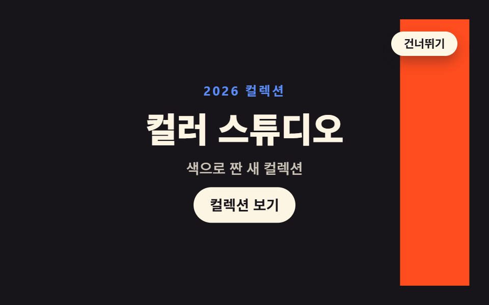
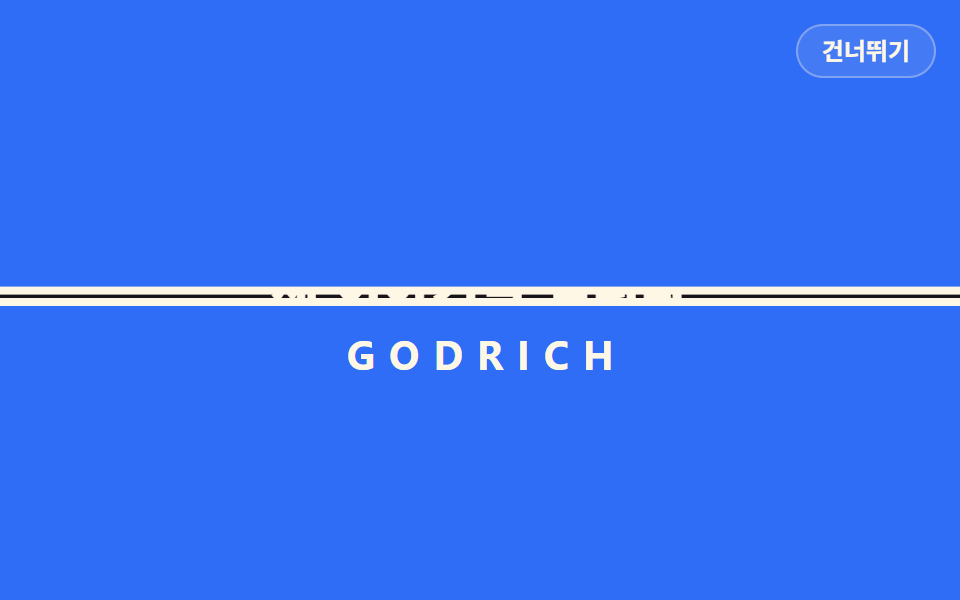
3 枚の色帯が scaleX で順に画面を走り、最後の帯が transform-origin を右に変えて抜けると、下の内容だけが残ります。
使いどころ色がそのままブランドのサイト
scaleXtransform-originanimation-fill-mode
<main class="stage">
  <section class="cf is-demo" id="cf" aria-label="サイトの最初の画面">
    <div class="cf__content" id="content">
      <p class="cf__kicker">2026コレクション</p>
      <h1 class="cf__title">カラースタジオ</h1>
      <p class="cf__sub">色で織った新しいコレクション</p>
      <button class="cf__cta" type="button">コレクションを見る</button>
    </div>
    <div class="cf__band cf__band--1" aria-hidden="true"></div>
    <div class="cf__band cf__band--2" aria-hidden="true"></div>
    <div class="cf__band cf__band--3" aria-hidden="true"></div>
    <button class="cf__skip" id="skip" type="button">スキップ</button>
    <p class="cf__sr" id="status" aria-live="polite">イントロ再生中</p>
  </section>
</main>
@use "../../../../site/static/demo-tokens" as *;
// 컬러 플러드 — 색 띠 세 장이 scaleX 로 차례로 화면을 훑고 지나간다. 띠는 왼쪽에서 자라 온(next) 띠에
// 밀리고, 퇴장은 오른쪽으로 접힌다: transform-origin 을 right 로 바꾼 것과 같은 효과를
// translateX(t·100%) scaleX(1−t) 합성으로 만든다 — 같은 시간 t 로 보간되면 오른쪽 끝이 항상 고정된다.
// 마지막 띠가 접혀 빠지면 그 아래 콘텐츠만 남는다(퇴장 뒤 빈 화면이 되지 않게 콘텐츠가 곧 솟아오른다).
// 기본(작성) 상태 = 완료 상태(띠 전부 접힘, 콘텐츠 안착).
$duration: $dur-loop; // 실제 인트로(띠 셋 훑기 + 안착) 한 번의 길이
$easing: $ease-spring; // 콘텐츠 안착
$color: $subject-blue; // 첫 번째 띠 색 (변형 color 가 바꾼다)
@include stage($stage-ink);
.cf { position: relative; width: 100%; height: 100%; overflow: hidden; }
// ── 띠 아래 깔리는 사이트 첫 화면
.cf__content {
position: absolute; inset: 0; z-index: 1;
display: grid; place-content: center; justify-items: center; gap: $sp-2;
text-align: center;
animation-name: cfContentOnce; animation-duration: $duration;
animation-timing-function: $easing; animation-iteration-count: 1; animation-fill-mode: backwards; // 칩: animation-fill-mode
}
.cf__kicker {
margin: 0; color: $subject-blue-light; // 잉크 무대 위 5.69:1 (run/016/_probe/a3_대비.py)
font-weight: 700; font-size: clamp(11px, 2.6vw, 13px); line-height: 1.4; letter-spacing: .14em;
}
.cf__title {
margin: 0; color: $subject-cream; // 잉크 위 17.11:1
font-weight: 800; font-size: clamp(24px, 7vw, 36px); line-height: 1.2;
}
.cf__sub {
margin: 0; color: rgba($subject-cream, .78); // 잉크 위 10.64:1
font-weight: 500; font-size: clamp(12px, 3vw, 14px); line-height: 1.5;
}
.cf__cta {
margin: 0; border: 0; border-radius: $r-pill; padding: $sp-2 $sp-4;
background: $subject-cream; color: $subject-ink; // 17.11:1
font-family: inherit; font-weight: 700; font-size: clamp(12px, 3vw, 14px); line-height: 1.4;
cursor: pointer;
}
.cf__cta:focus-visible { outline: 2px solid $subject-cream; outline-offset: 2px; }
// ── 색 띠. 기본 상태 = 전부 접힌(완료) 상태. 칩: scaleX · transform-origin(왼쪽에서 자란다)
.cf__band {
position: absolute; inset: 0; z-index: 2;
transform-origin: left center;
transform: translateX(0) scaleX(0);
will-change: transform;
animation-timing-function: linear; // 파도 앞이 일정한 속도로 지나가게 — 자람·접힘 같은 곡선이어야 이음이 벌어지지 않는다
animation-iteration-count: 1; animation-fill-mode: backwards;
}
.cf__band--1 {
background: $color;
animation-name: cfBand1; animation-duration: $duration;
}
.cf__band--2 {
background: $stage-yellow;
animation-name: cfBand2; animation-duration: $duration;
}
.cf__band--3 {
background: $stage-orange;
animation-name: cfBand3; animation-duration: $duration;
}
.cf__skip {
position: absolute; top: $sp-3; right: $sp-3; z-index: 4; margin: 0;
border: 0; border-radius: $r-pill; padding: $sp-1 $sp-3;
background: $subject-cream; color: $subject-ink; // 17.11:1 — 어느 띠 위에 놓여도 통과
font-family: inherit; font-weight: 700; font-size: 11px; line-height: 1.4;
cursor: pointer; box-shadow: $shadow-press;
}
.cf__skip:focus-visible { outline: 2px solid $subject-ink; outline-offset: 2px; }
.cf__sr {
position: absolute; width: 1px; height: 1px; margin: 0; overflow: hidden;
clip-path: inset(50%); white-space: nowrap;
}
// ── 실제 인트로(한 번 재생). 띠 1 → 2 → 3 이 13% 간격으로 줄지어 지나가고
// 마지막 띠가 접히는 39~52% 에 콘텐츠가 왼쪽부터 드러나며 솟아오른다
@keyframes cfBand1 {
0% { transform: translateX(0) scaleX(0); }
13% { transform: translateX(0) scaleX(1); }
26%, 100% { transform: translateX(100%) scaleX(0); }
}
@keyframes cfBand2 {
0%, 13% { transform: translateX(0) scaleX(0); }
26% { transform: translateX(0) scaleX(1); }
39%, 100% { transform: translateX(100%) scaleX(0); }
}
@keyframes cfBand3 {
0%, 26% { transform: translateX(0) scaleX(0); }
39% { transform: translateX(0) scaleX(1); }
52%, 100% { transform: translateX(100%) scaleX(0); }
}
@keyframes cfContentOnce {
0%, 38% { opacity: 0; transform: translateY(16px); }
54%, 100% { opacity: 1; transform: translateY(0); }
}
// ── 격자 미리보기 루프(2초). 루프 시작(0%)에서 콘텐츠는 이번 바퀴에 띠 1 에 덮이기 직전 상태라
// 띠가 settled 콘텐츠 위를 훑고 지나가는 모양이 되고, 덮인 사이(16%)에 시작 전 상태로 되돌아간다
.cf.is-demo .cf__band--1 { animation-name: cfBand1; animation-duration: $dur-loop; animation-iteration-count: infinite; }
.cf.is-demo .cf__band--2 { animation-name: cfBand2; animation-duration: $dur-loop; animation-iteration-count: infinite; }
.cf.is-demo .cf__band--3 { animation-name: cfBand3; animation-duration: $dur-loop; animation-iteration-count: infinite; }
.cf.is-demo .cf__content {
animation-name: cfContentLoop; animation-duration: $dur-loop;
animation-timing-function: $easing; animation-iteration-count: infinite; animation-fill-mode: backwards;
}
@keyframes cfContentLoop {
0%, 14% { opacity: 1; transform: translateY(0); }
16%, 38% { opacity: 0; transform: translateY(16px); } // 띠 1 이 완전히 덮은 뒤에 감춘다
54%, 100% { opacity: 1; transform: translateY(0); }
}
// 건너뛰기·Esc·재방문 — 애니메이션을 꺼 기본 상태(완료)로 돌린다 (is-demo 규칙 뒤에 둔다)
.cf.is-done .cf__band--1, .cf.is-done .cf__band--2, .cf.is-done .cf__band--3,
.cf.is-done .cf__content { animation-name: none; }
@media (max-width: 340px) {
.cf__content { gap: $sp-1; }
.cf__skip { top: $sp-2; right: $sp-2; }
}
@media (prefers-reduced-motion: reduce) {
.cf__band--1, .cf__band--2, .cf__band--3, .cf__content { animation-name: none !important; }
}html, body {
margin: 0;
overflow: hidden;
}
.stage {
box-sizing: border-box;
min-height: 100vh;
display: grid;
place-items: center;
margin: 0;
background: #17141a;
font-family: -apple-system, "Segoe UI", "Noto Sans KR", sans-serif;
padding: clamp(8px, 4vw, 24px);
}
.cf {
position: relative;
width: 100%;
height: 100%;
overflow: hidden;
}
.cf__content {
position: absolute;
inset: 0;
z-index: 1;
display: grid;
place-content: center;
justify-items: center;
gap: 8px;
text-align: center;
animation-name: cfContentOnce;
animation-duration: 2s;
animation-timing-function: cubic-bezier(0.2, 0.8, 0.2, 1);
animation-iteration-count: 1;
animation-fill-mode: backwards;
}
.cf__kicker {
margin: 0;
color: #5b8cf8;
font-weight: 700;
font-size: clamp(11px, 2.6vw, 13px);
line-height: 1.4;
letter-spacing: 0.14em;
}
.cf__title {
margin: 0;
color: #fff7e6;
font-weight: 800;
font-size: clamp(24px, 7vw, 36px);
line-height: 1.2;
}
.cf__sub {
margin: 0;
color: rgba(255, 247, 230, 0.78);
font-weight: 500;
font-size: clamp(12px, 3vw, 14px);
line-height: 1.5;
}
.cf__cta {
margin: 0;
border: 0;
border-radius: 999px;
padding: 8px 16px;
background: #fff7e6;
color: #17141a;
font-family: inherit;
font-weight: 700;
font-size: clamp(12px, 3vw, 14px);
line-height: 1.4;
cursor: pointer;
}
.cf__cta:focus-visible {
outline: 2px solid #fff7e6;
outline-offset: 2px;
}
.cf__band {
position: absolute;
inset: 0;
z-index: 2;
transform-origin: left center;
transform: translateX(0) scaleX(0);
will-change: transform;
animation-timing-function: linear;
animation-iteration-count: 1;
animation-fill-mode: backwards;
}
.cf__band--1 {
background: #2f6df6;
animation-name: cfBand1;
animation-duration: 2s;
}
.cf__band--2 {
background: #ffd23f;
animation-name: cfBand2;
animation-duration: 2s;
}
.cf__band--3 {
background: #ff4d1f;
animation-name: cfBand3;
animation-duration: 2s;
}
.cf__skip {
position: absolute;
top: 12px;
right: 12px;
z-index: 4;
margin: 0;
border: 0;
border-radius: 999px;
padding: 4px 12px;
background: #fff7e6;
color: #17141a;
font-family: inherit;
font-weight: 700;
font-size: 11px;
line-height: 1.4;
cursor: pointer;
box-shadow: 0 6px 12px rgba(23, 20, 26, 0.32);
}
.cf__skip:focus-visible {
outline: 2px solid #17141a;
outline-offset: 2px;
}
.cf__sr {
position: absolute;
width: 1px;
height: 1px;
margin: 0;
overflow: hidden;
clip-path: inset(50%);
white-space: nowrap;
}
@keyframes cfBand1 {
0% {
transform: translateX(0) scaleX(0);
}
13% {
transform: translateX(0) scaleX(1);
}
26%, 100% {
transform: translateX(100%) scaleX(0);
}
}
@keyframes cfBand2 {
0%, 13% {
transform: translateX(0) scaleX(0);
}
26% {
transform: translateX(0) scaleX(1);
}
39%, 100% {
transform: translateX(100%) scaleX(0);
}
}
@keyframes cfBand3 {
0%, 26% {
transform: translateX(0) scaleX(0);
}
39% {
transform: translateX(0) scaleX(1);
}
52%, 100% {
transform: translateX(100%) scaleX(0);
}
}
@keyframes cfContentOnce {
0%, 38% {
opacity: 0;
transform: translateY(16px);
}
54%, 100% {
opacity: 1;
transform: translateY(0);
}
}
.cf.is-demo .cf__band--1 {
animation-name: cfBand1;
animation-duration: 2s;
animation-iteration-count: infinite;
}
.cf.is-demo .cf__band--2 {
animation-name: cfBand2;
animation-duration: 2s;
animation-iteration-count: infinite;
}
.cf.is-demo .cf__band--3 {
animation-name: cfBand3;
animation-duration: 2s;
animation-iteration-count: infinite;
}
.cf.is-demo .cf__content {
animation-name: cfContentLoop;
animation-duration: 2s;
animation-timing-function: cubic-bezier(0.2, 0.8, 0.2, 1);
animation-iteration-count: infinite;
animation-fill-mode: backwards;
}
@keyframes cfContentLoop {
0%, 14% {
opacity: 1;
transform: translateY(0);
}
16%, 38% {
opacity: 0;
transform: translateY(16px);
}
54%, 100% {
opacity: 1;
transform: translateY(0);
}
}
.cf.is-done .cf__band--1, .cf.is-done .cf__band--2, .cf.is-done .cf__band--3,
.cf.is-done .cf__content {
animation-name: none;
}
@media (max-width: 340px) {
.cf__content {
gap: 4px;
}
.cf__skip {
top: 8px;
right: 8px;
}
}
@media (prefers-reduced-motion: reduce) {
.cf__band--1, .cf__band--2, .cf__band--3, .cf__content {
animation-name: none !important;
}
}(function () {
var root = document.getElementById('cf');
var content = document.getElementById('content');
var status = document.getElementById('status');
var KEY = 'godrich-intro09-seen';
var MSG_DONE = 'イントロが終わりました';
function finish() {
if (root.classList.contains('is-done')) { return; }
root.classList.add('is-done');
status.textContent = MSG_DONE;
try { sessionStorage.setItem(KEY, '1'); } catch (e) {}
}
// 한 번 본 브라우저에서는 처음부터 완료 상태
try { if (sessionStorage.getItem(KEY)) { finish(); } } catch (e) {}
document.getElementById('skip').addEventListener('click', finish);
document.addEventListener('keydown', function (e) {
if (e.key === 'Escape') { finish(); }
});
// 격자 미리보기 루프(.is-demo)는 손이 닿으면 실제 인트로(한 번 재생)로 넘어간다
root.addEventListener('pointerdown', function () { root.classList.remove('is-demo'); }, { once: true });
// 실제 인트로의 마지막 애니메이션(콘텐츠 안착)이 끝나면 완료로 기록한다
content.addEventListener('animationend', function (e) {
if (e.target === content) { finish(); }
});
})();// ColorFlood — vanilla 판(run/016/demo/09-intro-color-flood/index.html) 의 React 포트.
// 색 띠 세 장이 scaleX 로 차례로 화면을 훑고 지나가며, 마지막 띠가 오른쪽으로 접혀 빠지면 콘텐츠가 남는다.
// @keyframes 본문은 vanilla 와 같은 글자다 (값을 다시 타이핑하지 않는다).
import { useEffect, useState } from "react";
import type { CSSProperties } from "react";
import styles from "./ColorFlood.module.scss";
export type ColorFloodProps = {
duration?: number; // ms — 실제 인트로(띠 셋 훑기 + 안착) 한 번의 길이
easing?: string;
color?: string; // 첫 번째 띠 색
};
type Vars = CSSProperties & { "--duration"?: string; "--easing"?: string; "--color"?: string };
type KeyEvt = { key: string };
type AnimEvt = { target: unknown; currentTarget: unknown };
const KEY = "godrich-intro09-seen";
const LABEL = "사이트 첫 화면";
const KICKER = "2026 컬렉션";
const TITLE = "컬러 스튜디오";
const SUB = "색으로 짠 새 컬렉션";
const CTA = "컬렉션 보기";
const SKIP = "건너뛰기";
const STATUS_PLAY = "인트로 재생 중";
const STATUS_DONE = "인트로가 끝났습니다";
export default function ColorFlood(props: ColorFloodProps) {
const duration = props.duration ?? 2000;
const easing = props.easing ?? "cubic-bezier(.2, .8, .2, 1)";
const color = props.color ?? "#2f6df6";
// 한 번 본 브라우저에서는 처음부터 완료 상태
const [done, setDone] = useState<boolean>(() => {
try { return sessionStorage.getItem(KEY) === "1"; } catch { return false; }
});
const [preview, setPreview] = useState<boolean>(true);
useEffect(() => {
if (!done) return;
try { sessionStorage.setItem(KEY, "1"); } catch { /* 저장 불가 환경 무시 */ }
}, [done]);
useEffect(() => {
const onKey = (e: KeyEvt) => { if (e.key === "Escape") setDone(true); };
window.addEventListener("keydown", onKey);
return () => window.removeEventListener("keydown", onKey);
}, []);
const vars: Vars = { "--duration": duration + "ms", "--easing": easing, "--color": color };
return (
<main className={styles.stage}>
<section
className={styles.cf + (preview ? " " + styles.isDemo : "") + (done ? " " + styles.isDone : "")}
style={vars}
aria-label={LABEL}
onPointerDown={() => setPreview(false)}
>
<div
className={styles.content}
onAnimationEnd={(e: AnimEvt) => { if (e.target === e.currentTarget) setDone(true); }}
>
<p className={styles.kicker}>{KICKER}</p>
<h1 className={styles.title}>{TITLE}</h1>
<p className={styles.sub}>{SUB}</p>
<button className={styles.cta} type="button">{CTA}</button>
</div>
<div className={styles.band + " " + styles.band1} aria-hidden="true" />
<div className={styles.band + " " + styles.band2} aria-hidden="true" />
<div className={styles.band + " " + styles.band3} aria-hidden="true" />
<button className={styles.skip} type="button" onClick={() => setDone(true)}>{SKIP}</button>
<p className={styles.sr} aria-live="polite">{done ? STATUS_DONE : STATUS_PLAY}</p>
</section>
</main>
);
}09 カラーフラッド — 計測 累積面積 79.442% · 動いたフレーム 13/23GODRICH オリジナル · SCSS と React は zip に同梱 · オープニング アニメーション css 9選 — イントロ アニメーション 入門
このデモが属する記事
 オープニング アニメーション css 9選 — イントロ アニメーション 入門オープニング アニメーション css とは、ページが開いた最初の1〜2秒だけ画面を覆い、やがて退いて本来の画面を引き渡す演出のことです。スキップできてこそイントロ — 9つすべてにボタンと Esc と再訪の記録が備わり、その場で終わらせられ この記事のデモをすべて見る