03形の変わるブロブ
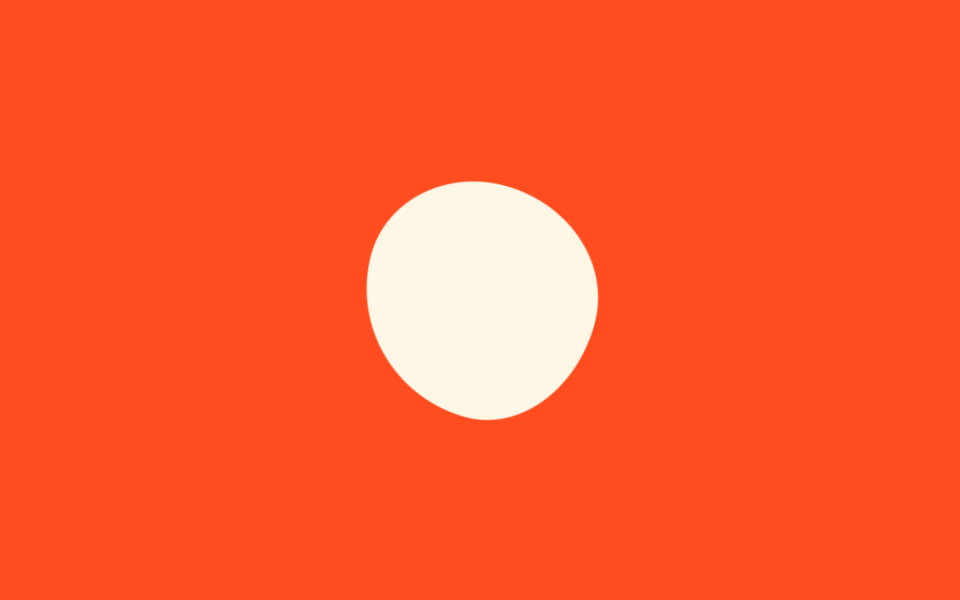
丸いクッションのような形が8つのborder-radius値を順に切り替えながらゆっくり回転し、生き物のようにうごめくローディングの塊になる。
使いどころブランド紹介型ローディング、かわいいサービスの待ち画面
border-radiusrotate$duration
<main class="stage">
  <div class="mb-blob is-demo" aria-hidden="true"></div>
</main>
@use "../../../../site/static/demo-tokens" as *;
// ── 변수 3개 ──────────────────────────────────────────
$duration: 2s;
$easing: linear;
$color: $subject-cream;
@include stage($stage-orange);
// 실사용: 로딩 중에만 .is-loading
.mb-blob {
width: 112px;
height: 112px;
border-radius: 58% 42% 43% 57% / 45% 58% 42% 55%; // 정지 모양도 블롭
background: $color;
}
.mb-blob.is-loading,
.mb-blob.is-demo {
// 반경 여덟 값이 순서를 바꾸며 모양을 바꾸고, 회전이 붙어 한 바퀴에 정확히 돌아온다
animation: mb-morph $duration $easing infinite;
}
@keyframes mb-morph {
0% {
border-radius: 58% 42% 43% 57% / 45% 58% 42% 55%;
transform: rotate(0deg) scale(1);
}
25% {
border-radius: 45% 55% 60% 40% / 52% 42% 58% 48%;
transform: rotate(90deg) scale(1.06);
}
50% {
border-radius: 57% 43% 40% 60% / 55% 47% 53% 45%;
transform: rotate(180deg) scale(0.96);
}
75% {
border-radius: 42% 58% 57% 43% / 48% 55% 45% 52%;
transform: rotate(270deg) scale(1.04);
}
100% {
border-radius: 58% 42% 43% 57% / 45% 58% 42% 55%;
transform: rotate(360deg) scale(1);
}
}
@media (prefers-reduced-motion: reduce) {
.mb-blob.is-loading,
.mb-blob.is-demo {
animation: none !important;
transform: none !important;
}
}html, body {
margin: 0;
overflow: hidden;
}
.stage {
box-sizing: border-box;
min-height: 100vh;
display: grid;
place-items: center;
margin: 0;
background: #ff4d1f;
font-family: -apple-system, "Segoe UI", "Noto Sans KR", sans-serif;
padding: clamp(8px, 4vw, 24px);
}
.mb-blob {
width: 112px;
height: 112px;
border-radius: 58% 42% 43% 57%/45% 58% 42% 55%;
background: #fff7e6;
}
.mb-blob.is-loading,
.mb-blob.is-demo {
animation: mb-morph 2s linear infinite;
}
@keyframes mb-morph {
0% {
border-radius: 58% 42% 43% 57%/45% 58% 42% 55%;
transform: rotate(0deg) scale(1);
}
25% {
border-radius: 45% 55% 60% 40%/52% 42% 58% 48%;
transform: rotate(90deg) scale(1.06);
}
50% {
border-radius: 57% 43% 40% 60%/55% 47% 53% 45%;
transform: rotate(180deg) scale(0.96);
}
75% {
border-radius: 42% 58% 57% 43%/48% 55% 45% 52%;
transform: rotate(270deg) scale(1.04);
}
100% {
border-radius: 58% 42% 43% 57%/45% 58% 42% 55%;
transform: rotate(360deg) scale(1);
}
}
@media (prefers-reduced-motion: reduce) {
.mb-blob.is-loading,
.mb-blob.is-demo {
animation: none !important;
transform: none !important;
}
}import { CSSProperties } from "react";
import styles from "./MorphingBlob.module.scss";
type Vars = CSSProperties & {
"--duration"?: string;
"--easing"?: string;
"--color"?: string;
};
export interface MorphingBlobProps {
duration?: string;
easing?: string;
color?: string;
}
export default function MorphingBlob({
duration = "2s",
easing = "linear",
color = "#fff7e6",
}: MorphingBlobProps) {
const style: Vars = {
"--duration": duration,
"--easing": easing,
"--color": color,
};
return <div className={styles.blob} style={style} aria-hidden="true" />;
}03 形の変わるブロブ — 計測 累積面積 2.206% · 動いたフレーム 23/23GODRICH オリジナル · SCSS と React は zip に同梱 · 【コピペOK】ローディング 画面 デザイン CSSだけ 9選
このデモが属する記事
 【コピペOK】ローディング 画面 デザイン CSSだけ 9選ローディング 画面 デザインとは、サービスが開く最初の瞬間に「今準備しています」と伝える待ち画面のことです。デフォルトのスピナーでも動きますが、パステルのリングや満ちていく水のような画面にすると、同じ待ち時間が意図のあるものに見えます。コピ この記事のデモをすべて見る