06レトロの太陽と遠近グリッド
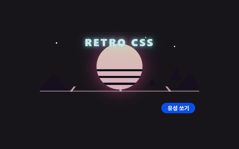
ストライプの太陽とヤシ、足元へ流れる遠近グリッドのレトロシーン — 画面をクリックすると流星が斜めに駆け抜ける。
使いどころゲーム・音楽イベントのランディング
perspectiverotateXtext-shadow
<main class="stage">
<div class="rt is-demo" id="rtRoot">
  <span class="rt__star rt__star--a"></span>
  <span class="rt__star rt__star--b"></span>
  <span class="rt__star rt__star--c"></span>
  <span class="rt__star rt__star--d"></span>
  <span class="rt__comet"></span>
  <span class="rt__shot"><span class="rt__streak"></span></span>
  <div class="rt__sun">
    <span class="rt__sunball"></span>
    <span class="rt__sunlines"></span>
  </div>
  <span class="rt__mount rt__mount--l"></span>
  <span class="rt__mount rt__mount--r"></span>
  <div class="rt__floor">
    <div class="rt__grid"></div>
  </div>
  <span class="rt__palm rt__palm--big"></span>
  <span class="rt__palm rt__palm--small"></span>
  <p class="rt__title">RETRO CSS</p>
  <button class="rt__fire" id="rtFire" type="button" aria-pressed="false">流星を撃つ</button>
</div>
</main>
@use "../../../../site/static/demo-tokens" as *;
// 레트로 해와 원근 그리드 — 줄무늬 해, 야자수, 원근 그리드 바닥을 도형으로 쌓는다.
// 그리드는 perspective + rotateX 로 눕혀 놓고 트랙을 세로로 흘려 다가오는 느낌을 낸다.
// 제목 글자는 text-shadow 네온. 유성은 루프(짧게 주기적으로) + 버튼(한 번 발사) 두 가지.
$duration: $dur-loop;
$easing: $ease-out;
$color: $subject-pink;
$sun-top: #d9c5b3;
$sun-bottom: #d6acbf;
$neon-cyan: #cee6e7;
$grid-pink: #ddb9c8;
$night: #0d0a12;
$ridge: #16101e;
@include stage($stage-ink);
.rt {
position: relative;
width: min(100%, 320px); height: 172px;
border-radius: $r-card; overflow: hidden;
display: block;
}
// 별
.rt__star {
position: absolute; width: 3px; height: 3px; border-radius: 50%;
background: $subject-cream;
animation-name: rtTwinkle; animation-duration: $duration;
animation-timing-function: ease-in-out; animation-iteration-count: infinite;
animation-direction: alternate; animation-fill-mode: both;
}
.rt__star--a { left: 10%; top: 12%; }
.rt__star--b { left: 30%; top: 8%; animation-delay: 320ms; }
.rt__star--c { left: 84%; top: 16%; animation-delay: 640ms; }
.rt__star--d { left: 66%; top: 6%; animation-delay: 960ms; }
// ── 해: 그라디언트 원 + 아랫절반 가로 줄눈
.rt__sun {
position: absolute; left: 50%; top: 26px; width: 88px; height: 88px;
margin-left: -44px; border-radius: 50%;
animation-name: rtSunPulse; animation-duration: $duration;
animation-timing-function: $easing; animation-iteration-count: infinite;
animation-direction: alternate;
}
.rt__sunball {
position: absolute; inset: 0; border-radius: 50%;
background: linear-gradient(180deg, $sun-top 0%, $sun-bottom 100%);
box-shadow: 0 0 32px rgba(244, 86, 157, .55);
}
.rt__sunlines {
position: absolute; left: 0; right: 0; bottom: 0; height: 52%;
border-radius: 0 0 $r-pill $r-pill; overflow: hidden;
background: repeating-linear-gradient(0deg, transparent 0 9px, $night 9px 13px);
}
// 산 실루엣
.rt__mount {
position: absolute; top: 84px; width: 70px; height: 40px;
clip-path: polygon(50% 0, 100% 100%, 0 100%);
background: $ridge;
}
.rt__mount--l { left: -8px; }
.rt__mount--r { right: -8px; width: 54px; height: 32px; }
// ── 원근 그리드 바닥: 눕힌 트랙이 세로로 흐른다
.rt__floor {
position: absolute; left: 0; right: 0; bottom: 0; height: 62px;
perspective: 240px; overflow: hidden;
}
.rt__grid {
position: absolute; left: -60%; top: -100%; width: 220%; height: 200%;
transform: rotateX(58deg); transform-origin: top center;
background:
repeating-linear-gradient(90deg, rgba($grid-pink, .8) 0 2px, transparent 2px 44px),
repeating-linear-gradient(0deg, rgba($grid-pink, .55) 0 2px, transparent 2px 36px);
animation-name: rtGridFlow; animation-duration: $duration;
animation-timing-function: linear; animation-iteration-count: infinite;
}
// 그리드 흐름: 눕힌 면 위를 세로로 한 칸(36px)만큼 이동 — transform 만 쓴다
// 야자수 실루엣
.rt__palm {
position: absolute;
width: 0; height: 0;
border-left: 12px solid transparent; border-right: 12px solid transparent;
border-bottom: 26px solid $ridge;
}
.rt__palm--big { right: 34px; top: 72px; }
.rt__palm--small { right: 82px; top: 92px; transform: scale(.6); transform-origin: top center; }
// 제목 네온
.rt__title {
position: absolute; left: 0; right: 0; top: 10px; margin: 0;
text-align: center; font-weight: 900; font-size: 21px; line-height: 1;
letter-spacing: 3px; color: $neon-cyan;
text-shadow: 0 0 8px rgba(126, 249, 255, .8), 0 0 22px rgba(126, 249, 255, .4);
}
// 루프 유성: 오른쪽 위에서 왼쪽 아래로 짧게 주기적으로
.rt__comet {
position: absolute; left: 74%; top: 20%; width: 34px; height: 3px;
border-radius: $r-pill;
background: linear-gradient(270deg, $subject-cream, rgba(255, 247, 230, 0));
transform: rotate(18deg);
animation-name: rtCometLoop; animation-duration: $duration;
animation-timing-function: $ease-out; animation-iteration-count: infinite;
animation-fill-mode: both;
}
// 버튼 유성: transition 한 번
.rt__shot {
position: absolute; left: 22%; top: 16%; width: 34px; height: 3px;
border-radius: $r-pill; opacity: 0;
transform: rotate(18deg);
transition: transform 700ms $ease-out, opacity 160ms linear;
}
.rt__streak {
display: block; width: 34px; height: 3px; border-radius: $r-pill;
background: linear-gradient(270deg, $neon-cyan, rgba(126, 249, 255, 0));
}
.rt.is-shot .rt__shot {
opacity: 1; transform: translateX(-96px) translateY(34px) rotate(18deg);
}
.rt__fire {
position: absolute; right: $sp-2; bottom: $sp-2;
padding: $sp-1 $sp-3; border: 0; border-radius: $r-pill;
background: $subject-blue-deep; color: $subject-cream;
font-family: inherit; font-weight: 700; font-size: 11px; line-height: 1.2;
cursor: pointer;
}
@keyframes rtSunPulse {
from { transform: scale(1); }
to { transform: scale(1.05); }
}
@keyframes rtGridFlow {
from { transform: rotateX(58deg) translateY(0); }
to { transform: rotateX(58deg) translateY(36px); }
}
@keyframes rtTwinkle {
from { opacity: .25; }
to { opacity: 1; }
}
@keyframes rtCometLoop {
0%, 44% { transform: translateX(0) translateY(0) rotate(18deg); opacity: 0; }
48% { opacity: 1; }
72%, 100% { transform: translateX(-88px) translateY(31px) rotate(18deg); opacity: 0; }
}
// 사람이 누른 상태: 루프 유성만 끊고(버튼 유성으로 본다) 나머지는 계속 흐른다
.rt:not(.is-demo) .rt__comet { animation-name: none; opacity: 0; }
@media (max-width: 340px) {
.rt { height: 136px; }
.rt__sun { top: 20px; width: 68px; height: 68px; margin-left: -34px; }
.rt__mount { top: 66px; }
.rt__palm--big { right: 22px; top: 58px; }
.rt__palm--small { right: 62px; top: 74px; }
.rt__floor { height: 48px; }
.rt__title { font-size: 16px; letter-spacing: 2px; }
}
@media (prefers-reduced-motion: reduce) {
.rt__star, .rt__sun, .rt__grid, .rt__comet { animation-name: none !important; }
.rt__shot { transition: none !important; }
}html, body {
margin: 0;
overflow: hidden;
}
.stage {
box-sizing: border-box;
min-height: 100vh;
display: grid;
place-items: center;
margin: 0;
background: #17141a;
font-family: -apple-system, "Segoe UI", "Noto Sans KR", sans-serif;
padding: clamp(8px, 4vw, 24px);
}
.rt {
position: relative;
width: min(100%, 320px);
height: 172px;
border-radius: 16px;
overflow: hidden;
display: block;
}
.rt__star {
position: absolute;
width: 3px;
height: 3px;
border-radius: 50%;
background: #fff7e6;
animation-name: rtTwinkle;
animation-duration: 2s;
animation-timing-function: ease-in-out;
animation-iteration-count: infinite;
animation-direction: alternate;
animation-fill-mode: both;
}
.rt__star--a {
left: 10%;
top: 12%;
}
.rt__star--b {
left: 30%;
top: 8%;
animation-delay: 320ms;
}
.rt__star--c {
left: 84%;
top: 16%;
animation-delay: 640ms;
}
.rt__star--d {
left: 66%;
top: 6%;
animation-delay: 960ms;
}
.rt__sun {
position: absolute;
left: 50%;
top: 26px;
width: 88px;
height: 88px;
margin-left: -44px;
border-radius: 50%;
animation-name: rtSunPulse;
animation-duration: 2s;
animation-timing-function: ease-out;
animation-iteration-count: infinite;
animation-direction: alternate;
}
.rt__sunball {
position: absolute;
inset: 0;
border-radius: 50%;
background: linear-gradient(180deg, #d9c5b3 0%, #d6acbf 100%);
box-shadow: 0 0 32px rgba(244, 86, 157, 0.55);
}
.rt__sunlines {
position: absolute;
left: 0;
right: 0;
bottom: 0;
height: 52%;
border-radius: 0 0 999px 999px;
overflow: hidden;
background: repeating-linear-gradient(0deg, transparent 0 9px, #0d0a12 9px 13px);
}
.rt__mount {
position: absolute;
top: 84px;
width: 70px;
height: 40px;
clip-path: polygon(50% 0, 100% 100%, 0 100%);
background: #16101e;
}
.rt__mount--l {
left: -8px;
}
.rt__mount--r {
right: -8px;
width: 54px;
height: 32px;
}
.rt__floor {
position: absolute;
left: 0;
right: 0;
bottom: 0;
height: 62px;
perspective: 240px;
overflow: hidden;
}
.rt__grid {
position: absolute;
left: -60%;
top: -100%;
width: 220%;
height: 200%;
transform: rotateX(58deg);
transform-origin: top center;
background: repeating-linear-gradient(90deg, rgba(221, 185, 200, 0.8) 0 2px, transparent 2px 44px), repeating-linear-gradient(0deg, rgba(221, 185, 200, 0.55) 0 2px, transparent 2px 36px);
animation-name: rtGridFlow;
animation-duration: 2s;
animation-timing-function: linear;
animation-iteration-count: infinite;
}
.rt__palm {
position: absolute;
width: 0;
height: 0;
border-left: 12px solid transparent;
border-right: 12px solid transparent;
border-bottom: 26px solid #16101e;
}
.rt__palm--big {
right: 34px;
top: 72px;
}
.rt__palm--small {
right: 82px;
top: 92px;
transform: scale(0.6);
transform-origin: top center;
}
.rt__title {
position: absolute;
left: 0;
right: 0;
top: 10px;
margin: 0;
text-align: center;
font-weight: 900;
font-size: 21px;
line-height: 1;
letter-spacing: 3px;
color: #cee6e7;
text-shadow: 0 0 8px rgba(126, 249, 255, 0.8), 0 0 22px rgba(126, 249, 255, 0.4);
}
.rt__comet {
position: absolute;
left: 74%;
top: 20%;
width: 34px;
height: 3px;
border-radius: 999px;
background: linear-gradient(270deg, #fff7e6, rgba(255, 247, 230, 0));
transform: rotate(18deg);
animation-name: rtCometLoop;
animation-duration: 2s;
animation-timing-function: ease-out;
animation-iteration-count: infinite;
animation-fill-mode: both;
}
.rt__shot {
position: absolute;
left: 22%;
top: 16%;
width: 34px;
height: 3px;
border-radius: 999px;
opacity: 0;
transform: rotate(18deg);
transition: transform 700ms ease-out, opacity 160ms linear;
}
.rt__streak {
display: block;
width: 34px;
height: 3px;
border-radius: 999px;
background: linear-gradient(270deg, #cee6e7, rgba(126, 249, 255, 0));
}
.rt.is-shot .rt__shot {
opacity: 1;
transform: translateX(-96px) translateY(34px) rotate(18deg);
}
.rt__fire {
position: absolute;
right: 8px;
bottom: 8px;
padding: 4px 12px;
border: 0;
border-radius: 999px;
background: #0a4fe8;
color: #fff7e6;
font-family: inherit;
font-weight: 700;
font-size: 11px;
line-height: 1.2;
cursor: pointer;
}
@keyframes rtSunPulse {
from {
transform: scale(1);
}
to {
transform: scale(1.05);
}
}
@keyframes rtGridFlow {
from {
transform: rotateX(58deg) translateY(0);
}
to {
transform: rotateX(58deg) translateY(36px);
}
}
@keyframes rtTwinkle {
from {
opacity: 0.25;
}
to {
opacity: 1;
}
}
@keyframes rtCometLoop {
0%, 44% {
transform: translateX(0) translateY(0) rotate(18deg);
opacity: 0;
}
48% {
opacity: 1;
}
72%, 100% {
transform: translateX(-88px) translateY(31px) rotate(18deg);
opacity: 0;
}
}
.rt:not(.is-demo) .rt__comet {
animation-name: none;
opacity: 0;
}
@media (max-width: 340px) {
.rt {
height: 136px;
}
.rt__sun {
top: 20px;
width: 68px;
height: 68px;
margin-left: -34px;
}
.rt__mount {
top: 66px;
}
.rt__palm--big {
right: 22px;
top: 58px;
}
.rt__palm--small {
right: 62px;
top: 74px;
}
.rt__floor {
height: 48px;
}
.rt__title {
font-size: 16px;
letter-spacing: 2px;
}
}
@media (prefers-reduced-motion: reduce) {
.rt__star, .rt__sun, .rt__grid, .rt__comet {
animation-name: none !important;
}
.rt__shot {
transition: none !important;
}
}// 유성: 미리보기 루프와 별개로, 누를 때마다 .is-shot 을 다시 걸어
// 대각선 스트릭을 transition 으로 한 번 가로지르게 한다.
(function () {
var root = document.getElementById('rtRoot');
var btn = document.getElementById('rtFire');
btn.addEventListener('click', function () {
root.classList.remove('is-demo');
root.classList.remove('is-shot');
window.requestAnimationFrame(function () {
root.classList.add('is-shot');
});
});
})();// RetroSunGrid — vanilla 판(run/078/demo/06-object-retro-sun-grid/index.html) 의 React 포트.
// 유성: 누를 때마다 한 번 대각선으로 가로지른다(is-shot). 첫 클릭에 미리보기 루프를 뗀다.
import { useState } from "react";
import type { CSSProperties } from "react";
import styles from "./RetroSunGrid.module.scss";
export type RetroSunGridProps = {
duration?: number;
easing?: string;
color?: string;
title?: string;
};
type Vars = CSSProperties & { "--duration"?: string; "--easing"?: string; "--color"?: string };
export default function RetroSunGrid(props: RetroSunGridProps) {
const duration = props.duration ?? 2000;
const easing = props.easing ?? "ease-out";
const color = props.color ?? "#ff9ebb";
const title = props.title ?? "RETRO CSS";
const [shot, setShot] = useState<boolean>(false);
const [preview, setPreview] = useState<boolean>(true);
const vars: Vars = { "--duration": duration + "ms", "--easing": easing, "--color": color };
const rootClass = ["rt", preview ? "is-demo" : "", shot ? "is-shot" : ""]
.filter(Boolean).map((c) => (styles as { [k: string]: string })[c]).join(" ");
return (
<main className={styles.stage}>
<div className={rootClass} style={vars}>
<span className={styles["rt__star"] + " " + styles["rt__star--a"]}></span>
<span className={styles["rt__star"] + " " + styles["rt__star--b"]}></span>
<span className={styles["rt__star"] + " " + styles["rt__star--c"]}></span>
<span className={styles["rt__star"] + " " + styles["rt__star--d"]}></span>
<span className={styles["rt__comet"]}></span>
<span className={styles["rt__shot"]}><span className={styles["rt__streak"]}></span></span>
<div className={styles["rt__sun"]}>
<span className={styles["rt__sunball"]}></span>
<span className={styles["rt__sunlines"]}></span>
</div>
<span className={styles["rt__mount"] + " " + styles["rt__mount--l"]}></span>
<span className={styles["rt__mount"] + " " + styles["rt__mount--r"]}></span>
<div className={styles["rt__floor"]}>
<div className={styles["rt__grid"]}></div>
</div>
<span className={styles["rt__palm"] + " " + styles["rt__palm--big"]}></span>
<span className={styles["rt__palm"] + " " + styles["rt__palm--small"]}></span>
<p className={styles["rt__title"]}>{title}</p>
<button
className={styles["rt__fire"]}
type="button"
aria-pressed={shot ? "true" : "false"}
onClick={() => { setPreview(false); setShot(false); requestAnimationFrame(() => setShot(true)); }}
>
유성 쏘기
</button>
</div>
</main>
);
}06 レトロの太陽と遠近グリッド — 計測 累積面積 3.71% · 動いたフレーム 23/23GODRICH オリジナル · SCSS と React は zip に同梱 · CSS アニメーション サンプル 9選 — 洗濯機・家・車を図形で動かす
このデモが属する記事
 CSS アニメーション サンプル 9選 — 洗濯機・家・車を図形で動かすcss アニメーション サンプルとして、洗濯機・家・車などの身の回りの物を、画像を一枚も使わずに色付きの箱いくつかで描いて動かす作り方を9つまとめました。どれも純粋な CSS の図形だけで、下のグリッドの中で今動いています。 この記事のデモをすべて見る