03ぷるぷるジェリー
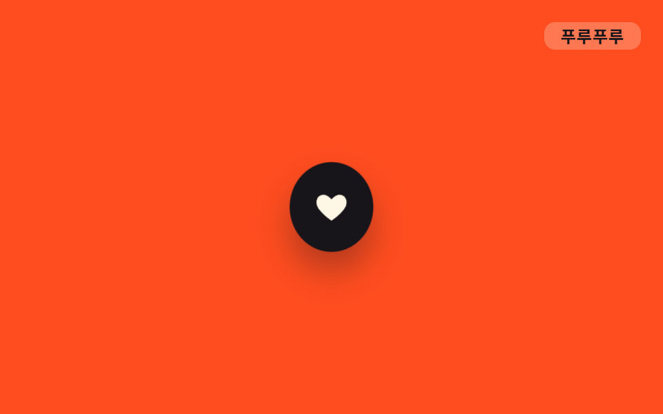
`.o-puru` は scaleX・scaleY をごく小さくずらして繰り返し、お気に入りハートアイコンがタップを誘うように微妙に震え続ける。
使いどころお気に入りハートアイコン、待機中のステータスドット、通知ベルアイコン
scale(1.07, .94)어긋난 위상900ms
<main class="stage">
  <button class="icon o-puru is-demo" type="button" aria-label="お気に入り">
    <svg viewBox="0 0 24 24" width="26" height="26" aria-hidden="true"><path d="M12 21s-7.5-4.6-10-9.3C.4 8 2 4.5 5.6 4 8 3.6 10 5 12 7c2-2 4-3.4 6.4-3 3.6.5 5.2 4 3.6 7.7C19.5 16.4 12 21 12 21z" fill="currentColor"/></svg>
  </button>
  <span class="tag">ぷるぷる</span>
</main>
@use "../../../../site/static/demo-tokens" as *;
// ── 변수 3개 ──────────────────────────────────────────
$duration: 900ms;
$easing: ease-in-out;
$color: $subject-cream;
// ── 데모 무대 ───────────────────────────────
@include stage($stage-orange);
.stage { position: relative; }
.icon {
width: 64px;
height: 64px;
border: 0;
border-radius: 50%;
display: grid;
place-items: center;
background: $stage-ink;
color: $color;
cursor: pointer;
box-shadow: $shadow-raised;
}
.tag {
position: absolute;
top: $sp-4;
right: $sp-4;
padding: $sp-1 $sp-3;
border-radius: $r-sm;
background: rgba($subject-cream, .25); // 먹 틴트는 주황 면을 어둡게 해 잉크 글자가 4.32:1 이었다 — 크림 틴트로 7.00:1
color: $stage-ink;
font-weight: 700;
font-size: 12px;
line-height: 1;
font-family: inherit;
letter-spacing: .04em;
}
// ── 사인파 soft-body 진동 — scale(1+δ, 1-δ·φ) 로 부피를 보존한 채 위상차로 흔든다 ──
// δ = 0.07·sin(2πt), 세로는 가로보다 위상이 π/2 늦는 cos 을 쓴다(직교 성분 — 서로 반대로 출렁).
// scaleX 가 최대인 순간 scaleY 는 0을 지난다 — 몸이 한 방향으로 눌리면 다른 방향은 잠시 쉰다 (형태 2차, 사용자 2026-09-14).
// keyframes 네 지점은 t = pct/100·2π 대입 결과: 25%→sin 1·cos 0 / 50%→sin 0·cos -1 / 75%→sin -1·cos 0
.o-puru {
animation: o-puru $duration $easing infinite;
}
@keyframes o-puru {
0%, 100% { transform: scale(1, 1); }
25% { transform: scale(1.07, .94); }
50% { transform: scale(1, 1.07); }
75% { transform: scale(.93, 1); }
}
// ── 접근성 ──────────────────────────────────────────
@media (prefers-reduced-motion: reduce) {
.o-puru { animation: none; }
}html, body {
margin: 0;
overflow: hidden;
}
.stage {
box-sizing: border-box;
min-height: 100vh;
display: grid;
place-items: center;
margin: 0;
background: #ff4d1f;
font-family: -apple-system, "Segoe UI", "Noto Sans KR", sans-serif;
padding: clamp(8px, 4vw, 24px);
}
.stage {
position: relative;
}
.icon {
width: 64px;
height: 64px;
border: 0;
border-radius: 50%;
display: grid;
place-items: center;
background: #17141a;
color: #fff7e6;
cursor: pointer;
box-shadow: 0 14px 24px rgba(23, 20, 26, 0.32);
}
.tag {
position: absolute;
top: 16px;
right: 16px;
padding: 4px 12px;
border-radius: 8px;
background: rgba(255, 247, 230, 0.25);
color: #17141a;
font-weight: 700;
font-size: 12px;
line-height: 1;
font-family: inherit;
letter-spacing: 0.04em;
}
.o-puru {
animation: o-puru 900ms ease-in-out infinite;
}
@keyframes o-puru {
0%, 100% {
transform: scale(1, 1);
}
25% {
transform: scale(1.07, 0.94);
}
50% {
transform: scale(1, 1.07);
}
75% {
transform: scale(0.93, 1);
}
}
@media (prefers-reduced-motion: reduce) {
.o-puru {
animation: none;
}
}import type { CSSProperties, MouseEvent } from "react";
import styles from "./JellyHeartIcon.module.scss";
export type JellyHeartIconProps = {
/** 스크린리더용 라벨 (기본 "찜하기") */
label?: string;
/** 한 번 떠는 데 걸리는 시간 (기본 900ms) */
duration?: number;
easing?: string;
color?: string;
onClick?: (e: MouseEvent<HTMLButtonElement>) => void;
};
type Vars = CSSProperties & {
"--duration"?: string;
"--easing"?: string;
"--color"?: string;
};
export default function JellyHeartIcon({
label = "찜하기",
duration = 900,
easing = "ease-in-out",
color = "#fff7e6",
onClick,
}: JellyHeartIconProps) {
const vars: Vars = {
"--duration": `${duration}ms`,
"--easing": easing,
"--color": color,
};
return (
<button type="button" className={styles.icon} style={vars} aria-label={label} onClick={onClick}>
<svg viewBox="0 0 24 24" width="26" height="26" aria-hidden="true">
<path
d="M12 21s-7.5-4.6-10-9.3C.4 8 2 4.5 5.6 4 8 3.6 10 5 12 7c2-2 4-3.4 6.4-3 3.6.5 5.2 4 3.6 7.7C19.5 16.4 12 21 12 21z"
fill="currentColor"
/>
</svg>
</button>
);
}03 ぷるぷるジェリー — 計測 累積面積 0.772% · 動いたフレーム 23/23GODRICH オリジナル · SCSS と React は zip に同梱 · CSS アニメーション バウンス 9選・一行でコピペOK
このデモが属する記事
 CSS アニメーション バウンス 9選・一行でコピペOKボタンやバッジが、ただ表示されるのではなくふわっと浮いたり、ぽよんと弾んだり、ぷるぷる震えたりする動きを見たことはありませんか。この記事はそんな「css アニメーション バウンス」の実例を、まんが的な擬音語(ふわふわ・ぽよん・ぷるぷるなど) この記事のデモをすべて見る