06ぴょんぴょん跳ねる
`.o-pyon` は着地直前に縦 scale を押しつぶし、跳ぶ瞬間に translateY と scale を伸ばして弾むリズムを作り、「もっと見る」矢印に使います。
使いどころ「もっと見る」矢印、スクロール誘導アイコン、空状態のイラスト
translateY+scale착지 스쿼시900ms
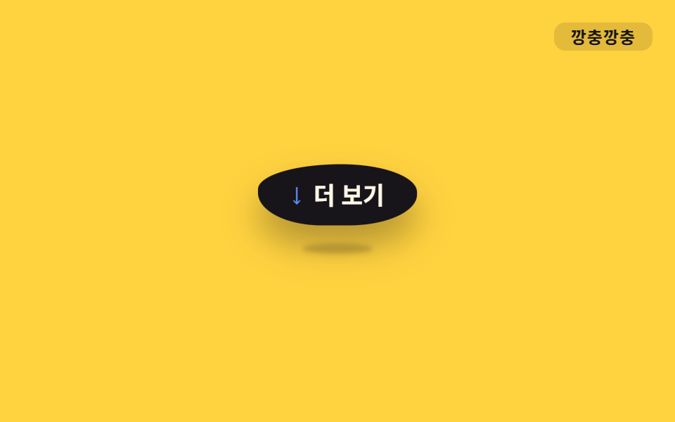
<main class="stage">
  <div class="hint o-pyon is-demo">
    <span class="hint__arrow" aria-hidden="true">↓</span>
    もっと見る
  </div>
  <span class="tag">ぴょんぴょん</span>
</main>
@use "../../../../site/static/demo-tokens" as *;
// ── 변수 3개 ──────────────────────────────────────────
$duration: 900ms;
$easing: ease-in-out;
$color: $subject-blue;
// ── 데모 무대 ───────────────────────────────
@include stage($stage-yellow);
.stage { position: relative; }
.hint {
position: relative;
display: inline-flex;
align-items: center;
gap: $sp-2;
padding: $sp-3 $sp-6;
border-radius: $r-pill;
background: $stage-ink;
color: $subject-cream;
font-weight: 700;
font-size: clamp(14px, 4vw, 17px);
line-height: 1;
font-family: inherit;
box-shadow: $shadow-raised;
}
// 바닥 접촉 그림자 — 알약 자체와 별개 레이어. 착지 순간(스쿼시) 넓고 짙게, 정점(공중)엔 좁고 옅게 ──
.hint::after {
content: "";
position: absolute;
left: 50%;
bottom: -8px;
width: 60%;
height: 8px;
border-radius: 50%;
background: rgba($stage-ink, .38);
filter: blur(2px);
transform: translateX(-50%) scale(1, 1);
}
.hint__arrow { font-size: 18px; line-height: 1; color: $subject-blue-light; } // 먹 알약 위 파란 글자 — AA 4.5
.tag {
position: absolute;
top: $sp-4;
right: $sp-4;
padding: $sp-1 $sp-3;
border-radius: $r-sm;
background: rgba(23, 20, 26, .12);
color: $stage-ink;
font-weight: 700;
font-size: 12px;
line-height: 1;
font-family: inherit;
letter-spacing: .04em;
}
// ── 사인파 soft-body + 바닥 그림자 (형태 2차, 사용자 2026-09-14) ─────
// 몸: border-radius 여덟 값(가로4·세로4)을 위상차 π/4 사인파 r_k = 50 + 10·sin(2πt + k·π/4) 로 흔들고,
// scaleX·scaleY 는 곱이 1 (면적 보존) — 눌리면 옆으로 퍼지고 늘어나면 가늘어진다.
// keyframes 다섯 지점(0·10·40·70·85%)은 t = pct/100·2π 를 대입한 계산 결과값.
// 그림자: 몸이 -16px 뜬 순간 +16px 내려와 바닥에 붙어 있다(상쇄). 착지 스쿼시 땐 넓고 짙게(무게),
// 공중 정점 땐 좁고 옅게 — 몸이 높을수록 그림자는 퍼져 약해진다는 역수 관계로 계산했다.
.o-pyon {
animation: o-pyon $duration $easing infinite;
}
.o-pyon::after {
animation: o-pyon-shadow $duration $easing infinite;
}
@keyframes o-pyon {
0%, 100% { transform: translateY(0) scale(1, 1); border-radius: 50% 57% 60% 57% / 50% 43% 40% 43%; }
10% { transform: translateY(2px) scale(1.11, .9); border-radius: 56% 60% 58% 52% / 44% 40% 42% 48%; }
40% { transform: translateY(-16px) scale(.93, 1.08); border-radius: 56% 48% 42% 40% / 44% 52% 58% 60%; }
70% { transform: translateY(2px) scale(1.11, .9); border-radius: 40% 41% 47% 55% / 60% 59% 53% 45%; }
85% { transform: translateY(0) scale(1.02, 1.03); border-radius: 42% 48% 56% 60% / 58% 52% 44% 40%; }
}
@keyframes o-pyon-shadow {
0%, 100% { transform: translate(-50%, 0) scale(1, 1); opacity: .9; }
10% { transform: translate(-50%, 0) scale(1.14, 1.3); opacity: 1; }
40% { transform: translate(-50%, 16px) scale(.6, .75); opacity: .4; }
70% { transform: translate(-50%, 0) scale(1.14, 1.3); opacity: 1; }
85% { transform: translate(-50%, 0) scale(1.05, 1.1); opacity: .95; }
}
// ── 접근성 ──────────────────────────────────────────
@media (prefers-reduced-motion: reduce) {
.o-pyon, .o-pyon::after { animation: none; }
}html, body {
margin: 0;
overflow: hidden;
}
.stage {
box-sizing: border-box;
min-height: 100vh;
display: grid;
place-items: center;
margin: 0;
background: #ffd23f;
font-family: -apple-system, "Segoe UI", "Noto Sans KR", sans-serif;
padding: clamp(8px, 4vw, 24px);
}
.stage {
position: relative;
}
.hint {
position: relative;
display: inline-flex;
align-items: center;
gap: 8px;
padding: 12px 24px;
border-radius: 999px;
background: #17141a;
color: #fff7e6;
font-weight: 700;
font-size: clamp(14px, 4vw, 17px);
line-height: 1;
font-family: inherit;
box-shadow: 0 14px 24px rgba(23, 20, 26, 0.32);
}
.hint::after {
content: "";
position: absolute;
left: 50%;
bottom: -8px;
width: 60%;
height: 8px;
border-radius: 50%;
background: rgba(23, 20, 26, 0.38);
filter: blur(2px);
transform: translateX(-50%) scale(1, 1);
}
.hint__arrow {
font-size: 18px;
line-height: 1;
color: #5b8cf8;
}
.tag {
position: absolute;
top: 16px;
right: 16px;
padding: 4px 12px;
border-radius: 8px;
background: rgba(23, 20, 26, 0.12);
color: #17141a;
font-weight: 700;
font-size: 12px;
line-height: 1;
font-family: inherit;
letter-spacing: 0.04em;
}
.o-pyon {
animation: o-pyon 900ms ease-in-out infinite;
}
.o-pyon::after {
animation: o-pyon-shadow 900ms ease-in-out infinite;
}
@keyframes o-pyon {
0%, 100% {
transform: translateY(0) scale(1, 1);
border-radius: 50% 57% 60% 57%/50% 43% 40% 43%;
}
10% {
transform: translateY(2px) scale(1.11, 0.9);
border-radius: 56% 60% 58% 52%/44% 40% 42% 48%;
}
40% {
transform: translateY(-16px) scale(0.93, 1.08);
border-radius: 56% 48% 42% 40%/44% 52% 58% 60%;
}
70% {
transform: translateY(2px) scale(1.11, 0.9);
border-radius: 40% 41% 47% 55%/60% 59% 53% 45%;
}
85% {
transform: translateY(0) scale(1.02, 1.03);
border-radius: 42% 48% 56% 60%/58% 52% 44% 40%;
}
}
@keyframes o-pyon-shadow {
0%, 100% {
transform: translate(-50%, 0) scale(1, 1);
opacity: 0.9;
}
10% {
transform: translate(-50%, 0) scale(1.14, 1.3);
opacity: 1;
}
40% {
transform: translate(-50%, 16px) scale(0.6, 0.75);
opacity: 0.4;
}
70% {
transform: translate(-50%, 0) scale(1.14, 1.3);
opacity: 1;
}
85% {
transform: translate(-50%, 0) scale(1.05, 1.1);
opacity: 0.95;
}
}
@media (prefers-reduced-motion: reduce) {
.o-pyon, .o-pyon::after {
animation: none;
}
}import type { CSSProperties, ReactNode } from "react";
import styles from "./HopHint.module.scss";
export type HopHintProps = {
children: ReactNode;
/** 한 번 뛰는 데 걸리는 시간 (기본 900ms) */
duration?: number;
easing?: string;
color?: string;
};
type Vars = CSSProperties & {
"--duration"?: string;
"--easing"?: string;
"--color"?: string;
};
export default function HopHint({
children,
duration = 900,
easing = "ease-in-out",
color = "#2f6df6",
}: HopHintProps) {
const vars: Vars = {
"--duration": `${duration}ms`,
"--easing": easing,
"--color": color,
};
return (
<div className={styles.hint} style={vars}>
<span className={styles.arrow} aria-hidden="true">
↓
</span>
{children}
</div>
);
}06 ぴょんぴょん跳ねる — 計測 累積面積 5.925% · 動いたフレーム 23/23GODRICH オリジナル · SCSS と React は zip に同梱 · CSS アニメーション バウンス 9選・一行でコピペOK
このデモが属する記事
 CSS アニメーション バウンス 9選・一行でコピペOKボタンやバッジが、ただ表示されるのではなくふわっと浮いたり、ぽよんと弾んだり、ぷるぷる震えたりする動きを見たことはありませんか。この記事はそんな「css アニメーション バウンス」の実例を、まんが的な擬音語(ふわふわ・ぽよん・ぷるぷるなど) この記事のデモをすべて見る