02バッジ光沢スイープ
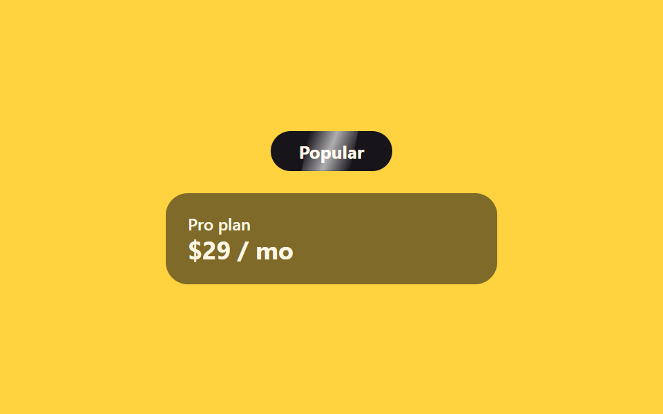
「人気」バッジの上を細い光が一定間隔で流れ、操作なしでも自然と目を引きます。
使いどころおすすめプランのバッジ、新着・割引ラベル
::aftertranslateX2.4s
<main class="stage">
  <div class="sh-wrap">
    <span class="sh-badge">Popular</span>
    <div class="sh-card">
      <span class="sh-card__tag">Pro plan</span>
      <span class="sh-card__price">$29 / mo</span>
    </div>
  </div>
</main>
@use "../../../../site/static/demo-tokens" as *;
// ── 변수 3개 ──────────────────────────────────────────
$duration: 2.4s;
$easing: ease-in-out;
$color: $subject-blue;
@include stage($stage-yellow);
.sh-wrap {
width: min(240px, 84vw);
display: flex;
flex-direction: column;
align-items: center;
gap: $sp-4;
}
.sh-badge {
position: relative;
overflow: hidden;
display: inline-block;
border-radius: $r-pill;
padding: $sp-2 $sp-5;
background: $subject-ink;
color: $subject-cream;
font: 700 13px/1 -apple-system, "Segoe UI", sans-serif;
}
// 광택 띠 — 폭 고정, transform 만 움직인다 (그라디언트 자체는 정적)
.sh-badge::after {
content: "";
position: absolute;
top: 0;
left: 0;
width: 40%;
height: 100%;
background: linear-gradient(100deg, transparent, rgba(255, 255, 255, .65), transparent);
transform: translateX(-260%) skewX(-12deg);
}
// 자동 재생 (호버 불필요) — badge 는 항상 스윕한다
.sh-badge::after {
animation: sh-sweep $duration $easing infinite;
}
@keyframes sh-sweep {
0% { transform: translateX(-260%) skewX(-12deg); }
60%, 100% { transform: translateX(360%) skewX(-12deg); }
}
.sh-card {
width: 100%;
box-sizing: border-box;
border-radius: $r-card;
padding: $sp-4;
background: rgba(23, 20, 26, .55);
color: $subject-cream;
display: flex;
flex-direction: column;
gap: $sp-1;
font: 600 12px/1 -apple-system, "Segoe UI", sans-serif;
}
.sh-card__tag { opacity: 1; } // AA: 뱃지 면(잉크 55% 옐로 겹침) 위 크림 100% — 4.89:1
.sh-card__price { font-size: 18px; font-weight: 700; }
@media (prefers-reduced-motion: reduce) {
.sh-badge::after { animation: none !important; opacity: 0 !important; }
}html, body {
margin: 0;
overflow: hidden;
}
.stage {
box-sizing: border-box;
min-height: 100vh;
display: grid;
place-items: center;
margin: 0;
background: #ffd23f;
font-family: -apple-system, "Segoe UI", "Noto Sans KR", sans-serif;
padding: clamp(8px, 4vw, 24px);
}
.sh-wrap {
width: min(240px, 84vw);
display: flex;
flex-direction: column;
align-items: center;
gap: 16px;
}
.sh-badge {
position: relative;
overflow: hidden;
display: inline-block;
border-radius: 999px;
padding: 8px 20px;
background: #17141a;
color: #fff7e6;
font: 700 13px/1 -apple-system, "Segoe UI", sans-serif;
}
.sh-badge::after {
content: "";
position: absolute;
top: 0;
left: 0;
width: 40%;
height: 100%;
background: linear-gradient(100deg, transparent, rgba(255, 255, 255, 0.65), transparent);
transform: translateX(-260%) skewX(-12deg);
}
.sh-badge::after {
animation: sh-sweep 2.4s ease-in-out infinite;
}
@keyframes sh-sweep {
0% {
transform: translateX(-260%) skewX(-12deg);
}
60%, 100% {
transform: translateX(360%) skewX(-12deg);
}
}
.sh-card {
width: 100%;
box-sizing: border-box;
border-radius: 16px;
padding: 16px;
background: rgba(23, 20, 26, 0.55);
color: #fff7e6;
display: flex;
flex-direction: column;
gap: 4px;
font: 600 12px/1 -apple-system, "Segoe UI", sans-serif;
}
.sh-card__tag {
opacity: 1;
}
.sh-card__price {
font-size: 18px;
font-weight: 700;
}
@media (prefers-reduced-motion: reduce) {
.sh-badge::after {
animation: none !important;
opacity: 0 !important;
}
}import { CSSProperties } from "react";
import styles from "./BadgeShineSweep.module.scss";
export interface BadgeShineSweepProps {
duration?: string;
easing?: string;
tag?: string;
}
export default function BadgeShineSweep({
duration = "2.4s",
easing = "ease-in-out",
tag = "Popular",
}: BadgeShineSweepProps) {
const style = { "--duration": duration, "--easing": easing } as CSSProperties;
return (
<div className={styles.wrap} style={style}>
<span className={styles.badge}>{tag}</span>
<div className={styles.card}>
<span className={styles.tag}>Pro plan</span>
<span className={styles.price}>$29 / mo</span>
</div>
</div>
);
}02 バッジ光沢スイープ — 計測 累積面積 1.628% · 動いたフレーム 7/23GODRICH オリジナル · SCSS と React は zip に同梱 · 【コピペOK】料金表 CSSアニメーション9選
このデモが属する記事
 【コピペOK】料金表 CSSアニメーション9選サブスクの料金プランを比較するとき、カードにマウスを乗せた瞬間にふわっと浮かんだり、金額の表示がパッと切り替わったりするページを見たことはありませんか。どのプランを選ぶか迷っているその一瞬に、こうした小さな動きが視線を誘導してくれます。この この記事のデモをすべて見る