02カードスケルトン
画像・見出し・説明の枠を持つカード1枚。
使いどころ商品・記事カード
3장가로형둥글게

<main class="stage">
  <div class="card">
    <div class="thumb"></div>
    <div class="title"></div>
    <div class="desc"></div>
    <div class="desc short"></div>
  </div>
</main>
@use "../../../../site/static/demo-tokens" as *;
// ── 변수 3개 ──────────────────────────────────────────
$duration: $dur-loop; // 빛이 카드 한 장을 훑는 시간
$easing: $ease-out;
$color: $subject-ink; // 막대 색 (노란 무대라 잉크 톤)
@include stage($stage-yellow);
.card {
width: clamp(160px, 60%, 260px);
padding: clamp(10px, 2.6vw, 14px);
border-radius: $r-card;
background: rgba($stage-paper, .55);
box-shadow: $shadow-raised;
display: grid;
gap: clamp(8px, 2vw, 10px);
}
// ── 막대 하나의 공통 모양 ──────────────────────────────
%bar {
position: relative;
overflow: hidden;
border-radius: $r-control;
background: rgba($color, .16);
&::after {
content: "";
position: absolute;
inset: 0;
background: linear-gradient(90deg, transparent, rgba($stage-paper, .85), transparent);
transform: translateX(-120%);
animation: shimmer $duration $easing infinite;
}
}
.thumb { @extend %bar; aspect-ratio: 2 / 1; }
.title { @extend %bar; height: clamp(12px, 3.6vw, 16px); width: 70%; }
.desc { @extend %bar; height: clamp(9px, 3vw, 12px); }
.desc.short { width: 55%; }
.title::after { animation-delay: -120ms; }
.desc::after { animation-delay: -240ms; }
.desc.short::after { animation-delay: -360ms; }
@keyframes shimmer {
to { transform: translateX(120%); }
}
@media (prefers-reduced-motion: reduce) {
.thumb::after, .title::after, .desc::after { animation: none !important; opacity: .5; transform: translateX(0); }
}html, body {
margin: 0;
overflow: hidden;
}
.stage {
box-sizing: border-box;
min-height: 100vh;
display: grid;
place-items: center;
margin: 0;
background: #ffd23f;
font-family: -apple-system, "Segoe UI", "Noto Sans KR", sans-serif;
padding: clamp(8px, 4vw, 24px);
}
.card {
width: clamp(160px, 60%, 260px);
padding: clamp(10px, 2.6vw, 14px);
border-radius: 16px;
background: rgba(255, 255, 255, 0.55);
box-shadow: 0 14px 24px rgba(23, 20, 26, 0.32);
display: grid;
gap: clamp(8px, 2vw, 10px);
}
.desc, .title, .thumb {
position: relative;
overflow: hidden;
border-radius: 12px;
background: rgba(23, 20, 26, 0.16);
}
.desc::after, .title::after, .thumb::after {
content: "";
position: absolute;
inset: 0;
background: linear-gradient(90deg, transparent, rgba(255, 255, 255, 0.85), transparent);
transform: translateX(-120%);
animation: shimmer 2s ease-out infinite;
}
.thumb {
aspect-ratio: 2/1;
}
.title {
height: clamp(12px, 3.6vw, 16px);
width: 70%;
}
.desc {
height: clamp(9px, 3vw, 12px);
}
.desc.short {
width: 55%;
}
.title::after {
animation-delay: -120ms;
}
.desc::after {
animation-delay: -240ms;
}
.desc.short::after {
animation-delay: -360ms;
}
@keyframes shimmer {
to {
transform: translateX(120%);
}
}
@media (prefers-reduced-motion: reduce) {
.thumb::after, .title::after, .desc::after {
animation: none !important;
opacity: 0.5;
transform: translateX(0);
}
}import type { CSSProperties } from "react";
import styles from "./CardSkeleton.module.scss";
export type CardSkeletonProps = {
/** 빛이 카드 한 장을 훑는 시간 (기본 2000ms) */
duration?: number;
/** CSS easing (기본 ease-out) */
easing?: string;
/** 막대 색 */
color?: string;
className?: string;
};
export default function CardSkeleton({
duration = 2000,
easing = "ease-out",
color = "#17141a",
className = "",
}: CardSkeletonProps) {
const vars = { "--duration": `${duration}ms`, "--easing": easing, "--color": color } as CSSProperties;
return (
<div className={`${styles.card} ${className}`} style={vars}>
<div className={styles.thumb} />
<div className={styles.title} />
<div className={styles.desc} />
<div className={`${styles.desc} ${styles.short}`} />
</div>
);
}02 カードスケルトン — 計測 累積面積 28.717% · 動いたフレーム 20/23GODRICH オリジナル · SCSS と React は zip に同梱 · 【コピペOK】CSS スケルトン ローディング 9選
このデモが属する記事
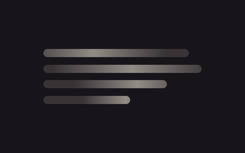 【コピペOK】CSS スケルトン ローディング 9選css スケルトンとは、本物のコンテンツが届く前に画面の形だけを灰色の板で先に見せておくローディング表現のことです。この記事ではシマーライン・カード・表・コンテナクエリまで9種類を選び、JavaScript を使わず SCSS だけで実装し この記事のデモをすべて見る