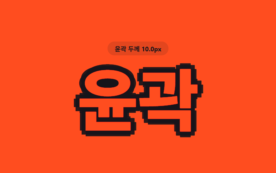
08アウトライングロー
color:transparent で中身を空にし -webkit-text-stroke で輪郭だけ残したうえで、filter:drop-shadow() の半径を大小させて輪郭のまわりに光が呼吸するようににじませる。
使いどころダークモードCTAの見出し、カードバッジのアウトライン
-webkit-text-strokedrop-shadow빈 윤곽선

<main class="stage">
  <h1 class="outline">無料で体験する</h1>
</main>
@use "../../../../site/static/demo-tokens" as *;
$duration: $dur-loop; // 빛이 커졌다 작아지는 숨쉬기 한 주기
$easing: $ease-spring;
$color: $subject-blue; // 윤곽선·빛 색
@include stage($stage-paper);
.outline {
margin: 0;
font-weight: 900; font-size: clamp(28px, 8.8vw, 46px); line-height: 1.2; font-family: inherit;
text-align: center;
color: transparent; // 속을 비워 윤곽선만 남긴다
-webkit-text-stroke: 2px $color;
text-stroke: 2px $color;
animation: glow $duration $easing infinite;
}
@keyframes glow {
0%, 100% { filter: drop-shadow(0 0 3px rgba($color, .5)); }
50% { filter: drop-shadow(0 0 14px rgba($color, .9)) drop-shadow(0 0 26px rgba($color, .5)); }
}
@media (prefers-reduced-motion: reduce) {
.outline { animation: none; filter: drop-shadow(0 0 10px rgba($color, .7)); }
}html, body {
margin: 0;
overflow: hidden;
}
.stage {
box-sizing: border-box;
min-height: 100vh;
display: grid;
place-items: center;
margin: 0;
background: #ffffff;
font-family: -apple-system, "Segoe UI", "Noto Sans KR", sans-serif;
padding: clamp(8px, 4vw, 24px);
}
.outline {
margin: 0;
font-weight: 900;
font-size: clamp(28px, 8.8vw, 46px);
line-height: 1.2;
font-family: inherit;
text-align: center;
color: transparent;
-webkit-text-stroke: 2px #2f6df6;
text-stroke: 2px #2f6df6;
animation: glow 2s cubic-bezier(0.2, 0.8, 0.2, 1) infinite;
}
@keyframes glow {
0%, 100% {
filter: drop-shadow(0 0 3px rgba(47, 109, 246, 0.5));
}
50% {
filter: drop-shadow(0 0 14px rgba(47, 109, 246, 0.9)) drop-shadow(0 0 26px rgba(47, 109, 246, 0.5));
}
}
@media (prefers-reduced-motion: reduce) {
.outline {
animation: none;
filter: drop-shadow(0 0 10px rgba(47, 109, 246, 0.7));
}
}import type { CSSProperties } from "react";
import styles from "./OutlineGlowText.module.scss";
export type OutlineGlowTextProps = {
text: string;
/** 빛이 커졌다 작아지는 숨쉬기 한 주기 (기본 2000ms) */
duration?: number;
easing?: string;
/** 윤곽선·빛 색 */
color?: string;
};
type Vars = CSSProperties & { "--duration"?: string; "--easing"?: string; "--color"?: string };
export default function OutlineGlowText({
text,
duration = 2000,
easing = "cubic-bezier(.2,.8,.2,1)",
color = "#2f6df6",
}: OutlineGlowTextProps) {
const vars: Vars = { "--duration": `${duration}ms`, "--easing": easing, "--color": color };
return <h1 className={styles.outline} style={vars}>{text}</h1>;
}08 アウトライングロー — 計測 累積面積 15.976% · 動いたフレーム 7/23GODRICH オリジナル · SCSS と React は zip に同梱 · CSS テキスト グラデーション アニメーション 9選 — 一行でコピペOK
このデモが属する記事
 CSS テキスト グラデーション アニメーション 9選 — 一行でコピペOKcss テキスト グラデーション アニメーションは、文字の中に流し込んだ色が動いたり光を放ったりして見える、background-clip:textやfilterだけで組める小さな演出です。この記事では9種類を選び、6〜25行のコードとして この記事のデモをすべて見る