01単体サイドバーナビ
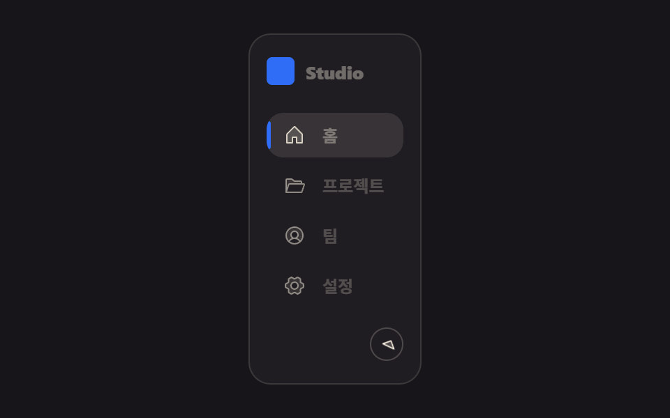
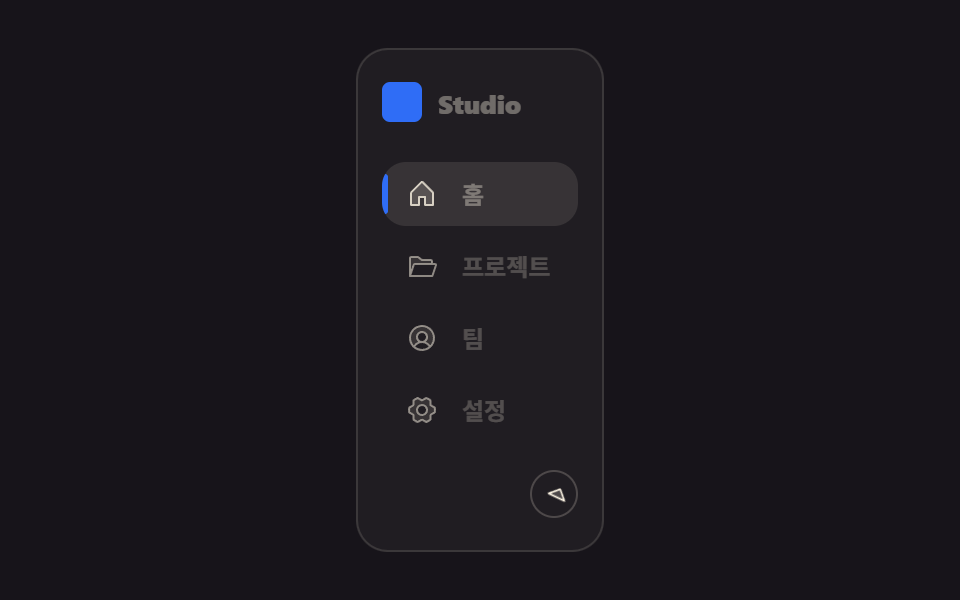
접기 버튼을 누르면 사이드바 폭이 실제로 줄어들며 라벨이 사라지고 아이콘만 남고, 지금 있는 메뉴 항목은 왼쪽에 세로 막대와 배경으로 표시됩니다.
使いどころ
widtharia-pressedclick
<main class="stage">
  <nav class="sd is-demo" aria-label="メインメニュー">
    <div class="sd__brand"><span class="sd__mark" aria-hidden="true"></span><span class="sd__brand-text">Studio</span></div>
    <ul class="sd__list">
      <li class="sd__item is-active"><a class="sd__link" href="#"><span class="sd__ic" aria-hidden="true"><svg viewBox="0 0 256 256"><g fill="currentColor"><path d="M216 120v96h-64v-64h-48v64H40v-96a8 8 0 0 1 2.34-5.66l80-80a8 8 0 0 1 11.32 0l80 80A8 8 0 0 1 216 120" opacity=".2"/><path d="m219.31 108.68l-80-80a16 16 0 0 0-22.62 0l-80 80A15.87 15.87 0 0 0 32 120v96a8 8 0 0 0 8 8h64a8 8 0 0 0 8-8v-56h32v56a8 8 0 0 0 8 8h64a8 8 0 0 0 8-8v-96a15.87 15.87 0 0 0-4.69-11.32M208 208h-48v-56a8 8 0 0 0-8-8h-48a8 8 0 0 0-8 8v56H48v-88l80-80l80 80Z"/></g></svg></span><span class="sd__label">ホーム</span></a></li>
      <li class="sd__item"><a class="sd__link" href="#"><span class="sd__ic" aria-hidden="true"><svg viewBox="0 0 256 256"><g fill="currentColor"><path d="M208 88v24H69.77a8 8 0 0 0-7.59 5.47L32 208V64a8 8 0 0 1 8-8h53.33a8 8 0 0 1 4.8 1.6L128 80h72a8 8 0 0 1 8 8" opacity=".2"/><path d="M245 110.64a16 16 0 0 0-13-6.64h-16V88a16 16 0 0 0-16-16h-69.33l-27.73-20.8a16.14 16.14 0 0 0-9.6-3.2H40a16 16 0 0 0-16 16v144a8 8 0 0 0 8 8h179.1a8 8 0 0 0 7.59-5.47l28.49-85.47a16.05 16.05 0 0 0-2.18-14.42M93.34 64l29.86 22.4A8 8 0 0 0 128 88h72v16H69.77a16 16 0 0 0-15.18 10.94L40 158.7V64Zm112 136H43.1l26.67-80H232Z"/></g></svg></span><span class="sd__label">プロジェクト</span></a></li>
      <li class="sd__item"><a class="sd__link" href="#"><span class="sd__ic" aria-hidden="true"><svg viewBox="0 0 256 256"><g fill="currentColor"><path d="M224 128a95.76 95.76 0 0 1-31.8 71.37A72 72 0 0 0 128 160a40 40 0 1 0-40-40a40 40 0 0 0 40 40a72 72 0 0 0-64.2 39.37A96 96 0 1 1 224 128" opacity=".2"/><path d="M128 24a104 104 0 1 0 104 104A104.11 104.11 0 0 0 128 24M74.08 197.5a64 64 0 0 1 107.84 0a87.83 87.83 0 0 1-107.84 0M96 120a32 32 0 1 1 32 32a32 32 0 0 1-32-32m97.76 66.41a79.66 79.66 0 0 0-36.06-28.75a48 48 0 1 0-59.4 0a79.66 79.66 0 0 0-36.06 28.75a88 88 0 1 1 131.52 0"/></g></svg></span><span class="sd__label">チーム</span></a></li>
      <li class="sd__item"><a class="sd__link" href="#"><span class="sd__ic" aria-hidden="true"><svg viewBox="0 0 256 256"><g fill="currentColor"><path d="m230.1 108.76l-31.85-18.14c-.64-1.16-1.31-2.29-2-3.41l-.12-36A104.6 104.6 0 0 0 162 32l-32 17.89h-4L94 32a104.6 104.6 0 0 0-34.11 19.25l-.16 36c-.7 1.12-1.37 2.26-2 3.41l-31.84 18.1a99.2 99.2 0 0 0 0 38.46l31.85 18.14c.64 1.16 1.31 2.29 2 3.41l.12 36A104.6 104.6 0 0 0 94 224l32-17.87h4L162 224a104.6 104.6 0 0 0 34.08-19.25l.16-36c.7-1.12 1.37-2.26 2-3.41l31.84-18.1a99.2 99.2 0 0 0 .02-38.48M128 168a40 40 0 1 1 40-40a40 40 0 0 1-40 40" opacity=".2"/><path d="M128 80a48 48 0 1 0 48 48a48.05 48.05 0 0 0-48-48m0 80a32 32 0 1 1 32-32a32 32 0 0 1-32 32m109.94-52.79a8 8 0 0 0-3.89-5.4l-29.83-17l-.12-33.62a8 8 0 0 0-2.83-6.08a111.9 111.9 0 0 0-36.72-20.67a8 8 0 0 0-6.46.59L128 41.85L97.88 25a8 8 0 0 0-6.47-.6a111.9 111.9 0 0 0-36.68 20.75a8 8 0 0 0-2.83 6.07l-.15 33.65l-29.83 17a8 8 0 0 0-3.89 5.4a106.5 106.5 0 0 0 0 41.56a8 8 0 0 0 3.89 5.4l29.83 17l.12 33.63a8 8 0 0 0 2.83 6.08a111.9 111.9 0 0 0 36.72 20.67a8 8 0 0 0 6.46-.59L128 214.15L158.12 231a7.9 7.9 0 0 0 3.9 1a8.1 8.1 0 0 0 2.57-.42a112.1 112.1 0 0 0 36.68-20.73a8 8 0 0 0 2.83-6.07l.15-33.65l29.83-17a8 8 0 0 0 3.89-5.4a106.5 106.5 0 0 0-.03-41.52m-15 34.91l-28.57 16.25a8 8 0 0 0-3 3c-.58 1-1.19 2.06-1.81 3.06a7.94 7.94 0 0 0-1.22 4.21l-.15 32.25a95.9 95.9 0 0 1-25.37 14.3L134 199.13a8 8 0 0 0-3.91-1h-3.83a8.1 8.1 0 0 0-4.1 1l-28.84 16.1A96 96 0 0 1 67.88 201l-.11-32.2a8 8 0 0 0-1.22-4.22c-.62-1-1.23-2-1.8-3.06a8.1 8.1 0 0 0-3-3.06l-28.6-16.29a90.5 90.5 0 0 1 0-28.26l28.52-16.28a8 8 0 0 0 3-3c.58-1 1.19-2.06 1.81-3.06a7.94 7.94 0 0 0 1.22-4.21l.15-32.25a95.9 95.9 0 0 1 25.37-14.3L122 56.87a8 8 0 0 0 4.1 1h3.64a8 8 0 0 0 4.1-1l28.84-16.1A96 96 0 0 1 188.12 55l.11 32.2a8 8 0 0 0 1.22 4.22c.62 1 1.23 2 1.8 3.06a8.1 8.1 0 0 0 3 3.06l28.6 16.29a90.5 90.5 0 0 1 .05 28.29Z"/></g></svg></span><span class="sd__label">設定</span></a></li>
    </ul>
    <button class="sd__toggle" type="button" aria-label="サイドバーの折りたたみ/展開" aria-pressed="false">
      <span class="sd__toggle-ic" aria-hidden="true"><svg viewBox="0 0 256 256"><g fill="currentColor"><path d="M160 48v160l-80-80Z" opacity=".2"/><path d="M163.06 40.61a8 8 0 0 0-8.72 1.73l-80 80a8 8 0 0 0 0 11.32l80 80A8 8 0 0 0 168 208V48a8 8 0 0 0-4.94-7.39M152 188.69L91.31 128L152 67.31Z"/></g></svg></span>
    </button>
  </nav>
</main>
@use "../../../../site/static/demo-tokens" as *;
$duration: $dur-base;
$easing: $ease-spring;
$color: $subject-blue;
@include stage($stage-ink);
.sd {
box-sizing: border-box;
width: 208px;
max-width: 78vw;
height: 268px;
max-height: 84vh;
display: flex;
flex-direction: column;
border-radius: $r-card;
padding: $sp-4 $sp-3;
background: rgba(255, 247, 230, .04);
border: 1px solid rgba(255, 247, 230, .12);
overflow: hidden;
transition: width $duration $easing;
}
.sd.is-collapsed { width: 76px; }
.sd__brand {
display: flex; align-items: center; gap: $sp-2;
margin-bottom: $sp-5;
overflow: hidden;
}
.sd__mark {
flex: 0 0 auto;
width: $sp-5; height: $sp-5;
border-radius: $r-xs;
background: $color;
}
.sd__brand-text {
font-weight: 800; font-size: 13px; line-height: 1; font-family: inherit;
color: $subject-cream;
white-space: nowrap;
transition: opacity $duration $easing;
}
.sd.is-collapsed .sd__brand-text { opacity: 0; }
.sd__list { list-style: none; margin: 0; padding: 0; display: flex; flex-direction: column; gap: $sp-1; flex: 1; }
.sd__item { position: relative; border-radius: $r-control; }
.sd__link {
position: relative;
display: flex; align-items: center; gap: $sp-3;
padding: $sp-2 $sp-3;
border-radius: $r-control;
text-decoration: none;
color: rgba(255, 247, 230, .62);
overflow: hidden;
transition: background $duration $easing, color $duration $easing;
}
.sd__item.is-active .sd__link { background: rgba(255, 247, 230, .1); color: $subject-cream; }
.sd__item.is-active .sd__link::before {
content: "";
position: absolute; left: 0; top: 18%; bottom: 18%;
width: 3px; border-radius: $r-xs;
background: $color;
}
.sd__ic { flex: 0 0 auto; width: $sp-4; height: $sp-4; opacity: .8; }
.sd__ic svg { display: block; width: 100%; height: 100%; }
.sd__label { font-weight: 600; font-size: 12px; line-height: 1; font-family: inherit; white-space: nowrap; transition: opacity $duration $easing; }
.sd.is-collapsed .sd__label { opacity: 0; }
.sd__toggle {
flex: 0 0 auto;
align-self: flex-end;
width: $sp-6; height: $sp-6;
margin-top: $sp-3;
border-radius: $r-pill;
border: 1px solid rgba(255, 247, 230, .2);
background: transparent;
cursor: pointer;
display: grid; place-items: center;
}
.sd__toggle-ic {
width: 14px; height: 14px;
color: $subject-cream; // Phosphor duotone(caret-left): g fill="currentColor" 가 이 값을 물려받는다
transform: rotate(0deg);
transition: transform $duration $easing;
}
.sd__toggle-ic svg { display: block; width: 100%; height: 100%; }
.sd.is-collapsed ~ .sd__toggle .sd__toggle-ic,
.sd.is-collapsed .sd__toggle-ic { transform: rotate(180deg); }
// ── 자동 루프(무조건 재생): 펼침 ↔ 접힘을 2초 주기로 오간다 ──────────────
.sd.is-demo { animation: sd-breathe 2s ease-in-out infinite; }
.sd.is-demo .sd__brand-text,
.sd.is-demo .sd__label { animation: sd-fade 2s ease-in-out infinite; }
.sd.is-demo .sd__toggle-ic { animation: sd-rotate 2s ease-in-out infinite; }
@keyframes sd-breathe {
0%, 20%, 100% { width: 208px; }
50%, 70% { width: 76px; }
}
@keyframes sd-fade {
0%, 20%, 100% { opacity: 1; }
50%, 70% { opacity: 0; }
}
@keyframes sd-rotate {
0%, 20%, 100% { transform: rotate(0deg); }
50%, 70% { transform: rotate(180deg); }
}
@media (max-width: 340px), (max-height: 220px) {
.sd { width: 168px; padding: $sp-3 $sp-2; }
.sd__brand { margin-bottom: $sp-3; }
.sd.is-demo { animation-duration: 2s; }
}
@media (prefers-reduced-motion: reduce) {
.sd.is-demo,
.sd.is-demo .sd__brand-text,
.sd.is-demo .sd__label,
.sd.is-demo .sd__toggle-ic { animation: none !important; }
.sd, .sd__brand-text, .sd__label, .sd__toggle-ic { transition: none; }
}html, body {
margin: 0;
overflow: hidden;
}
.stage {
box-sizing: border-box;
min-height: 100vh;
display: grid;
place-items: center;
margin: 0;
background: #17141a;
font-family: -apple-system, "Segoe UI", "Noto Sans KR", sans-serif;
padding: clamp(8px, 4vw, 24px);
}
.sd {
box-sizing: border-box;
width: 208px;
max-width: 78vw;
height: 268px;
max-height: 84vh;
display: flex;
flex-direction: column;
border-radius: 16px;
padding: 16px 12px;
background: rgba(255, 247, 230, 0.04);
border: 1px solid rgba(255, 247, 230, 0.12);
overflow: hidden;
transition: width 300ms cubic-bezier(0.2, 0.8, 0.2, 1);
}
.sd.is-collapsed {
width: 76px;
}
.sd__brand {
display: flex;
align-items: center;
gap: 8px;
margin-bottom: 20px;
overflow: hidden;
}
.sd__mark {
flex: 0 0 auto;
width: 20px;
height: 20px;
border-radius: 4px;
background: #2f6df6;
}
.sd__brand-text {
font-weight: 800;
font-size: 13px;
line-height: 1;
font-family: inherit;
color: #fff7e6;
white-space: nowrap;
transition: opacity 300ms cubic-bezier(0.2, 0.8, 0.2, 1);
}
.sd.is-collapsed .sd__brand-text {
opacity: 0;
}
.sd__list {
list-style: none;
margin: 0;
padding: 0;
display: flex;
flex-direction: column;
gap: 4px;
flex: 1;
}
.sd__item {
position: relative;
border-radius: 12px;
}
.sd__link {
position: relative;
display: flex;
align-items: center;
gap: 12px;
padding: 8px 12px;
border-radius: 12px;
text-decoration: none;
color: rgba(255, 247, 230, 0.62);
overflow: hidden;
transition: background 300ms cubic-bezier(0.2, 0.8, 0.2, 1), color 300ms cubic-bezier(0.2, 0.8, 0.2, 1);
}
.sd__item.is-active .sd__link {
background: rgba(255, 247, 230, 0.1);
color: #fff7e6;
}
.sd__item.is-active .sd__link::before {
content: "";
position: absolute;
left: 0;
top: 18%;
bottom: 18%;
width: 3px;
border-radius: 4px;
background: #2f6df6;
}
.sd__ic {
flex: 0 0 auto;
width: 16px;
height: 16px;
opacity: 0.8;
}
.sd__ic svg {
display: block;
width: 100%;
height: 100%;
}
.sd__label {
font-weight: 600;
font-size: 12px;
line-height: 1;
font-family: inherit;
white-space: nowrap;
transition: opacity 300ms cubic-bezier(0.2, 0.8, 0.2, 1);
}
.sd.is-collapsed .sd__label {
opacity: 0;
}
.sd__toggle {
flex: 0 0 auto;
align-self: flex-end;
width: 24px;
height: 24px;
margin-top: 12px;
border-radius: 999px;
border: 1px solid rgba(255, 247, 230, 0.2);
background: transparent;
cursor: pointer;
display: grid;
place-items: center;
}
.sd__toggle-ic {
width: 14px;
height: 14px;
color: #fff7e6;
transform: rotate(0deg);
transition: transform 300ms cubic-bezier(0.2, 0.8, 0.2, 1);
}
.sd__toggle-ic svg {
display: block;
width: 100%;
height: 100%;
}
.sd.is-collapsed ~ .sd__toggle .sd__toggle-ic,
.sd.is-collapsed .sd__toggle-ic {
transform: rotate(180deg);
}
.sd.is-demo {
animation: sd-breathe 2s ease-in-out infinite;
}
.sd.is-demo .sd__brand-text,
.sd.is-demo .sd__label {
animation: sd-fade 2s ease-in-out infinite;
}
.sd.is-demo .sd__toggle-ic {
animation: sd-rotate 2s ease-in-out infinite;
}
@keyframes sd-breathe {
0%, 20%, 100% {
width: 208px;
}
50%, 70% {
width: 76px;
}
}
@keyframes sd-fade {
0%, 20%, 100% {
opacity: 1;
}
50%, 70% {
opacity: 0;
}
}
@keyframes sd-rotate {
0%, 20%, 100% {
transform: rotate(0deg);
}
50%, 70% {
transform: rotate(180deg);
}
}
@media (max-width: 340px), (max-height: 220px) {
.sd {
width: 168px;
padding: 12px 8px;
}
.sd__brand {
margin-bottom: 12px;
}
.sd.is-demo {
animation-duration: 2s;
}
}
@media (prefers-reduced-motion: reduce) {
.sd.is-demo,
.sd.is-demo .sd__brand-text,
.sd.is-demo .sd__label,
.sd.is-demo .sd__toggle-ic {
animation: none !important;
}
.sd, .sd__brand-text, .sd__label, .sd__toggle-ic {
transition: none;
}
}// 실제 동작: 버튼을 누르면 사이드바 폭이 실제로 줄어들고 라벨이 사라진다. 첫 클릭에 자동 루프(is-demo)를 멈춘다.
var nav = document.querySelector('.sd');
var btn = document.querySelector('.sd__toggle');
btn.addEventListener('click', function () {
nav.classList.remove('is-demo');
var collapsed = nav.classList.toggle('is-collapsed');
btn.setAttribute('aria-pressed', String(collapsed));
});import { useState } from "react";
import type { CSSProperties } from "react";
import styles from "./Sidebar.module.scss";
export type SidebarProps = {
duration?: number;
easing?: string;
color?: string;
};
type Vars = CSSProperties & { "--duration"?: string; "--easing"?: string; "--color"?: string };
const ITEMS = ["홈", "프로젝트", "팀", "설정"];
// Phosphor Duotone(MIT) — house · folder-open · user-circle · gear-six, ITEMS 와 같은 순서
const ICONS = [
<g key="house" fill="currentColor"><path d="M216 120v96h-64v-64h-48v64H40v-96a8 8 0 0 1 2.34-5.66l80-80a8 8 0 0 1 11.32 0l80 80A8 8 0 0 1 216 120" opacity=".2" /><path d="m219.31 108.68l-80-80a16 16 0 0 0-22.62 0l-80 80A15.87 15.87 0 0 0 32 120v96a8 8 0 0 0 8 8h64a8 8 0 0 0 8-8v-56h32v56a8 8 0 0 0 8 8h64a8 8 0 0 0 8-8v-96a15.87 15.87 0 0 0-4.69-11.32M208 208h-48v-56a8 8 0 0 0-8-8h-48a8 8 0 0 0-8 8v56H48v-88l80-80l80 80Z" /></g>,
<g key="folder" fill="currentColor"><path d="M208 88v24H69.77a8 8 0 0 0-7.59 5.47L32 208V64a8 8 0 0 1 8-8h53.33a8 8 0 0 1 4.8 1.6L128 80h72a8 8 0 0 1 8 8" opacity=".2" /><path d="M245 110.64a16 16 0 0 0-13-6.64h-16V88a16 16 0 0 0-16-16h-69.33l-27.73-20.8a16.14 16.14 0 0 0-9.6-3.2H40a16 16 0 0 0-16 16v144a8 8 0 0 0 8 8h179.1a8 8 0 0 0 7.59-5.47l28.49-85.47a16.05 16.05 0 0 0-2.18-14.42M93.34 64l29.86 22.4A8 8 0 0 0 128 88h72v16H69.77a16 16 0 0 0-15.18 10.94L40 158.7V64Zm112 136H43.1l26.67-80H232Z" /></g>,
<g key="user" fill="currentColor"><path d="M224 128a95.76 95.76 0 0 1-31.8 71.37A72 72 0 0 0 128 160a40 40 0 1 0-40-40a40 40 0 0 0 40 40a72 72 0 0 0-64.2 39.37A96 96 0 1 1 224 128" opacity=".2" /><path d="M128 24a104 104 0 1 0 104 104A104.11 104.11 0 0 0 128 24M74.08 197.5a64 64 0 0 1 107.84 0a87.83 87.83 0 0 1-107.84 0M96 120a32 32 0 1 1 32 32a32 32 0 0 1-32-32m97.76 66.41a79.66 79.66 0 0 0-36.06-28.75a48 48 0 1 0-59.4 0a79.66 79.66 0 0 0-36.06 28.75a88 88 0 1 1 131.52 0" /></g>,
<g key="gear" fill="currentColor"><path d="m230.1 108.76l-31.85-18.14c-.64-1.16-1.31-2.29-2-3.41l-.12-36A104.6 104.6 0 0 0 162 32l-32 17.89h-4L94 32a104.6 104.6 0 0 0-34.11 19.25l-.16 36c-.7 1.12-1.37 2.26-2 3.41l-31.84 18.1a99.2 99.2 0 0 0 0 38.46l31.85 18.14c.64 1.16 1.31 2.29 2 3.41l.12 36A104.6 104.6 0 0 0 94 224l32-17.87h4L162 224a104.6 104.6 0 0 0 34.08-19.25l.16-36c.7-1.12 1.37-2.26 2-3.41l31.84-18.1a99.2 99.2 0 0 0 .02-38.48M128 168a40 40 0 1 1 40-40a40 40 0 0 1-40 40" opacity=".2" /><path d="M128 80a48 48 0 1 0 48 48a48.05 48.05 0 0 0-48-48m0 80a32 32 0 1 1 32-32a32 32 0 0 1-32 32m109.94-52.79a8 8 0 0 0-3.89-5.4l-29.83-17l-.12-33.62a8 8 0 0 0-2.83-6.08a111.9 111.9 0 0 0-36.72-20.67a8 8 0 0 0-6.46.59L128 41.85L97.88 25a8 8 0 0 0-6.47-.6a111.9 111.9 0 0 0-36.68 20.75a8 8 0 0 0-2.83 6.07l-.15 33.65l-29.83 17a8 8 0 0 0-3.89 5.4a106.5 106.5 0 0 0 0 41.56a8 8 0 0 0 3.89 5.4l29.83 17l.12 33.63a8 8 0 0 0 2.83 6.08a111.9 111.9 0 0 0 36.72 20.67a8 8 0 0 0 6.46-.59L128 214.15L158.12 231a7.9 7.9 0 0 0 3.9 1a8.1 8.1 0 0 0 2.57-.42a112.1 112.1 0 0 0 36.68-20.73a8 8 0 0 0 2.83-6.07l.15-33.65l29.83-17a8 8 0 0 0 3.89-5.4a106.5 106.5 0 0 0-.03-41.52m-15 34.91l-28.57 16.25a8 8 0 0 0-3 3c-.58 1-1.19 2.06-1.81 3.06a7.94 7.94 0 0 0-1.22 4.21l-.15 32.25a95.9 95.9 0 0 1-25.37 14.3L134 199.13a8 8 0 0 0-3.91-1h-3.83a8.1 8.1 0 0 0-4.1 1l-28.84 16.1A96 96 0 0 1 67.88 201l-.11-32.2a8 8 0 0 0-1.22-4.22c-.62-1-1.23-2-1.8-3.06a8.1 8.1 0 0 0-3-3.06l-28.6-16.29a90.5 90.5 0 0 1 0-28.26l28.52-16.28a8 8 0 0 0 3-3c.58-1 1.19-2.06 1.81-3.06a7.94 7.94 0 0 0 1.22-4.21l.15-32.25a95.9 95.9 0 0 1 25.37-14.3L122 56.87a8 8 0 0 0 4.1 1h3.64a8 8 0 0 0 4.1-1l28.84-16.1A96 96 0 0 1 188.12 55l.11 32.2a8 8 0 0 0 1.22 4.22c.62 1 1.23 2 1.8 3.06a8.1 8.1 0 0 0 3 3.06l28.6 16.29a90.5 90.5 0 0 1 .05 28.29Z" /></g>,
];
const CARET_LEFT = (
<g fill="currentColor"><path d="M160 48v160l-80-80Z" opacity=".2" /><path d="M163.06 40.61a8 8 0 0 0-8.72 1.73l-80 80a8 8 0 0 0 0 11.32l80 80A8 8 0 0 0 168 208V48a8 8 0 0 0-4.94-7.39M152 188.69L91.31 128L152 67.31Z" /></g>
);
export default function Sidebar({ duration = 300, easing = "cubic-bezier(.2,.8,.2,1)", color = "#2f6df6" }: SidebarProps) {
const [collapsed, setCollapsed] = useState(false);
const [active, setActive] = useState(0);
const vars: Vars = { "--duration": `${duration}ms`, "--easing": easing, "--color": color };
return (
<nav className={`${styles.sd} ${collapsed ? styles.collapsed : ""}`} style={vars} aria-label="주 메뉴">
<div className={styles.brand}>
<span className={styles.mark} aria-hidden="true" />
<span className={styles.brandText}>Studio</span>
</div>
<ul className={styles.list}>
{ITEMS.map((label, i) => (
<li key={label} className={i === active ? styles.active : undefined}>
<a className={styles.link} href="#" onClick={(e: { preventDefault: () => void }) => { e.preventDefault(); setActive(i); }}>
<span className={styles.ic} aria-hidden="true">
<svg viewBox="0 0 256 256">{ICONS[i]}</svg>
</span>
<span className={styles.label}>{label}</span>
</a>
</li>
))}
</ul>
<button
type="button"
className={styles.toggle}
aria-label="사이드바 접기/펼치기"
aria-pressed={collapsed}
onClick={() => setCollapsed((v) => !v)}
>
<span className={styles.toggleIc} aria-hidden="true">
<svg viewBox="0 0 256 256">{CARET_LEFT}</svg>
</span>
</button>
</nav>
);
}01 単体サイドバーナビ — 計測 累積面積 12.547% · 動いたフレーム 13/23GODRICH オリジナル · SCSS と React は zip に同梱 · ダッシュボード ウィジェット単体UI9選 —そのまま貼れる部品だけ
このデモが属する記事
 ダッシュボード ウィジェット単体UI9選 —そのまま貼れる部品だけ管理画面をまるごと使うのではなく、この部品だけを自分のプロジェクトにそのまま貼りたい人のために、単体で動くダッシュボード ウィジェットを9個集めました。ドーナツチャートは実際に数字が数え上がります。 この記事のデモをすべて見る