04グラデーション・グラスヒーロー
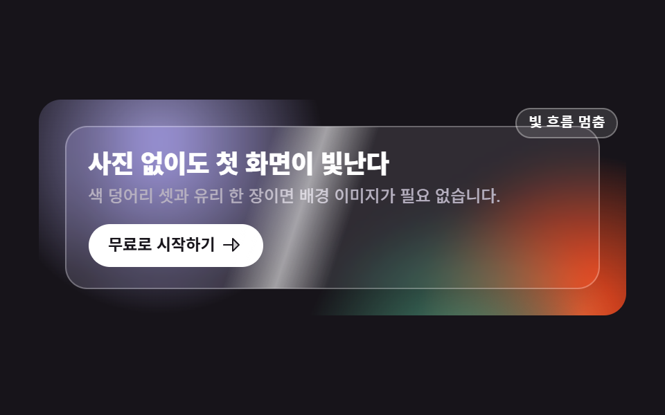
写真を一枚も使わず、ゆっくり流れる三つの色の塊の上に半透明のガラスカードが浮かび、その表面を光が斜めに一度走ります。
使いどころ画像素材がないサービス紹介の冒頭
backdrop-filterradial-gradientclip-path
<main class="stage">
  <section class="hg is-demo">
    <!-- 배경: 사진이 아니라 radial-gradient 색 덩어리 세 개. 서로 다른 위상으로 느리게 흐른다 -->
    <div class="hg__bg" aria-hidden="true">
      <span class="hg__blob hg__blob--a"></span>
      <span class="hg__blob hg__blob--b"></span>
      <span class="hg__blob hg__blob--c"></span>
    </div>

    <div class="hg__card">
      <!-- 빛줄기는 clip-path 로 카드 모양 안에 갇힌다 -->
      <span class="hg__sheen" aria-hidden="true"><i class="hg__beam"></i></span>
      <h1 class="hg__title">写真なしでも映えるヒーロー</h1>
      <p class="hg__sub">色の塊三つとガラス一枚で背景画像は要りません。</p>
      <a class="hg__cta" href="#">無料で始める
        <svg viewBox="0 0 256 256" width="16" height="16" aria-hidden="true" focusable="false" fill="currentColor"><path d="M216,128l-72,72V56Z" opacity="0.2"/><path d="M221.66,122.34l-72-72A8,8,0,0,0,136,56v64H40a8,8,0,0,0,0,16h96v64a8,8,0,0,0,13.66,5.66l72-72A8,8,0,0,0,221.66,122.34ZM152,180.69V75.31L204.69,128Z"/></svg>
      </a>
    </div>

    <button class="hg__switch" type="button" aria-pressed="false">光の流れを止める</button>
  </section>
</main>
@use "../../../../site/static/demo-tokens" as *;
// 275 히어로 팔레트 — 아홉 항목이 같은 값을 쓴다. 괄호 안은 실측 대비비
$hr-ink: $stage-ink; // 무대(잉크)
$hr-paper: $stage-paper; // 제목·버튼 면
$hr-mist: #b6b0c0; // 잉크 위 보조 글자 8.65:1
$hr-violet: #9791c9; // 색 덩어리 1
$hr-orange: $stage-orange; // 색 덩어리 2
$hr-grass: #479074; // 색 덩어리 3
$duration: $dur-loop; // 덩어리 한 바퀴 · 빛줄기 한 번
$easing: $ease-spring; // 덩어리가 흐르는 결
$color: $hr-violet; // 이 항목의 강조색
@include stage($hr-ink);
// 히어로 — 사진 한 장 없이 잉크 바닥 + 색 덩어리로 배경을 만든다
.hg {
position: relative;
box-sizing: border-box;
overflow: hidden;
display: grid;
place-items: center;
width: clamp(272px, 94vw, 424px);
padding: clamp(16px, 4vw, 24px);
border-radius: $r-card;
background: $hr-ink;
}
.hg__bg {
position: absolute;
inset: 0;
}
// 덩어리는 radial-gradient — 가장자리가 이미 부드러워 blur 필터가 필요 없다
.hg__blob {
position: absolute;
width: 240px;
height: 240px;
border-radius: 50%;
}
.hg__blob--a {
left: -64px;
top: -104px;
background: radial-gradient(circle at 50% 50%, $color, rgba($color, 0) 70%);
}
// 밝은 덩어리 둘은 글자가 앉는 왼쪽 위를 피해 아래로 내린다 (미스트 글자의 대비를 지킨다).
// b 는 오른쪽 아래 모서리(중심 가로 97%), c 는 바닥의 오른쪽 절반이다 — `left: 44%` 는 덩어리의
// **왼쪽 모서리**라 424px 무대에서 187~427px 을 덮고 중심은 72% 다. 가운데가 아니다
.hg__blob--b {
right: -108px;
bottom: -136px;
background: radial-gradient(circle at 50% 50%, $hr-orange, rgba($hr-orange, 0) 70%);
}
.hg__blob--c {
left: 44%;
bottom: -160px;
background: radial-gradient(circle at 50% 50%, $hr-grass, rgba($hr-grass, 0) 70%);
}
// 유리 카드 — 뒤의 덩어리를 backdrop-filter 로 흐려 받는다
.hg__card {
position: relative;
z-index: 1;
box-sizing: border-box;
width: 100%;
padding: clamp(12px, 3.2vw, 20px);
border: 1px solid rgba(255, 255, 255, .28);
border-radius: $r-card;
background: rgba(255, 255, 255, .10);
backdrop-filter: blur(12px) saturate(140%);
-webkit-backdrop-filter: blur(12px) saturate(140%);
}
// 빛줄기 — clip-path 로 카드 모양(같은 반경) 안에 가둔다
.hg__sheen {
position: absolute;
inset: 0;
clip-path: inset(0 round #{$r-card});
pointer-events: none;
}
.hg__beam {
--sweep: 440px;
position: absolute;
left: 0;
top: -60%;
bottom: -60%;
width: 72px;
background: linear-gradient(90deg, rgba(255, 255, 255, 0), rgba(255, 255, 255, .55) 50%, rgba(255, 255, 255, 0));
transform: rotate(18deg) translateX(-120px);
}
.hg__title {
margin: 0;
color: $hr-paper; // 흰 글자 on 잉크 18.24:1
font-weight: 800; font-size: clamp(15px, 3.8vw, 22px); line-height: 1.18;
letter-spacing: -.015em;
word-break: keep-all; // 한국어는 낱말 단위로 줄을 바꾼다
}
.hg__sub {
margin: $sp-1 0 0;
color: $hr-mist; // 미스트 on 잉크 8.65:1
font-weight: 500; font-size: clamp(10px, 2.5vw, 13px); line-height: 1.45;
}
.hg__cta {
display: inline-flex;
align-items: center;
gap: $sp-1;
margin-top: clamp(8px, 2.4vw, 12px);
padding: clamp(4px, 1.6vw, 8px) clamp(8px, 3vw, 16px);
border-radius: $r-pill;
background: $hr-paper;
color: $hr-ink; // 잉크 글자 on 흰 면 18.24:1
font-weight: 700; font-size: clamp(10px, 2.4vw, 13px); line-height: 1;
text-decoration: none;
}
.hg__cta:focus-visible {
outline: 2px solid $hr-paper;
outline-offset: 3px;
}
// 빛의 흐름만 멈추는 작은 스위치
.hg__switch {
position: absolute;
z-index: 2;
top: 6px;
right: 6px;
padding: $sp-1 $sp-2;
border: 1px solid rgba(255, 255, 255, .32);
border-radius: $r-pill;
background: rgba(255, 255, 255, .12);
color: $hr-paper;
font-weight: 600; font-size: 10px; line-height: 1.2;
cursor: pointer;
}
.hg__switch[aria-pressed="true"] {
background: rgba(255, 255, 255, .26);
}
.hg__switch:focus-visible {
outline: 2px solid $hr-paper;
outline-offset: 2px;
}
// ── 자동 재생 ─────────────────────────────────────────────
// 덩어리 셋은 같은 길이(캡처 창 2초의 약수여야 한다)의 다른 경로·다른 위상으로 흐른다.
// animation 단축은 delay 를 0 으로 리셋하므로 낱개 속성으로 쓴다
.hg.is-demo .hg__blob {
animation-duration: $duration;
animation-timing-function: $easing;
animation-iteration-count: infinite;
animation-fill-mode: backwards;
}
.hg.is-demo .hg__blob--a { animation-name: hgDriftA; }
.hg.is-demo .hg__blob--b { animation-name: hgDriftB; animation-delay: -.6667s; }
.hg.is-demo .hg__blob--c { animation-name: hgDriftC; animation-delay: -1.3333s; }
.hg.is-demo .hg__beam {
animation-name: hgSheen;
animation-duration: $duration;
animation-timing-function: $ease-out;
animation-iteration-count: infinite;
}
// 스위치를 누르면 있던 자리에 그대로 선다 (같은 특이도 · 뒤에 오므로 이긴다)
.hg.is-paused .hg__blob,
.hg.is-paused .hg__beam { animation-play-state: paused; }
@keyframes hgDriftA {
0%, 100% { transform: translate(0, 0); }
50% { transform: translate(34px, 22px); }
}
@keyframes hgDriftB {
0%, 100% { transform: translate(0, 0); }
50% { transform: translate(-30px, -20px); }
}
@keyframes hgDriftC {
0%, 100% { transform: translate(0, 0); }
50% { transform: translate(24px, -28px); }
}
// 빛줄기는 카드 왼쪽 밖에서 들어와 오른쪽 밖으로 나간다 — 되감기는 clip-path 밖에서 일어나 보이지 않는다
@keyframes hgSheen {
0%, 6% { transform: rotate(18deg) translateX(-120px); }
56%, 100% { transform: rotate(18deg) translateX(var(--sweep)); }
}
// 좁은 화면 — 세로로 쌓지 않고 글자·여백만 줄인다 (이 안에서는 간격을 올리지 않는다)
@media (max-width: 340px), (max-height: 220px) {
.hg { width: 100%; padding: $sp-3; }
.hg__card { padding: $sp-2; }
.hg__blob { width: 180px; height: 180px; }
.hg__beam { --sweep: 300px; width: 56px; }
.hg__switch { padding: 0 $sp-1; font-size: 9px; }
}
@media (prefers-reduced-motion: reduce) {
// .hg.is-demo .hg__blob (0,3,0) 를 이기려면 !important 가 필요하다 — 카드·글자는 그대로 남는다
.hg__blob, .hg__beam { animation: none !important; }
}html, body {
margin: 0;
overflow: hidden;
}
.stage {
box-sizing: border-box;
min-height: 100vh;
display: grid;
place-items: center;
margin: 0;
background: #17141a;
font-family: -apple-system, "Segoe UI", "Noto Sans KR", sans-serif;
padding: clamp(8px, 4vw, 24px);
}
.hg {
position: relative;
box-sizing: border-box;
overflow: hidden;
display: grid;
place-items: center;
width: clamp(272px, 94vw, 424px);
padding: clamp(16px, 4vw, 24px);
border-radius: 16px;
background: #17141a;
}
.hg__bg {
position: absolute;
inset: 0;
}
.hg__blob {
position: absolute;
width: 240px;
height: 240px;
border-radius: 50%;
}
.hg__blob--a {
left: -64px;
top: -104px;
background: radial-gradient(circle at 50% 50%, #9791c9, rgba(151, 145, 201, 0) 70%);
}
.hg__blob--b {
right: -108px;
bottom: -136px;
background: radial-gradient(circle at 50% 50%, #ff4d1f, rgba(255, 77, 31, 0) 70%);
}
.hg__blob--c {
left: 44%;
bottom: -160px;
background: radial-gradient(circle at 50% 50%, #479074, rgba(71, 144, 116, 0) 70%);
}
.hg__card {
position: relative;
z-index: 1;
box-sizing: border-box;
width: 100%;
padding: clamp(12px, 3.2vw, 20px);
border: 1px solid rgba(255, 255, 255, 0.28);
border-radius: 16px;
background: rgba(255, 255, 255, 0.1);
backdrop-filter: blur(12px) saturate(140%);
-webkit-backdrop-filter: blur(12px) saturate(140%);
}
.hg__sheen {
position: absolute;
inset: 0;
clip-path: inset(0 round 16px);
pointer-events: none;
}
.hg__beam {
--sweep: 440px;
position: absolute;
left: 0;
top: -60%;
bottom: -60%;
width: 72px;
background: linear-gradient(90deg, rgba(255, 255, 255, 0), rgba(255, 255, 255, 0.55) 50%, rgba(255, 255, 255, 0));
transform: rotate(18deg) translateX(-120px);
}
.hg__title {
margin: 0;
color: #ffffff;
font-weight: 800;
font-size: clamp(15px, 3.8vw, 22px);
line-height: 1.18;
letter-spacing: -0.015em;
word-break: keep-all;
}
.hg__sub {
margin: 4px 0 0;
color: #b6b0c0;
font-weight: 500;
font-size: clamp(10px, 2.5vw, 13px);
line-height: 1.45;
}
.hg__cta {
display: inline-flex;
align-items: center;
gap: 4px;
margin-top: clamp(8px, 2.4vw, 12px);
padding: clamp(4px, 1.6vw, 8px) clamp(8px, 3vw, 16px);
border-radius: 999px;
background: #ffffff;
color: #17141a;
font-weight: 700;
font-size: clamp(10px, 2.4vw, 13px);
line-height: 1;
text-decoration: none;
}
.hg__cta:focus-visible {
outline: 2px solid #ffffff;
outline-offset: 3px;
}
.hg__switch {
position: absolute;
z-index: 2;
top: 6px;
right: 6px;
padding: 4px 8px;
border: 1px solid rgba(255, 255, 255, 0.32);
border-radius: 999px;
background: rgba(255, 255, 255, 0.12);
color: #ffffff;
font-weight: 600;
font-size: 10px;
line-height: 1.2;
cursor: pointer;
}
.hg__switch[aria-pressed=true] {
background: rgba(255, 255, 255, 0.26);
}
.hg__switch:focus-visible {
outline: 2px solid #ffffff;
outline-offset: 2px;
}
.hg.is-demo .hg__blob {
animation-duration: 2s;
animation-timing-function: cubic-bezier(0.2, 0.8, 0.2, 1);
animation-iteration-count: infinite;
animation-fill-mode: backwards;
}
.hg.is-demo .hg__blob--a {
animation-name: hgDriftA;
}
.hg.is-demo .hg__blob--b {
animation-name: hgDriftB;
animation-delay: -0.6667s;
}
.hg.is-demo .hg__blob--c {
animation-name: hgDriftC;
animation-delay: -1.3333s;
}
.hg.is-demo .hg__beam {
animation-name: hgSheen;
animation-duration: 2s;
animation-timing-function: ease-out;
animation-iteration-count: infinite;
}
.hg.is-paused .hg__blob,
.hg.is-paused .hg__beam {
animation-play-state: paused;
}
@keyframes hgDriftA {
0%, 100% {
transform: translate(0, 0);
}
50% {
transform: translate(34px, 22px);
}
}
@keyframes hgDriftB {
0%, 100% {
transform: translate(0, 0);
}
50% {
transform: translate(-30px, -20px);
}
}
@keyframes hgDriftC {
0%, 100% {
transform: translate(0, 0);
}
50% {
transform: translate(24px, -28px);
}
}
@keyframes hgSheen {
0%, 6% {
transform: rotate(18deg) translateX(-120px);
}
56%, 100% {
transform: rotate(18deg) translateX(var(--sweep));
}
}
@media (max-width: 340px), (max-height: 220px) {
.hg {
width: 100%;
padding: 12px;
}
.hg__card {
padding: 8px;
}
.hg__blob {
width: 180px;
height: 180px;
}
.hg__beam {
--sweep: 300px;
width: 56px;
}
.hg__switch {
padding: 0 4px;
font-size: 9px;
}
}
@media (prefers-reduced-motion: reduce) {
.hg__blob, .hg__beam {
animation: none !important;
}
}(function () {
var root = document.querySelector('.hg');
var card = root.querySelector('.hg__card');
var sw = root.querySelector('.hg__switch');
// 격자 미리보기용 자동 루프 — 카드에 손이 닿으면 뗀다 (스위치는 예외라 눌러서 다시 켤 수 있다)
function stopLoop() { root.classList.remove('is-demo'); }
sw.addEventListener('click', function () {
var paused = sw.getAttribute('aria-pressed') === 'true';
sw.setAttribute('aria-pressed', paused ? 'false' : 'true');
// animation-play-state 만 바꾼다 — 덩어리도 빛줄기도 있던 자리에 그대로 선다
root.classList.toggle('is-paused', !paused);
if (paused) { root.classList.add('is-demo'); }
});
card.addEventListener('pointerenter', stopLoop);
root.addEventListener('focusin', function (e) {
if (e.target !== sw) { stopLoop(); }
});
})();import { useState } from "react";
import type { CSSProperties, ReactNode } from "react";
import styles from "./HeroGradientGlass.module.scss";
/* ambient 에 FocusEvent 가 없어 파일 안에 필요한 만큼만 선언한다 */
type FocusEvt = { target: unknown; currentTarget: unknown };
export type HeroGradientGlassProps = {
title?: string;
sub?: string;
cta?: string;
/** 빛의 흐름을 멈추는 스위치의 이름 */
switchLabel?: string;
/** 덩어리 한 바퀴 · 빛줄기 한 번(ms) */
duration?: number;
easing?: string;
/** 첫 번째 색 덩어리이자 이 항목의 강조색 */
color?: string;
};
type Vars = CSSProperties & { "--duration"?: string; "--easing"?: string; "--color"?: string };
const ArrowRight = (): ReactNode => (
<svg viewBox="0 0 256 256" width="16" height="16" aria-hidden="true" focusable="false" fill="currentColor">
<path d="M216,128l-72,72V56Z" opacity="0.2" />
<path d="M221.66,122.34l-72-72A8,8,0,0,0,136,56v64H40a8,8,0,0,0,0,16h96v64a8,8,0,0,0,13.66,5.66l72-72A8,8,0,0,0,221.66,122.34ZM152,180.69V75.31L204.69,128Z" />
</svg>
);
export default function HeroGradientGlass({
title = "사진 없이도 첫 화면이 빛난다",
sub = "색 덩어리 셋과 유리 한 장이면 배경 이미지가 필요 없습니다.",
cta = "무료로 시작하기",
switchLabel = "빛 흐름 멈춤",
duration = 2000,
easing = "cubic-bezier(.2,.8,.2,1)",
color = "#5b4bd6",
}: HeroGradientGlassProps): ReactNode {
const [loop, setLoop] = useState<boolean>(true);
const [paused, setPaused] = useState<boolean>(false);
const vars: Vars = { "--duration": `${duration}ms`, "--easing": easing, "--color": color };
/* 스위치는 animation-play-state 만 바꾼다 — 다시 누르면 미리보기 루프도 함께 돌아온다 */
const toggle = (): void => {
setPaused(!paused);
if (paused) { setLoop(true); }
};
const cls = [styles.hg, loop ? styles.isDemo : "", paused ? styles.isPaused : ""].join(" ").trim();
return (
<section
className={cls}
style={vars}
onFocus={(e: FocusEvt) => { if (e.target !== e.currentTarget) { setLoop(false); } }}
>
{/* 배경: 사진이 아니라 radial-gradient 색 덩어리 세 개 */}
<div className={styles.bg} aria-hidden="true">
<span className={`${styles.blob} ${styles.blobA}`} />
<span className={`${styles.blob} ${styles.blobB}`} />
<span className={`${styles.blob} ${styles.blobC}`} />
</div>
<div className={styles.card} onPointerEnter={() => setLoop(false)}>
{/* 빛줄기는 clip-path 로 카드 모양 안에 갇힌다 */}
<span className={styles.sheen} aria-hidden="true"><i className={styles.beam} /></span>
<h1 className={styles.title}>{title}</h1>
<p className={styles.sub}>{sub}</p>
<a className={styles.cta} href="#">
{cta}
<ArrowRight />
</a>
</div>
<button className={styles.switch} type="button" aria-pressed={paused} onClick={toggle}>
{switchLabel}
</button>
</section>
);
}04 グラデーション・グラスヒーロー — 計測 累積面積 34.29% · 動いたフレーム 17/23GODRICH オリジナル · SCSS と React は zip に同梱 · ファーストビュー デザイン 9パターン、コピペで置ける
このデモが属する記事
 ファーストビュー デザイン 9パターン、コピペで置けるファーストビュー デザインとは、ページを開いた最初の一画面全体の置き方のことです。ここでは九つのファーストビューを、貼った場所でそのまま動くHTMLとSCSSで載せました。どれも外部のファイルを一つも読み込まず、動きはCSSだけで組んであり この記事のデモをすべて見る